


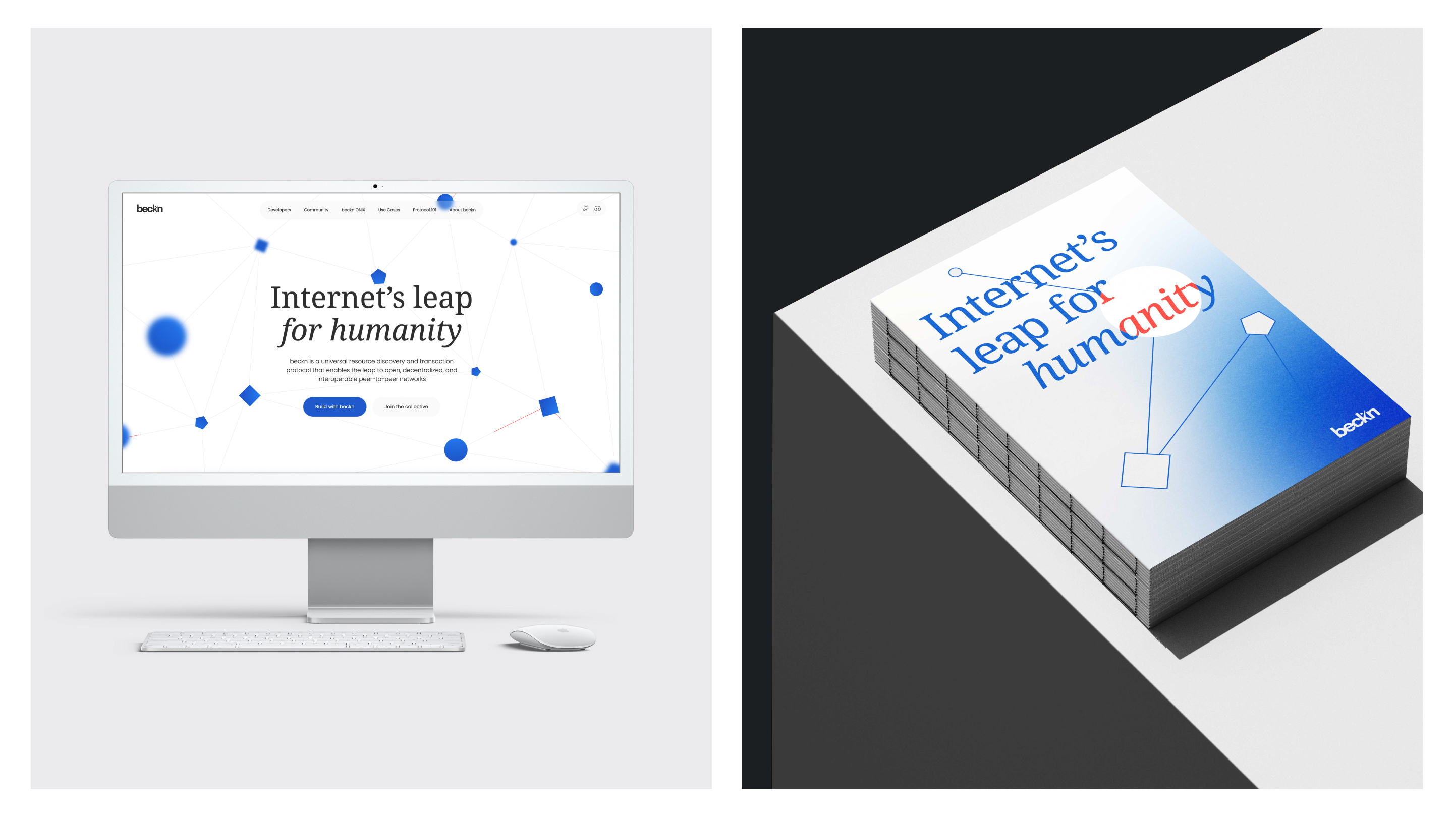
We reimagined the visual identity for beckn, a universal protocol enabling open, decentralised digital ecosystems. The world carries interconnectedness in its pocket, yet continues to function in silos. Envisioned as free, open, and accessible, the internet’s promise remains uneven – one that beckn reimagines through open, decentralised digital ecosystems.
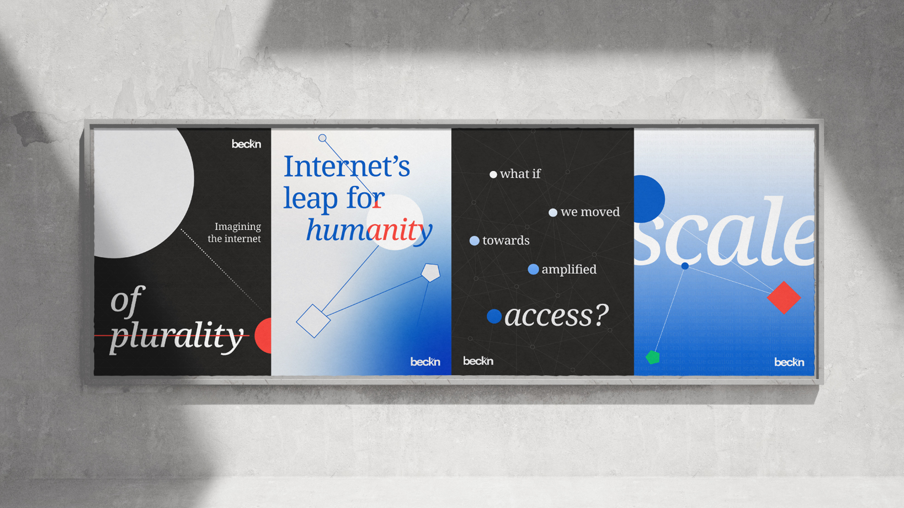
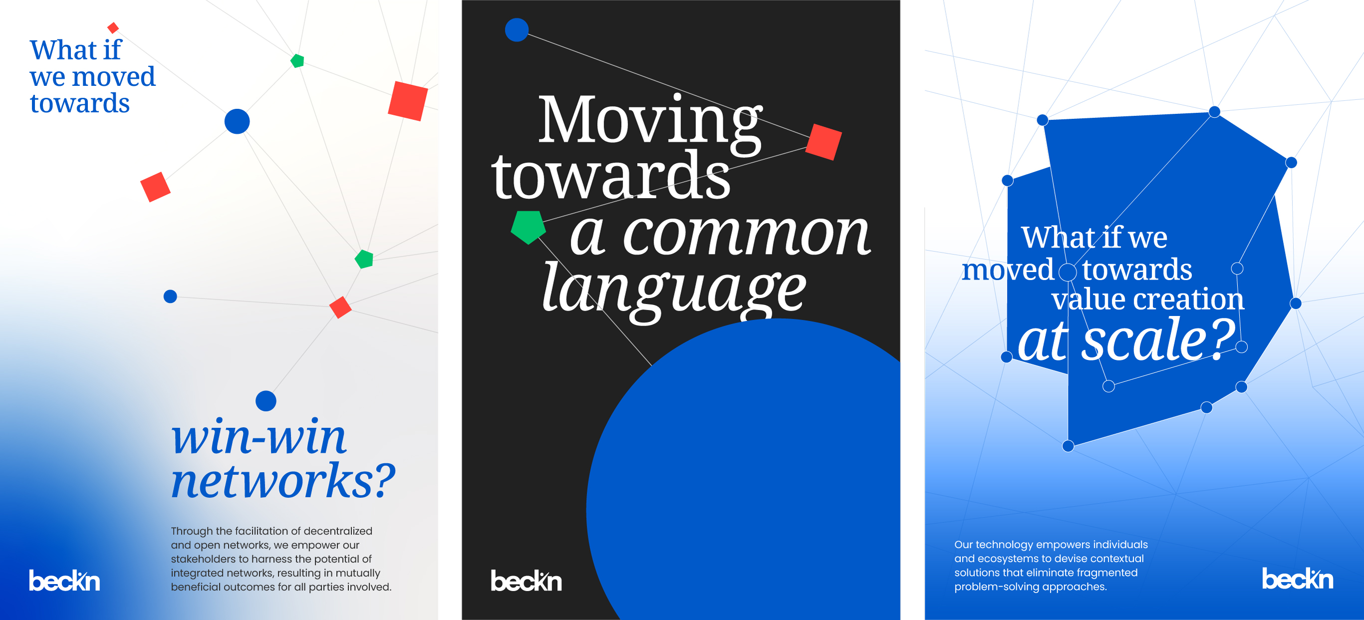
Having built beckn’s identity in 2020, the brand language was evolved from a quiet, minimal presence into one that feels bold, empowering, and deliberately counter-intuitive. Rooted in the metaphor of the rhizome – a non-linear, interconnected network – the refreshed system reflects how the internet actually works.
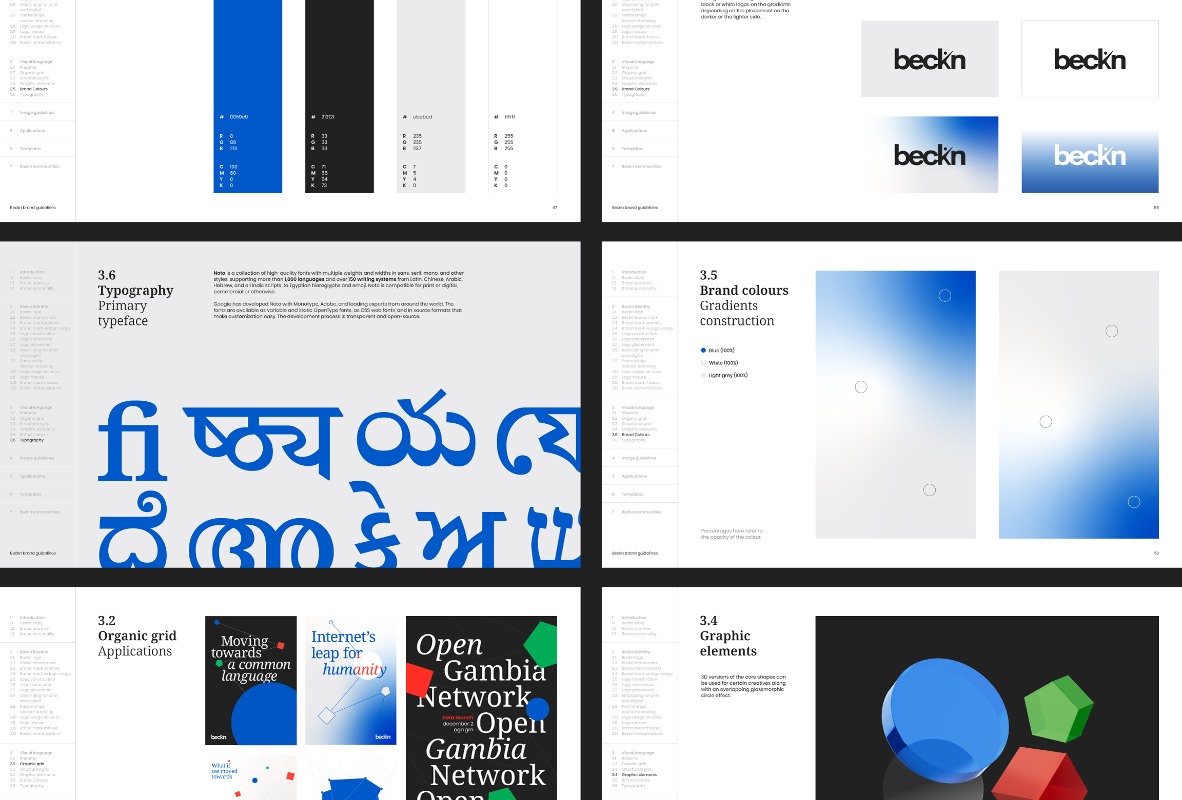
At the core of the identity is an organic rhizome grid layered with a structured framework, balancing dynamism with order. A visual language built from three geometric forms circle, square, and pentagon – represents the ecosystem’s diverse participants, while Noto Serif, chosen for its open-source, multilingual design, reinforces values of openness and inclusion.
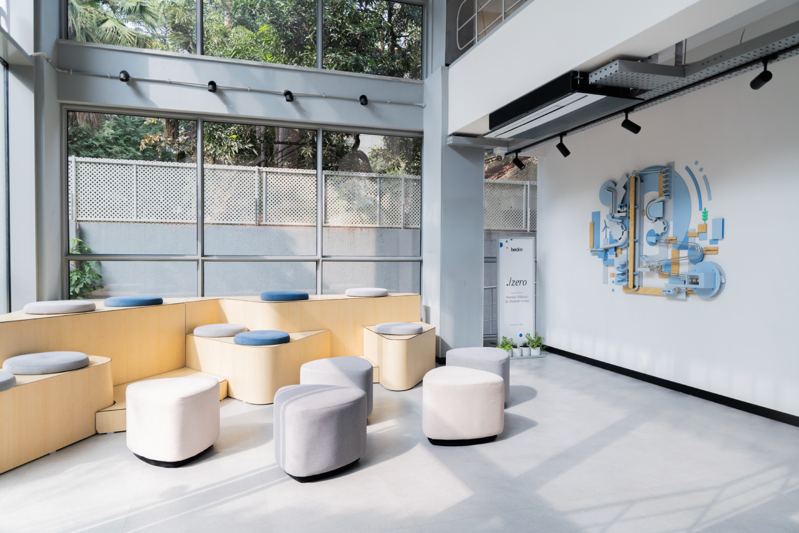
Early last year, we also conceptualized & designed the beckn office along with Sayspace that translated the core principles of beckn into their space.
The idea was to create a space that feels open, inclusive & also feels like an epicenter of creation. The iconic blue staircase and amphitheatre-style seating brought in a sense of warmth and boldness, while the community wall became a shared canvas for people to openly exchange ideas and thoughts.
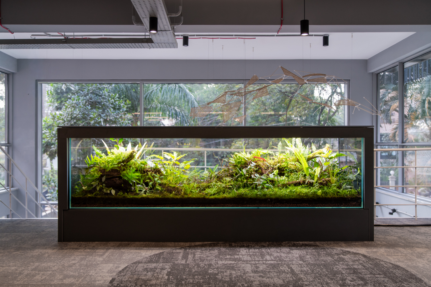
We collaborated with different people in this process to bring the space to life. Along with Madhu Chandrika we designed an installation, ‘an *efficient* machine?’, inspired by the works of an American cartoonist Rube Goldberg to make people wonder or chuckle about the complexity of a simple task which is a commentary on today’s world of digital transactions. Green Grapes Studios helped us design a 10ft long vivarium which is a living metaphor for beckn as an ever-growing, self-sustaining ecosystem, a network of networks which has been thriving ever-since.


CREDIT
- Agency/Creative: Small Town Folk
- Article Title: Strategy and Rebrand for Beckn by Small Town Folk
- Organisation/Entity: Agency
- Project Type: Identity
- Project Status: Published
- Agency/Creative Country: India
- Agency/Creative City: Bangalore
- Market Region: Asia
- Project Deliverables: Brand Architecture, Brand Creation, Brand Design, Brand Experience, Brand Guidelines, Brand Identity, Brand Redesign, Brand Refinement, Brand Strategy, Brand Tone of Voice, Environmental Graphics, Visualisation, Web Design
- Industry: Technology
- Keywords: #visualidentity #spacedesign #brandguidelines #posterdesign
-
Credits:
Strategy+Rebrand: Small Town Folk
Vivarium: Green Grape Studios
An efficient machine? installation: Madhu Chandrika
beckn office design: Say space


