


Rupty is a natural treat brand for dogs and cats born to challenge the logic of the traditional ultra-processed snack industry. Its products are made from simple and real ingredients, with no additives, disguises, or magic formulas.
Operating in e-commerce, with a presence in pet shops, veterinary clinics, and pet-friendly spaces, the brand speaks to an urban, young, and conscious audience looking for healthier choices for their pets, transforming treat time into a genuine exchange of affection.
The brand started with a more artisanal vibe, but as the business grew, it became evident that the name no longer supported its strategic ambition nor translated the territory it wanted to occupy: a rebellious yet welcoming brand; questioning, but affectionate.
The challenge involved breaking away from the predictable visual codes of the natural pet segment, often associated with an organic or nature-related aesthetic. The new brand needed to communicate quality and consciousness without losing its lightness, while also building an urban positioning full of personality.
From the strategic immersion, we structured the brand’s purpose as a clear positioning: to care consciously and please the ones who are really in charge (the pets, of course). The brand transforms natural treats into exchanges of affection that nourish and get them jumping for joy.
This direction unfolds into four pillars that support the brand: rebellion, by challenging the old way of making treats and questioning ultra-processed products full of additives; care, in the choice of simple and true ingredients; joy, celebrating the energy and moments shared with pets; and authenticity, ensuring honest choices, without disguises or empty promises.
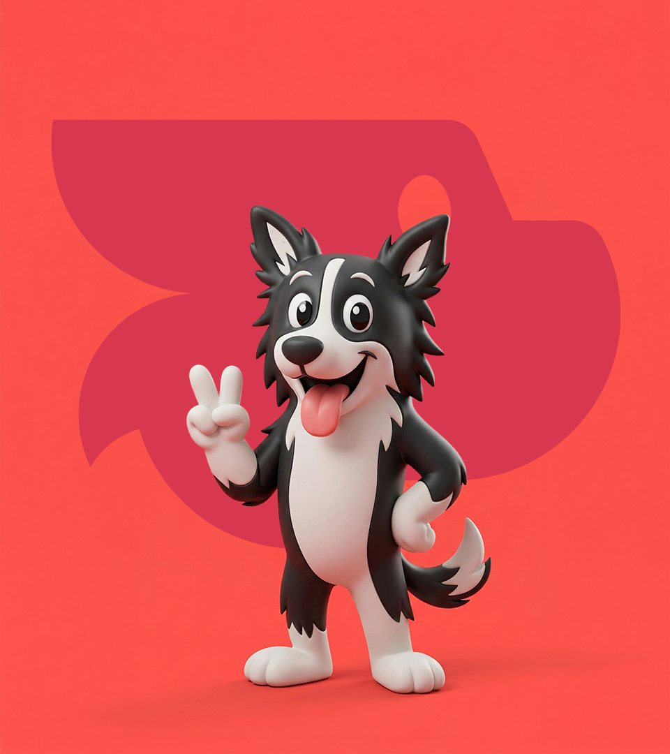
The defined behavior was clear: a friendly rebel brand. It questions the industry but welcomes pets and their pet parents. It challenges the system with lightness and optimism, balancing an urban attitude with genuine care. It is from this territory that the brand’s name is born.
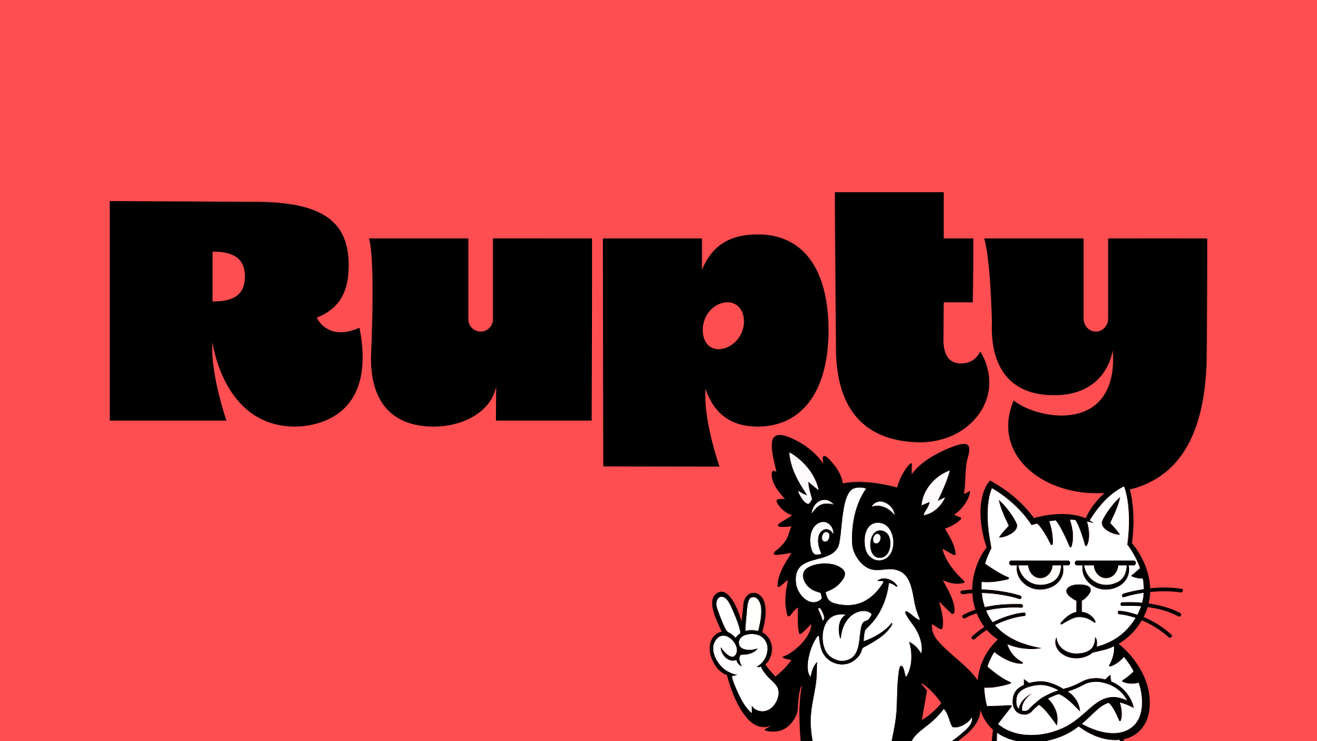
Rupty is a friendly neologism derived from “disruptive”. Short, catchy, and memorable, it carries the idea of breaking with the industry standard without losing its friendly aspect. Like an affectionate nickname, Rupty arrives to win the hearts of those seeking truer choices for their pets.
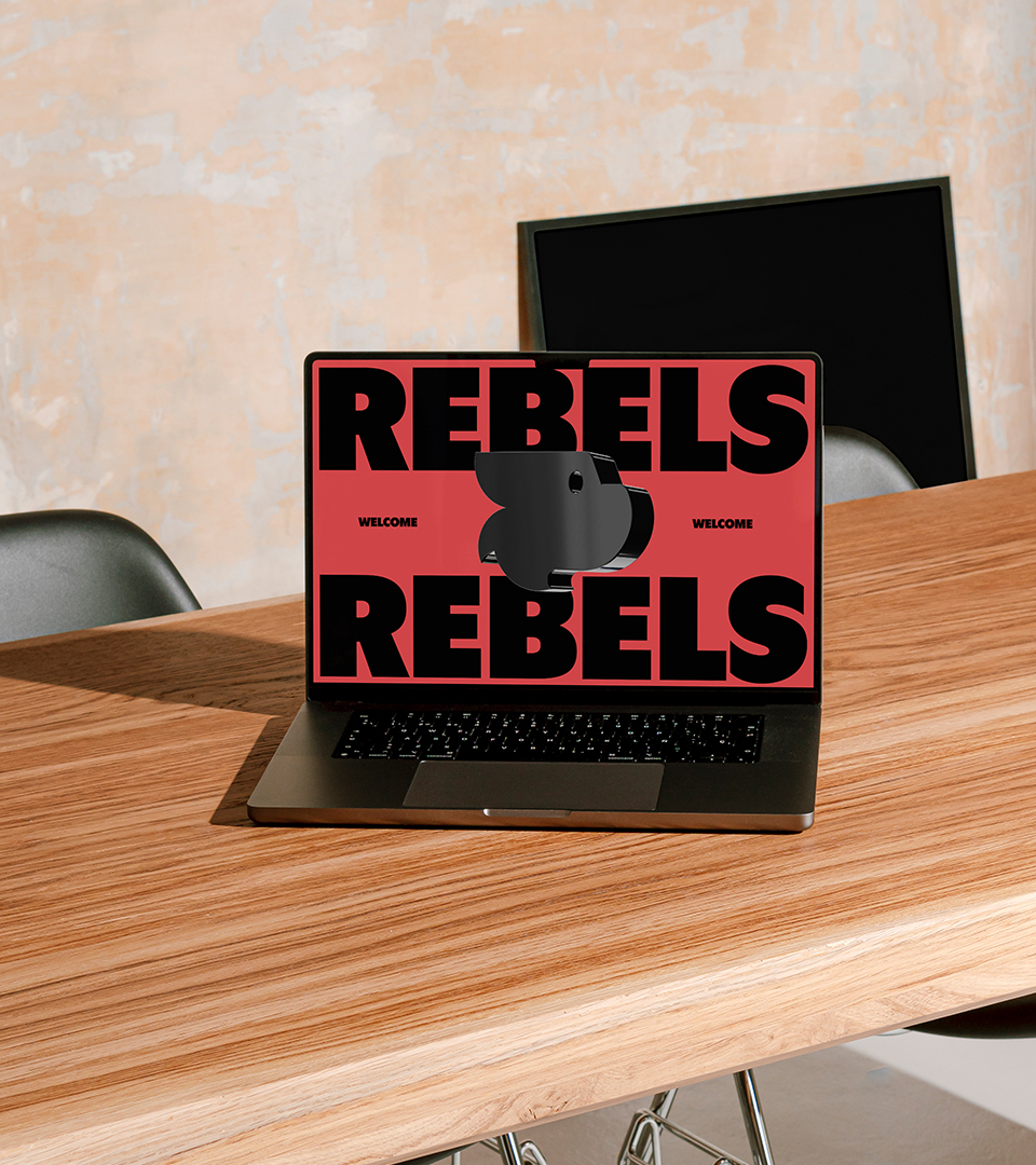
The visual identity translates this strategic territory into a strong, expressive, and proprietary system. The logo was built from typography with striking shapes and fluid curves, balancing strength and friendliness. Its design conveys energy and personality, reinforcing the friendly rebel behavior that guides the brand.
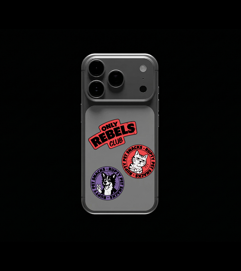
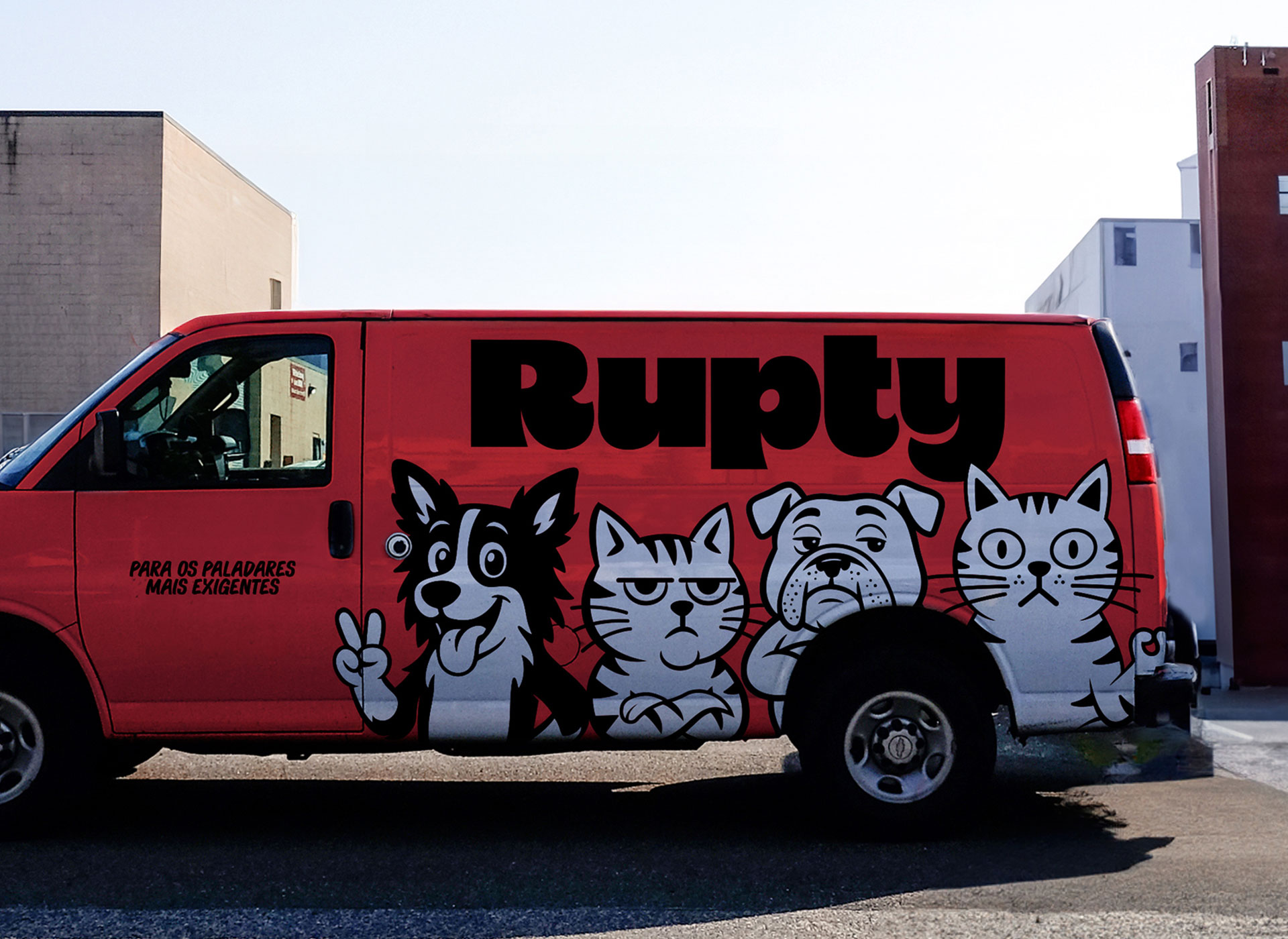
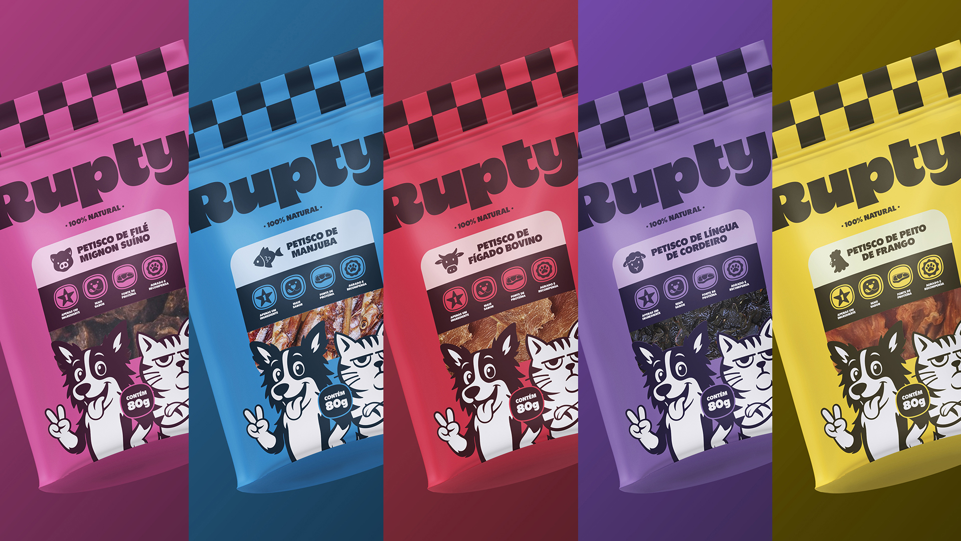
The symbol is born from the fusion of dog and cat silhouettes, representing that, at Rupty, all rebels are welcome. The monogram with the letter “R” works as a quick signature, expanding applicability and strengthening recognition across different formats.
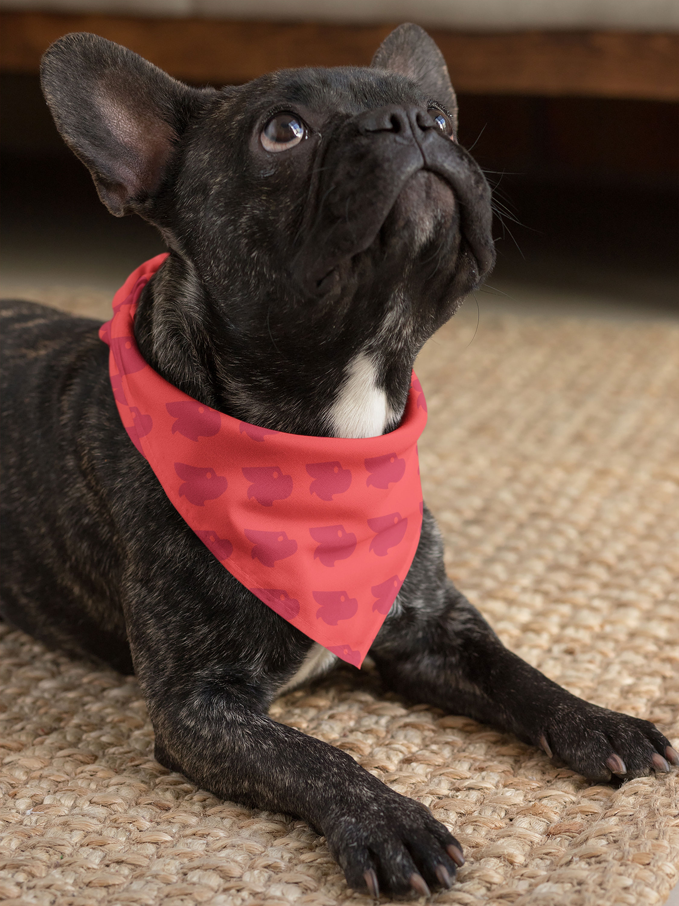
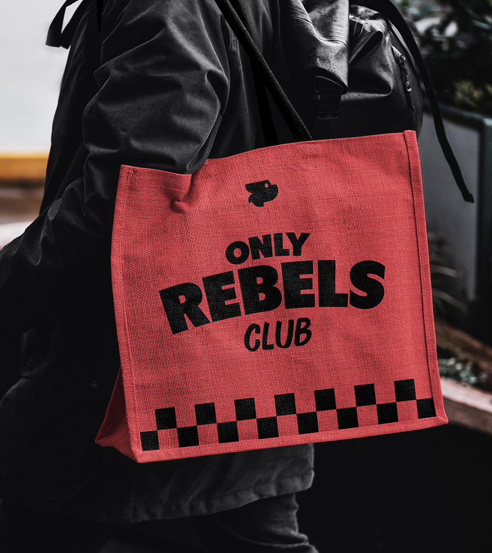
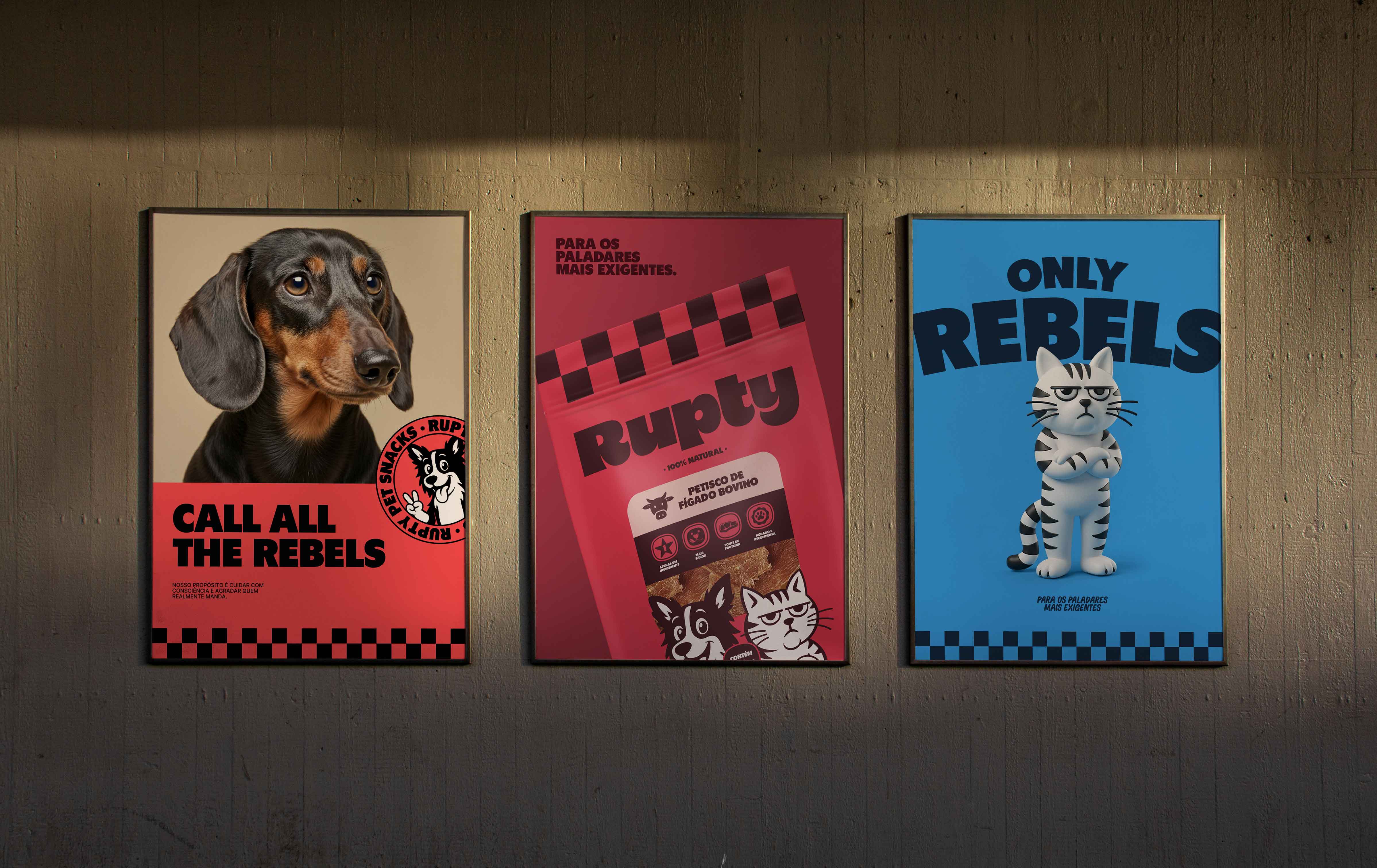
The color palette is a strategic tool for differentiation at the point of sale. Rebel Red and Black take center stage, establishing an urban and striking tone that breaks away from the predictable greens of the natural segment. Supporting colors organize the product mix by protein, ensuring clarity and scalability for future expansions.
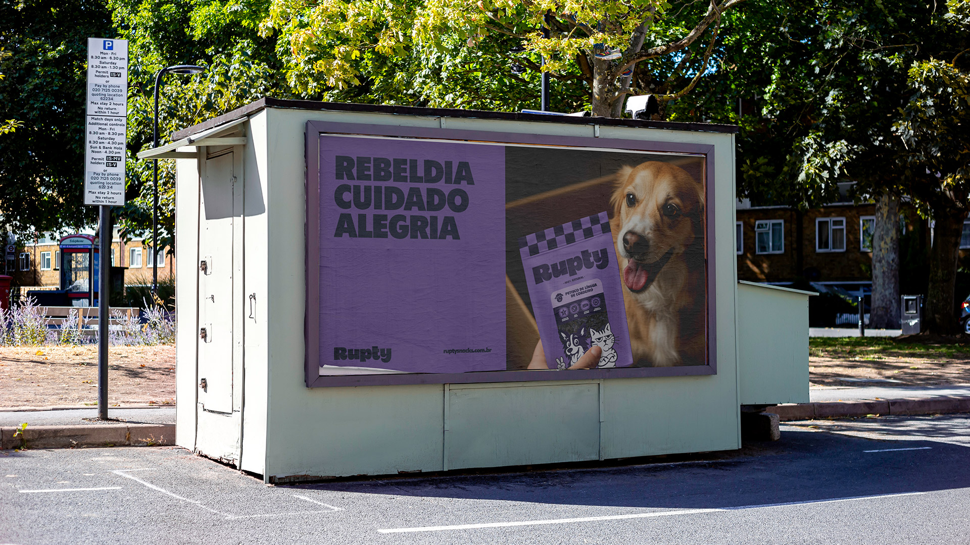
The brand assets expand this visual universe with personality. The checkerboard pattern nods to street culture, while illustrations and icons bring lightness and closeness. Provocative lockups and stickers translate the brand’s personality into phrases that question the old way of making treats. Finally, the photography balances the system with a sunny and luminous aesthetic, reinforcing the pillars of care and joy.
CREDIT
- Agency/Creative: Bradda Design
- Article Title: Bradda Design Launches Rupty as a Disruptive Natural Treat Brand for Modern Pet Culture
- Organisation/Entity: In-House
- Project Type: Graphic
- Project Status: Published
- Agency/Creative Country: Brazil
- Agency/Creative City: Florianópolis
- Market Region: South America
- Project Deliverables: Brand Design, Brand Naming, Packaging Design
- Industry: Food/Beverage
- Keywords: #naming #branddesign #pet #packaging #rupty
-
Credits:
Project Manager: Natalia Favero
Strategy & Naming: Rafaela Sotuyo
Strategy & Naming: Hemelyn Haertel
Art Direction & Design: Lucas Guidi
Illustration: Letícia Marcondes
Motion: Lauro Henn


