


Packaging design for Calliope
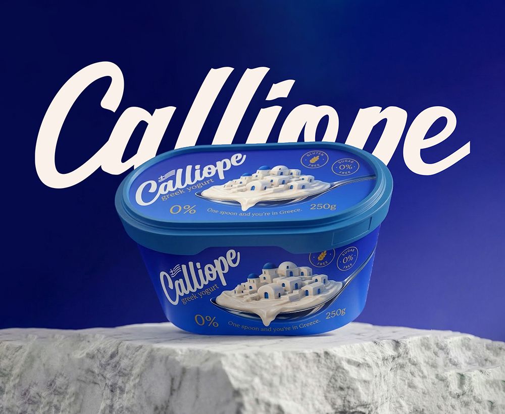
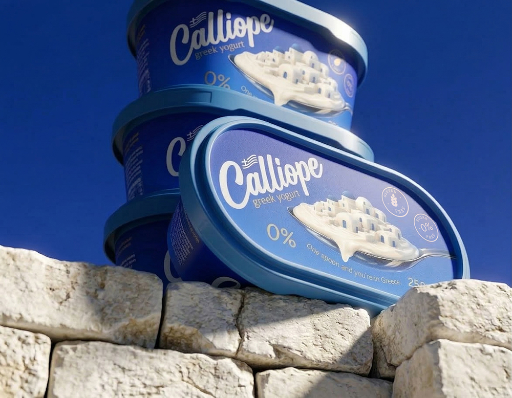
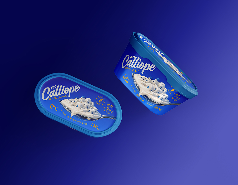
This packaging design conveys purity, lightness and high quality at first glance. The deep blue color is immediately associated with the maritime culture of Greece, creating a sense of trust and freshness. The font is soft and flowing, which conveys naturalness and comfort, as if the yogurt has just been prepared in the traditional way.
The main visual solution, a white village formed on a spoon, ingeniously combines the product and the story of origin. It is reminiscent of the white houses of Santorini with blue roofs, which not only attracts the eye, but also creates a direct connection between culture and taste. The 0% mark and minimalist symbols emphasize a healthy lifestyle without unnecessary noise.
Storytelling:
Imagine a sunny morning on the shores of the Aegean Sea. The wind gently moves the white curtains, and in the distance you can see small houses with blue domes. A local family, with a secret passed down from generation to generation, makes their yogurt with the same simplicity and love as years ago. In every spoonful there is that silence, that sun, that purity.
“Calliope” is not just yogurt. It is a journey without moving from one place. When you open the package, you feel not only a taste, but a story. A story where simplicity becomes luxury, and naturalness becomes a true pleasure.
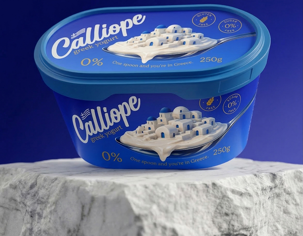
One spoonful… and you are already there. This packaging design is built around a simple yet profound idea: to convey a truly Greek experience, right from the first spoonful. The deep, rich blue is not just a color, but a feeling: it evokes the depth of the sea, the vastness of the sky, and the purity that characterizes high-quality dairy products. The choice of this color also creates a strong contrast with the white yogurt, emphasizing its naturalness and freshness.
The logo, “Calliope,” is designed with soft, flowing lines that recall the creamy texture of yogurt. It has a feminine touch and elegance that involuntarily associates the product with a delicate, carefully crafted product. The shape of the letters is not only legible, but also has a memorable silhouette, which is important for brand recognition.
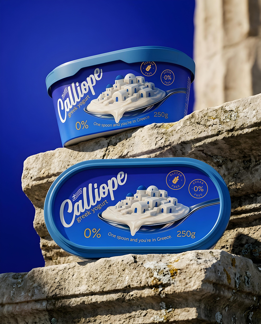
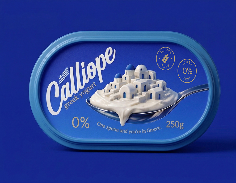
The most powerful and memorable element of the design is the white city built on a spoon. This is not just a beautiful visual; this is a story told without words. Yogurt here becomes a landscape, and each spoonful a small journey. This approach creates an emotional connection with the consumer, turning the product not just food, but an experience.
The packaging design is also thoughtful: rounded corners and a comfortable grip structure create a sense of trust and comfort. It is not only beautiful on the shelf, but also functional for everyday use. The design of the lid repeats the main visual language, providing a complete and harmonious look.
Text elements are minimal, but clear. The “0%” marking is large and noticeable, directly communicating the idea of a healthy lifestyle. The phrase “One spoon and you’re in Greece” is not just a slogan, but a promise. It creates anticipation, interest and a desire to try.
Storytelling:
There is a place where time flows slowly. Mornings begin with the first ray of sunlight, which touches the white walls and illuminates the narrow streets. People there are not in a hurry. They appreciate simple moments: coffee, conversation, and a spoonful of fresh yogurt.
In that same place, in a small kitchen, this story begins. The milk comes from a nearby farm, where animals are kept with care and love. Everything is prepared without unnecessary intervention, preserving the natural taste and texture. This is not production, this is tradition.
When you open “Calliope”, you open a part of that story. The first spoonful is soft, light, almost airy. It melts on the tongue, leaving a clean, natural taste, without heaviness. It is the feeling when you realize that simple can be perfect.
And suddenly you are no longer here. You are there, among white houses, under a blue sky, in the air filled with the smell of sea salt. You have a spoon in your hand, but in reality it is the key to opening a world.
This yogurt is not made just to fill you up. It is made to remind you that true pleasure comes from simplicity. That everything can be pure, natural and at the same time infinitely rich in feelings.
“Calliope” is not just a design. It is a feeling. It is a memory, even if you have never been there. And every time you pick up a new spoon, that story begins anew.
CREDIT
- Agency/Creative: Atyan Design
- Article Title: Atyan Design Shapes Calliope Into a Greek Yogurt Brand Inspired by Sea Light and Simplicity
- Organisation/Entity: Agency
- Project Type: Packaging
- Project Status: Published
- Agency/Creative Country: Armenia
- Agency/Creative City: Atyan Design
- Market Region: Europe
- Project Deliverables: Packaging Design
- Format: Bucket
- Industry: Food/Beverage
- Keywords: yogurt
-
Credits:
Graphic Designer: Aram Atyan
Graphic Designer: Mos Atyan


