


Ama Terra is a bio-social farm that promotes a high quality of life through sustainable agriculture. The project was founded in 2010 by the non-profit association “Cooperativa Sociale Ama Aquilone.” Its protagonists are the people involved in the cooperative itself, who continue their commitment in the Piceno Hills, where the organization is based. The products created through sustainable social agriculture reflect a deep care for the environment.
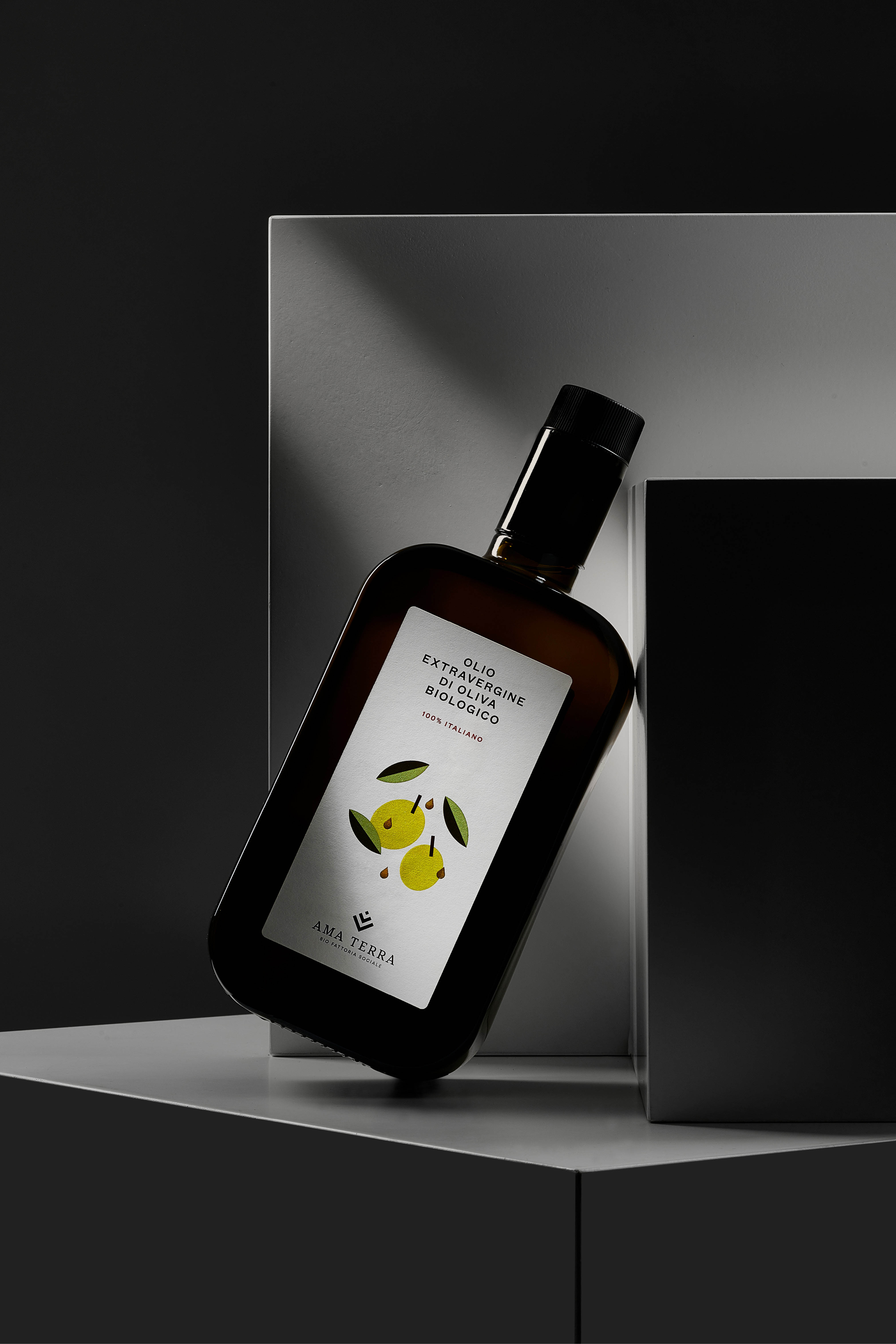
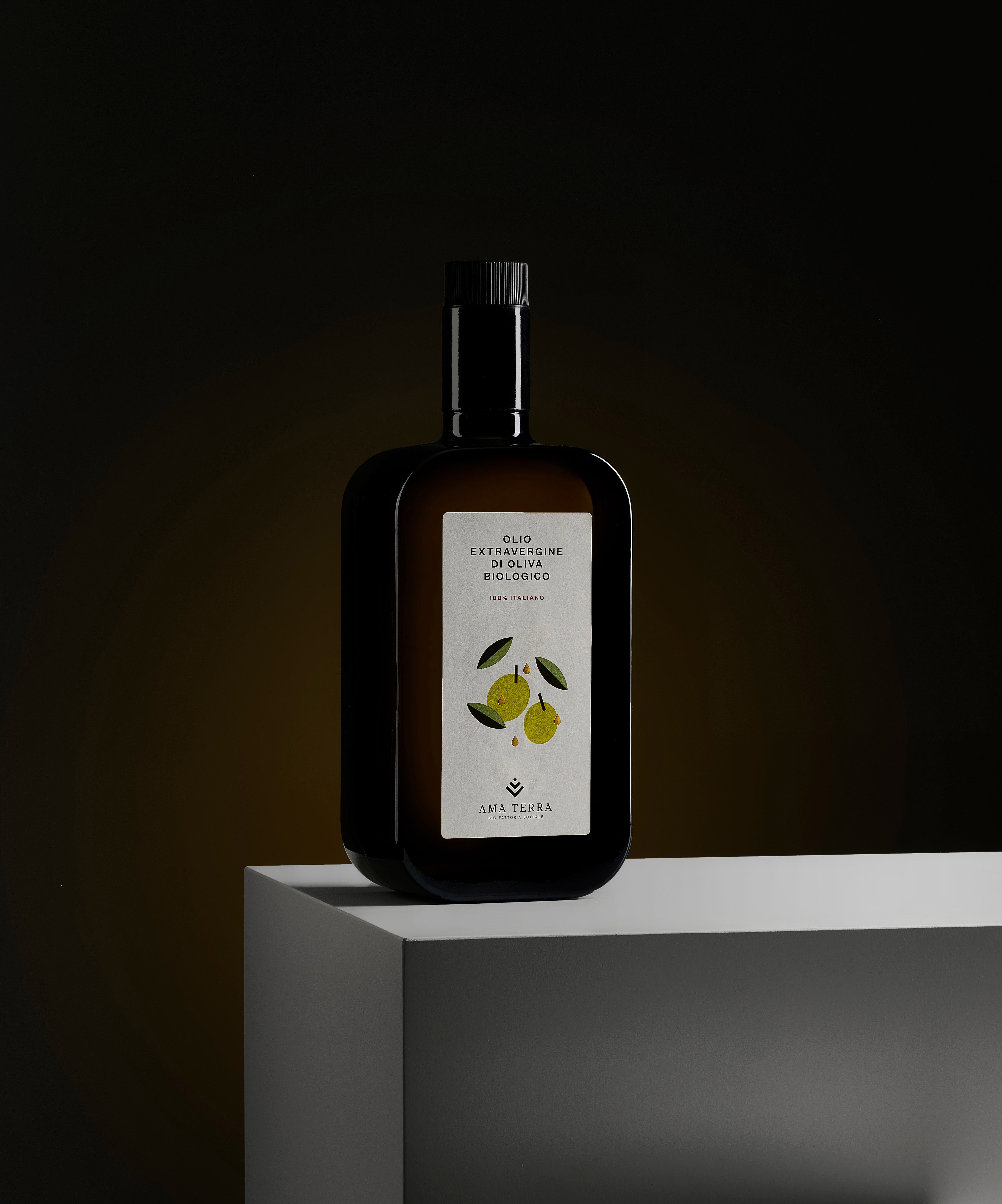
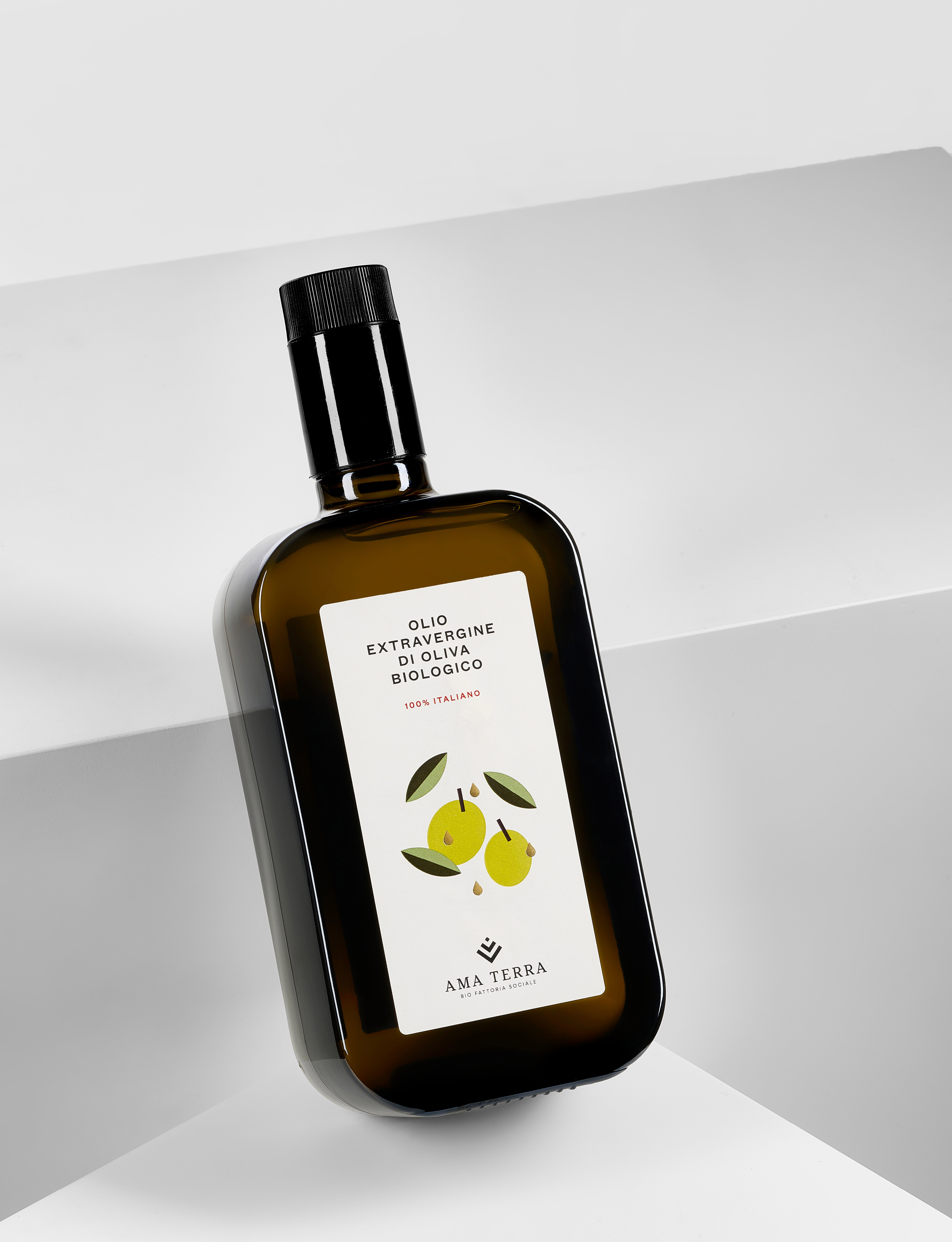
For this reason, Ama Terra represents a unique reality, promoting an agricultural model that encourages conscious consumption while safeguarding rural heritage, supporting the local economy, and fostering social well-being. This creates a virtuous circle connecting nature, work, territory, and social ethics. For the Ama Terra organic product line, simple and anti-ornamental labels were designed. The visual identity was developed through typography and illustration, which become the main expressive elements across the entire product line.
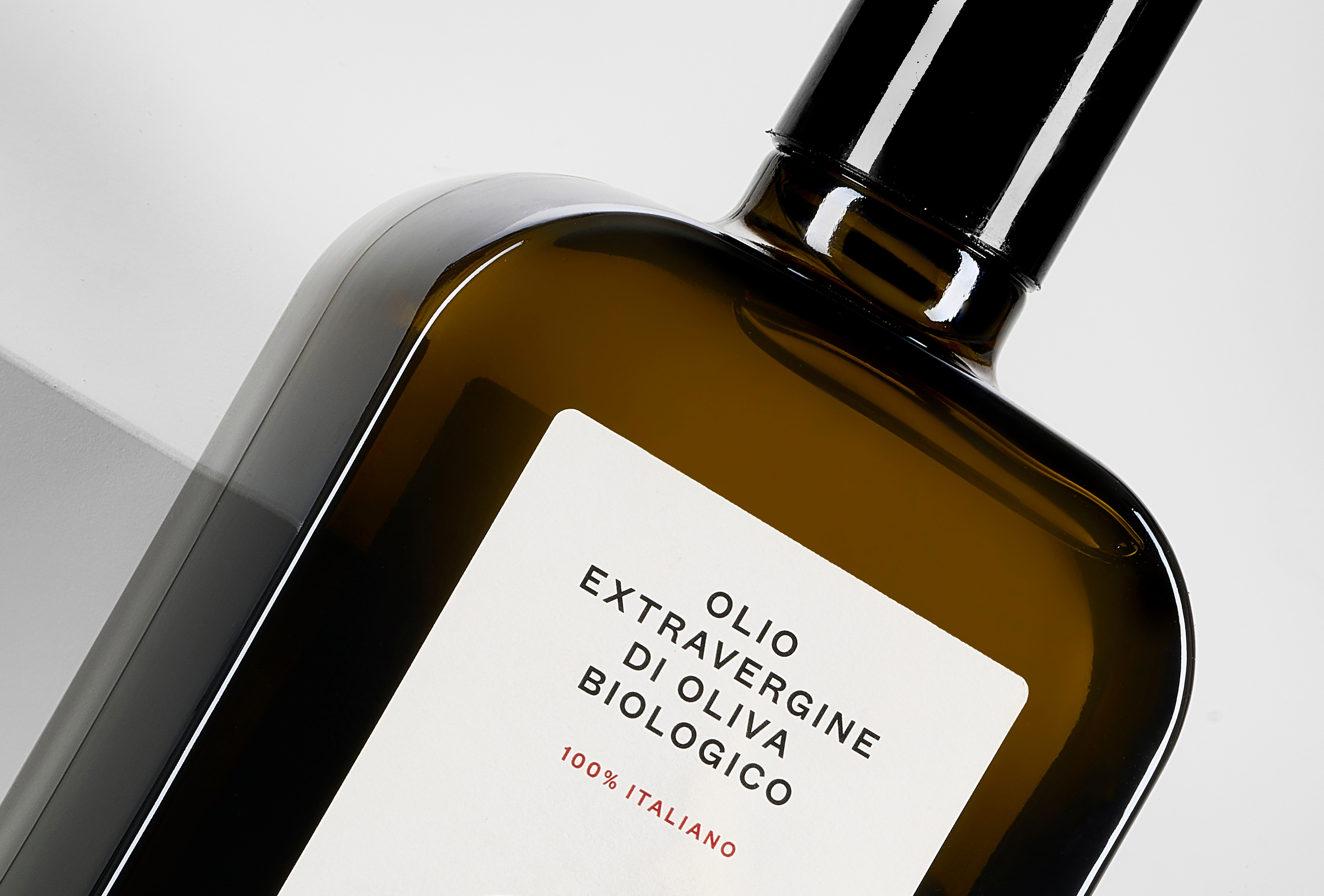
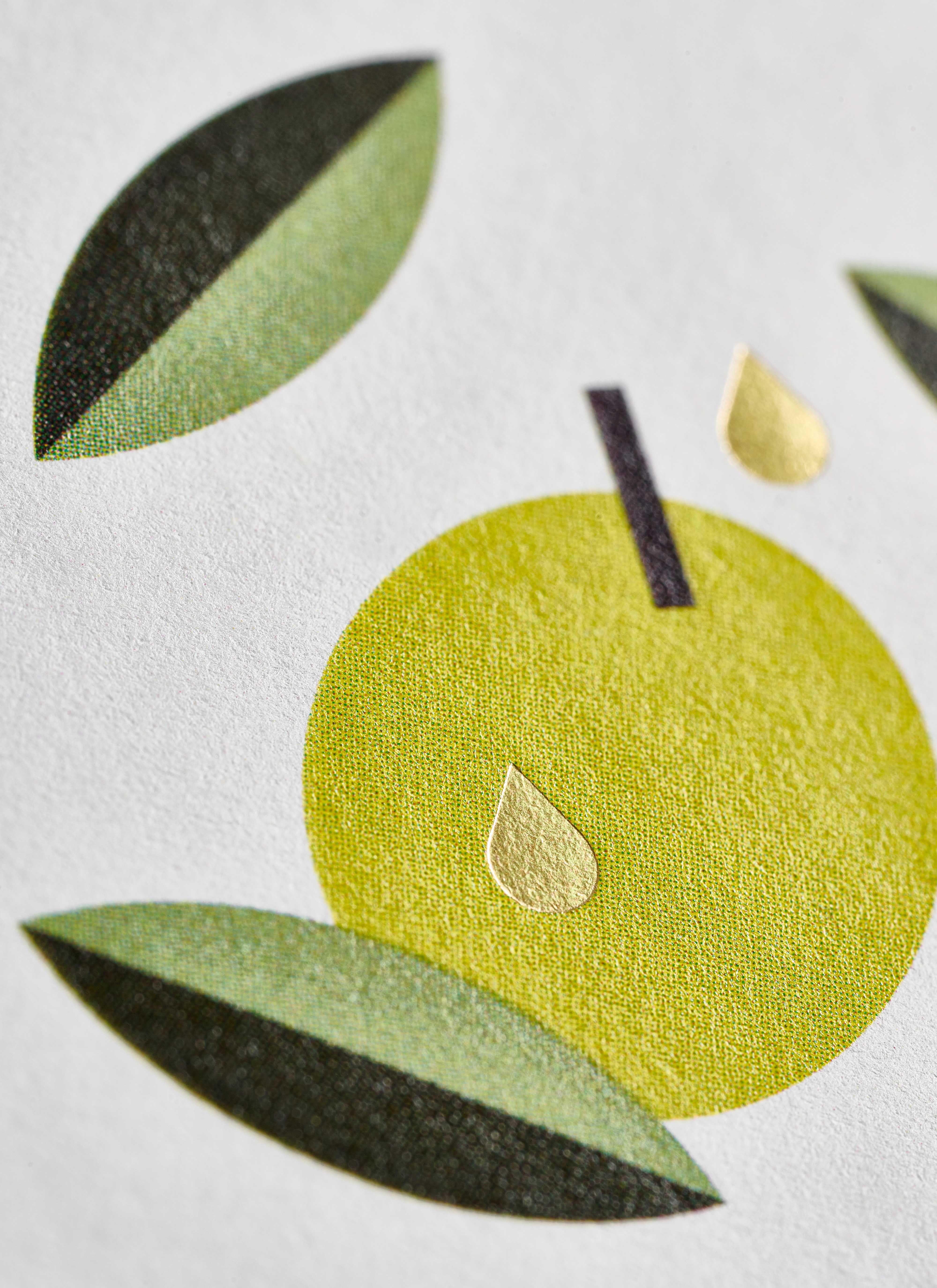
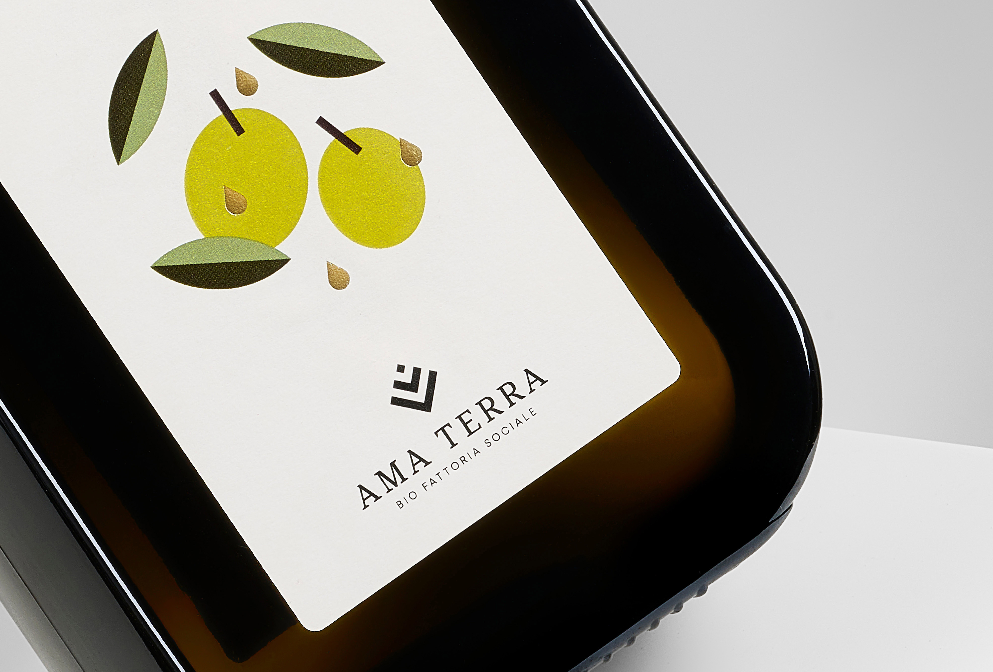
The illustration is based on the simplification and the abstraction to the geometric figures of the elements that constitute the oil: the leaf, the olive and the drop of oil. The various parts recompose distributing proportionally along all the front label. This geometric translation of the shapes is also recalled in typography; hence a grotesque signature was chosen, without graces, designed on the basis of geometric figures such as circles and squares. This typographic design is therefore able to guarantee a nitid and highly readable result, also in contexts hardly readable.
The label is printed on textured ivory paper in four-colour process. A gold lamination ennobles the parts representing the heart of the fruit, recalling the logo of Ama Terra that is a growing grain seed.
CREDIT
- Agency/Creative: Emmesse
- Article Title: Emmesse Shapes Ama Terra into an Organic Identity Rooted in Sustainable Social Agriculture
- Organisation/Entity: Agency
- Project Type: Packaging
- Project Status: Published
- Agency/Creative Country: Italy
- Agency/Creative City: Teramo (TE)
- Market Region: Global
- Project Deliverables: Art Direction, Brand Design, Brand Identity, Brand Redesign, Branding, Food Photography, Graphic Design, Illustration, Label Design, Packaging Design, Rebranding, Tone of Voice
- Format: Bottle
- Industry: Food/Beverage
- Keywords: Oil label, oil, olio extravergine di oliva biologico, italy
-
Credits:
Graphic Designer: Matteo Spinelli
Graphic Designer: Chiara Coscia
Still-life photo: Andrea Straccini


