


Design Concept: The Heritage Brew — A Sensory Journey into South Indian Tradition
As the lead graphic designer for this project, my objective was to transform Filter Kaapi from a functional daily beverage into a premium sensory experience that resonates on a global stage. The core of this packaging identity lies in the delicate marriage of South Indian heritage with a high-end, contemporary aesthetic. By stripping away the cluttered visuals often associated with traditional coffee brands and replacing them with a curated, minimalist luxury, we position the brand as both an artisanal craft and a profound cultural legacy.
1. Visual Identity & Color Strategy
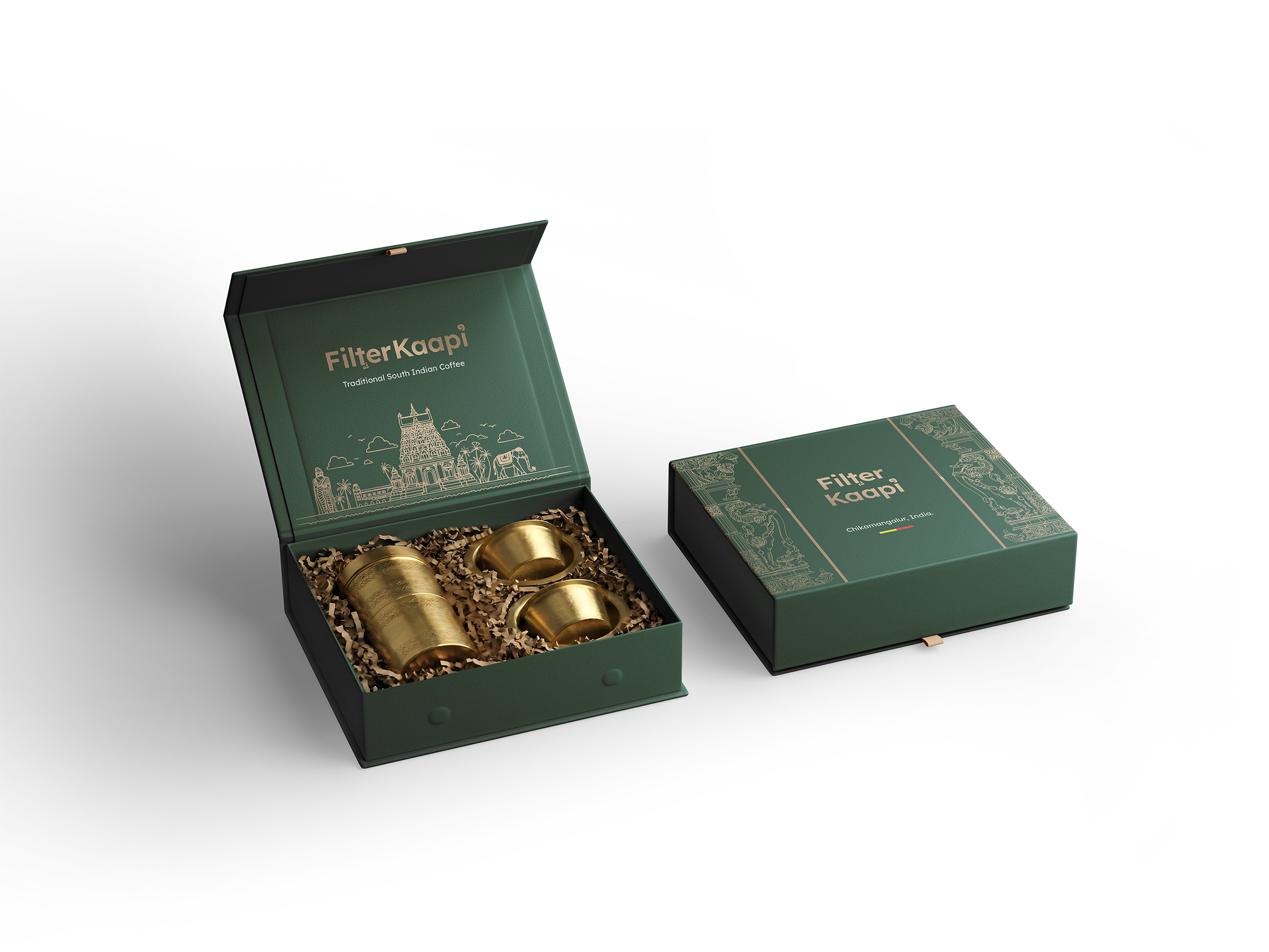
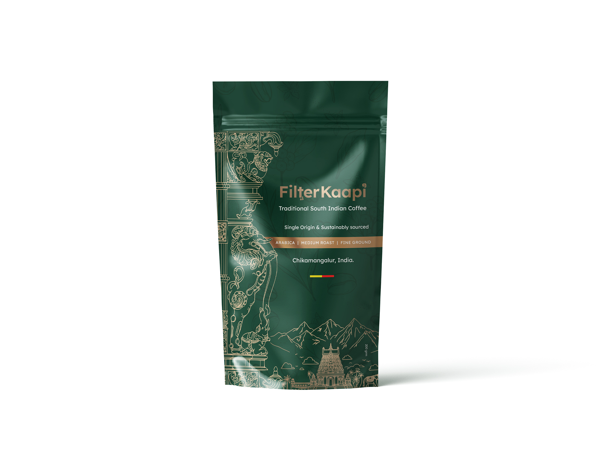
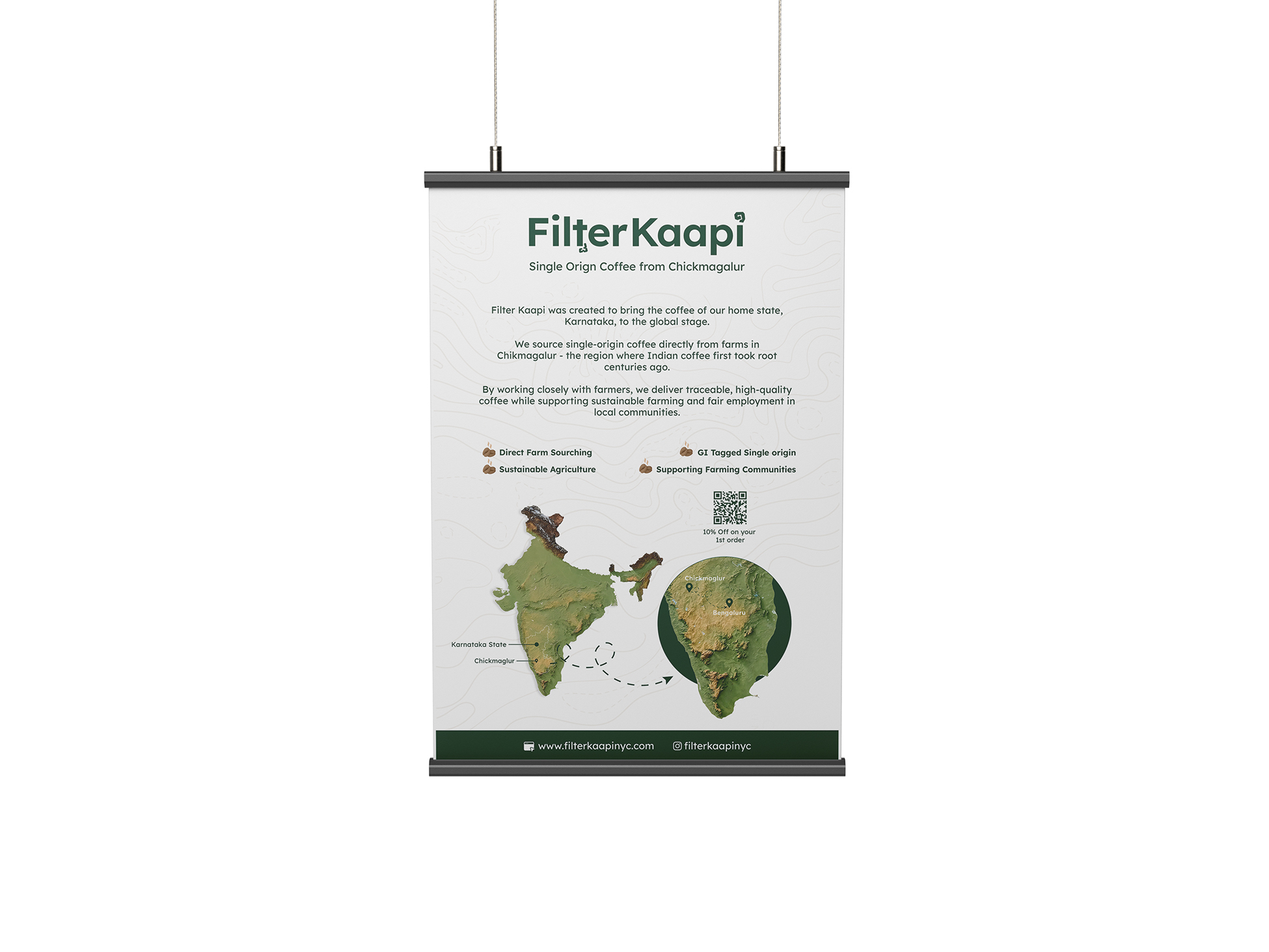
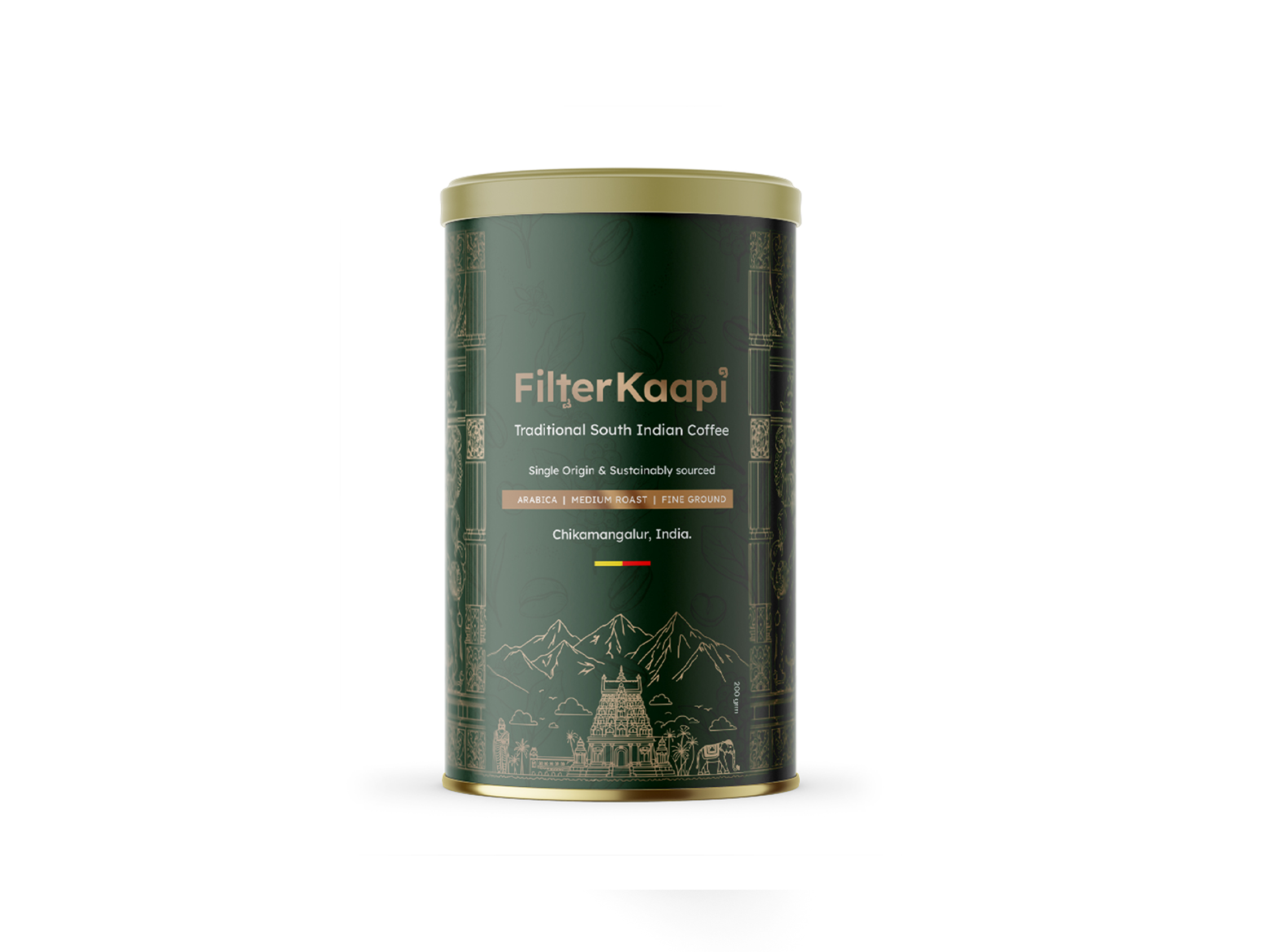
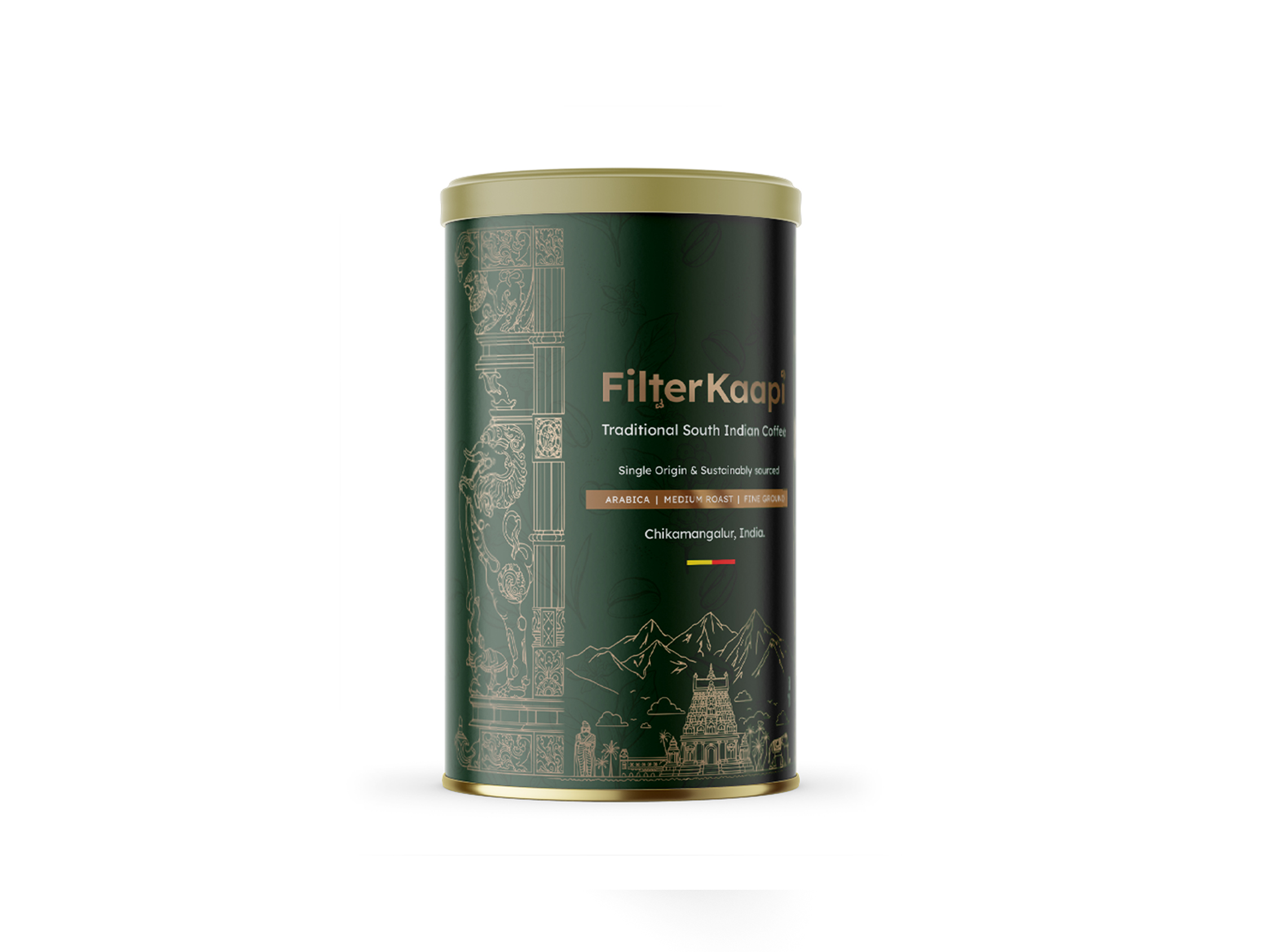
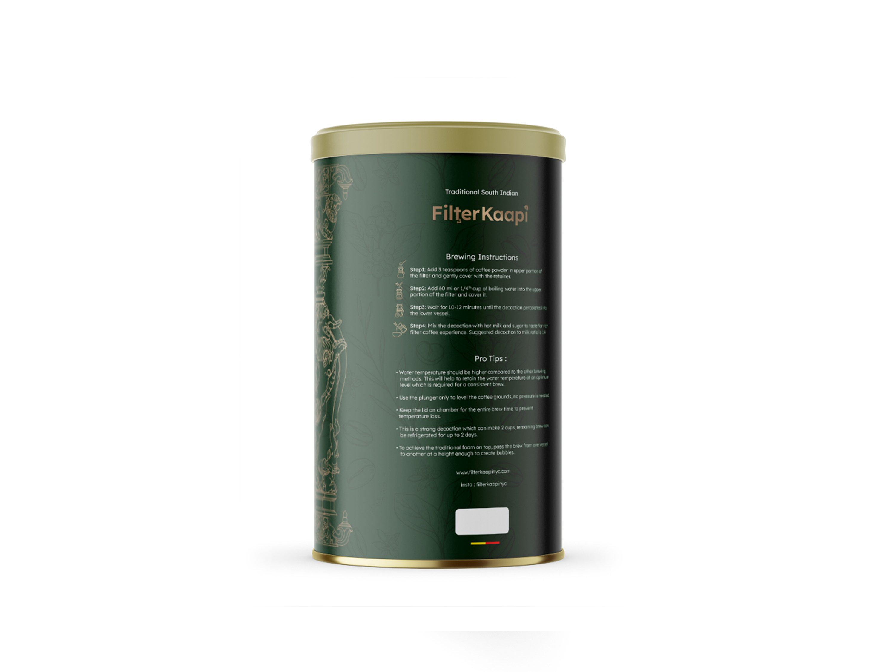
The primary color story is anchored by a deep, sophisticated Forest Green. This specific hue was selected to evoke the lush, mist-covered, shade-grown plantations of Chikmagalur. It provides a grounding, organic foundation that feels premium yet rooted in nature.
To create a striking visual contrast, I utilized Champagne Gold foiling for the accents and illustrations. Gold is not merely a signifier of luxury here; it represents the “liquid gold” of a perfectly brewed decoction and the warmth of the morning sun hitting a brass tumbler. This metallic finish ensures the packaging catches the light on a retail shelf, demanding attention through elegance rather than noise.
2. Illustrative Storytelling & Iconography
The heart of the design is the intricate line-art iconography. I integrated traditional Yali motifs—the mythical guardians found in Dravidian architecture—to serve as a symbolic protector of the coffee’s purity. The gold-line vector illustrations depict:
Dravidian Temple Gopurams: Honoring the architectural soul of South India.
The Legend of Baba Budan: Subtly referencing the Sufi saint who first brought coffee seeds to India in the 17th century.
The Iconic Brass Dabara: A visual cue that bridges the gap between the raw product and the final, frothy ritual.
These elements create a “sense of place,” ensuring that the consumer isn’t just buying coffee, but is instead engaging with a story that spans centuries.
3. Typography & Brand Voice
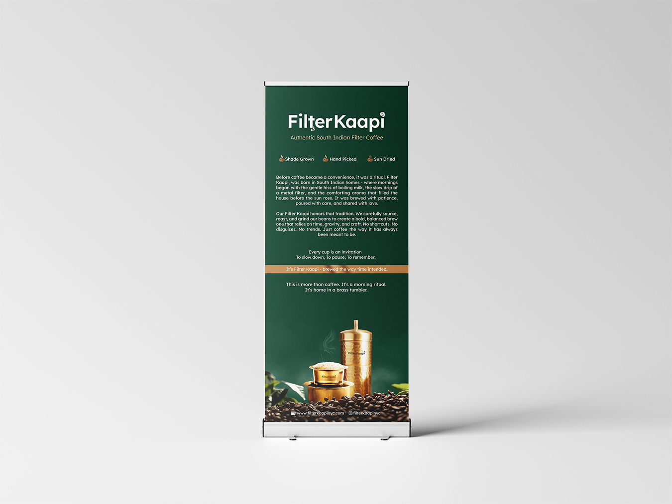
The logotype is a custom, bilingual-inspired serif. The subtle inclusion of Kannada script elements within the English “Filter Kaapi” letters acts as a nod to the coffee’s origin in Karnataka. This typographic choice reflects a brand that is deeply traditional yet designed for a global, urban audience that appreciates clean lines and legibility. The secondary “copy” is kept sparse and elegant, using sans-serif fonts to maintain a modern, breathable layout.
4. Materiality & Structural Design
The “premium” tier is reinforced through tactile touchpoints. For the stand-up pouches, we opted for a soft-touch matte finish which feels luxurious in the hand and eliminates harsh reflections. The structured gift boxes are the centerpiece of the collection; featuring rigid construction and magnetic closures (or brass-style hardware), they are designed to be kept and reused, echoing the sustainable nature of the coffee itself. The interior of the boxes uses natural shredded kraft paper to provide a rustic, organic contrast to the polished exterior.
CREDIT
- Agency/Creative: Trisaga.co
- Article Title: Trisaga.co Elevates Filter Kaapi with Premium Packaging Rooted in South Indian Heritage
- Organisation/Entity: Agency
- Project Type: Packaging
- Project Status: Non Published
- Agency/Creative Country: India
- Agency/Creative City: Trisaga.co
- Market Region: Asia
- Project Deliverables: Design
- Format: Box, Can, Pouch
- Industry: Food/Beverage
- Keywords: Premium Heritage, South Indian Aesthetic, Artisanal Branding, Chikmagalur Coffee, Minimalist Luxury, Cultural Storytelling, Earthy Palette, High-End Packaging.
-
Credits:
Graphic Designer: Darshan S


