


The Context
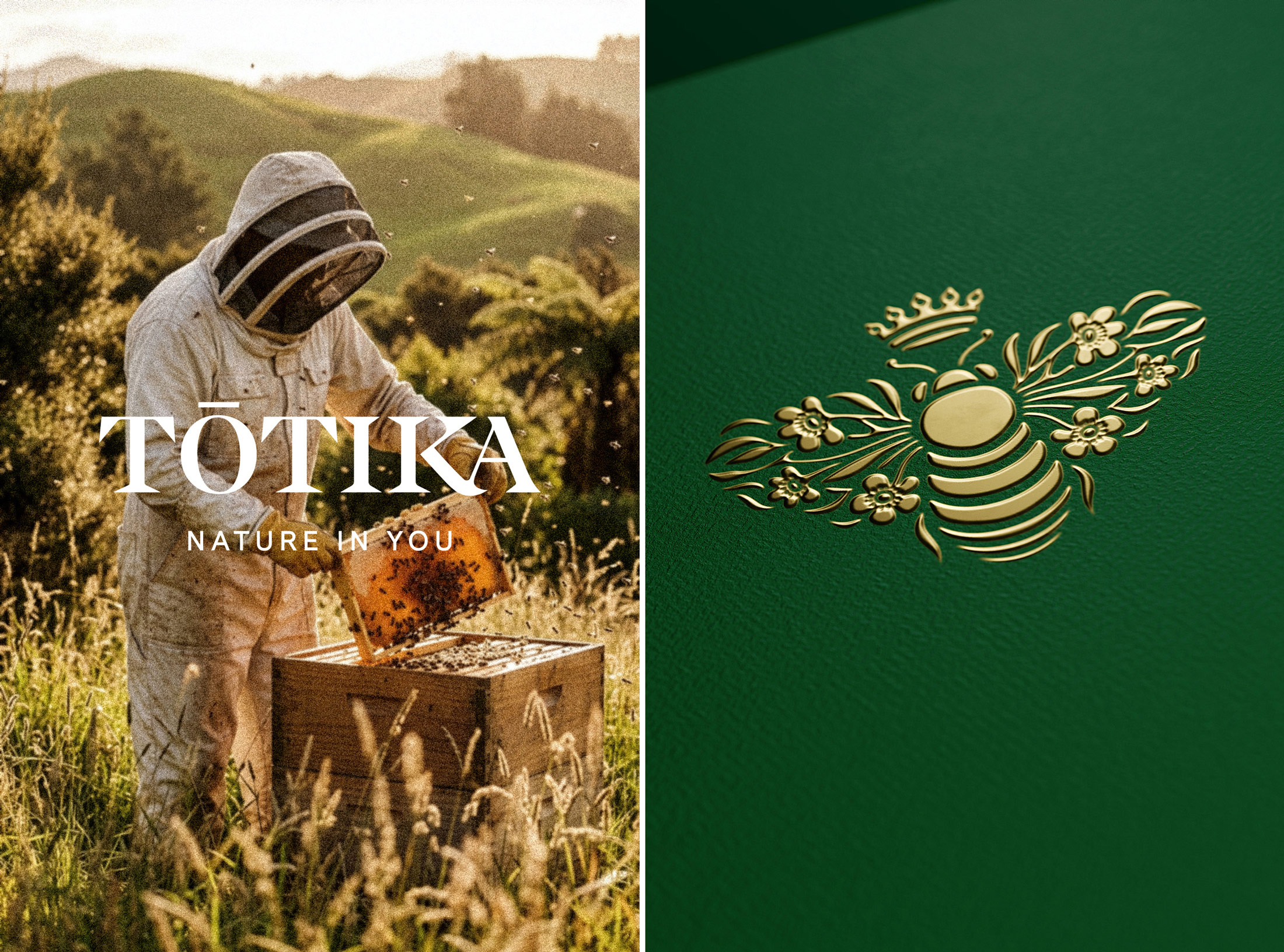
Tōtika is a New Zealand-based brand rooted in a deep belief in nature’s power to heal and nurture. Built on ethical beekeeping practices and scientific expertise, the brand produces premium-grade Mānuka honey with exceptional bioactive properties. Beyond honey, Tōtika embodies a holistic vision of wellness, combining efficacy, sustainability, and luxury.
The brand targets a conscious, high-end audience seeking products that are both effective and aligned with their values, natural, ethical, and refined. Positioned at the intersection of health, skincare, and luxury, Tōtika stands for a new generation of premium products driven by integrity and performance.
Our Mission
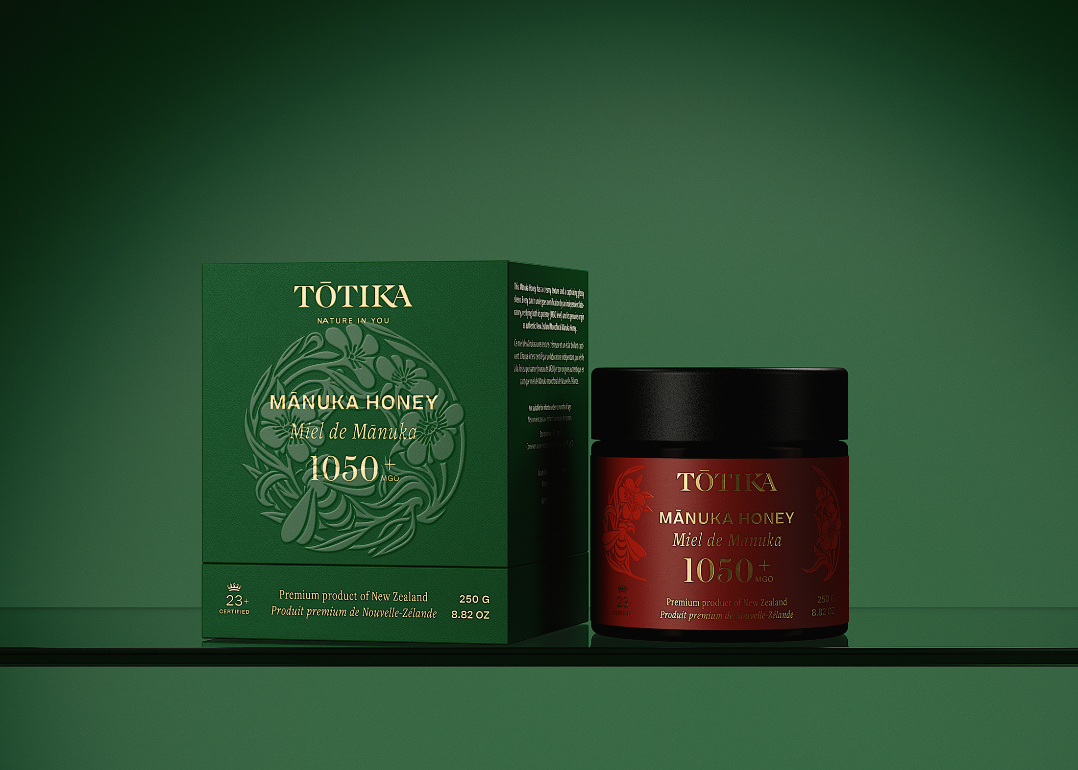
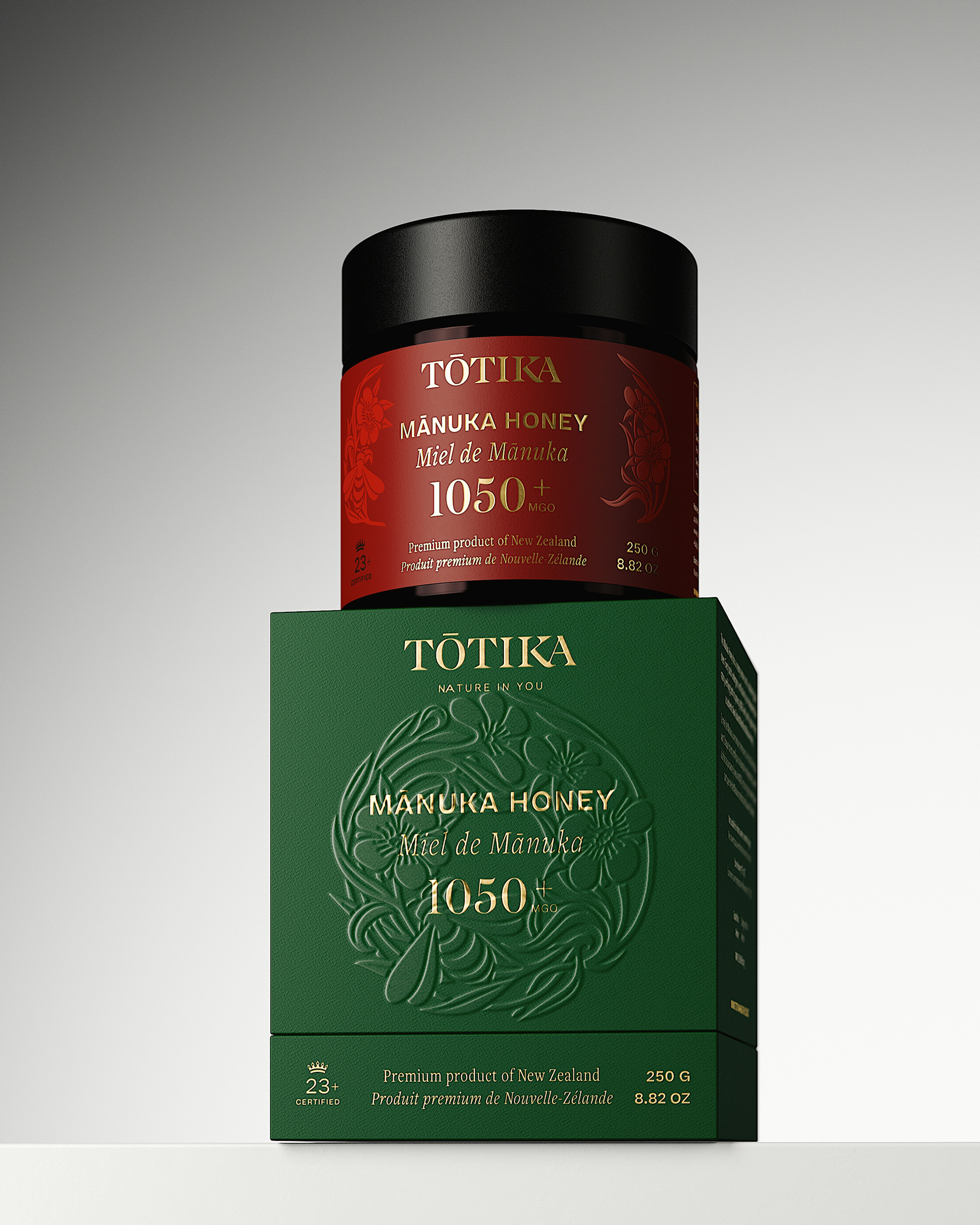
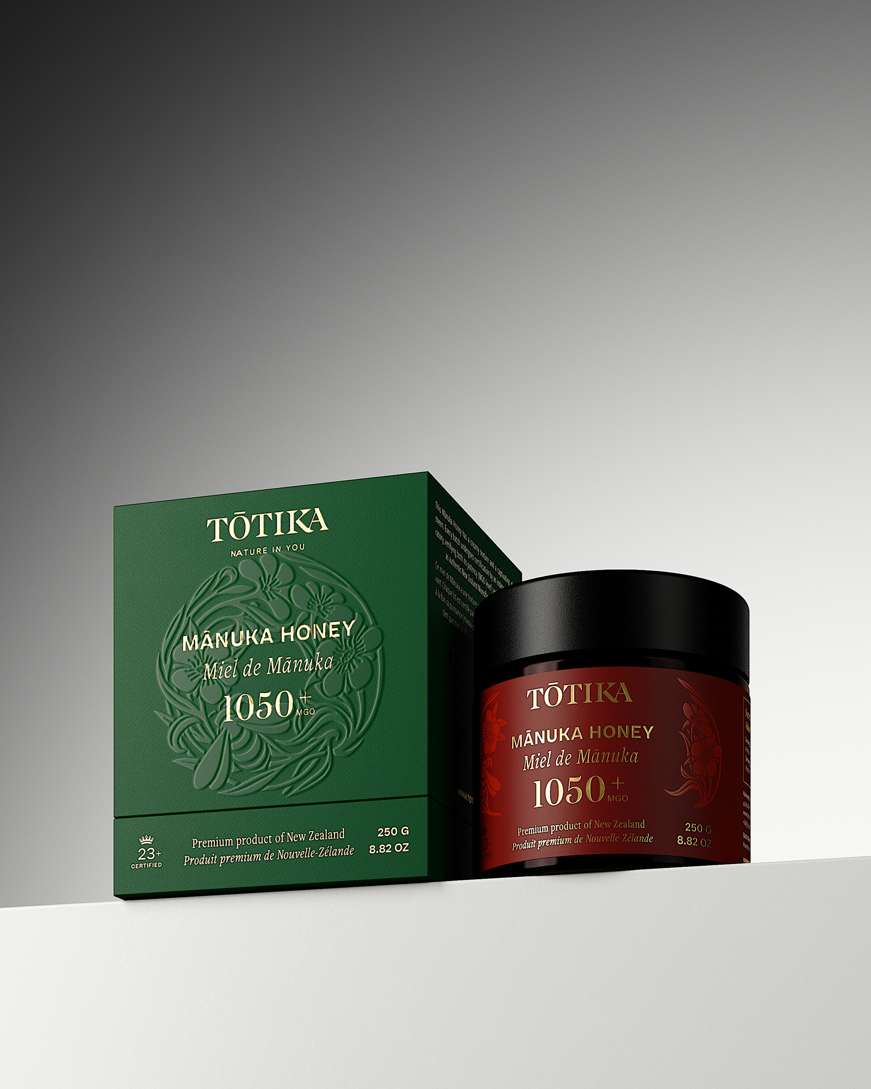
Following the redesign of Tōtika’s skincare range, we were commissioned to rethink the packaging of the Mānuka Honey 1050+ MGO.
Our mission was to create a packaging system that aligns seamlessly with the new skincare brand universe while expressing the unique nature of honey as a raw, powerful, and precious ingredient. The challenge was to balance luxury codes with authenticity, and to elevate a functional product into a premium, desirable object.
Our Approach
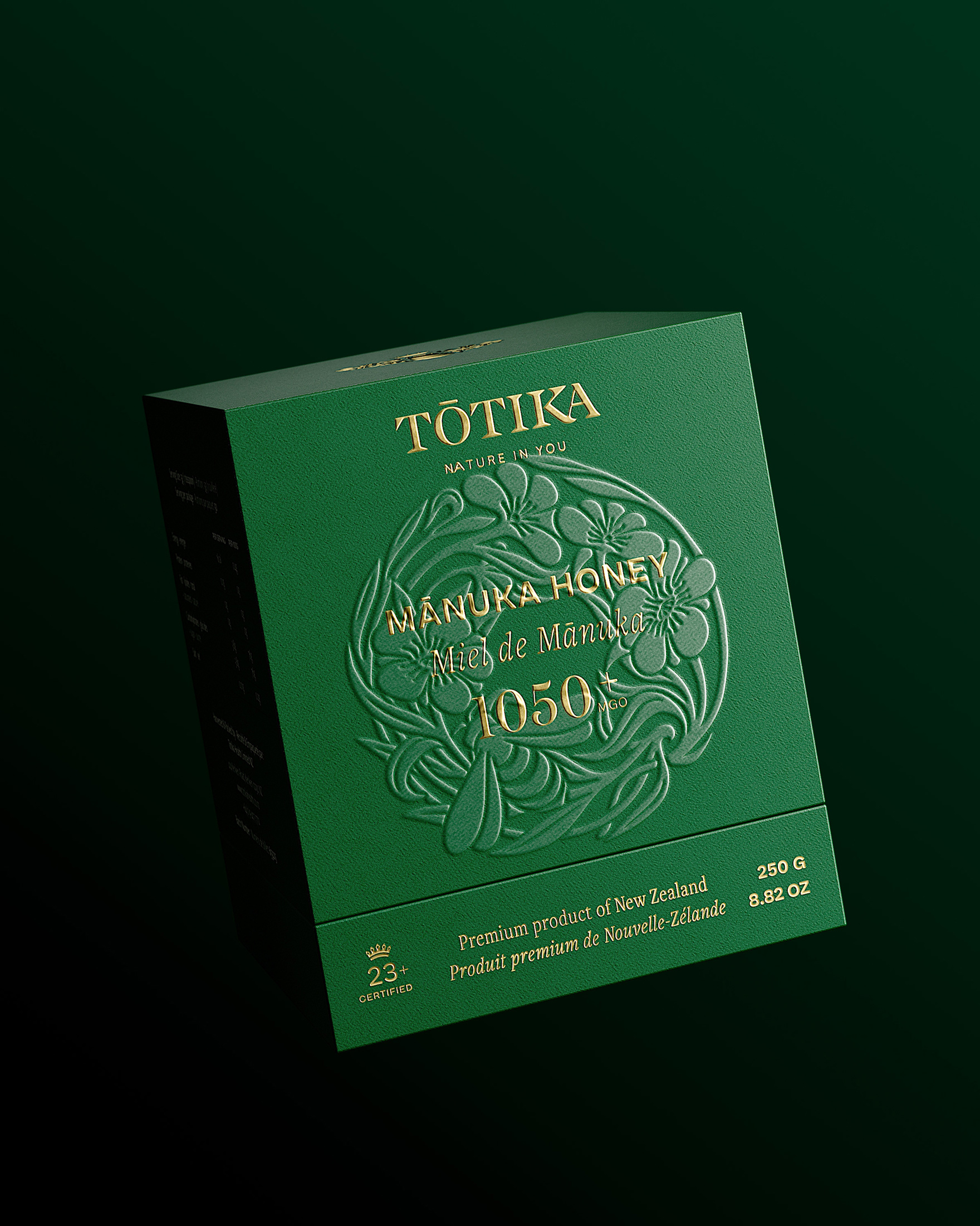
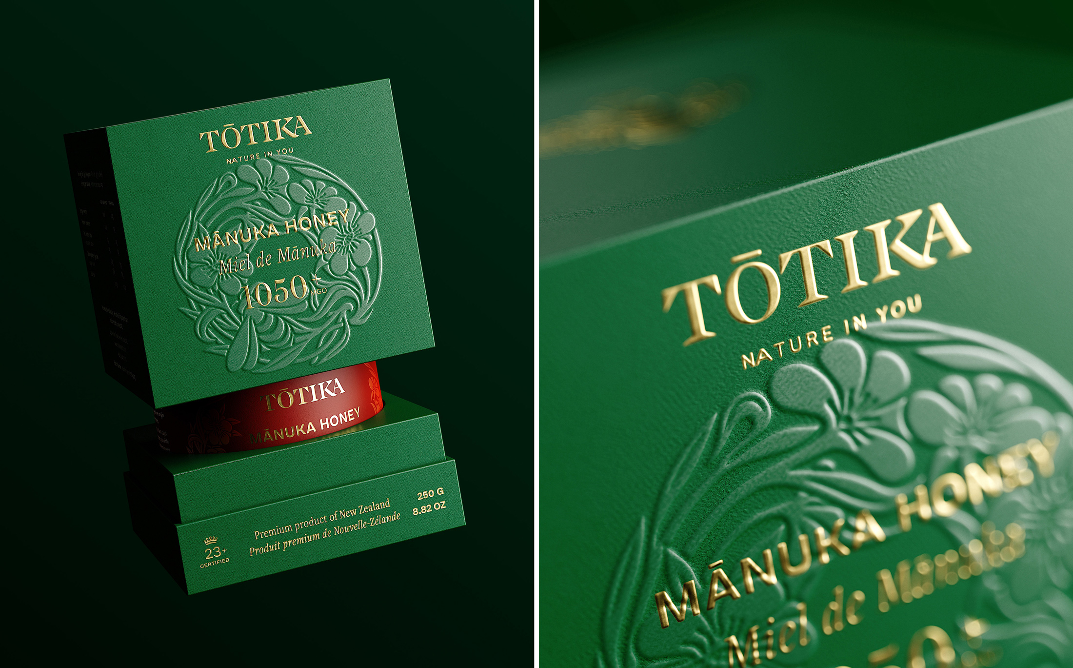
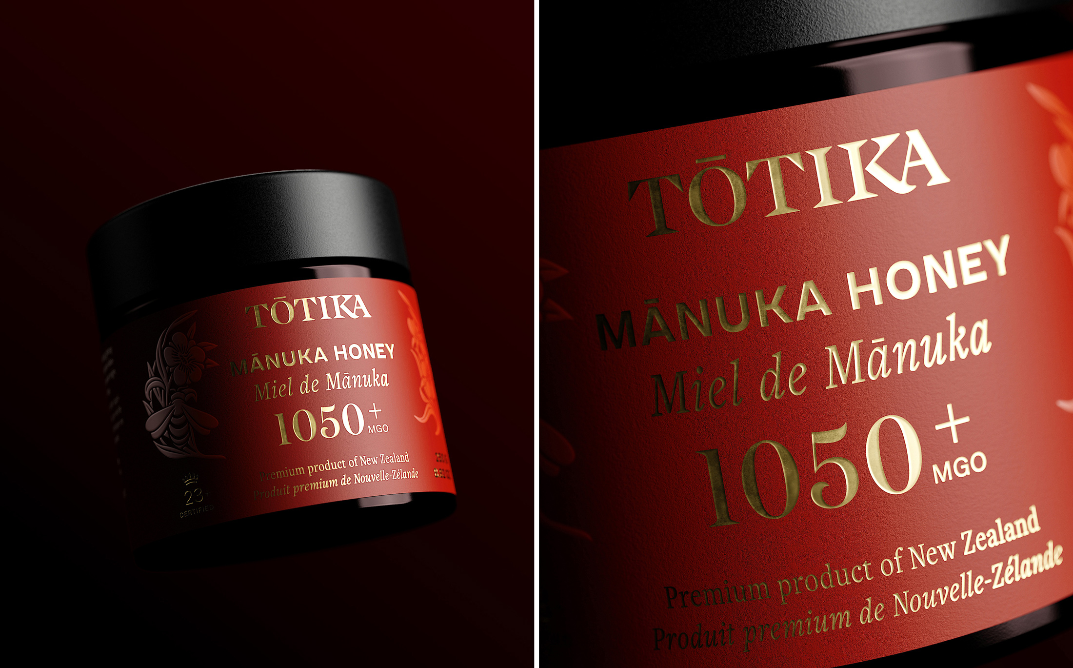
We developed a refined and expressive packaging direction built on coherence, materiality, and sensory impact.
The design language draws from the brand’s core inspirations: wild nature, abundance, and the preciousness of natural resources, translated into a rich and sophisticated visual system. We explored multiple creative directions, all maintaining strong alignment with the skincare identity while introducing nuances specific to honey range.
The Result
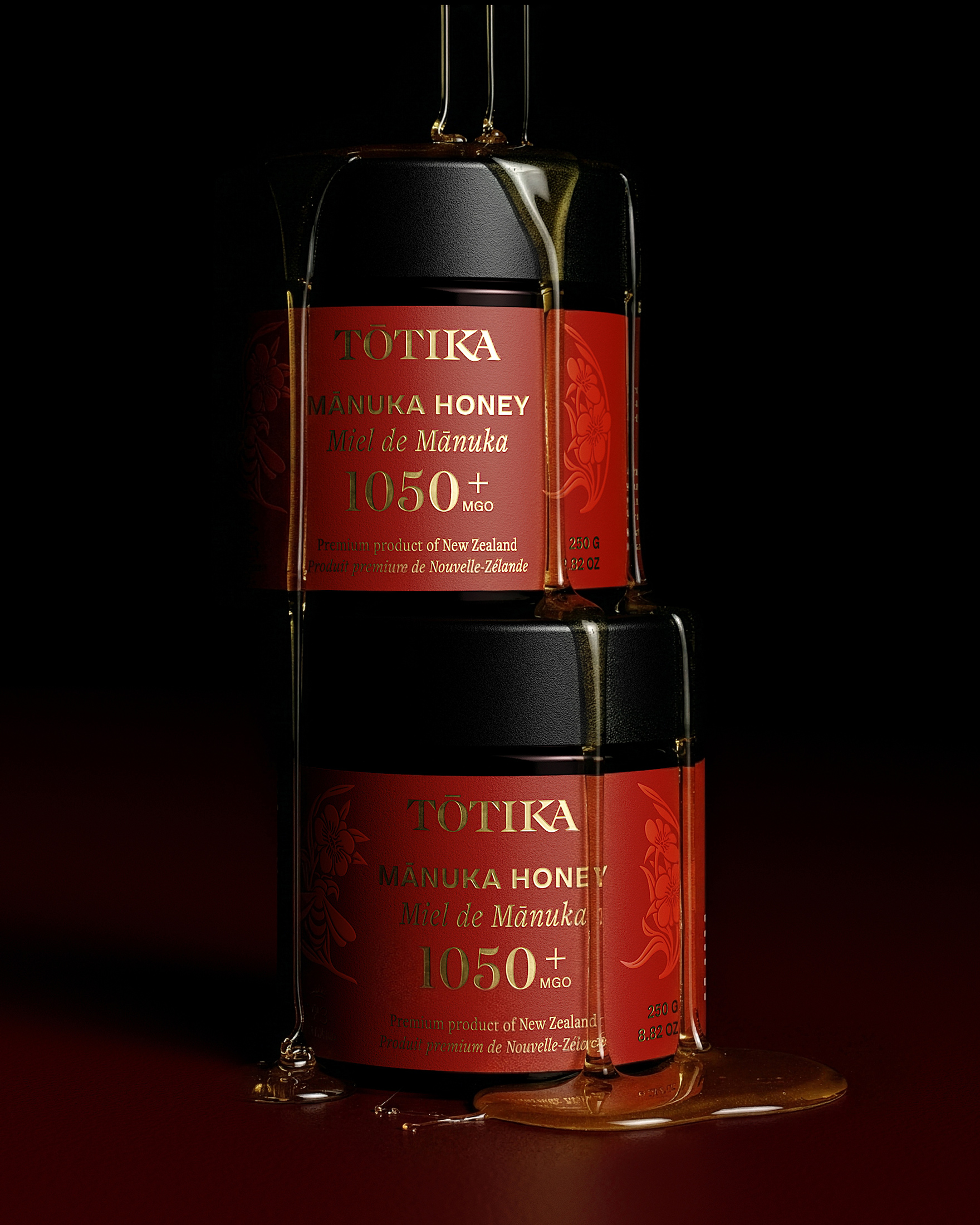
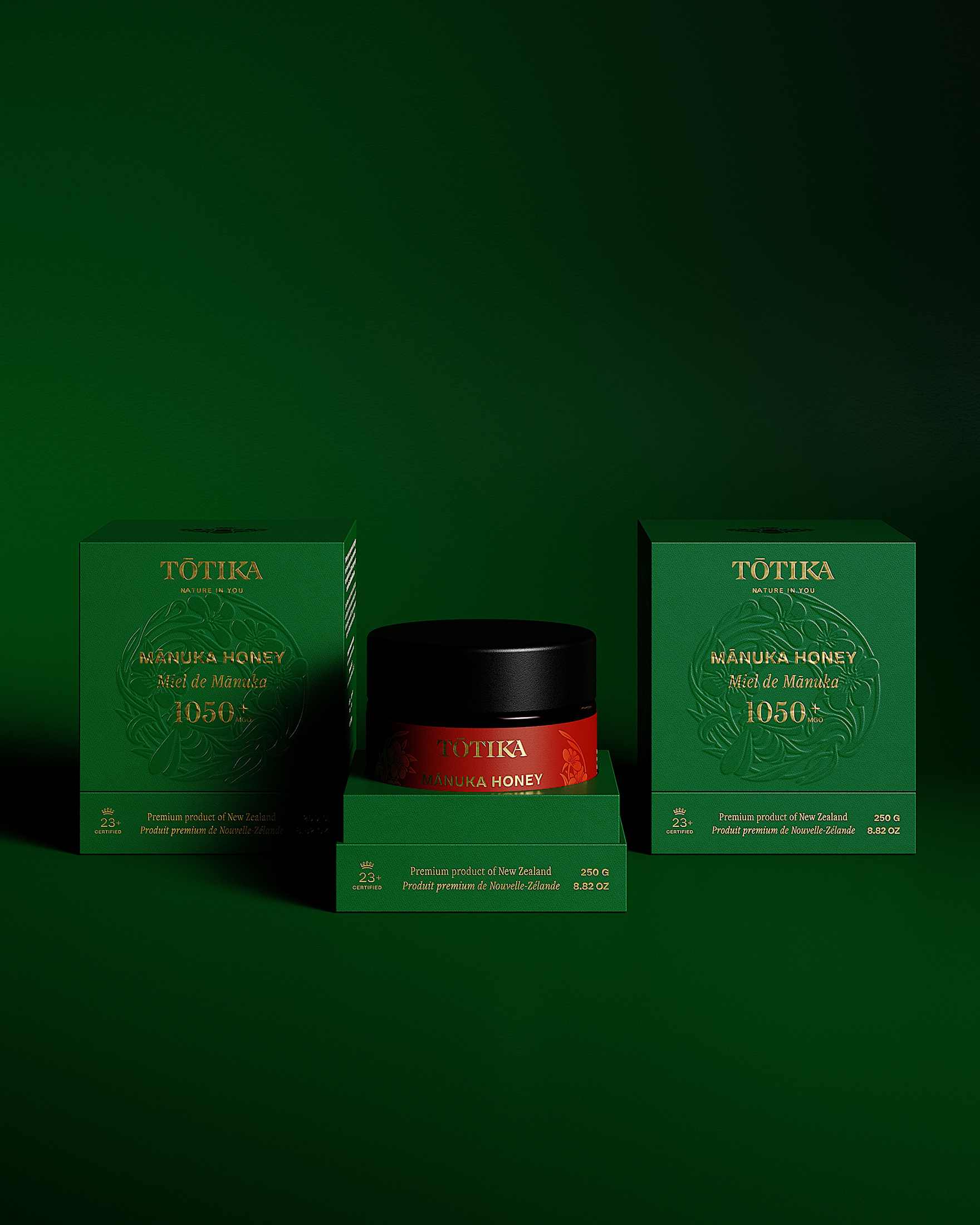
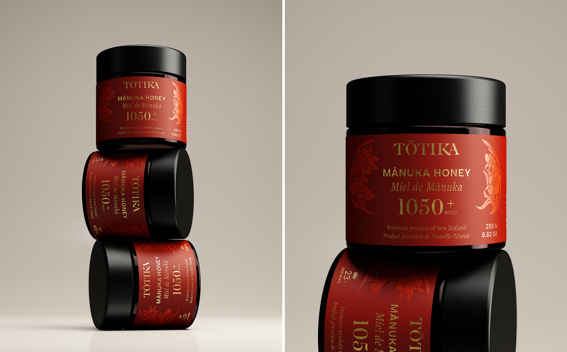
The final design elevates Tōtika’s Mānuka honey beyond a functional product into a true luxury experience.
By combining strong visual consistency with distinctive packaging codes, the project reinforces the brand’s positioning in the premium segment. The balance between natural authenticity and refined execution creates a powerful emotional connection with consumers.
The result is a packaging system that not only stands out on the shelf but also embodies Tōtika’s core promise: delivering nature’s most powerful ingredients through a sophisticated and contemporary lens.
CREDIT
- Agency/Creative: Petitmoulin Studio
- Article Title: Tōtika – From Hive to Luxury: Elevating Mānuka Honey Into a Contemporary Brand Experience by Petitmoulin Studio
- Organisation/Entity: Agency
- Project Type: Packaging
- Project Status: Published
- Agency/Creative Country: France
- Agency/Creative City: Dijon
- Market Region: Global
- Project Deliverables: 2D Design, 3D Design, Art Direction, Brand Guidelines, Brand Identity, Brand Redesign, CGI, Creative Direction, Illustration, Logo Design, Packaging Design, Packaging Guidelines, Rebranding, Set Design, Visualisation
- Format: Box, Pot
- Industry: Food/Beverage
- Keywords: Manuka Honey, Skincare, Redesign, Brand Identity, Beauty, Brand Design, Packaging Design, Illustration, Logotype, Symbol, Branding, Logo Design, Design, Product Design, Packaging Design,
-
Credits:
Creation Director: Petitmoulin Studio


