


Since its introduction in 1935, tesa has become a household name – so established, in fact, that it appears in the German dictionary. Beyond the name itself, the brand has long been recognized for its iconic logo and distinctive color palette. Yet with more than 30 sub-categories and approximately 1,700 SKUs that had evolved independently over time, the consumer portfolio had become highly fragmented. The task was clear: create cohesion without compromising the individuality of each product line.
Building on extensive customer journey analyses, POS observations, and shopper insights, a comprehensive packaging design system was developed that reflects tesa’s renewed strategic positioning. The result is a unified visual language featuring a bolder logo, clearer visual hierarchy, and a consistent naming approach –strengthening shelf impact and reinforcing brand recognition across markets.
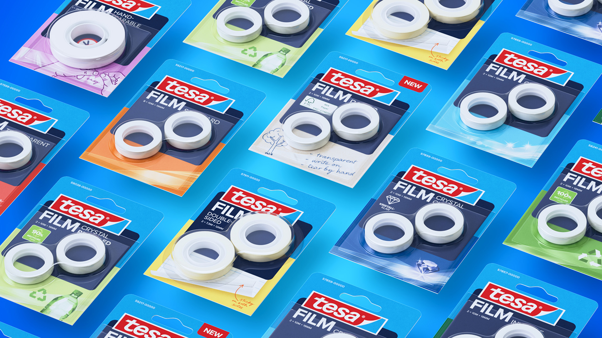
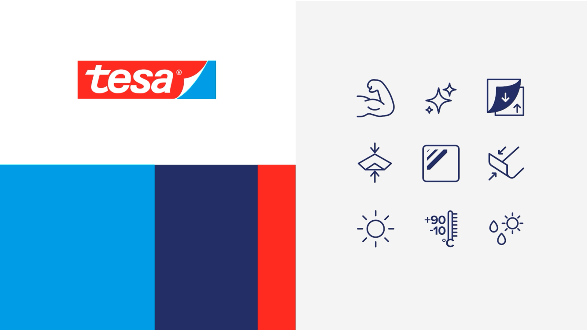
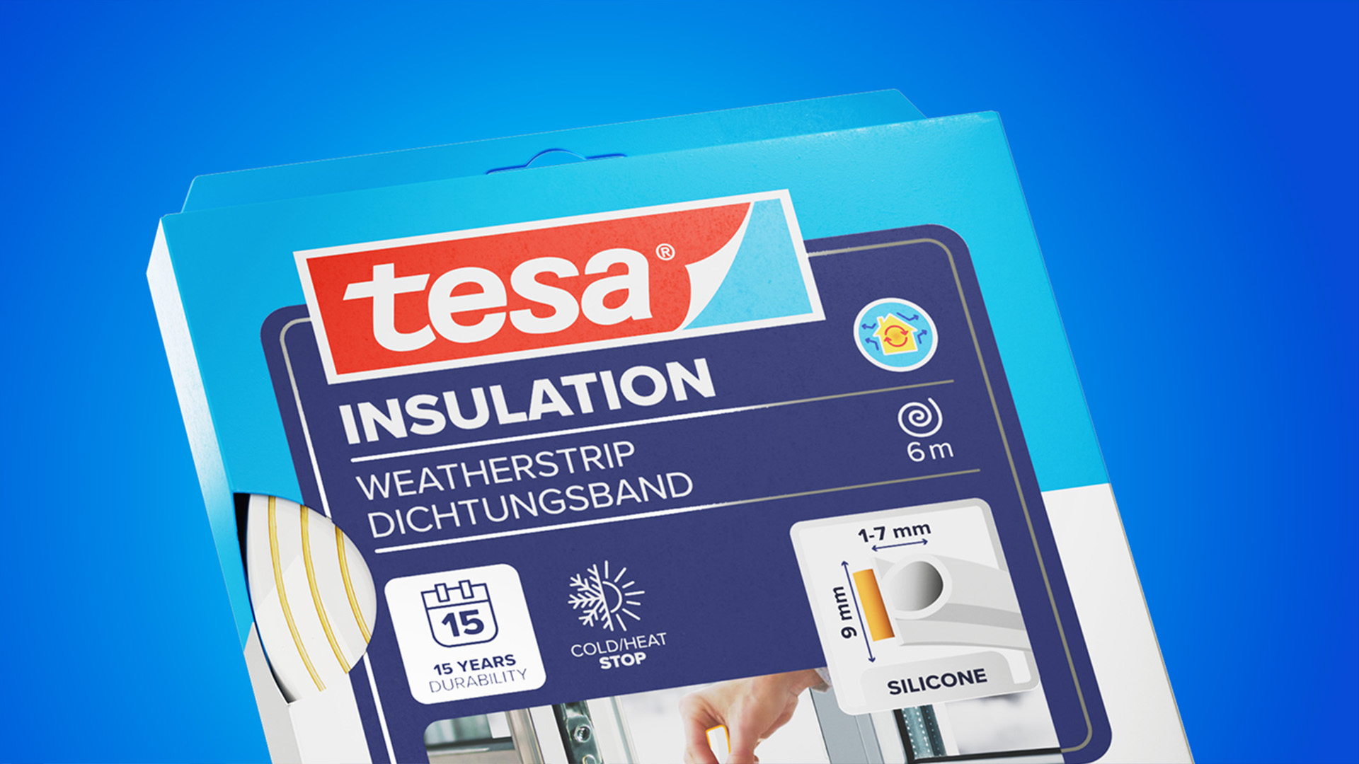
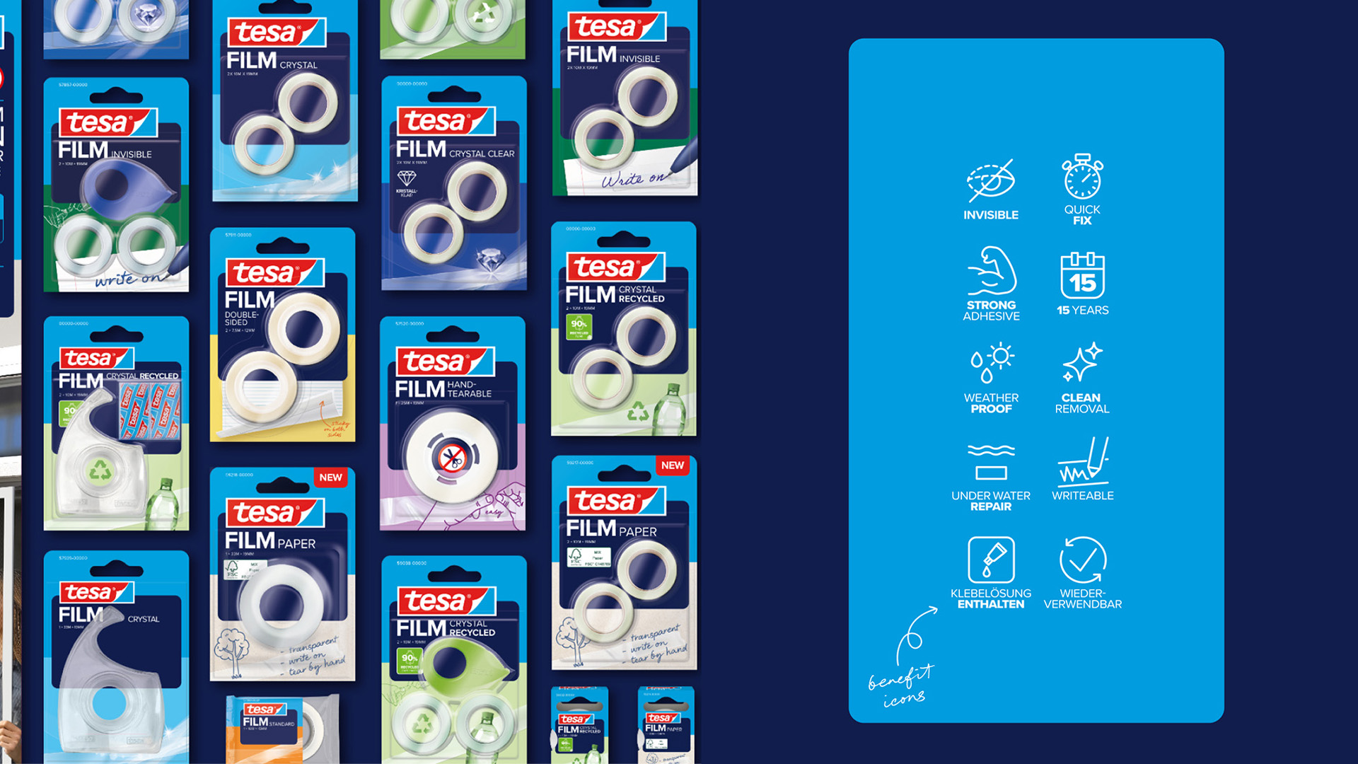
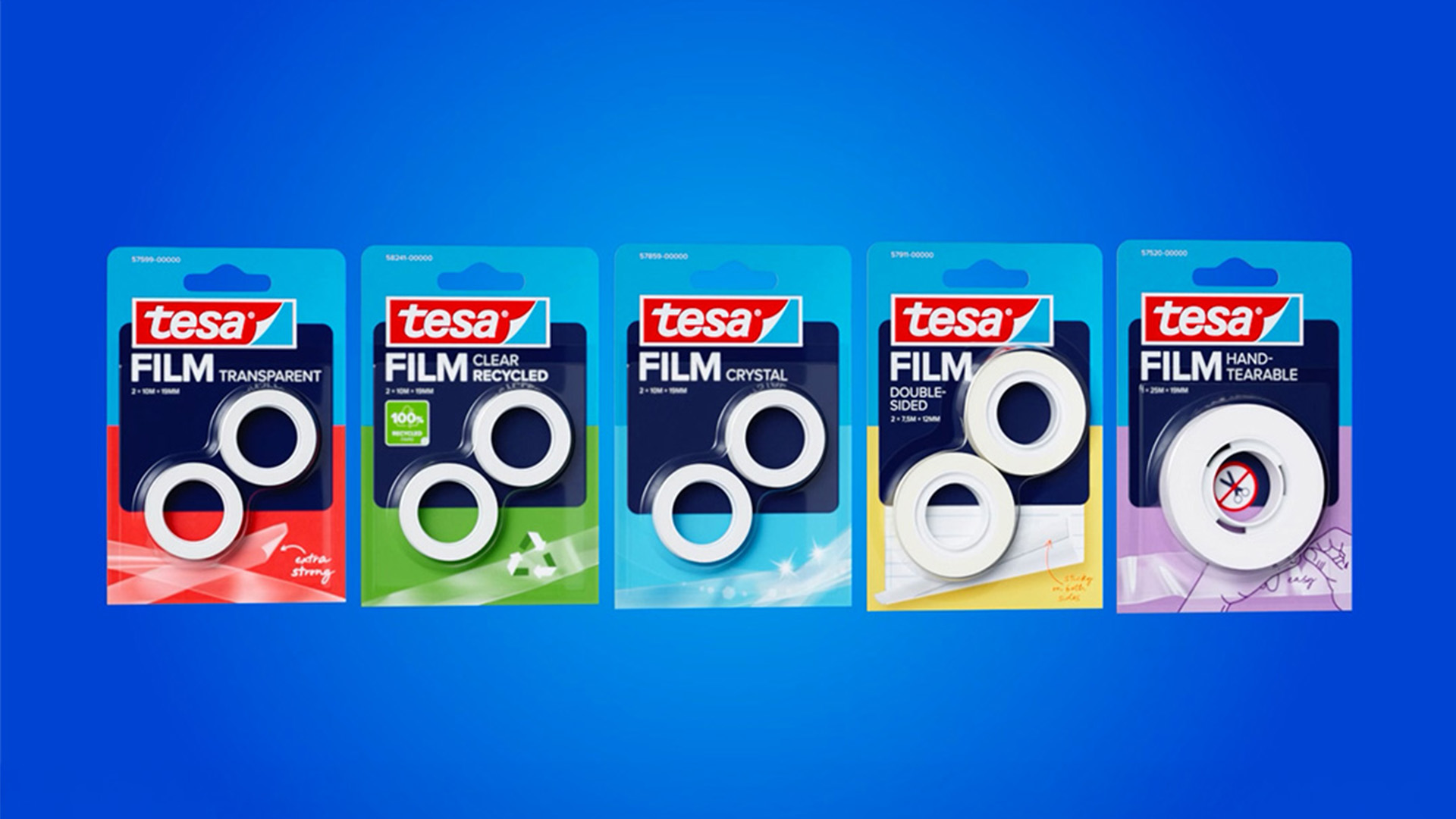
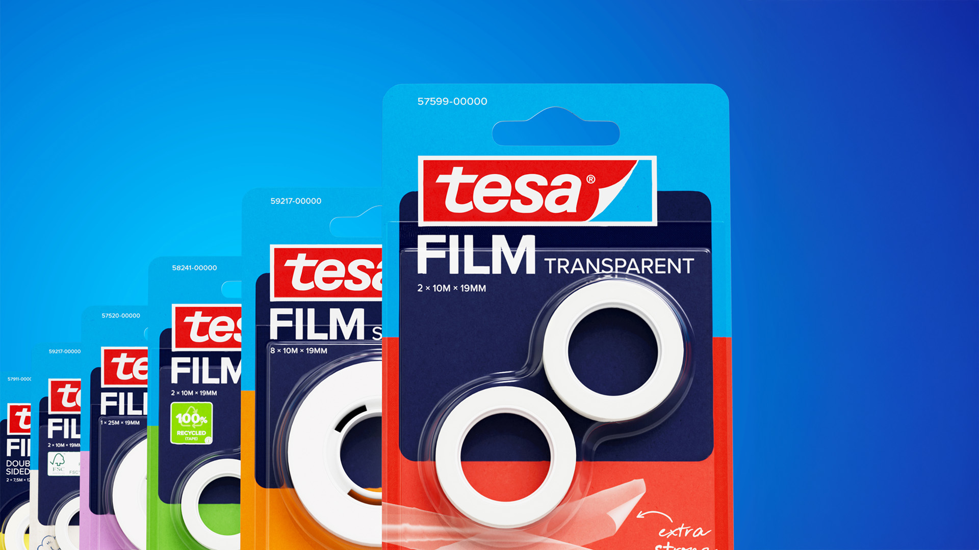
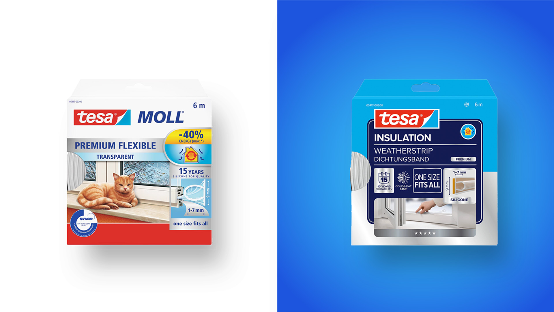
Central to the new system is the iconic tesa blue, now used to establish a strong and coherent corporate identity across all product categories. A dark blue background provides the visual foundation for communication, anchored by the tesa logo, which is deliberately designed in the form of an adhesive tape element to symbolically “hold” the layout together. Generous white space and a restrained, minimalist design enhance readability and create a sense of order and calm on shelf.
To improve usability, the communication approach has shifted from text-heavy explanations to a more intuitive, image- and icon-driven system. Clear visualizations illustrate application scenarios and product benefits, enabling quicker orientation and decision-making in retail environments. Integrated QR codes seamlessly connect the physical packaging to digital services, transforming the pack into an interface that links product, application, and additional guidance.
In essence, the project represents a holistic rebrand that not only strengthens tesa’s visual identity but also elevates the consumer experience. A rebrand that sticks.
CREDIT
- Agency/Creative: Peter Schmidt Group
- Article Title: Peter Schmidt Group Shapes tesa into a More Unified Brand Across 30 Product Categories
- Organisation/Entity: Agency
- Project Type: Packaging
- Project Status: Published
- Agency/Creative Country: Germany
- Agency/Creative City: Hamburg
- Market Region: Europe
- Project Deliverables: Identity System, Industrial Design, Packaging Design, Rebranding, Retail Design
- Format: Blister-Pack
- Industry: Manufacturing
- Keywords: consumer goods, rebranding, packaging design, adhesive tape, blister packaging, brand identity
-
Credits:
Client Engagement: Inga Wolter
Client Lead: Hanna Petersen
Stategy Lead: Michael Waning
Stategy: Aleksander Djordjevic
PM: Louis Cotroneo
PM: Miriam Richter
PM: Nicole Bischhoff
ECD: Sven Rieckmann
Design Director: Yara Soliman
Designer: Simon Merz
Designer: Verena Knuck
Designer: Laura Saramok
Designer: Miriam Bobbert
Designer: Liv Markieton
Designer: Julia Coronel
Designer: Elias Terrabona


