


The sector
Construction companies with decades in the market often show up to meetings with hastily made logos and communication that doesn’t reflect the weight of the work they deliver. The more technical the company, the less attention it pays to how it is perceived. And in the real estate market, perception comes before trust. Trust closes deals.
The brand
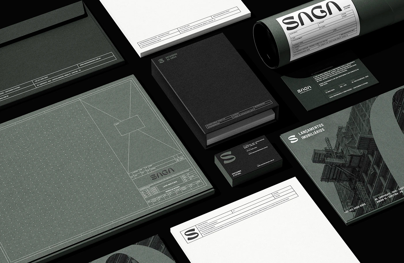
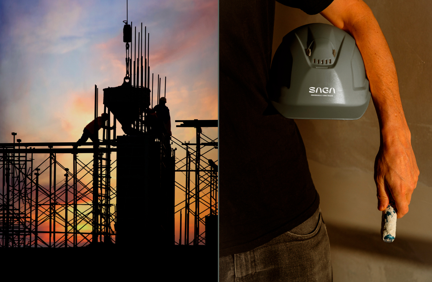
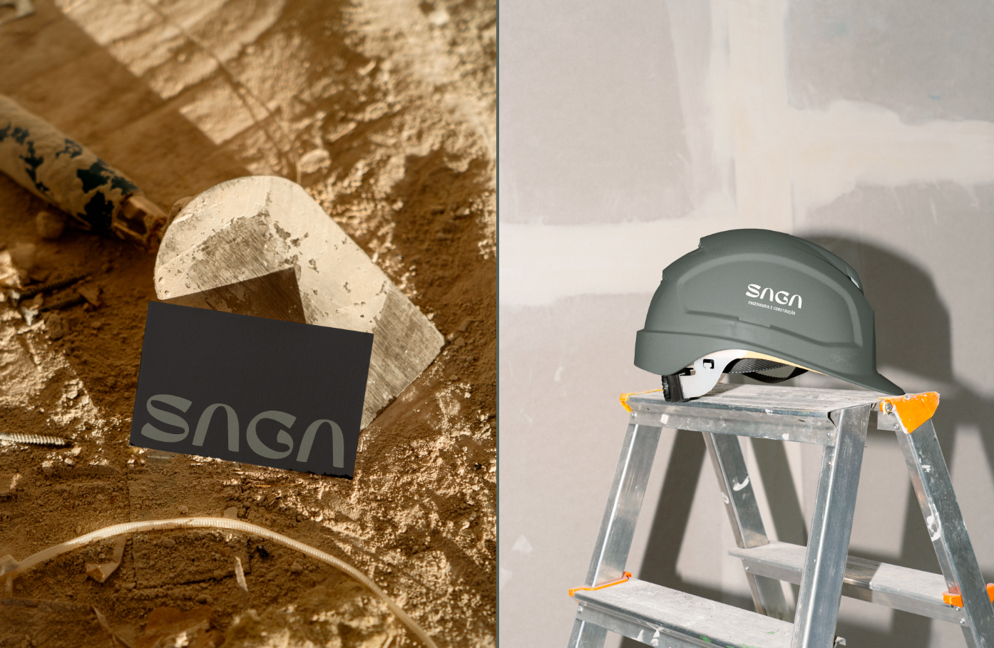
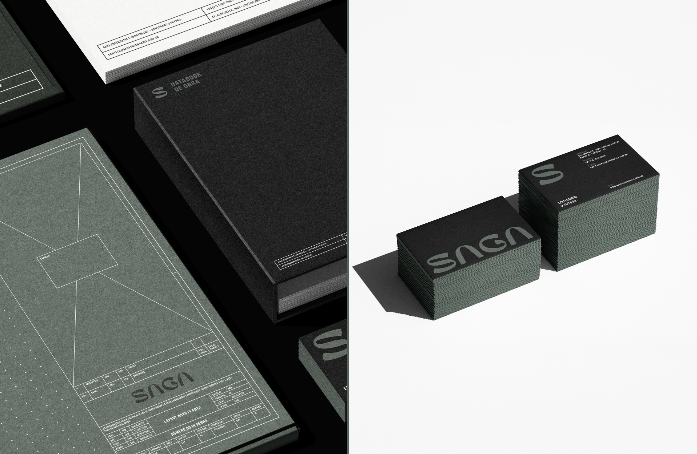
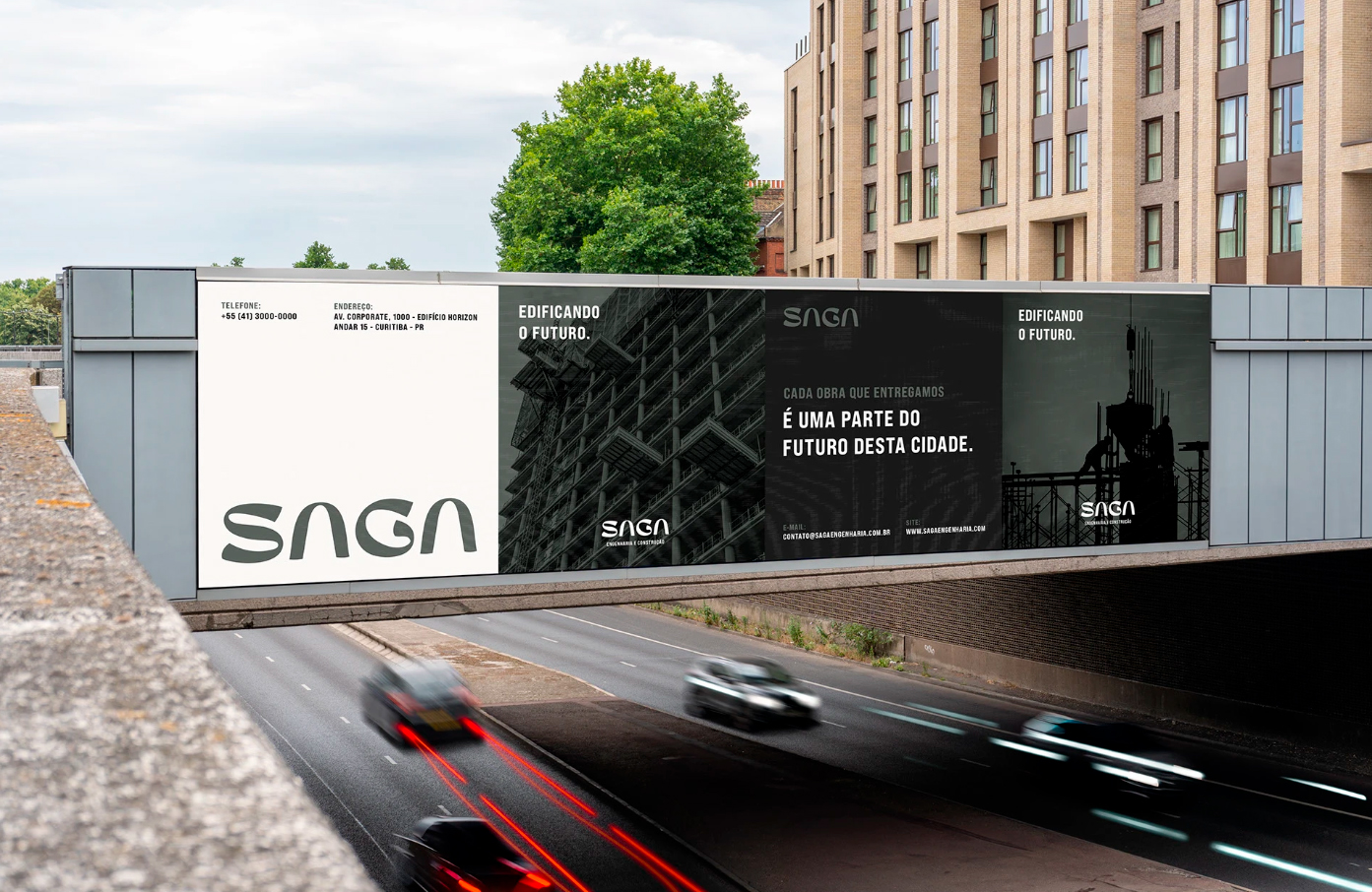
SAGA has 14 years in the market, projects delivered on time, and a track record that few competitors can present with the same consistency. The problem wasn’t what it did — it was what the market saw before even getting to know it. An outdated identity communicated the opposite of what the company actually was.
Diagnosis
“Visual identity doesn’t close construction deals.”
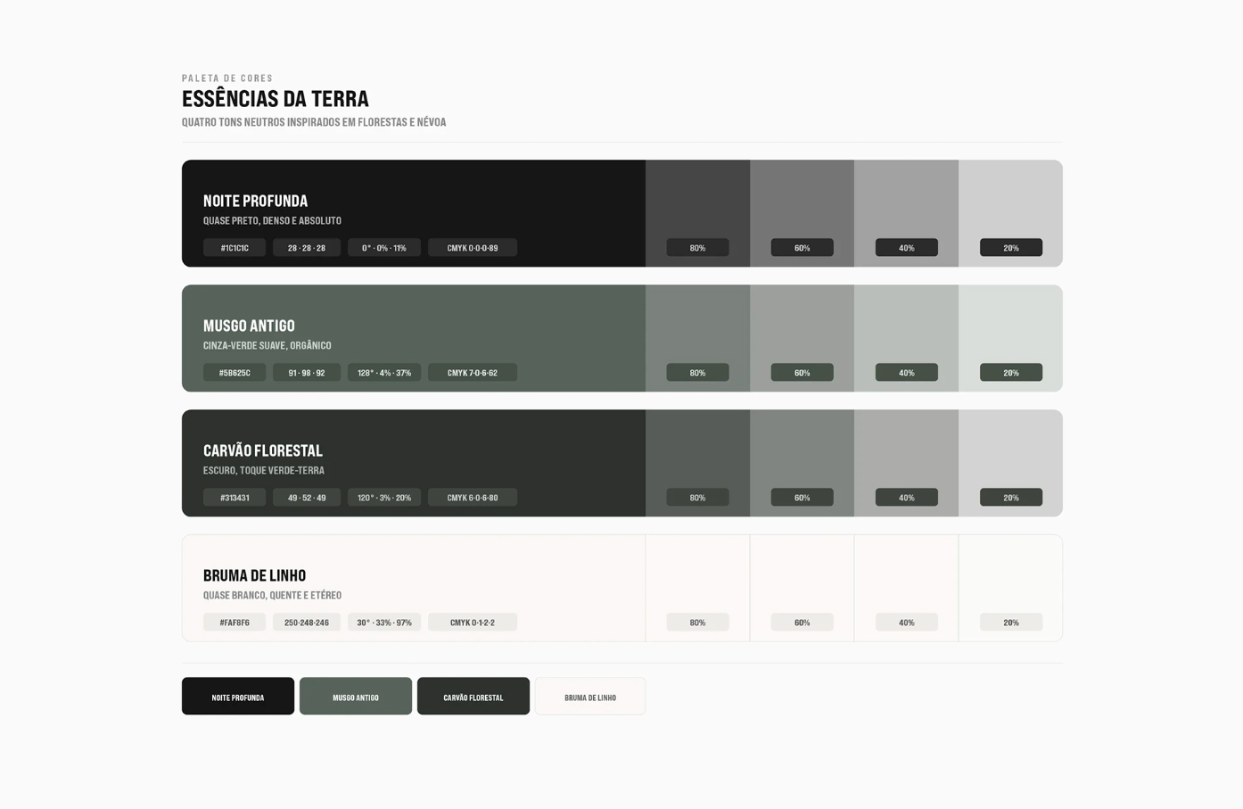
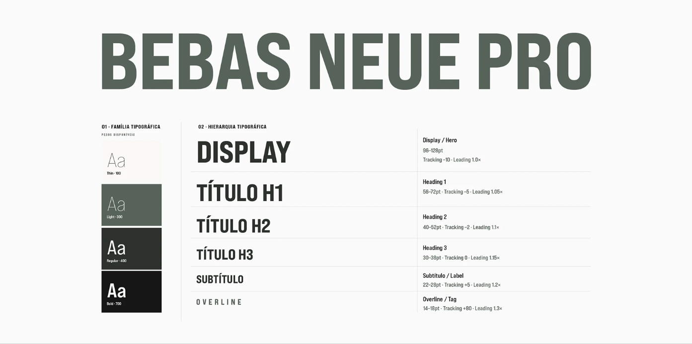
This phrase appears in almost every briefing with construction companies — until the moment a competitor with half the track record wins the contract simply because it conveyed more trust in the first meeting. Generic construction communication, lack of visual hierarchy, and a tone of voice without clear criteria. SAGA carried some of these marks.
CREDIT
- Agency/Creative: Ezoke Brand Studio
- Article Title: Ezoke Brand Studio Repositions SAGA with a Stronger Identity for Construction Market Trust
- Organisation/Entity: Freelance
- Project Type: Identity
- Project Status: Non Published
- Agency/Creative Country: Brazil
- Agency/Creative City: Curitiba
- Market Region: South America
- Project Deliverables: Brand Guidelines, Brand Identity, Identity System, Logo Design
- Industry: Construction
- Keywords: Construction, Civil Engineering, Real Estate, Brand Identity, Logo Design, Visual Identity, Brand Guidelines, Identity System, B2B Branding, Brazil, South America, Geometric, Corporate Identity
-
Credits:
Marcos: Ezoke


