Pond Design – Malmö Chokladfabrik The Ö-series
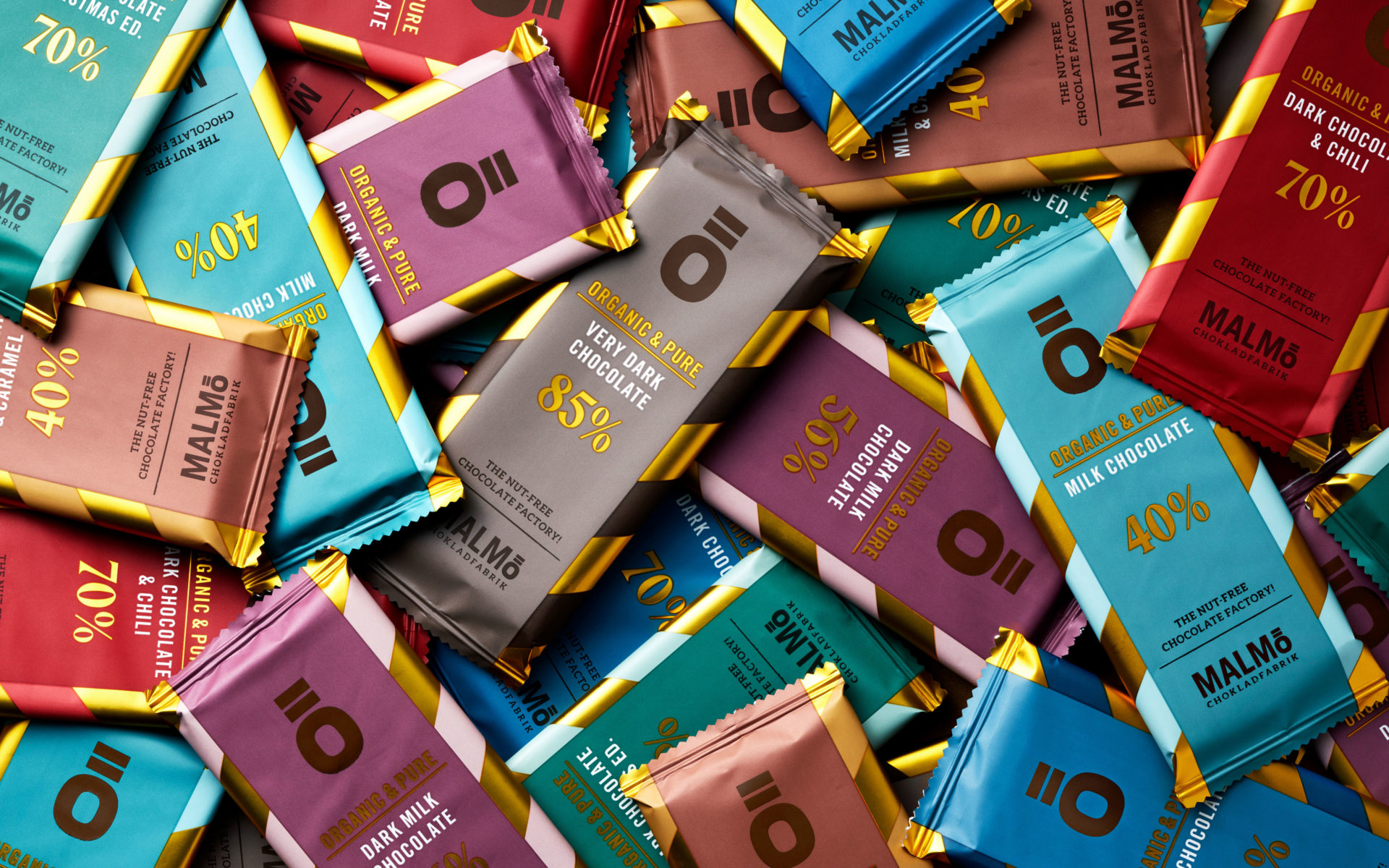
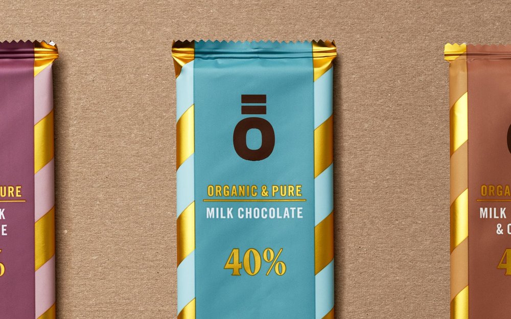
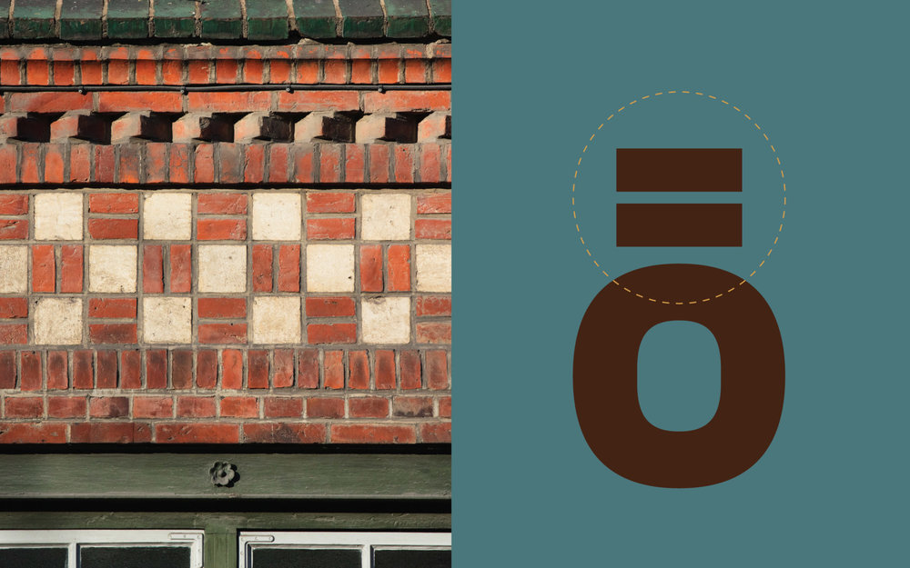
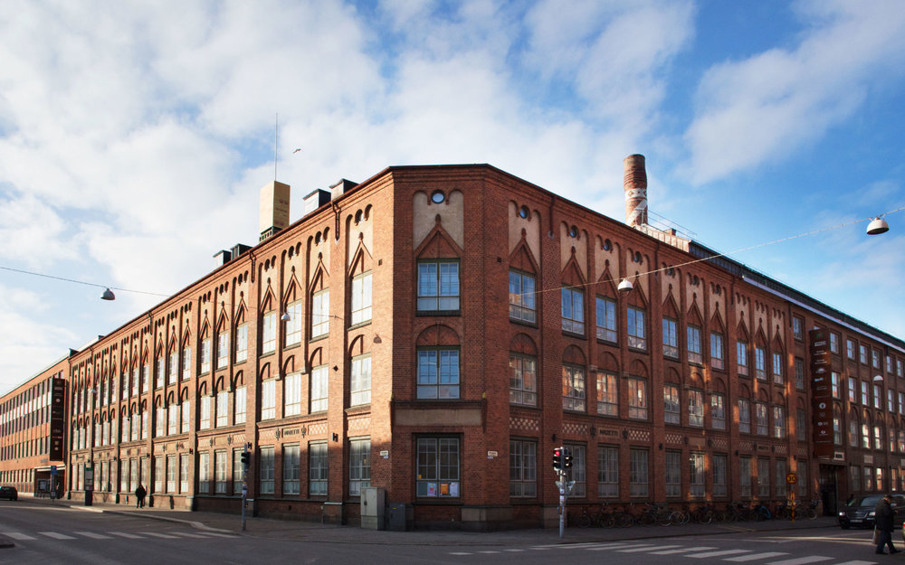
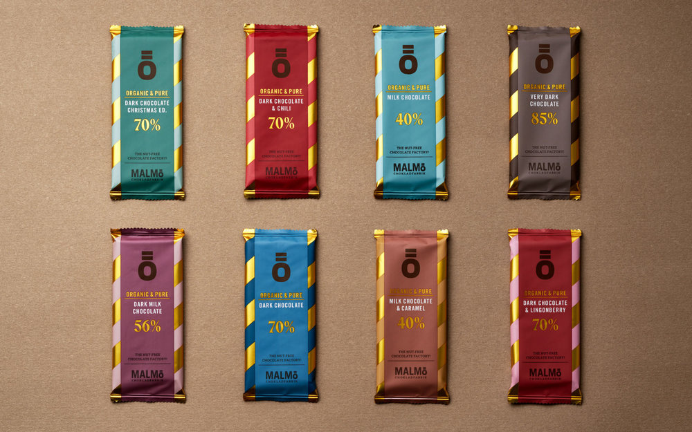
Malmö Chokladfabrik Ö-SerienMalmö Chokladfabrik is a super-premium chocolate brand with a rich past and history. Although it was considered a classic brand, it was suffering from growing competition and a somewhat outdated feel. That all changed when the brand was acquired by two enthusiastic brothers, which, for the last few years, have been completely transforming it. With new range launches, a complete re-branding, a communication overhaul and a new, award-winning design, the brand is now again winning the hearts of chocolate connoisseurs all over the Nordics.Structural Design, Packaging Design, Product Design, Naming Previously targeting mainly upmarket retail venues and specialty stores, Malmö Chokladfabrik wanted to expand its product portfolio. The mission was to launch a new, attractively-priced premium subrange that will appeal to a wide, mass-market consumer group and will enable an international expansion. High-market brands are moving today into the territory of mass-luxury and are becoming more approachable to a wider audience. As a consequence, consumers expect to find a choice of products, from price-friendly to premium, and even super-premium, at their local supermarket. This is certainly the case for chocolate, where we have seen crafted, premium, pure and organic bars entering local grocery stores. Malmö Chokladfabrik, with its super-premium chocolate, is in a good place to make a move into the world of mass-market retailing. The design idea was to create a balance between indulgence and approachability. We used a seemingly “simple” flow pack and contrasted it with premium design elements. The result is a chocolate bar with an edgy, modern look and quality feel, with simplicity, elegance and presence. We used the letter Ö from the logotype as the name of the range. Instead of the two dots over the Ö, two horizontal “bricks” were place above the “O”, to connect the chocolate to the brick building of the old Mazetti factory in Malmö, where the brand has its roots. Both the chocolate bar and the packaging carry a striped pattern, a tribute to the chocolate factory’s chimney.



CREDIT
- Agency/Creative: Pond Design
- Article Title: Malmö Chokladfabrik The Ö-series Packaging Design
- Organisation/Entity: Agency Commercial, Published
- Project Type: Packaging
- Agency/Creative Country: Sweden
- Market Region: Europe
- Format: Flow-Pack
- Substrate: Plastic


