


Imaga has spent over a decade in traditional custom software development, building products with a strong focus on outcomes and long-term client value. For years, it was business as usual — until the rise of GenAI.
The shift marked a turning point. Recognizing its transformative potential early on, Imaga embraced GenAI as a force that would redefine digital products and their role in people’s lives. The challenge was clear: integrate AI seamlessly while keeping interfaces intuitive and interactions effortless.
“We always felt the brand wasn’t telling the right story. When we decided to change that, we started with a hard question: what do we actually do that others don’t? The answer was simple but took a while to land. We’re the team you call when UX and AI need to work in sync.”
*— Dmitri Alex, CEO*
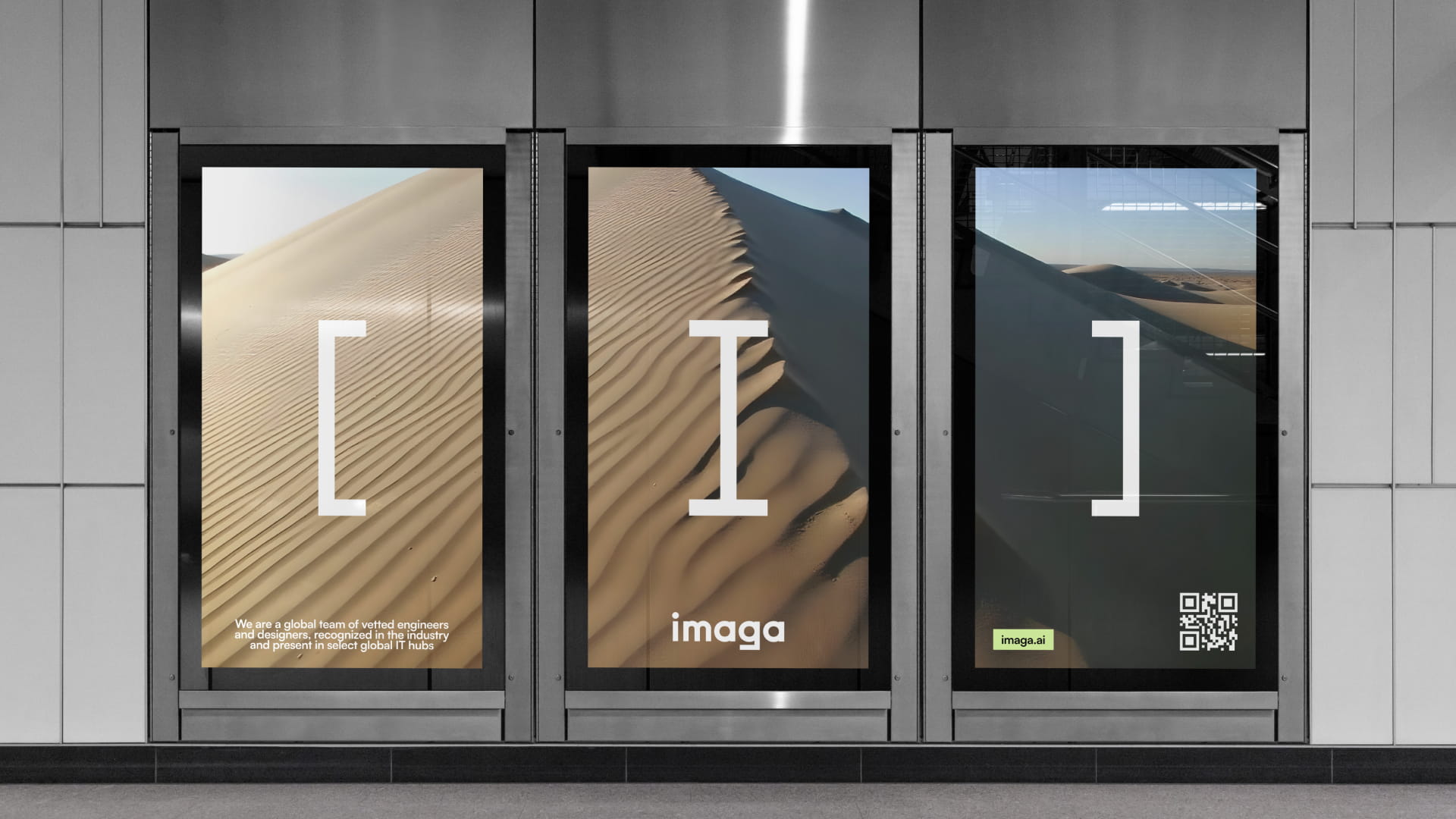
The new identity reflects this approach. The logo acts as a visual formula — minimal, yet not simple — with a subtle reference to the grammar of AI, symbolizing the company’s strength in thoughtful AI integration.
Rather than following industry conventions, Imaga deliberately steps outside the typical visual language of IT. The brand is built to connect with people, not just technology — reflecting a belief that digital products should ultimately improve everyday life.
Positioning itself at the intersection of UX and AI, Imaga shapes not only functional products but expectations of what modern digital experiences should be. This direction informs every decision — with a clear, intentional approach grounded in user experience and enabled by technology.
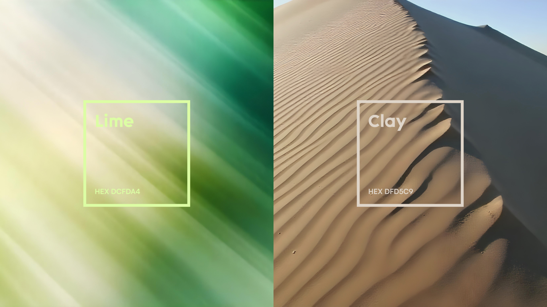
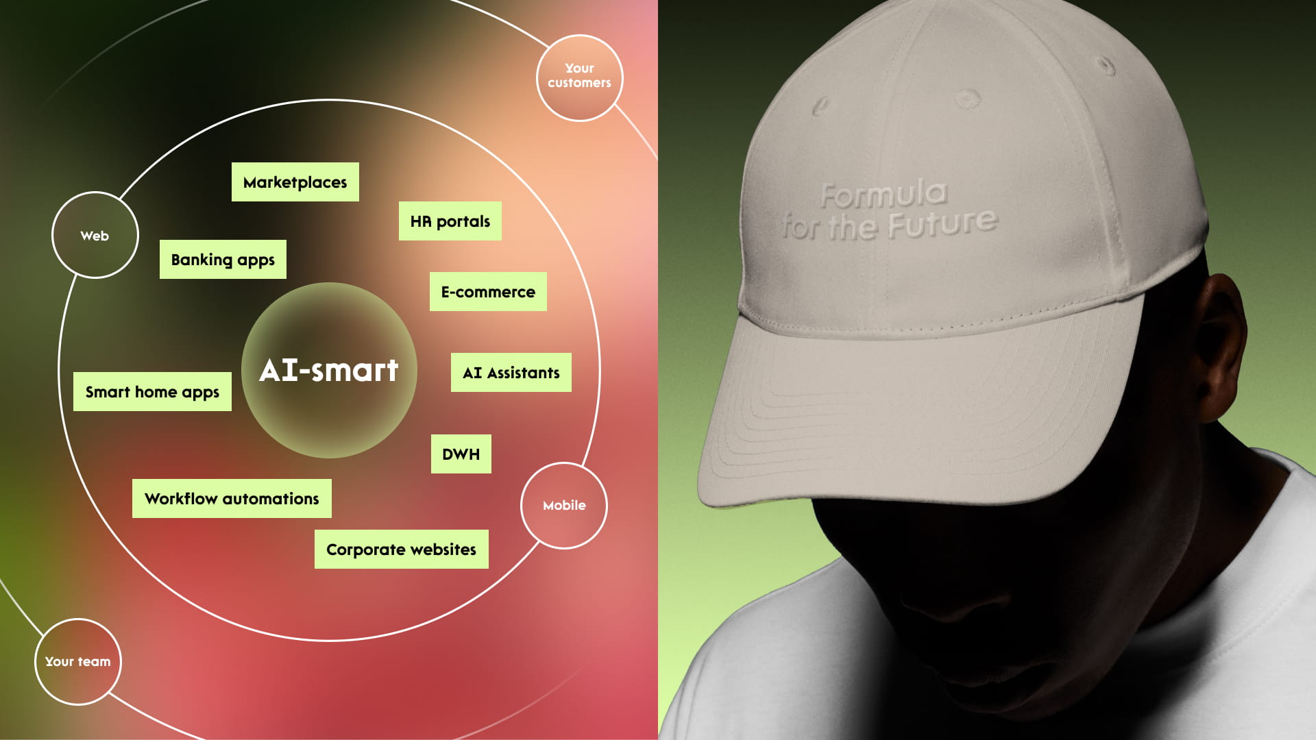
“The lime color was a genuine debate. It felt like a risk. But every time we questioned it, we came back to the same thing: it’s alive without being loud. That’s the balance we were after. Same with going black as the base across presentations. It turned out to ground everything else in a way nothing else did.” *— Dmitri Alex, CEO*
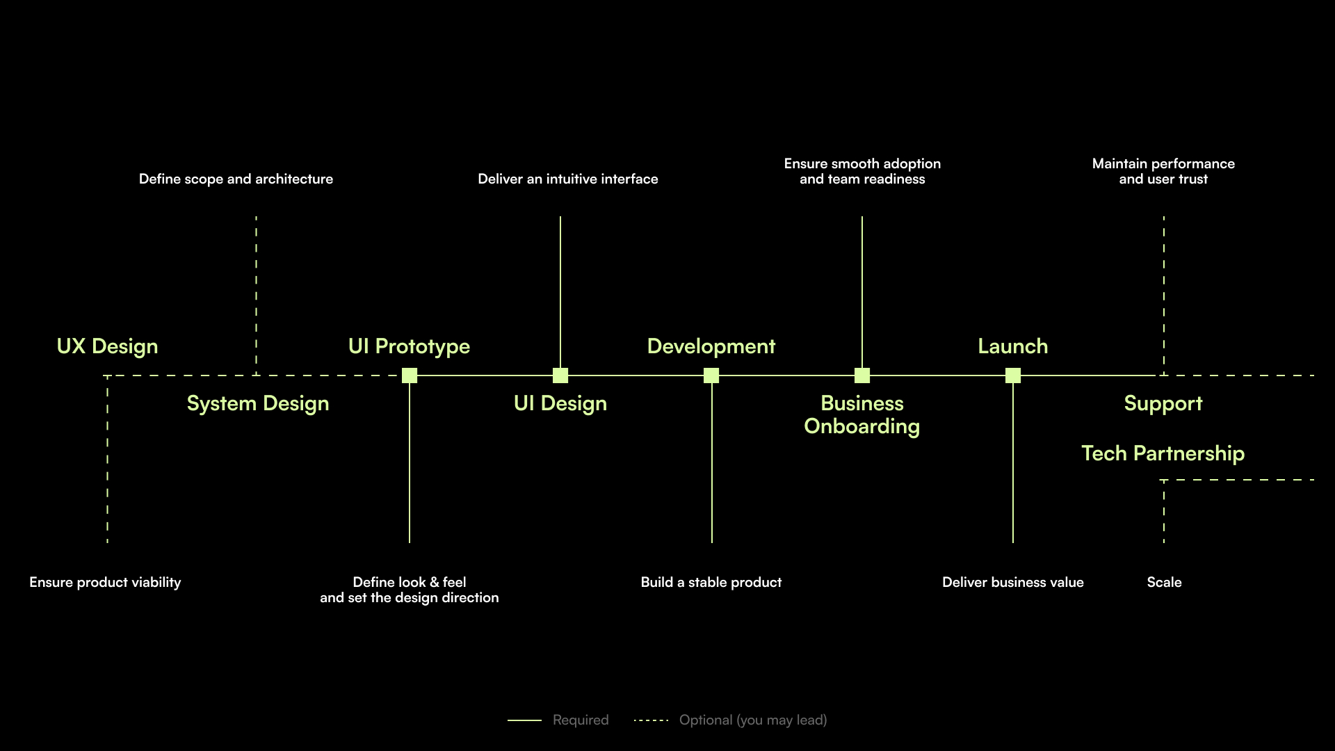
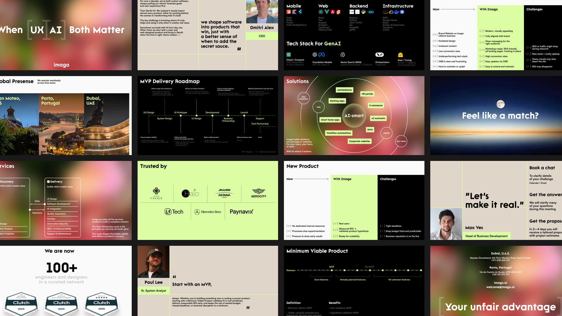
The pitch deck plays a central role as a brand asset, designed to address questions before they arise and communicate effectively across stakeholders — from project managers to CTOs and founders. Every element contributes to a structured and focused narrative.
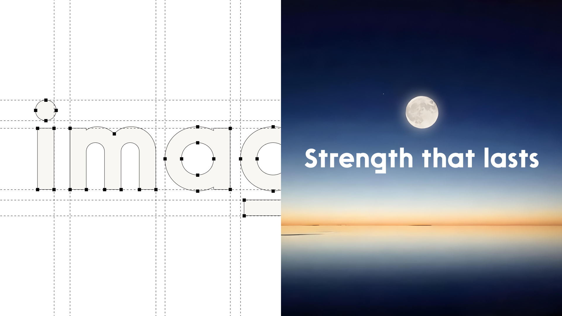
Typography is equally intentional. The chosen typeface, Rawest, reinforces the system through subtle details that echo the visual language of the logo, balancing precision with a sense of liveliness.
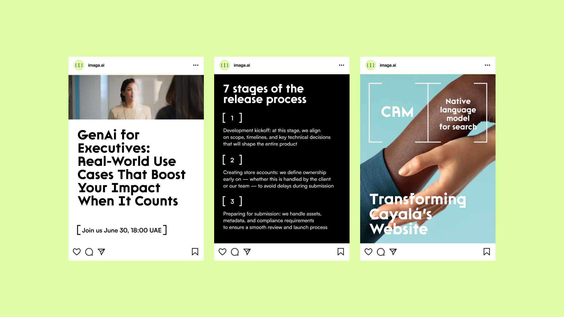
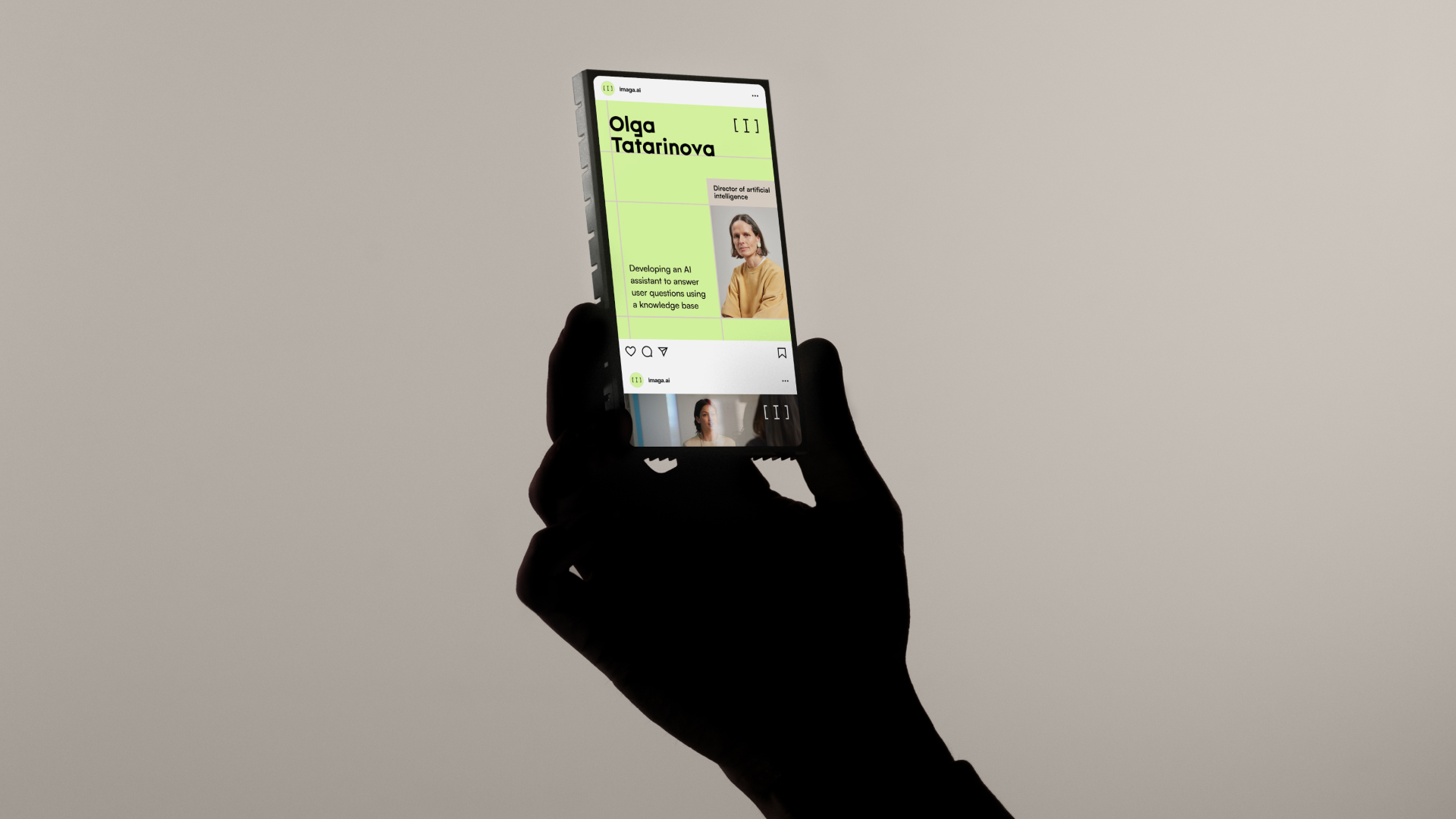
Transparency in process allows clients to move forward with confidence, creating a sense of inevitability in the final outcome. This is reflected in a graphic system built on guiding structures that organize content and maintain clarity.
At its core, the brand is grounded in empathy, clarity, and usability. Imaga engages only where it can deliver real value — using AI not as a trend, but as a tool to build stronger, more effective products.

CREDIT
- Agency/Creative: Lesha Voropaev
- Article Title: Imaga Evolved Its Identity to Reflect a New Era in Software Development
- Organisation/Entity: Freelance
- Project Type: Identity
- Project Status: Published
- Agency/Creative Country: Spain
- Agency/Creative City: Valencia
- Market Region: Global
- Project Deliverables: Brand Architecture, Brand Identity
- Industry: Technology
- Keywords: branding AI
-
Credits:
Brand Designer & Art-Director: Lesha Voropaev


