


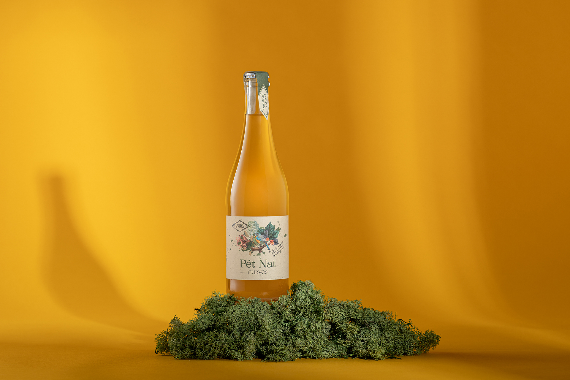
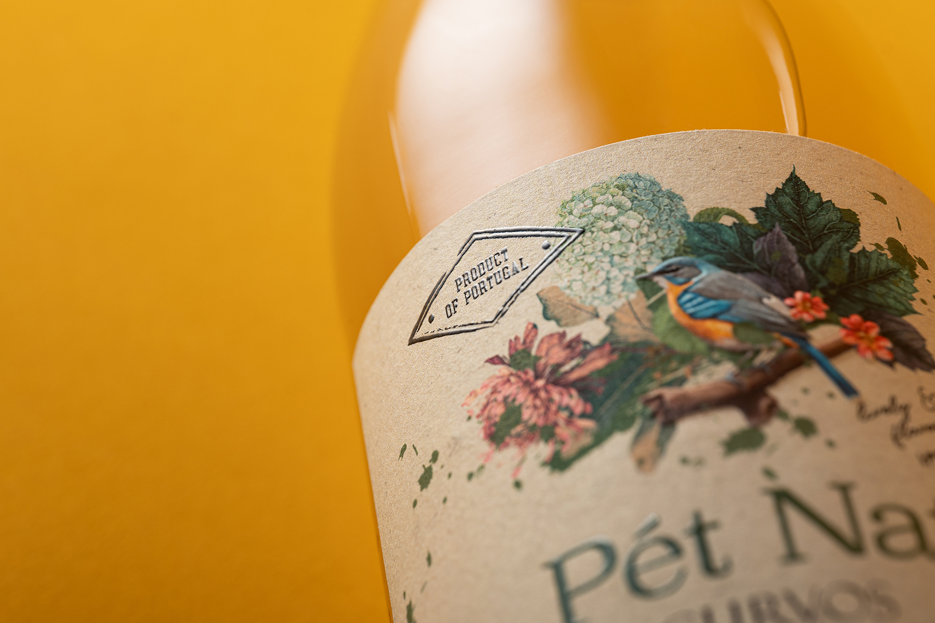
The design of Pét Nat Curvos was born from a desire to translate the unique atmosphere of Quinta de Curvos into a visual language that feels both evocative and contemporary. Surrounded by lush landscapes, flowering gardens, birds, and tranquil lakes, the estate offers an almost idyllic setting — a place where nature and imagination quietly intersect, creating the perfect environment for contemplation and discovery. This sense of place became the starting point for our creative approach.
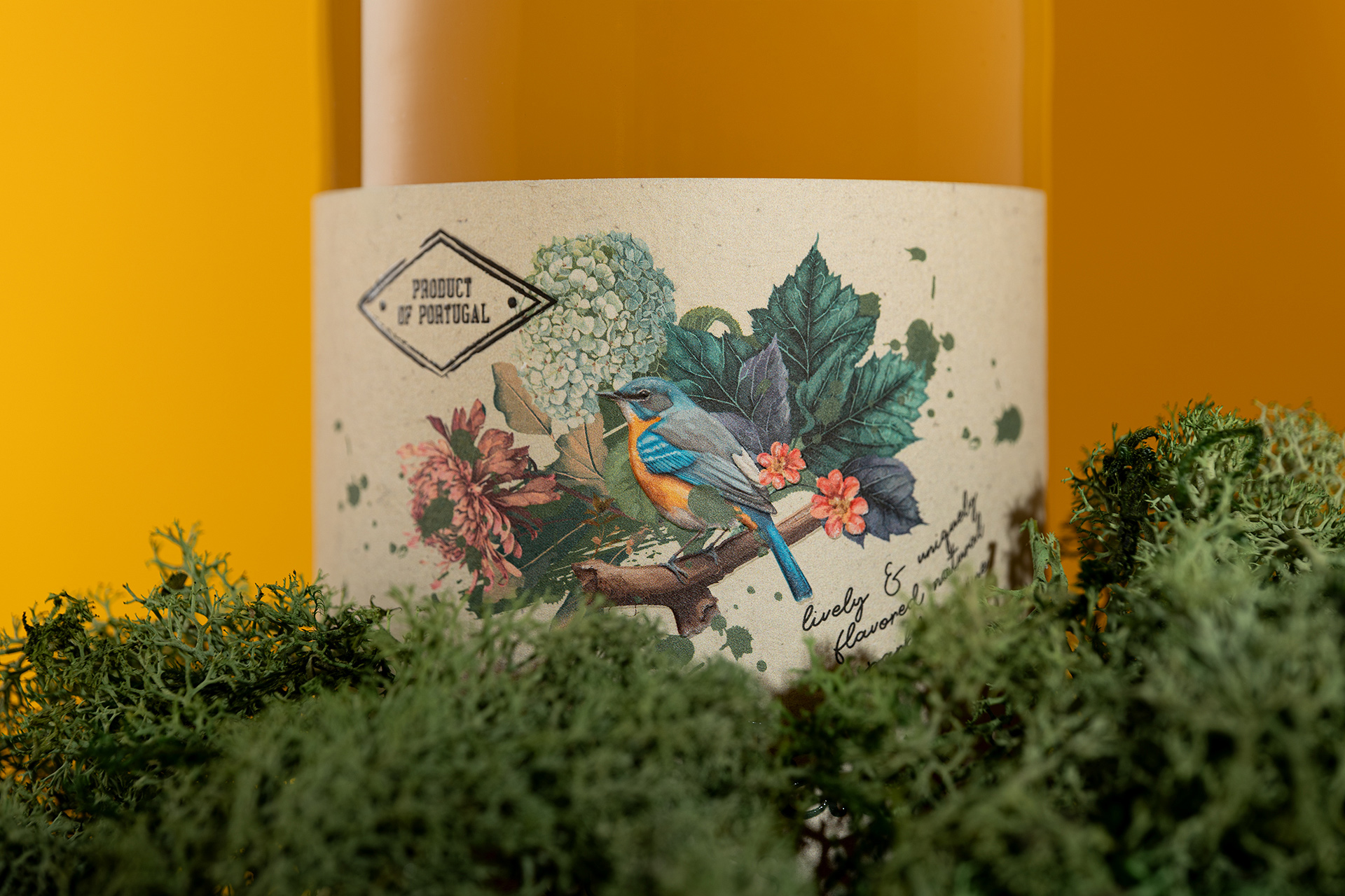
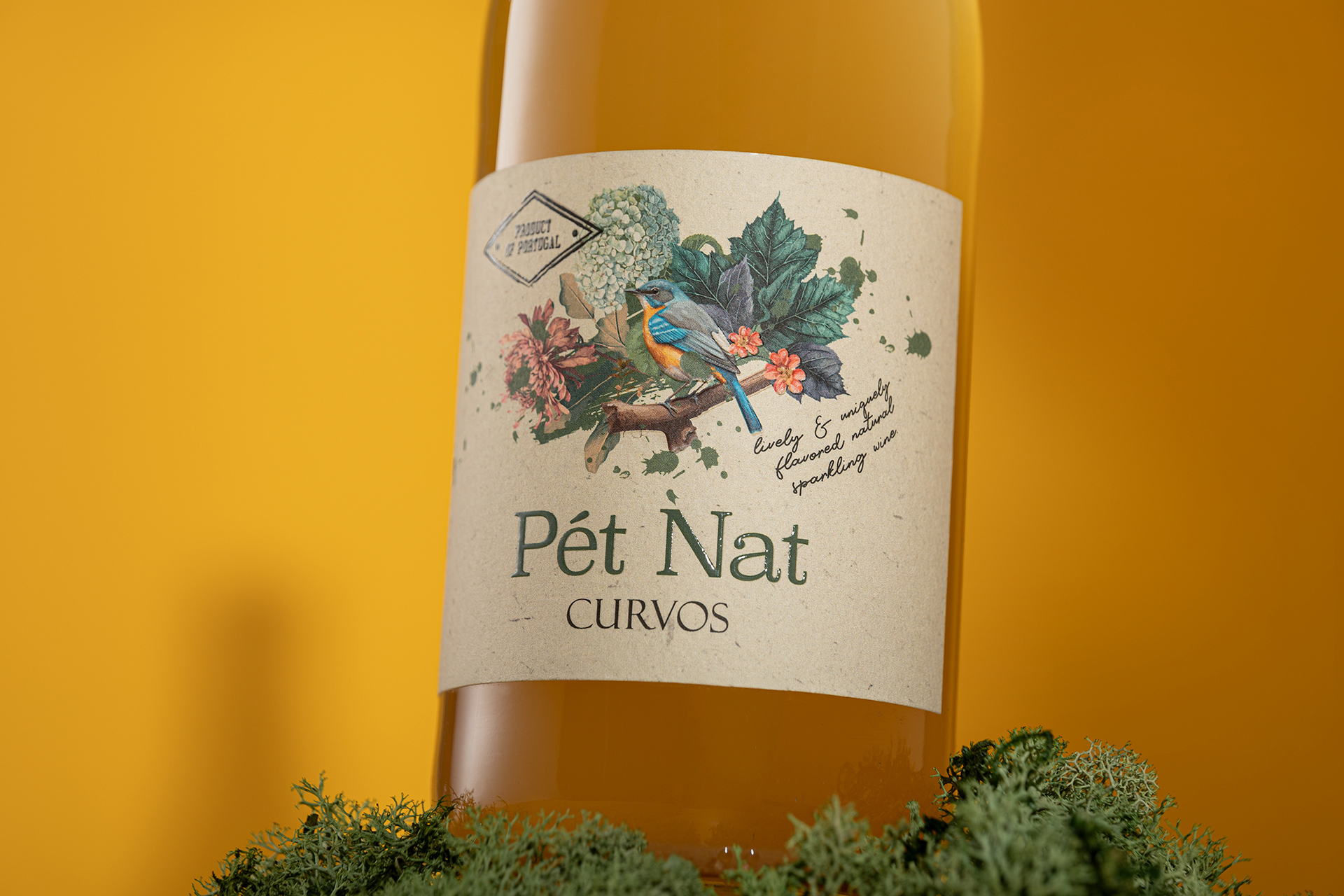
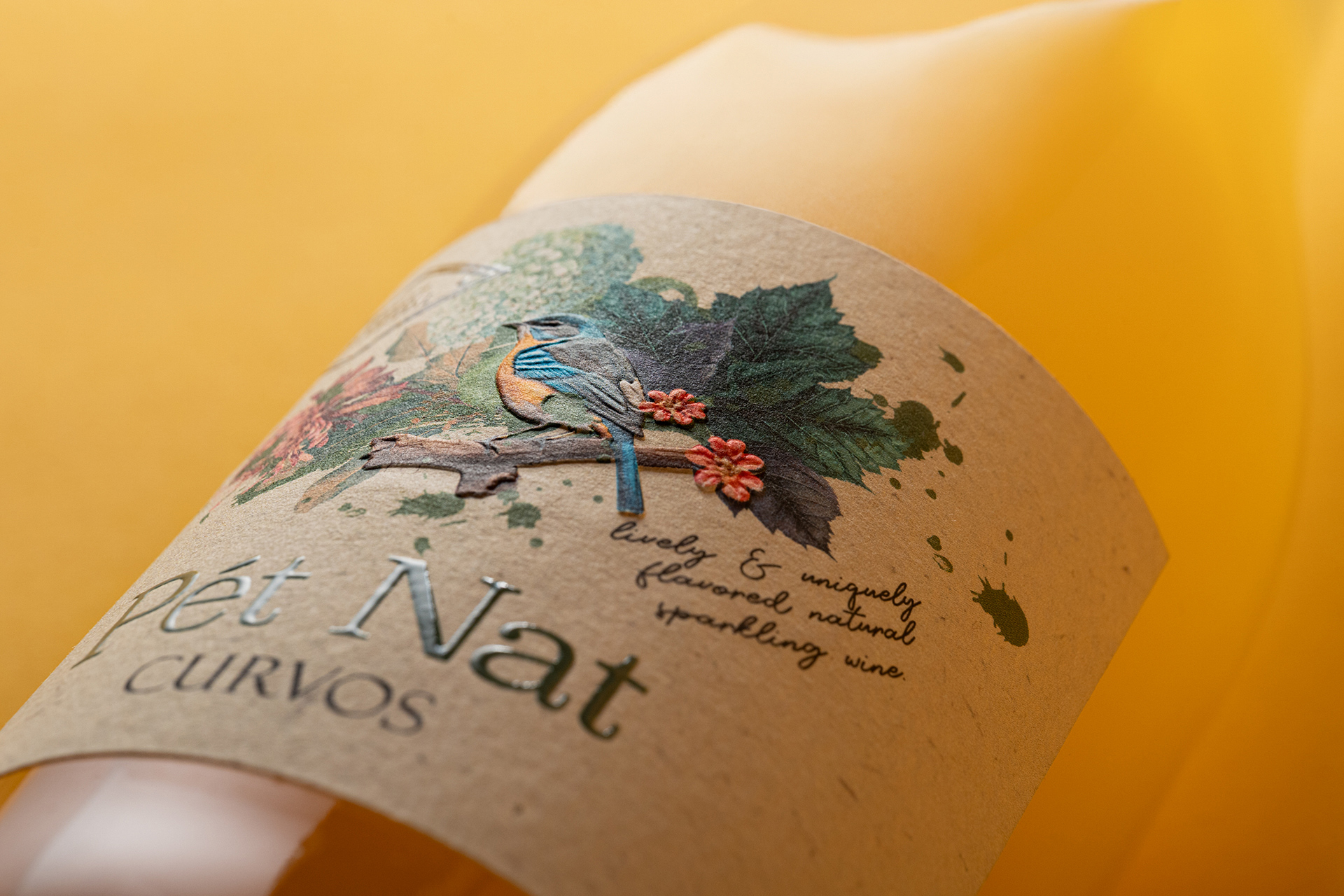
As the agency behind the design, we sought to capture not just the physical beauty of the surroundings, but also the emotional resonance they carry. The illustrated composition reflects this intention: a delicate balance between flora and fauna, where a bird rests among leaves and flowers, suggesting a moment suspended in time. It is an invitation to slow down, to observe, and to connect with a more poetic dimension of the natural world.
The packaging was conceived to feel young and refreshing, aligning with the vibrant and expressive character of the wine itself. At the same time, it carries a sense of authenticity and charm, avoiding excess while maintaining a strong visual identity. The tactile quality of the label, combined with its soft, natural tones, reinforces this idea of something genuine and approachable, yet carefully crafted.
Quinta de Curvos holds a history that spans more than four centuries, enriched by countless legends and estórias that have been passed down through generations. These narratives are not confined to words alone; they are embedded in the estate’s surroundings — from the old manor house to the caves, and in the quiet transitions between the lake, the gardens, and the vineyards. Our role was to interpret this layered heritage and express it in a way that feels relevant today, without losing its depth.
Rather than creating a purely decorative label, we developed a visual story that reflects this continuity between past and present. The result is a design that feels both expressive and grounded, where each element contributes to a broader sense of place. Pét Nat Curvos becomes, in this way, more than a product — it becomes a small window into the spirit of the estate, shaped by history, nature, and imagination.
CREDIT
- Agency/Creative: M&A Creative Agency
- Article Title: M&A Creative Agency Gives Pét Nat Curvos a Poetic Wine Label Rooted in Nature and Place
- Organisation/Entity: Agency
- Project Type: Packaging
- Project Status: Published
- Agency/Creative Country: Portugal
- Agency/Creative City: Anadia - Lisbon
- Market Region: Global
- Project Deliverables: Label Design, Photography
- Format: Bottle
- Industry: Food/Beverage
- Keywords: Packaging Alcohol Wine Pétnat
-
Credits:
Design: M&A Creative Agency
Photography: M&A Creative Agency


