


The Challenge
The furniture industry is saturated with identities that speak loudly — relying on ornament, excess, and visual noise to convey luxury. The real challenge was not how to make ALIVIRA look expensive, but how to make it feel meaningful. The brief demanded a brand that communicates refinement without declaring it, and presence without excess — a visual language that resonates with an audience that has moved beyond decoration and toward something quieter, more enduring, and more honest.
The Solution
ALIVIRA was conceived as an editorial identity system rather than a decorative brand. The core philosophy — that stillness can become presence — shaped every decision from typography and composition to color and material direction. Instead of loud visual gestures, the identity was built through controlled contrast, typographic scale, tactile atmospheres, and a deep sensitivity to form. The result is a brand that speaks through restraint, allowing the products themselves to carry the emotional weight.
Creative Strategy & Conceptual Foundation
The creative direction was grounded in a single principle: luxury defined by what is removed, not what is added. Rather than layering ornament onto the brand, the identity strips everything back to its most essential elements — weight, texture, rhythm, and silence. This translates into an editorial visual system where every element has a deliberate role, and nothing exists without intention.
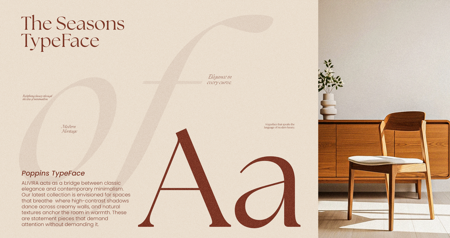
Typography was treated as a structural force rather than a decorative element. The identity moves between bold, oversized statements that dominate the frame and restrained micro-copy that guides the eye with quiet precision — creating editorial tension and visual rhythm across every layout. This contrast of scale communicates confidence, authority, and a brand that understands its own weight.
Visual Identity & Color Language
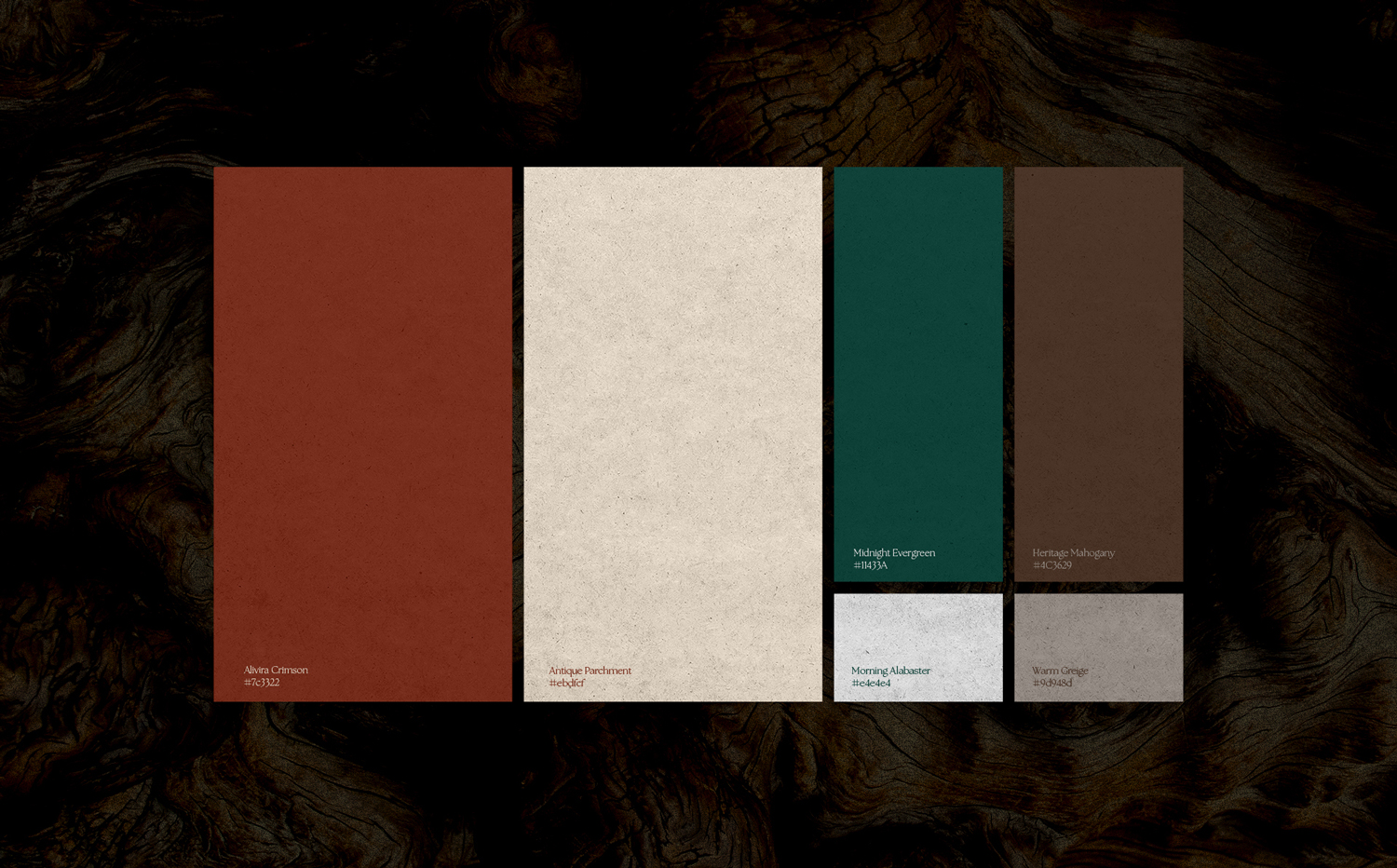
The ALIVIRA palette is built around a deliberate primary pairing that defines the brand’s character. The foundational tone — a deep, grounded warm brown (#7C3322) — carries the visual weight and emotional presence of the identity, evoking crafted wood, rich material depth, and quiet sophistication. Supporting it as the primary neutral field is a soft architectural cream (#EBDFCF) that functions as open space within the system — breathable, restrained, and perfectly balanced to let typography and composition breathe.
Secondary tones — including a saturated olive green, warm wood browns, and subtle beige neutrals — appear sparingly to support material storytelling, photography direction, and layout structure. This controlled hierarchy ensures the primary duo remains dominant while the supporting colors enhance rather than compete, creating a cohesive visual language that feels both warm and considered.
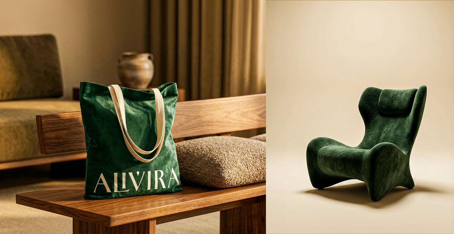
Brand Applications & Art Direction
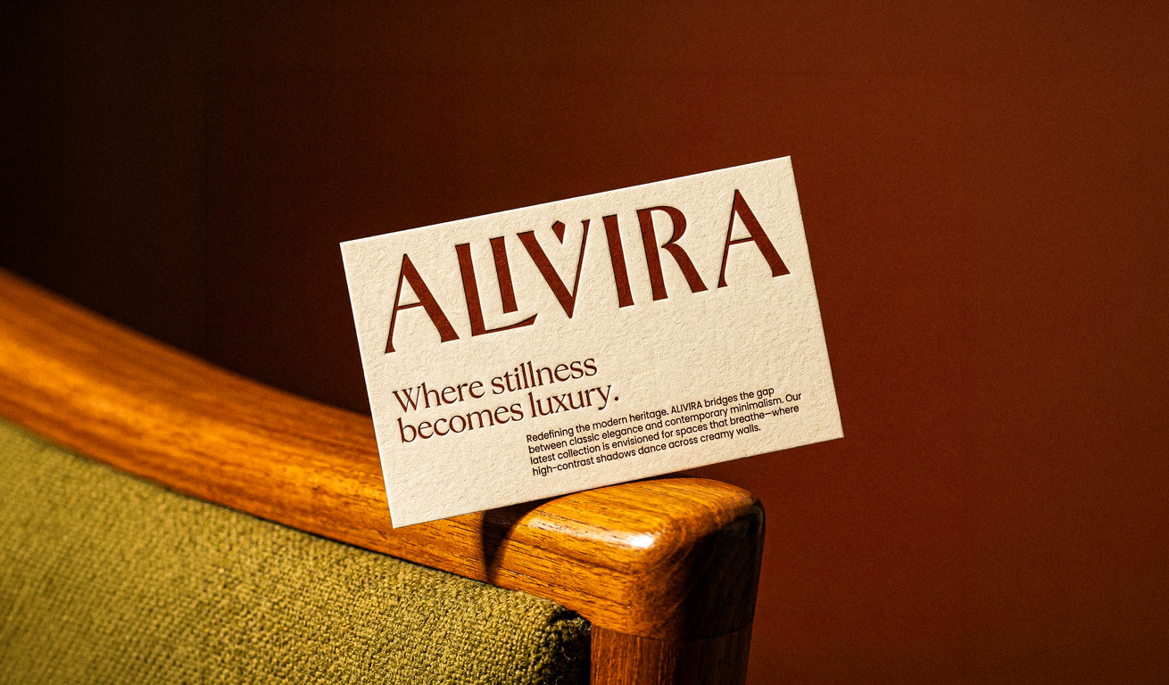
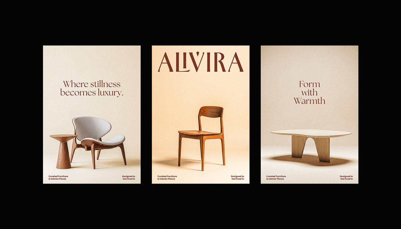
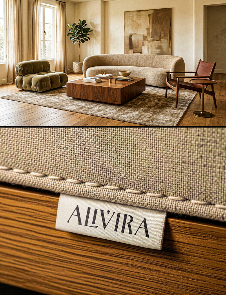
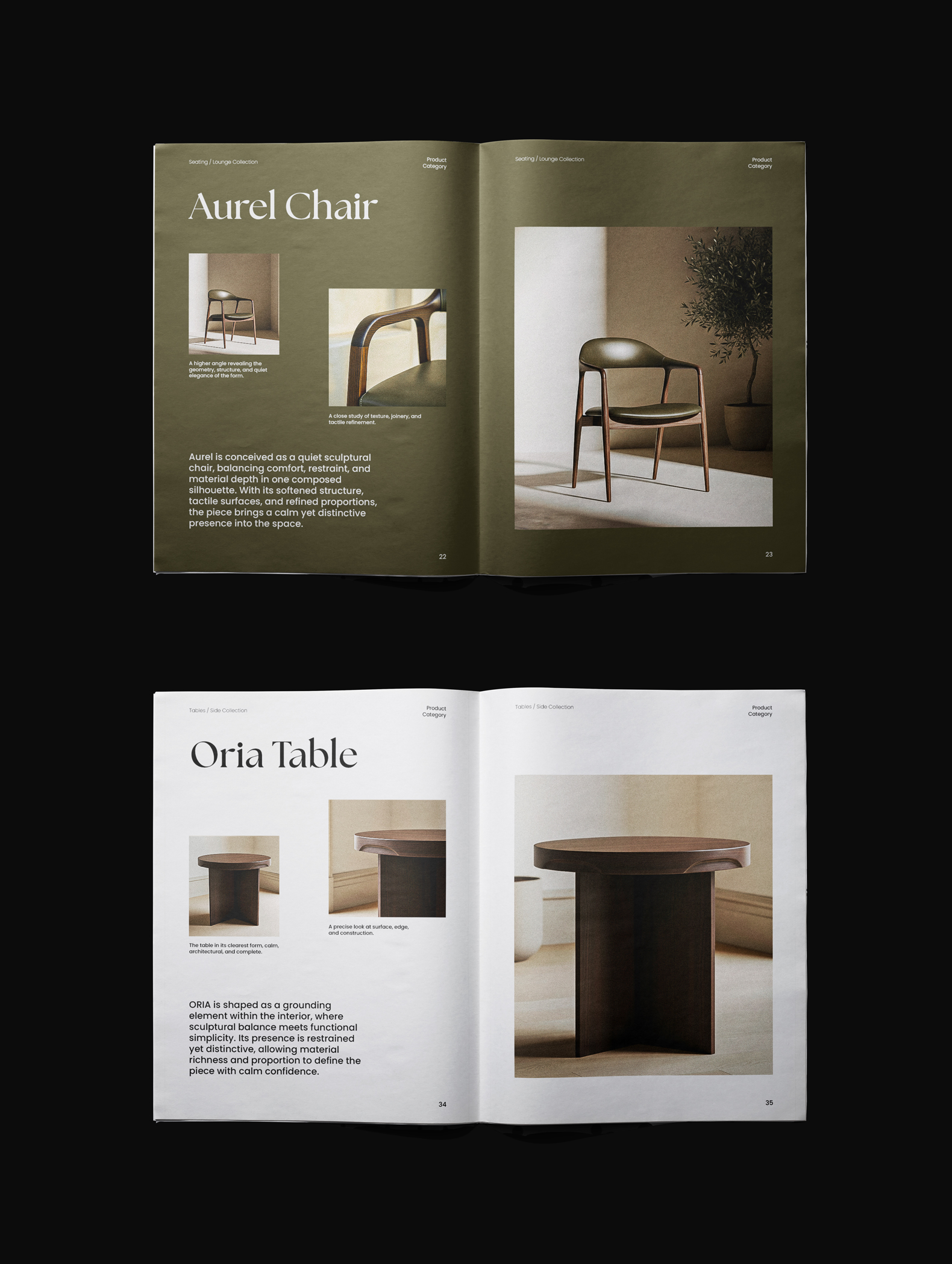
Every touchpoint was designed to extend the same editorial language. Business stationery uses premium textured cotton paper with letterpress-pressed typography, making the brand physically tangible and unmistakably intentional. Product photography follows a warm studio system where clear directional lighting, visible shadows, and material depth replace the cold perfection of typical commercial furniture imagery — making the products feel desirable, real, and worth owning.
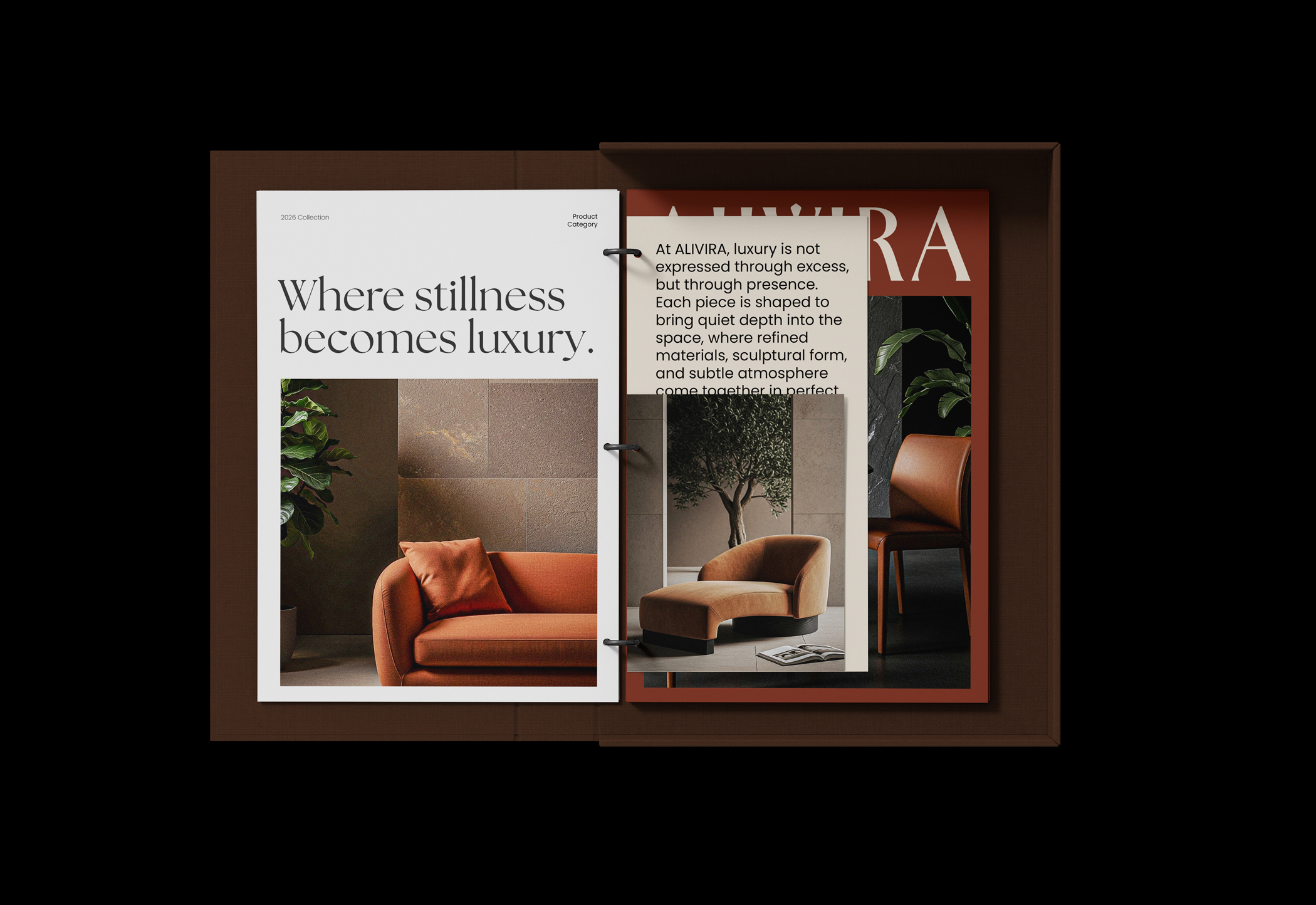
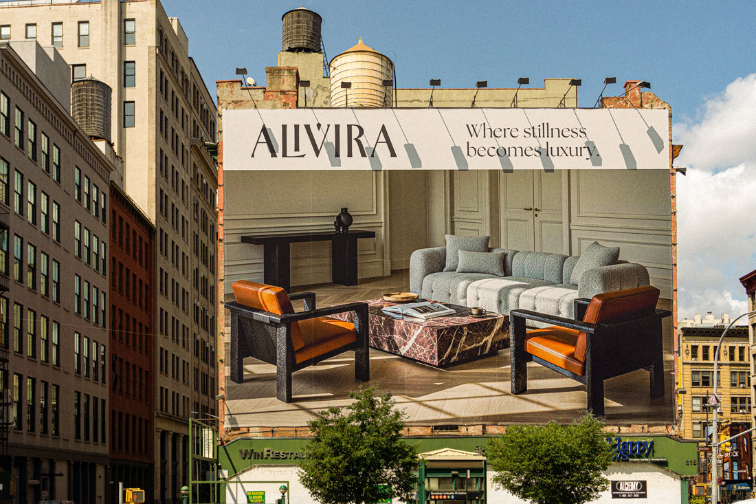
Editorial layouts across print and digital applications apply extreme typographic scale contrast, where oversized brand statements occupy entire frames alongside delicate informational detail — a visual language that moves between confidence and subtlety in a way that is distinctly ALIVIRA.
The Outcome
The result is a cohesive brand world that feels simultaneously classic and contemporary — composed, tactile, and unmistakably intentional. ALIVIRA does not shout its luxury. It holds it. Every application — from the weight of the business card to the stillness of the product frame — communicates a brand built for those who understand that true refinement is always quiet.
ALIVIRA is not just a furniture identity. It is a considered editorial experience where stillness becomes presence, restraint becomes richness, and every element earns its place.
CREDIT
- Agency/Creative: Ahmed Eltilbany
- Article Title: ALIVIRA : A Furniture Identity Built on Stillness, Editorial Tension, and Material Presence By Ahmed Eltilbany
- Organisation/Entity: Freelance
- Project Type: Identity
- Project Status: Published
- Agency/Creative Country: Egypt
- Agency/Creative City: Cairo
- Market Region: Europe, Middle East
- Project Deliverables: Art Direction, Brand Design, Brand Identity, Brand Naming, Brand Strategy, Branding, Typography
- Industry: Manufacturing
- Keywords: Furniture Brand / Luxury Furniture / Brand Design / Identity System / Visual Identity Designer / Ahmed Eltilbany / Branding Egypt / Logo Design / Editorial Branding / Premium Identity
-
Credits:
Art Direction: Ahmed Eltilbany
Graphic Design: Ahmed Eltilbany


