


Korean Bros is a Korean American CPG food brand built on a simple, audacious premise: make Korean food branding as bold as the cuisine itself. Los Angeles-based branding agency Truffl developed the full brand identity, packaging system, visual language, and digital experience — creating a satirical, comedy-driven universe that translates the energy of Korean flavor into every touchpoint, from shelf to social.
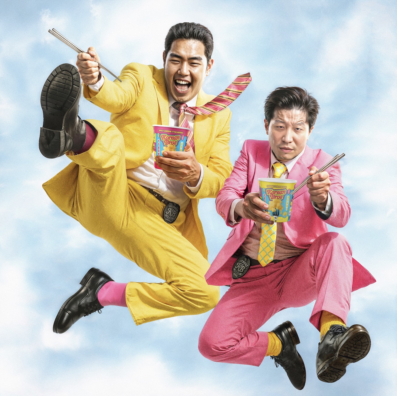
Truffl built the brand around two fictional brothers — Dok and James — on a self-appointed mission to end bland food. They’re not mascots in the traditional CPG sense. They’re characters with a point of view: confrontational, comedic, and completely convinced that their way of eating is the only way worth living. The voice borrows from meme-native communication and Internet culture, filtered through a distinctly Korean American lens. The humor isn’t an accessory to the brand. It is the brand.
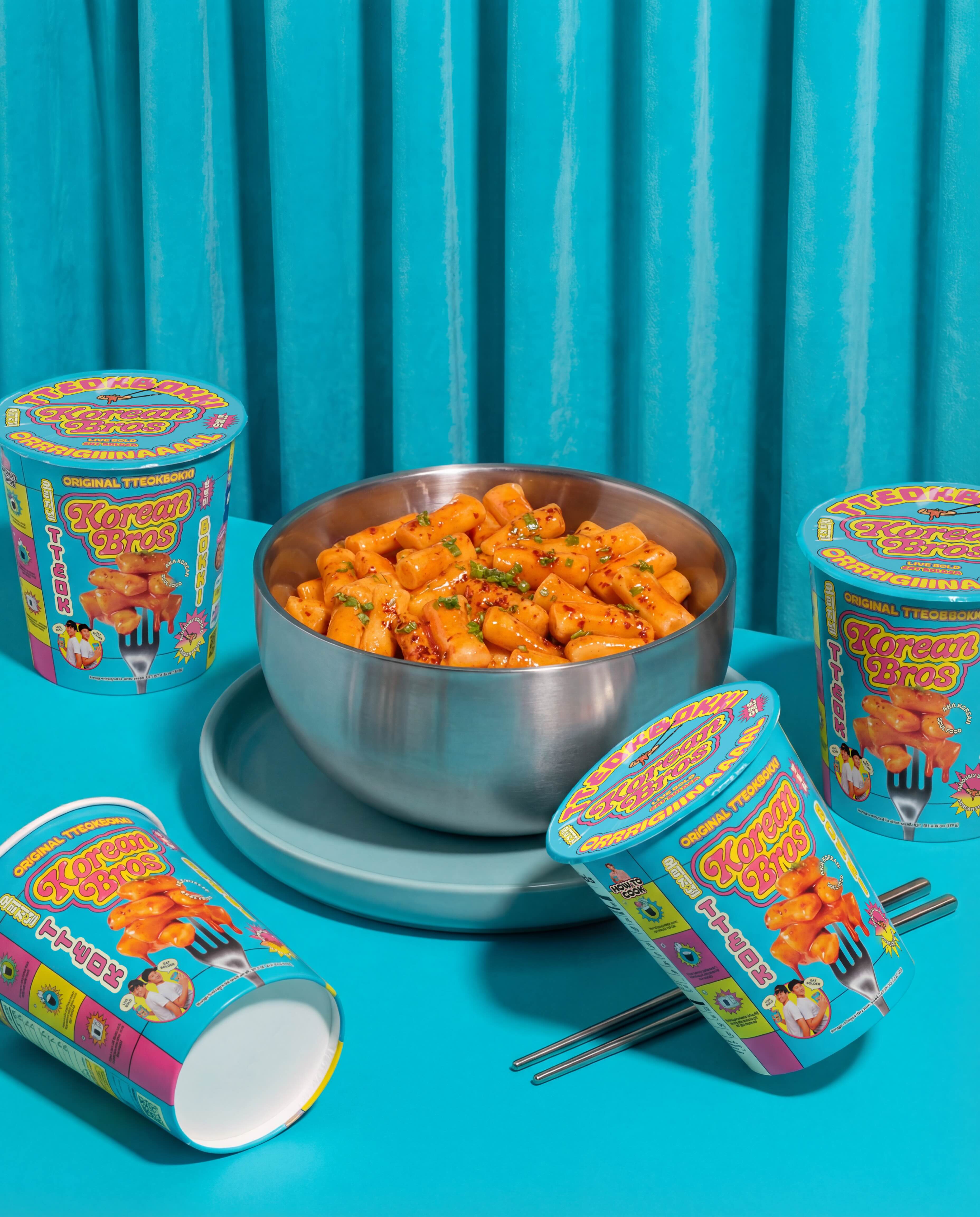
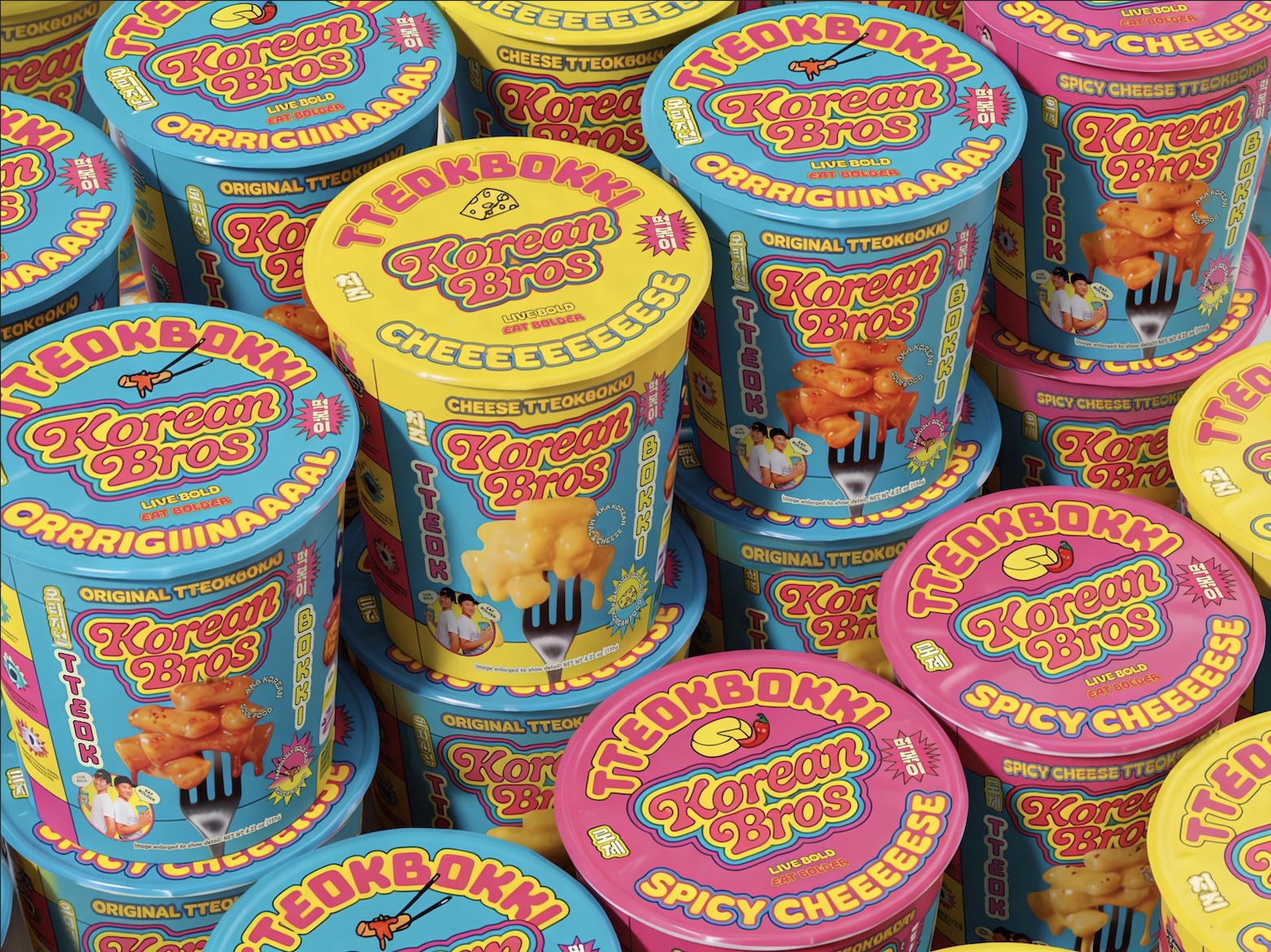
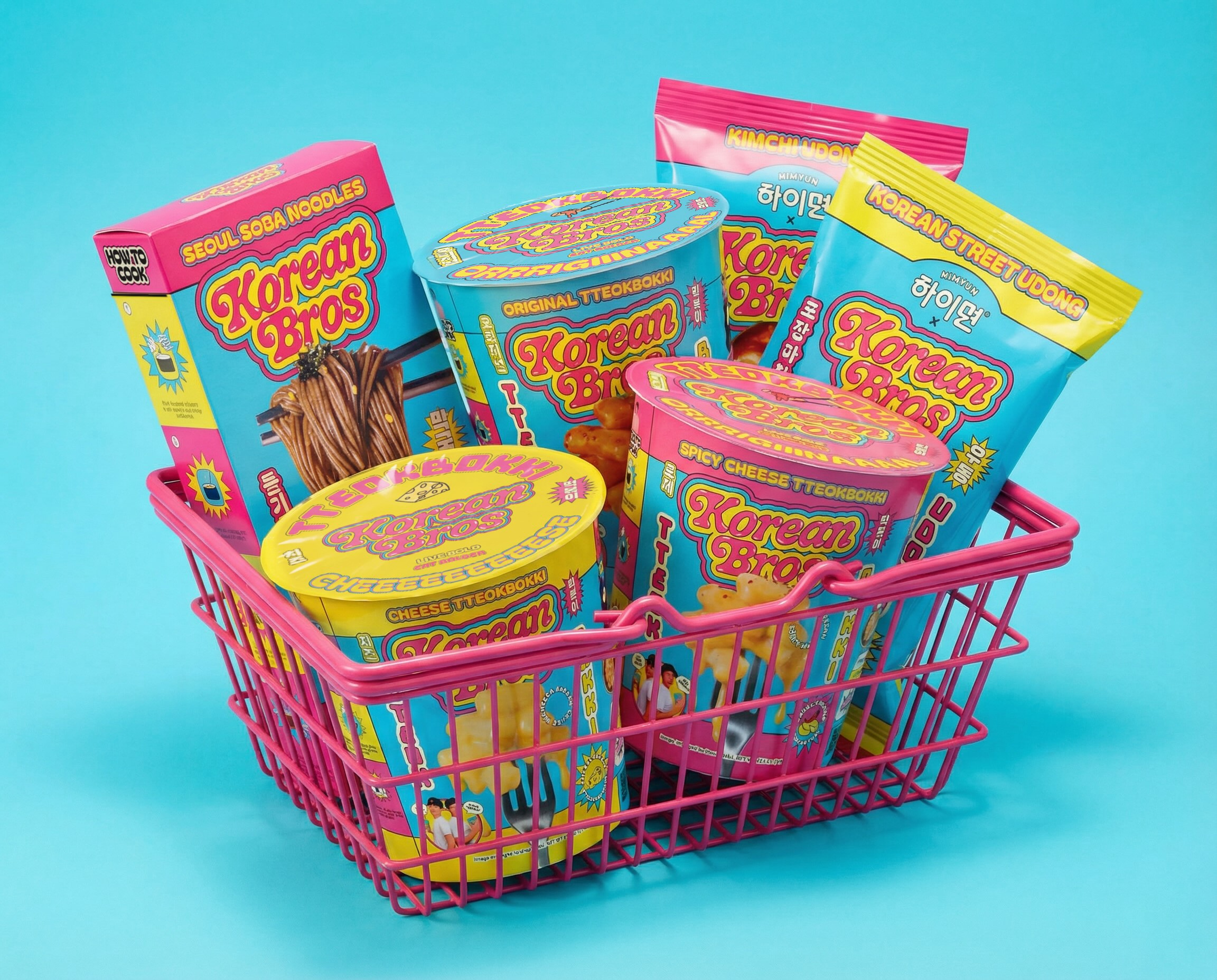
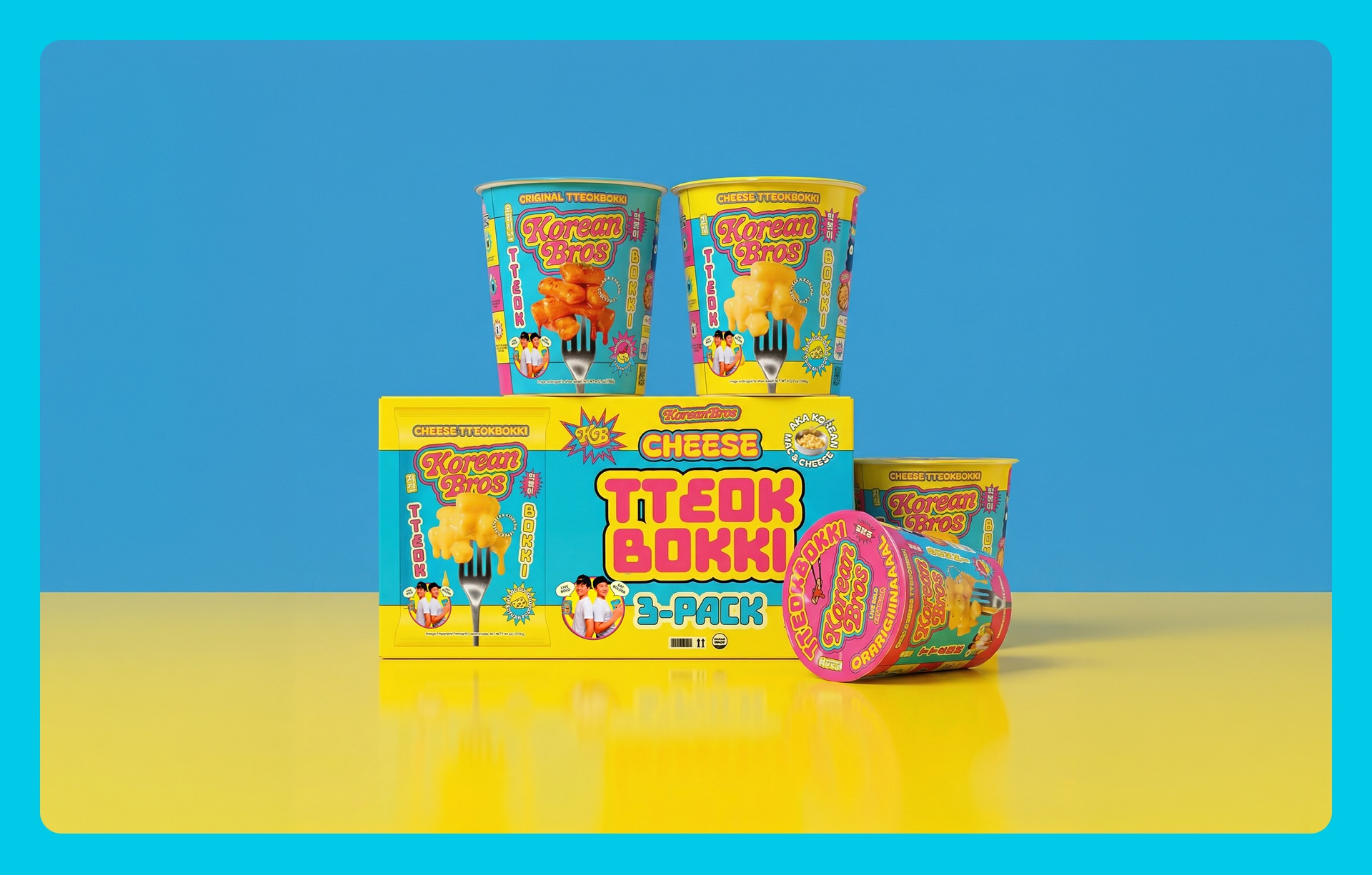
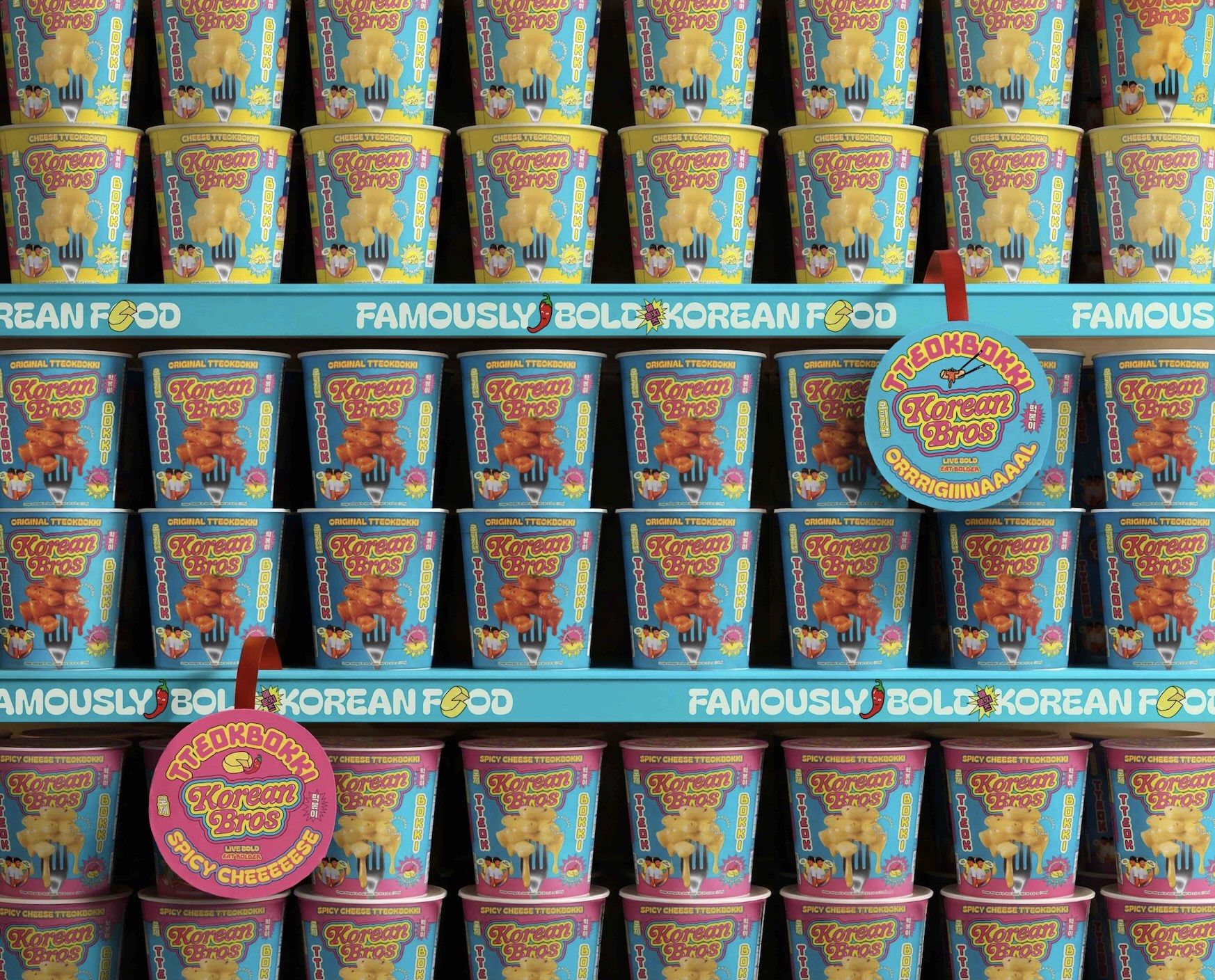
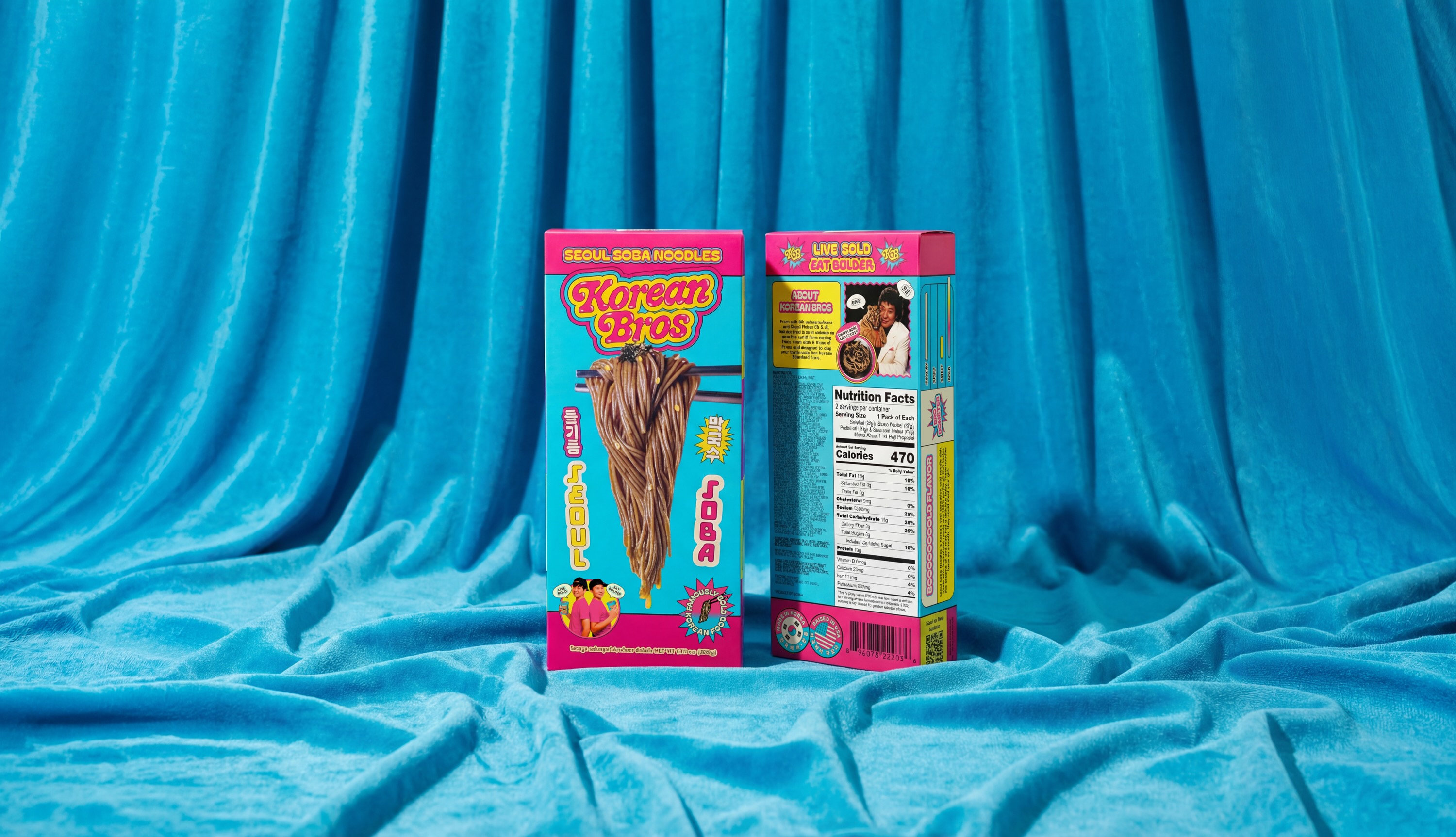
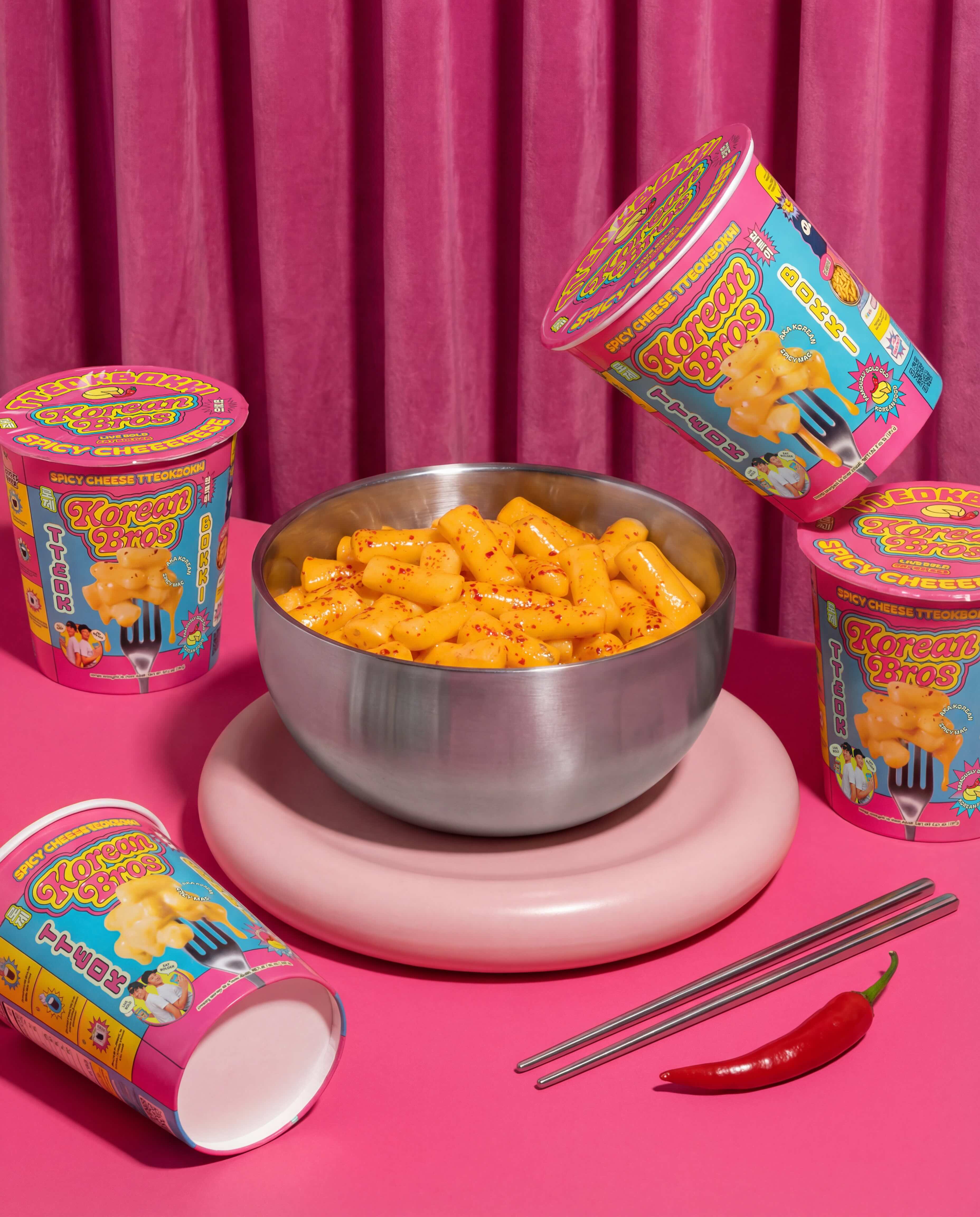
Truffl designed the Korean Bros wordmark as a custom bubble-lettered logotype — thick, inflated, and deliberately cartoonish, reading more like the title card of a Saturday morning cartoon than a food brand. A vivid yellow, hot pink, and electric cyan color palette anchors the system — equal parts comic book and convenience store energy drink, chosen to dominate at shelf against the muted tones and kraft-paper minimalism of the natural food aisle. A hand-drawn illustration library of chopsticks, chili peppers, noodle swirls, dumplings, and flame bursts builds a visual vocabulary that’s instantly recognizable and infinitely extensible. Hangul characters are integrated as graphic elements rather than functional text — communicating heritage without defaulting to tired visual tropes. Meme-style founder photography inspired by Step Brothers, a sticker and badge system, and a bold pattern library ensure Korean Bros owns its visual territory completely.
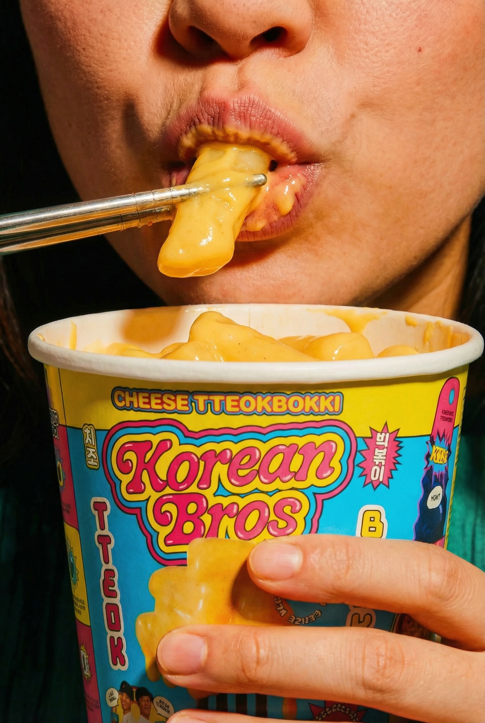
The packaging system achieves coherence across the full product range through a consistent visual vocabulary that adapts to each SKU. Dripping food photography communicates flavor. Mascots channel the “Live Bold. Eat Bolder” mantra. Satirical founder photos anchor back-of-pack storytelling. The messaging dials up easy comparisons to American foods — tteokbokki becomes Korean Mac and Cheese — along with comedic flavor profiles and a Bro Origin story on every pack. Korean language translations amp up cultural credibility. Every element, from shelf presence to label detail, reinforces the brand and creates moments of fun and discovery.
Truffl designed and developed the Korean Bros website to blend conversion-driven commerce with comedic interludes — satirical product reviews, an option to order 1 million packs of noodles, a full “Bro Dictionary” of custom Bro-isms, and a “Bro Face Generator” that lets users create a shareable Honorary Korean Bro card.
Full brand strategy, visual identity, illustration, packaging, and digital experience by Truffl.

CREDIT
- Agency/Creative: Truffl
- Article Title: Truffl’s Branding for Korean Bros is as Bold as Korean Food Tastes
- Organisation/Entity: Agency
- Project Type: Identity
- Project Status: Published
- Agency/Creative Country: United States
- Agency/Creative City: Los Angeles
- Market Region: North America
- Project Deliverables: Art Direction, Brand Creation, Brand Design, Brand Guidelines, Brand Identity, Brand Strategy, Brand Tone of Voice, Brand World, Branding, Food Photography, Identity System, Packaging Design, Packaging Guidelines, Photography, Photography Styling, Web Design
- Industry: Food/Beverage
- Keywords: Food branding, Korean food, Truffl, Food packaging
-
Credits:
Branding, Packaging, Illustrations, Strategy, Copywriting, Web Design, Creative Direction: Truffl
Motion Graphics: Studio Sentempo
Food Stylist: Danielle Campbell
AI Portraits: Not Content
Food Photography: Audrey Ma
Web Development: Carlos Salvador


