


I. THE PREFACE: ARCHITECTING THE RESTLESS HOME
At House of Ta, our foundational philosophy is simple yet profound: “Brand as Home.” Usually, a home is a static place of stillness. But for PUSH PUSH, we were faced with a beautiful paradox: How do you build a home for those who never stop moving? How do you create a sanctuary for the “hustle” of the modern pavement?
Streetwear is often a landscape of noise—loud logos, ephemeral trends, and sensationalist slogans. Our mission was to perform a distillation. We sought to filter out the static and find the “stillness” within the motion. PUSH PUSH is not just a brand; it is a Mobile Sanctuary designed for the Gen Z spirit that finds peace in the stride.
II. THE INSPIRATION: THE COLLISION OF TWO WORLDS
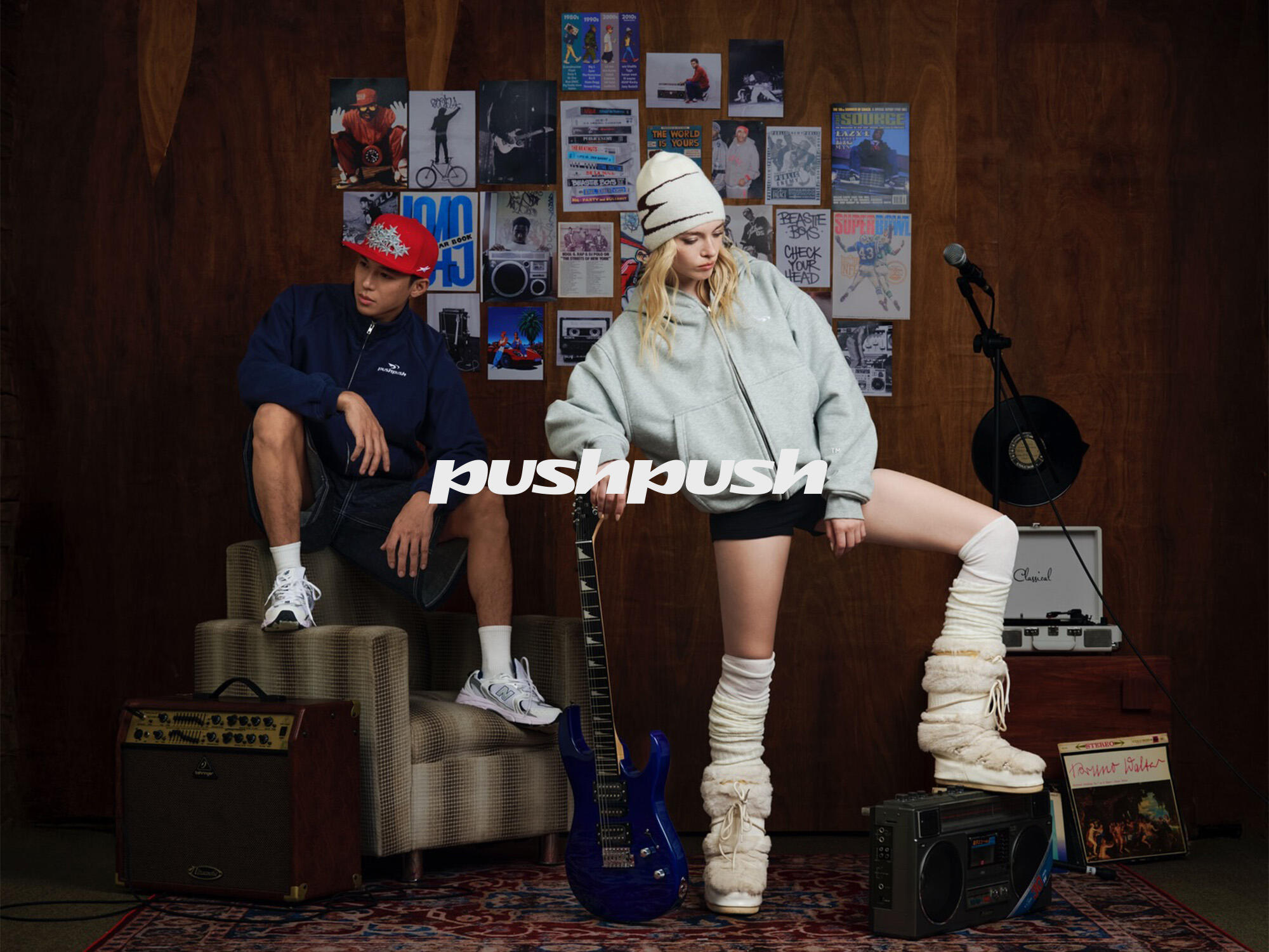
The soul of PUSH PUSH resides in a vibrant cultural collision. It is where the bold, spirited heart of Mexico meets the pragmatic, high-velocity utility of American Highstreet.
We drew inspiration from the honest textures of the city: the spray-painted brick walls of Brooklyn, the sun-baked asphalt of Mexico City, and the rhythmic sound of sneakers hitting the sidewalk. This is a “raw beauty” that doesn’t need to apologize for its presence.
However, at House of Ta, we do not merely replicate the street; we curate it. We took the heat of this Mexico-American spirit and placed it under the lens of international design sophistication. We envisioned a brand that carries the “heat” of the hustle but provides the “cool” of a sanctuary.
III. THE DISRUPTION: REFINING THE STREET NOISE
Most streetwear brands try to scream to be heard. We chose to speak in a whisper that resonates. This is our Disruptive Minimalism.
We challenged the fast-fashion status quo by daring to use The Power of Stillness. We removed the unnecessary. We stripped away the decorative “clutter” to reveal the Visual Anatomy of the brand. We believe that true premium positioning comes from the confidence to be simple. By breaking the conventional rules of “noisy” streetwear, we found a simplicity that is both expensive and enduring.
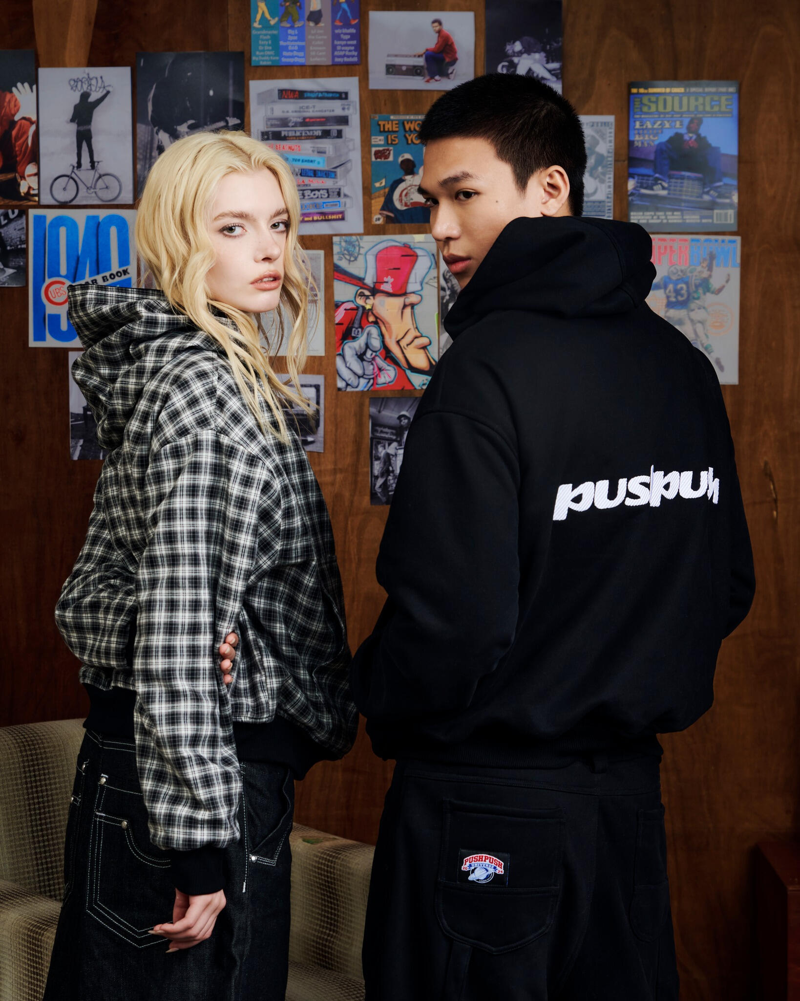
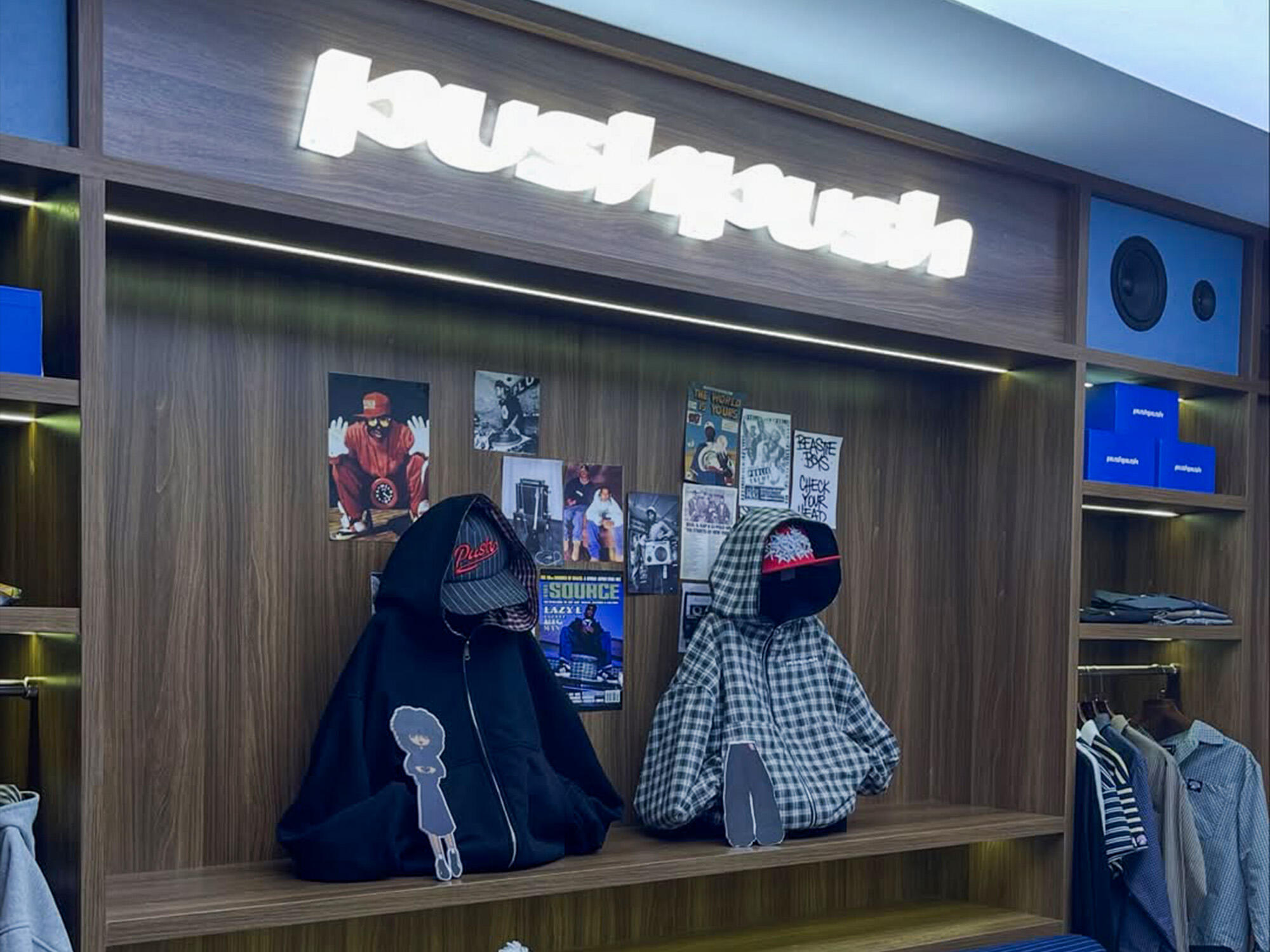
IV. VISUAL EXECUTION: THE ANATOMY OF MOTION
The identity of PUSH PUSH is an exercise in precision. Every angle, every line, and every “spray” is a deliberate point of dialogue.
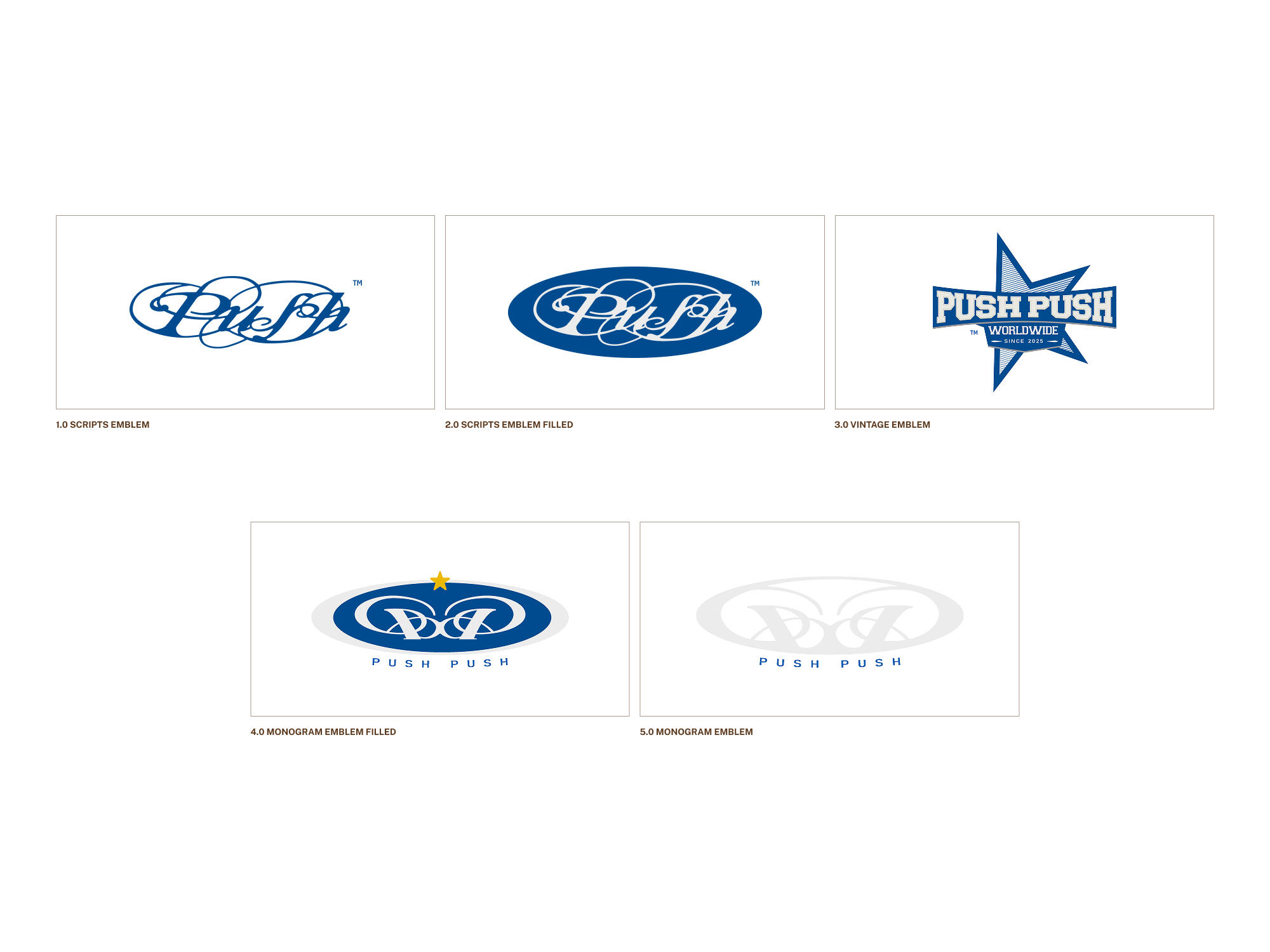
1. The Wordmark: The Powerhouse of Momentum
The typography is designed to be Wide & Bold, acting as a solid architectural foundation.
The 85° Slant: This is the brand’s “pulse.” An 85-degree lean keeps the logotype in a state of constant, kinetic energy. It mirrors the body’s posture in a forward stride. It is the visual embodiment of the mantra: “Always Push Forward.”
Angular Cut-outs: Sharp, precise incisions in the letterforms mirror the details of the logomark, creating a tight, cohesive visual language.
2. The Logomark: The Trinity of the Modern Hustle
The PUSH PUSH icon is a distilled symbol built on three cultural pillars:
The Shoeprint: A nod to the pavement—the literal mark we leave on our community and our journey.
The Double ‘P’ Structure: Representing the brand name while metaphorically symbolizing the ‘x2 Hustle’ spirit—doubling the effort, doubling the passion.
The Arrow: The overall silhouette forms an arrow, signifying a relentless drive toward the future.
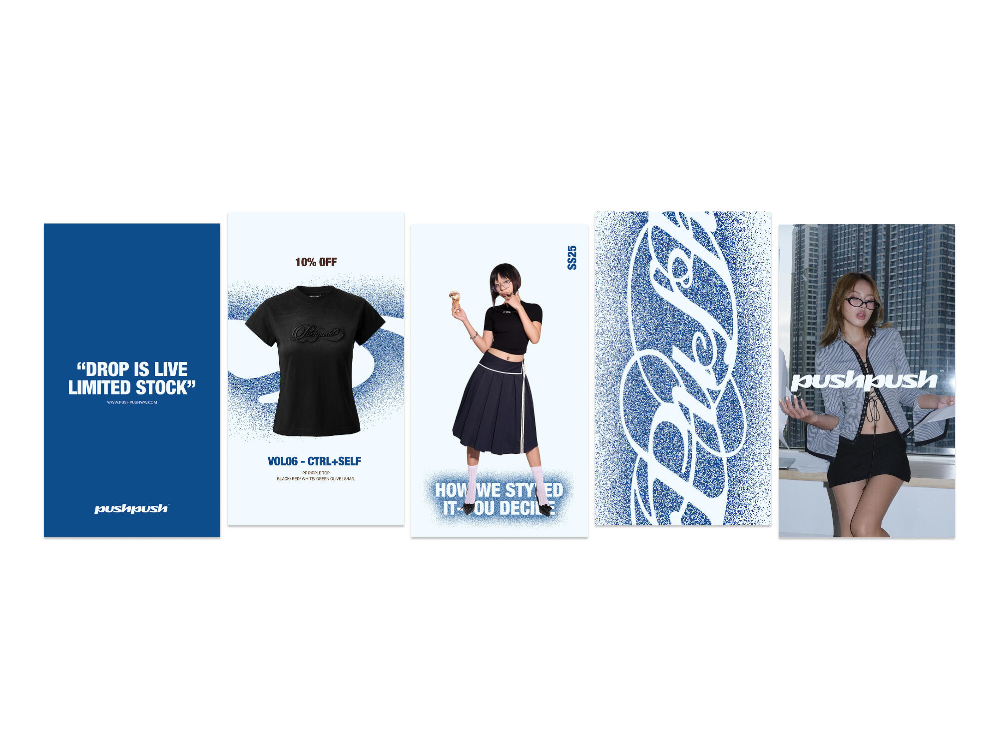
3. The Visual Language: Curated Chaos (Spray Effect)
To honor the street roots without feeling “cheap,” we developed a Strategic Spray Rendering.
Unlike random graffiti, our spray effect is “curated.” It provides a tactile, human touch—a reminder of the artisan behind the machine. It gives the brand a soul, a breath, and a depth that flat vector designs cannot achieve.
V. PHILOSOPHY OF MATERIALITY: MATERIAL-FIRST
In the House of Ta, we know that a home is only as good as its foundation. For PUSH PUSH, the fabric is the foundation. We embrace a Material-First approach because we believe streetwear is about Instant Comfort.
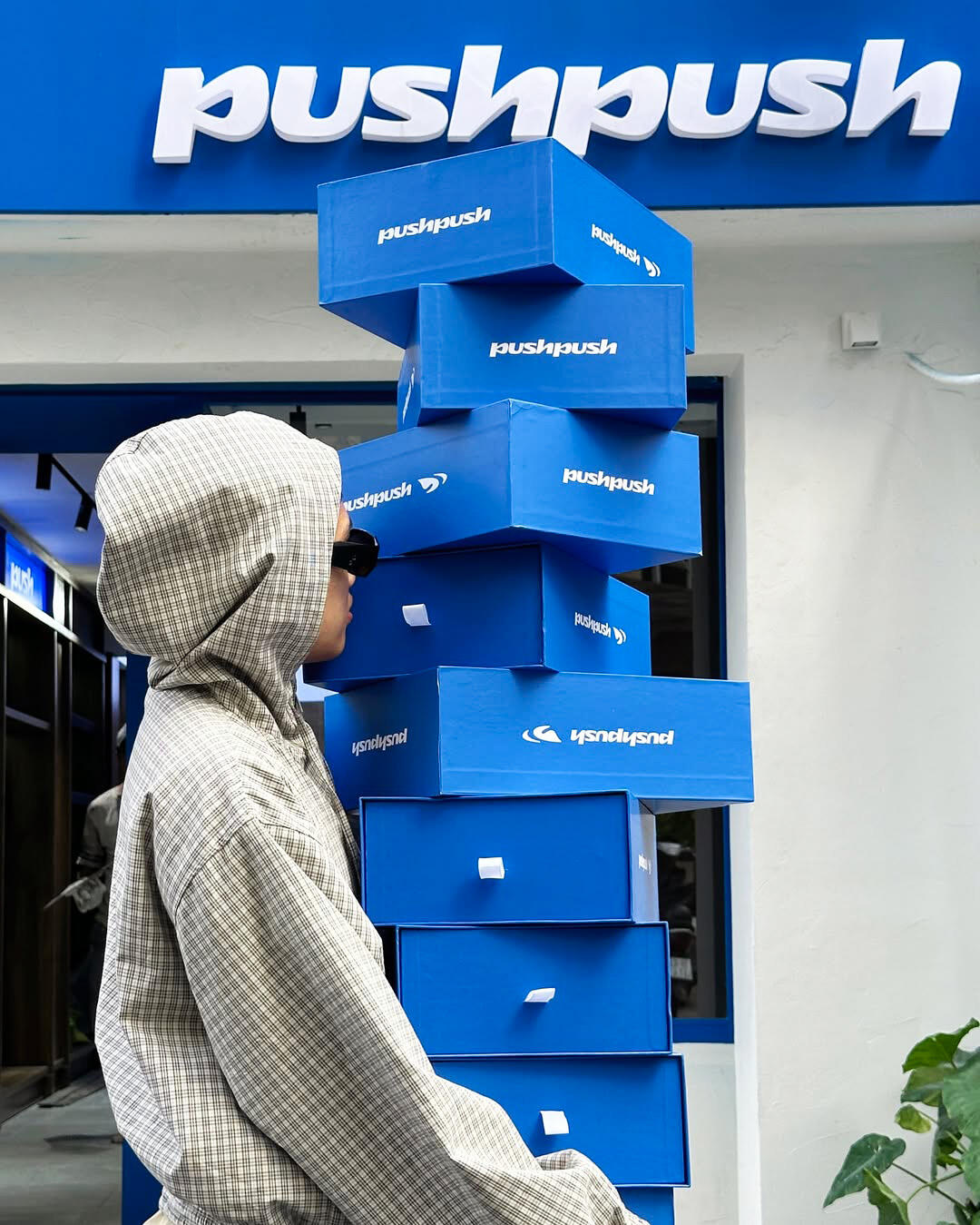
The visual identity—using colors like Bold Blue, Stark White, and Vibrant Yellow—is designed to highlight the texture and innovative nature of the fabrics. We don’t just design for the eye; we design for the “touch.” The brand serves as a “point of anchor,” allowing the wearer to feel grounded and empowered by the quality of what they wear.
VI. CULTURAL RESONANCE: THE VOICE OF GEN Z
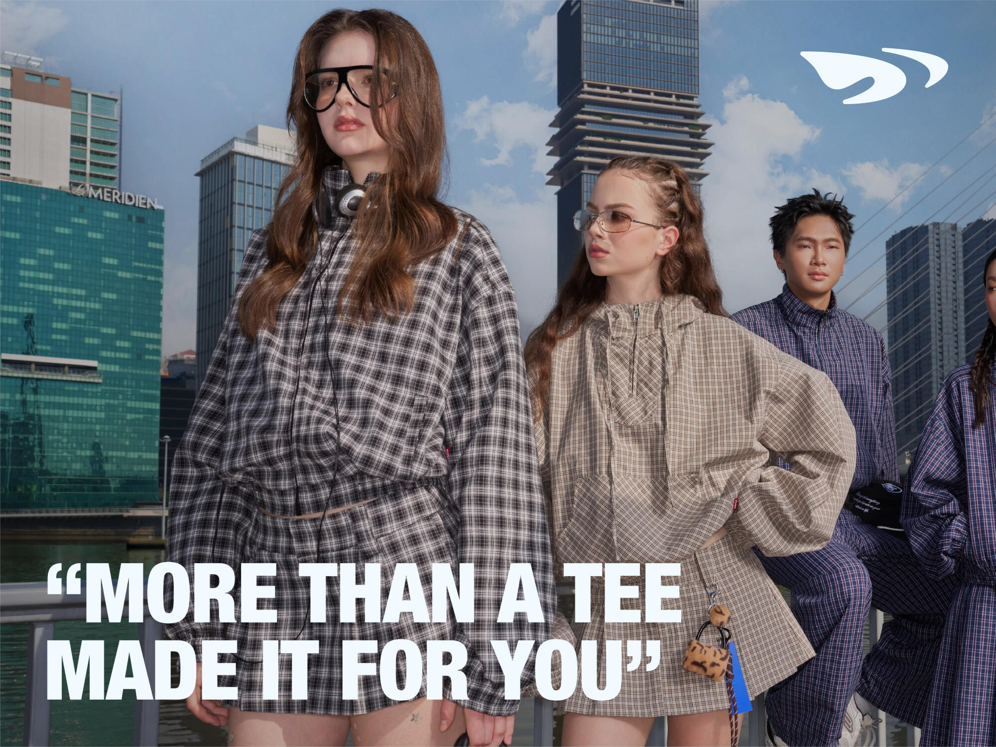
PUSH PUSH speaks to a generation that is confident, trend-driven, and embraces change. They don’t want a brand to define them; they want a brand to represent them.
By using international design thinking to translate local street materials, we created a brand that feels both familiar and futuristic. It is “Street, without the cheap slang.” It is an intellectual approach to the hustle, providing a visual home for those who dream big but stay grounded in their unique identity.
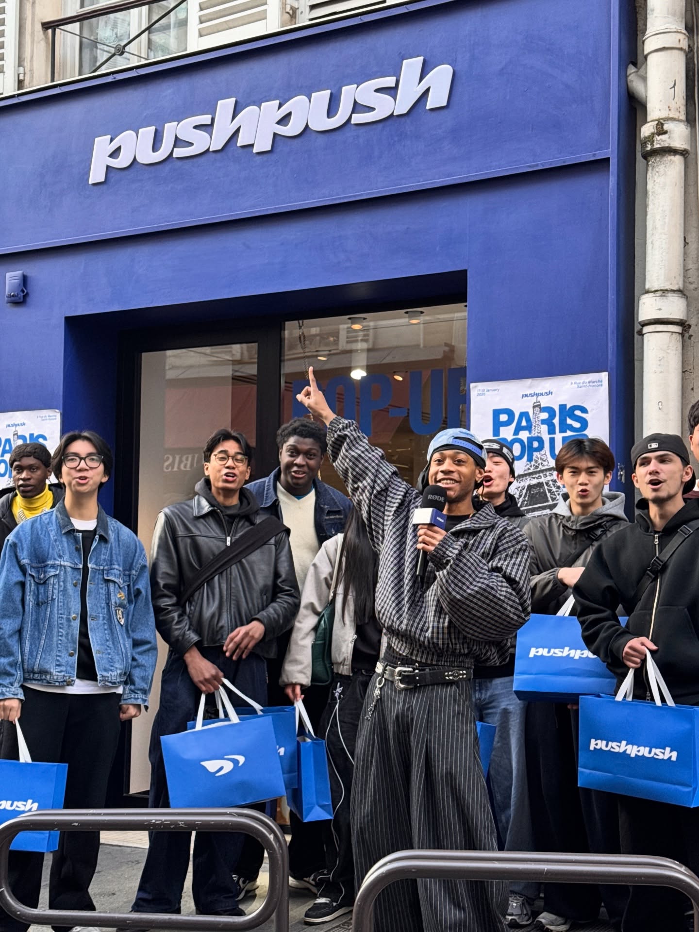
VII. THE RESPONSE: A NEW DIALOGUE
The completion of the PUSH PUSH project is not just a delivery of assets; it is the birth of a new dialogue with the street.
House of Ta has successfully built a “Visual Home” where the spirit of movement is celebrated through the lens of stillness. From the meticulous anatomy of the logo to the soulful spray effects, every touchpoint is a testament to the power of Distilled Design.
CREDIT
- Agency/Creative: House of Ta Studio
- Article Title: House of Ta Studio Shapes PUSH PUSH into a Minimal Streetwear Identity Built for Constant Motion
- Organisation/Entity: In-House
- Project Type: Identity
- Project Status: Published
- Agency/Creative Country: Vietnam
- Agency/Creative City: Ho Chi Minh
- Market Region: Global
- Project Deliverables: Brand Design, Brand Identity, Branding, Graphic Design, Logo Design
- Industry: Fashion
- Keywords: Branding
-
Credits:
Creative Director: House of Ta Studio


