


Background
The energy drink category has historically been defined by visual aggression. Loud graphics, extreme performance messaging, and hyper-masculine aesthetics have dominated the shelf for decades. While these cues once helped establish the category, today’s beverage landscape is shifting. Consumers are increasingly drawn to drinks that offer cleaner ingredients, lighter caffeine sources, and more balanced energy experiences.
As better-for-you energy beverages emerge, the visual language of the category has yet to fully evolve. Many brands still rely on the same established design codes, leaving an opportunity to rethink how an energy product could appear in a more modern and expressive way.
STAR is a concept brand developed by WORK AND COMPANY to explore what an energized organic tea could look like within this changing landscape combining the clarity of modern wellness beverages with the vibrancy and excitement associated with energy drinks.
Strategy
The strategic objective was to create a brand that communicates energy without visual aggression. Instead of relying on heavy typography, metallic finishes, or performance-driven cues, the design focuses on the idea of energy as a spark a moment of brightness, inspiration, and uplift.
The brand needed to achieve three key goals:
• Stand out within a crowded energy drink shelf
• Reflect the cleaner, more natural positioning of an organic tea beverage
• Create a flexible graphic system that could extend across packaging, retail environments, and brand communications
This strategic direction positioned STAR as a beverage that feels optimistic, vibrant, and contemporary, bridging the gap between traditional energy drinks and modern wellness beverages.
Design Solution
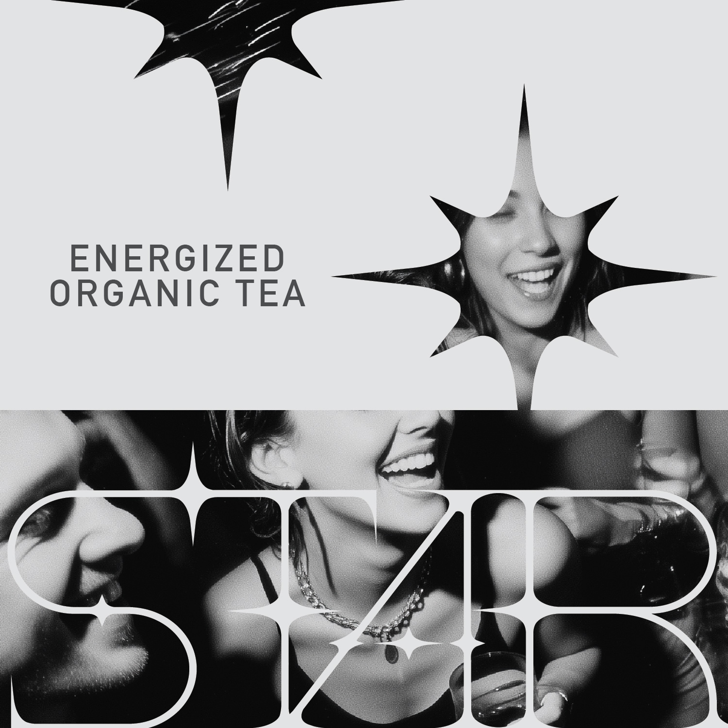
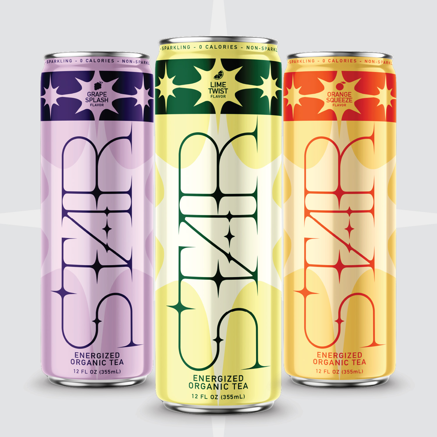
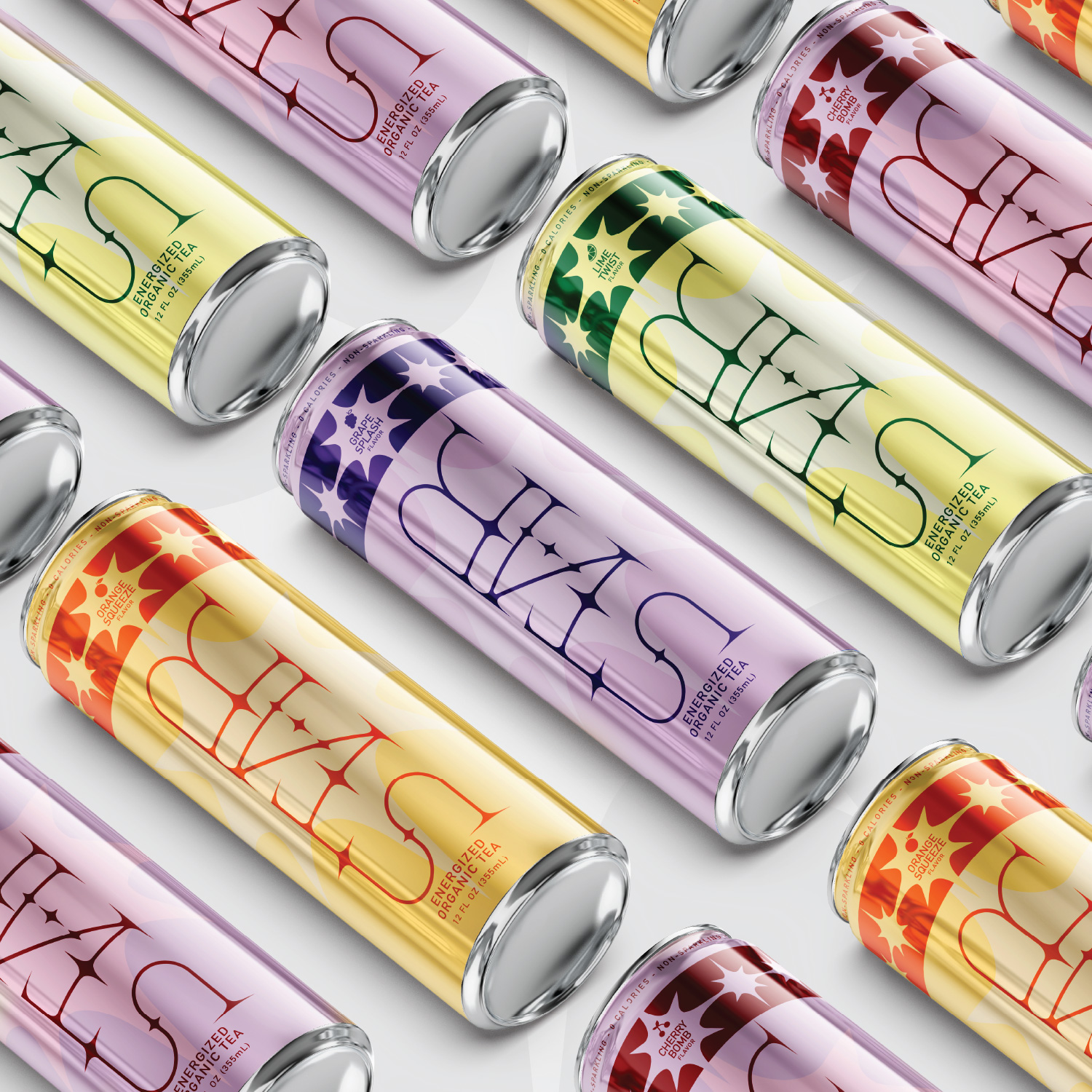
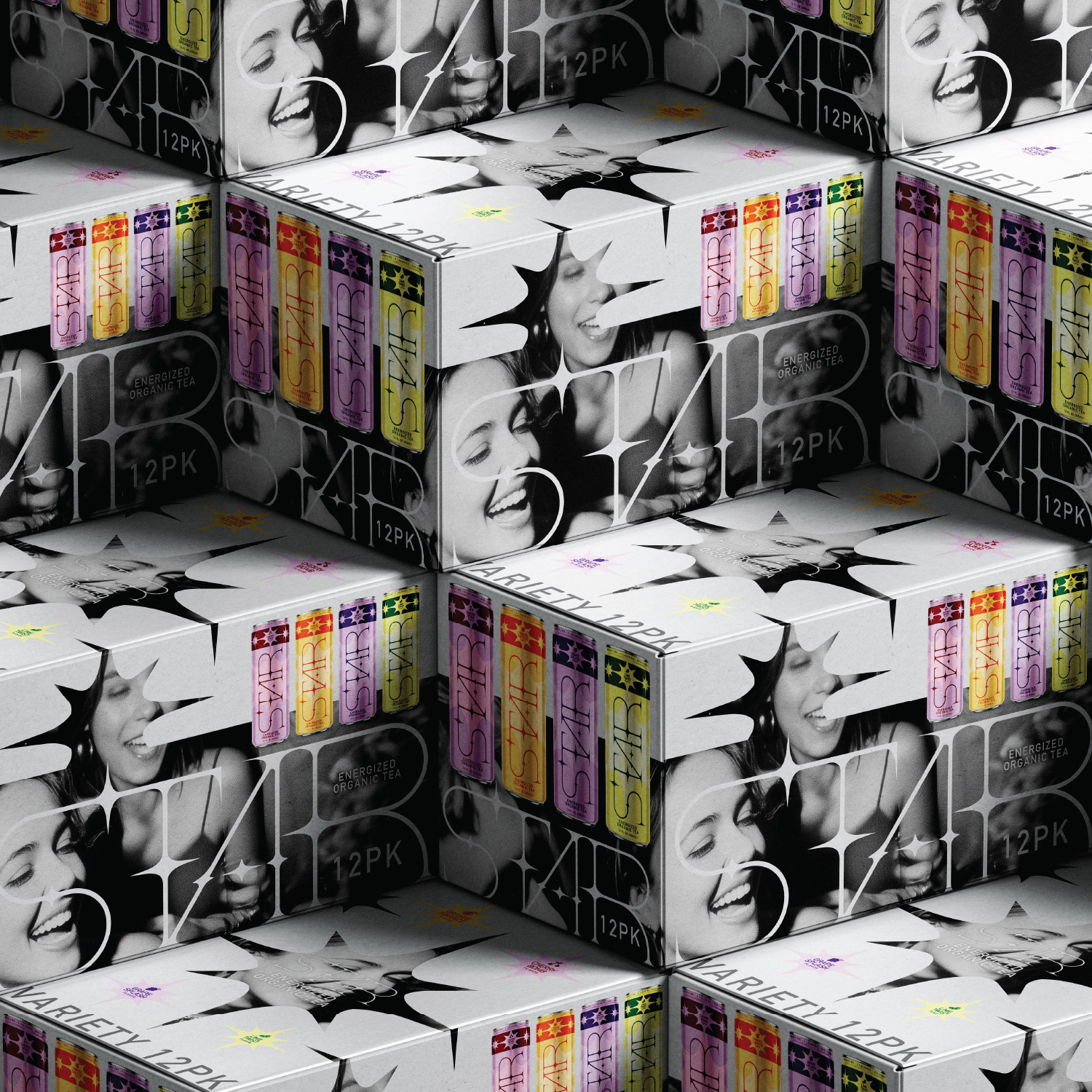
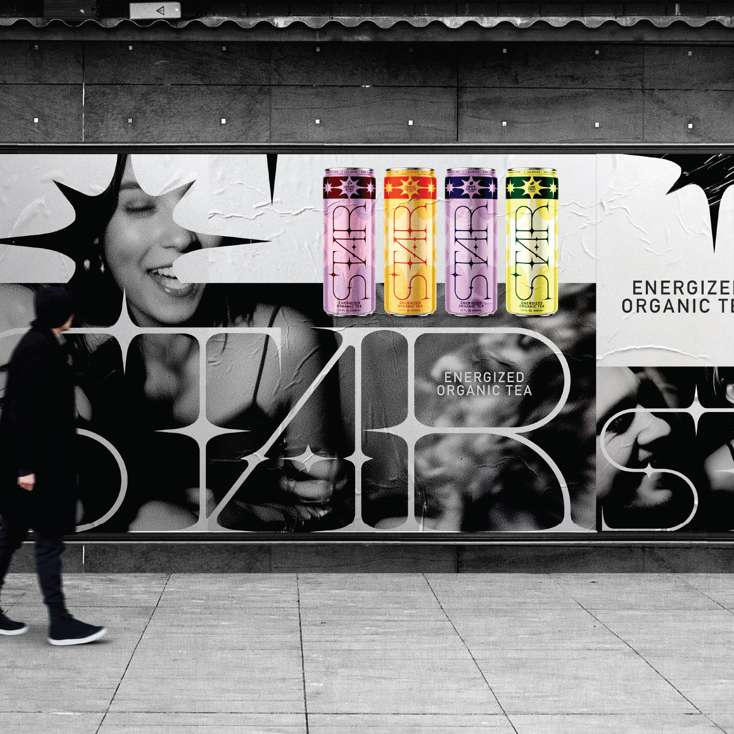
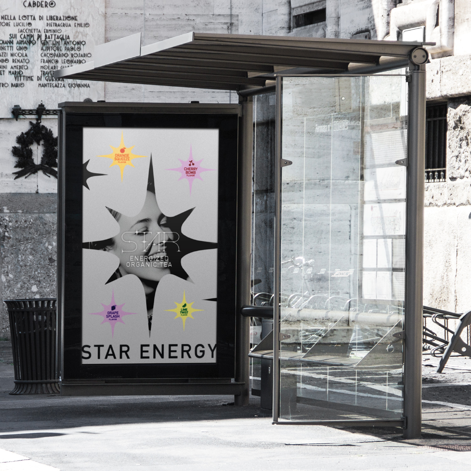
At the center of the identity is the STAR logotype, punctuated by radiant starbursts that symbolize the spark of energy delivered in every can. The vertical orientation of the typography transforms the package into a tall visual beacon, maximizing shelf visibility while maintaining a clean and modern composition.
A luminous gradient color system differentiates flavors across the lineup, creating a vibrant yet cohesive range. These glowing color transitions evoke light and energy while reinforcing the brand’s uplifting personality.
The starburst motif becomes the foundation of the visual language, appearing across flavor markers, packaging patterns, and graphic elements throughout the system. This approach creates a flexible identity that can scale beyond the can itself.
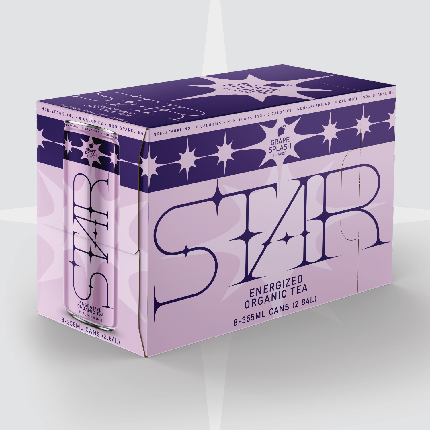
Secondary packaging expands the brand world further. Multipack cartons incorporate high-contrast black-and-white lifestyle photography layered with bursts of color and repeating cans, transforming the packaging into a dynamic retail billboard.
The system also extends naturally into posters, retail graphics, and merchandise, allowing the brand to live beyond the product and build a broader visual culture around the idea of energy and inspiration.
Outcome
STAR demonstrates how the next generation of energy beverages could move beyond the traditional design codes of the category. By combining the brightness and excitement of energy drinks with the clarity and balance of modern wellness products, the concept presents a more **optimistic and design-driven vision for energized beverages.
The result is a brand system that feels bold yet refined, energetic yet approachable, capturing the moment when energy ignites and ideas begin to shine.

CREDIT
- Agency/Creative: Work and Company
- Article Title: Work and Company Introduces STAR with a Fresh Vision for Organic Tea Energy Drink Packaging
- Organisation/Entity: Agency
- Project Type: Packaging
- Project Status: Non Published
- Agency/Creative Country: United States
- Agency/Creative City: NEW YORK
- Market Region: North America
- Project Deliverables: Brand Creation, Brand Identity, Brand Naming, Identity System, Logo Design, Packaging Design
- Format: Box, Can
- Industry: Food/Beverage
- Keywords: drink, beverage, energy, star, cocktail
-
Credits:
Designer: Gene Portnoy


