


Packaging design
1. The Challenge
As you might know, our expertise goes beyond design—we also do naming. Our client was planning to launch a new 1-kilogram ice cream line meant for families and big companies. Initially, we pitched the name “Davras” for this new direction. It’s a catchy word that perfectly captures the vibe of a lively feast and a full table. But as the project evolved, the strategy shifted.
2. The Research
We couldn’t ignore one crucial fact: Basma’s single-serve ice cream had already won the market’s heart and built strong brand loyalty. Spending huge budgets and resources to build a new name from scratch felt like an unnecessary risk. The most logical and profitable move was to stick with the trusted, good old “Basma” brand.
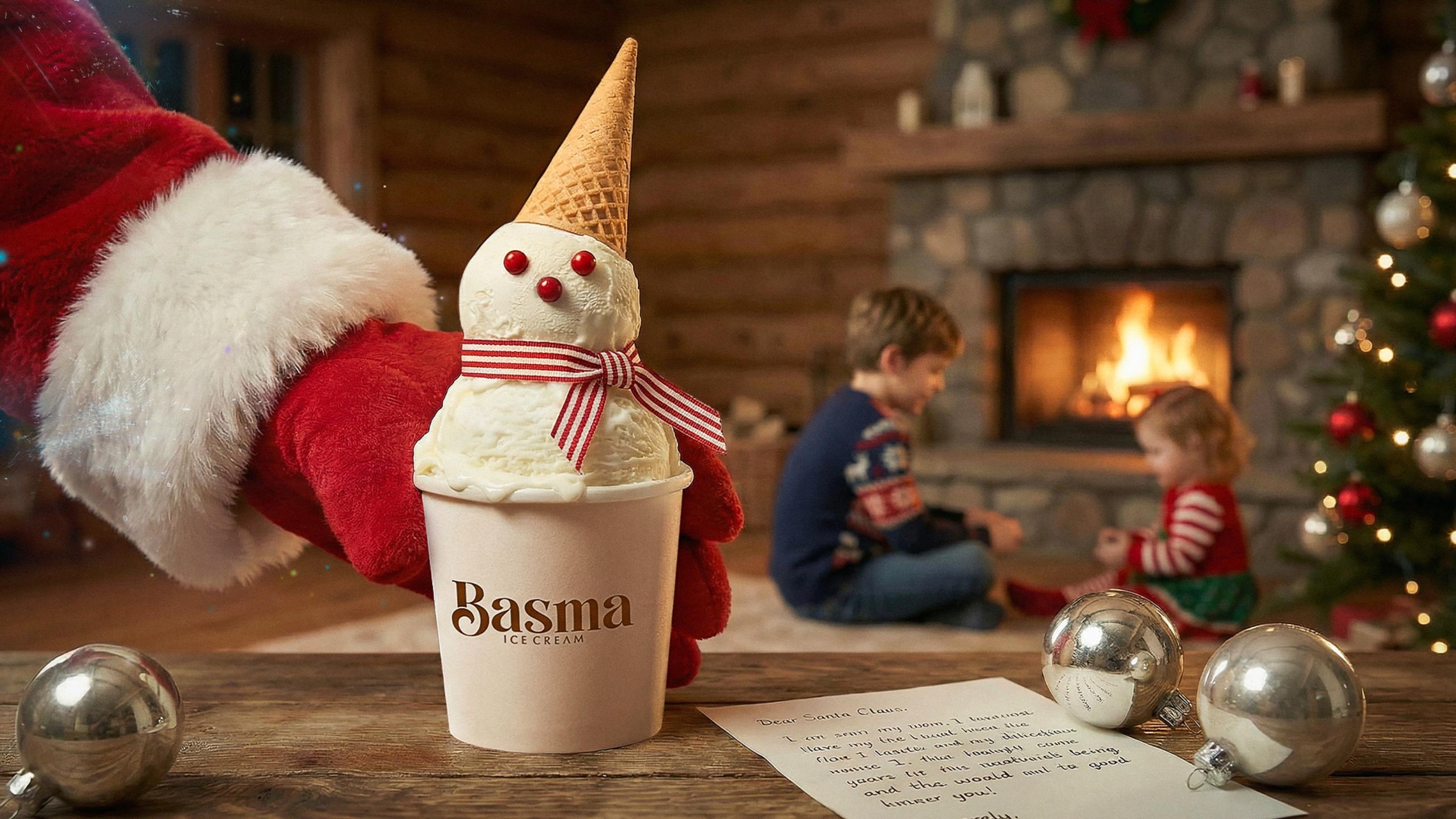
Ice cream isn’t just a dessert; it’s an emotion. Before a customer even picks it up from the freezer, they have to “eat it with their eyes.” After diving deep into the market and consumer psychology, our conclusion was simple: the product must sell itself right off the shelf. The packaging couldn’t just be a protective wrapper; it had to be a mouth-watering showcase that instantly triggers the taste buds.
3. The Solution
We made several bold design choices to reveal the true essence of the product:
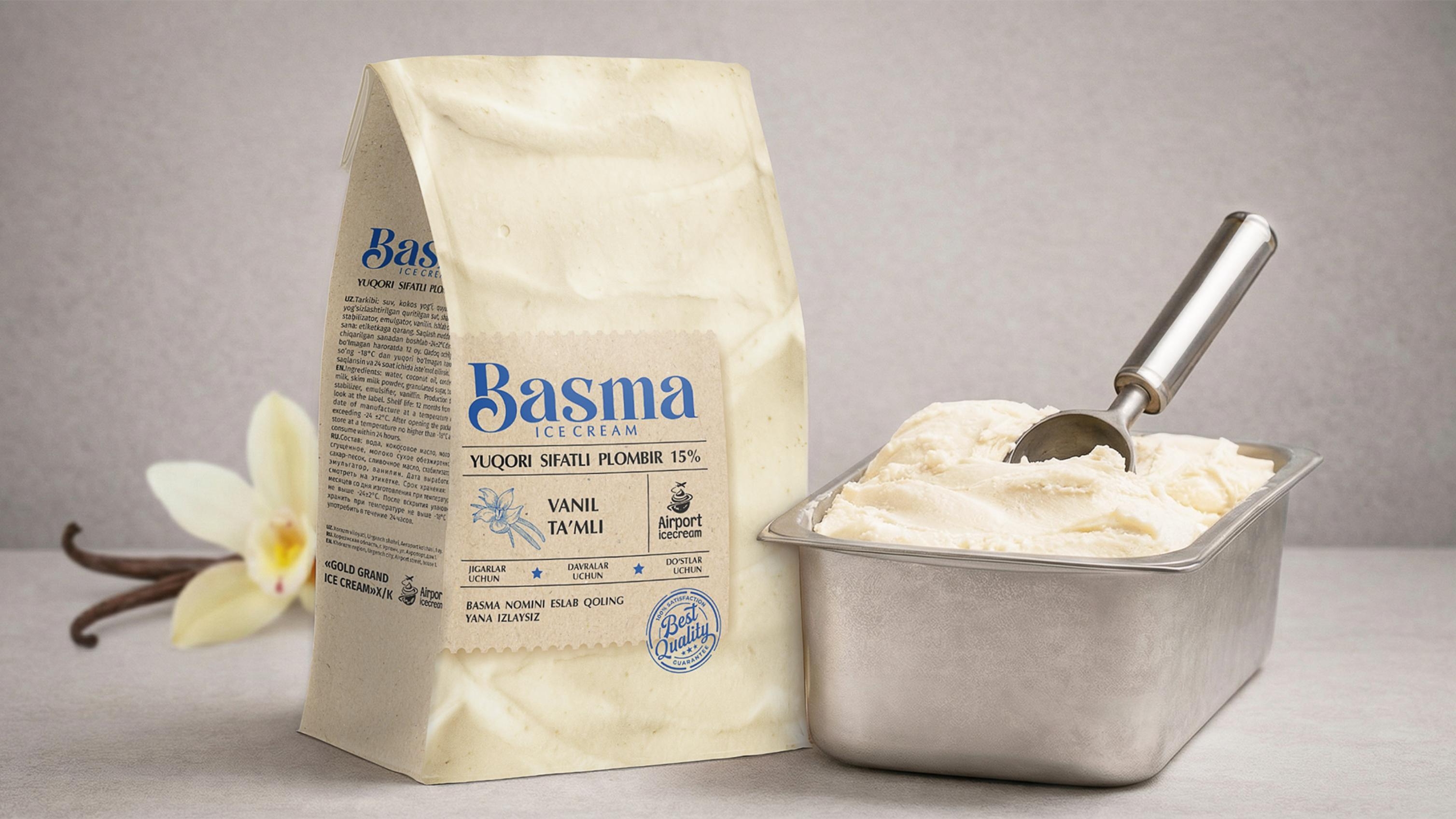
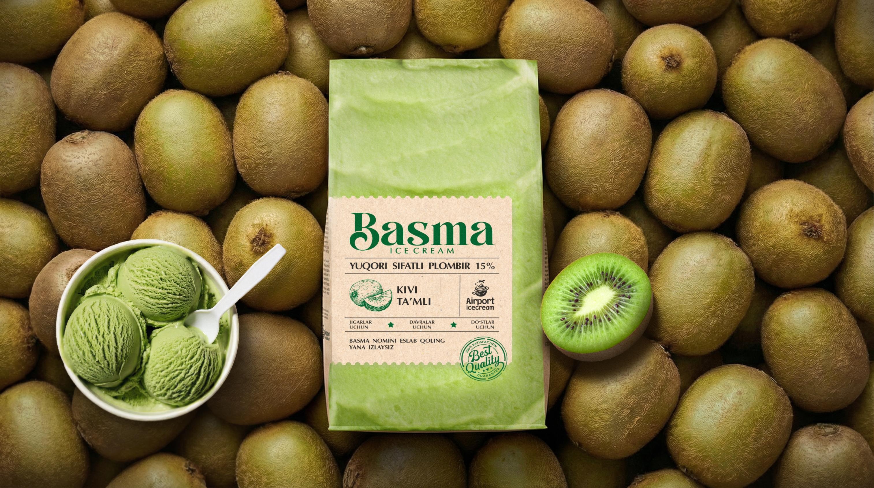
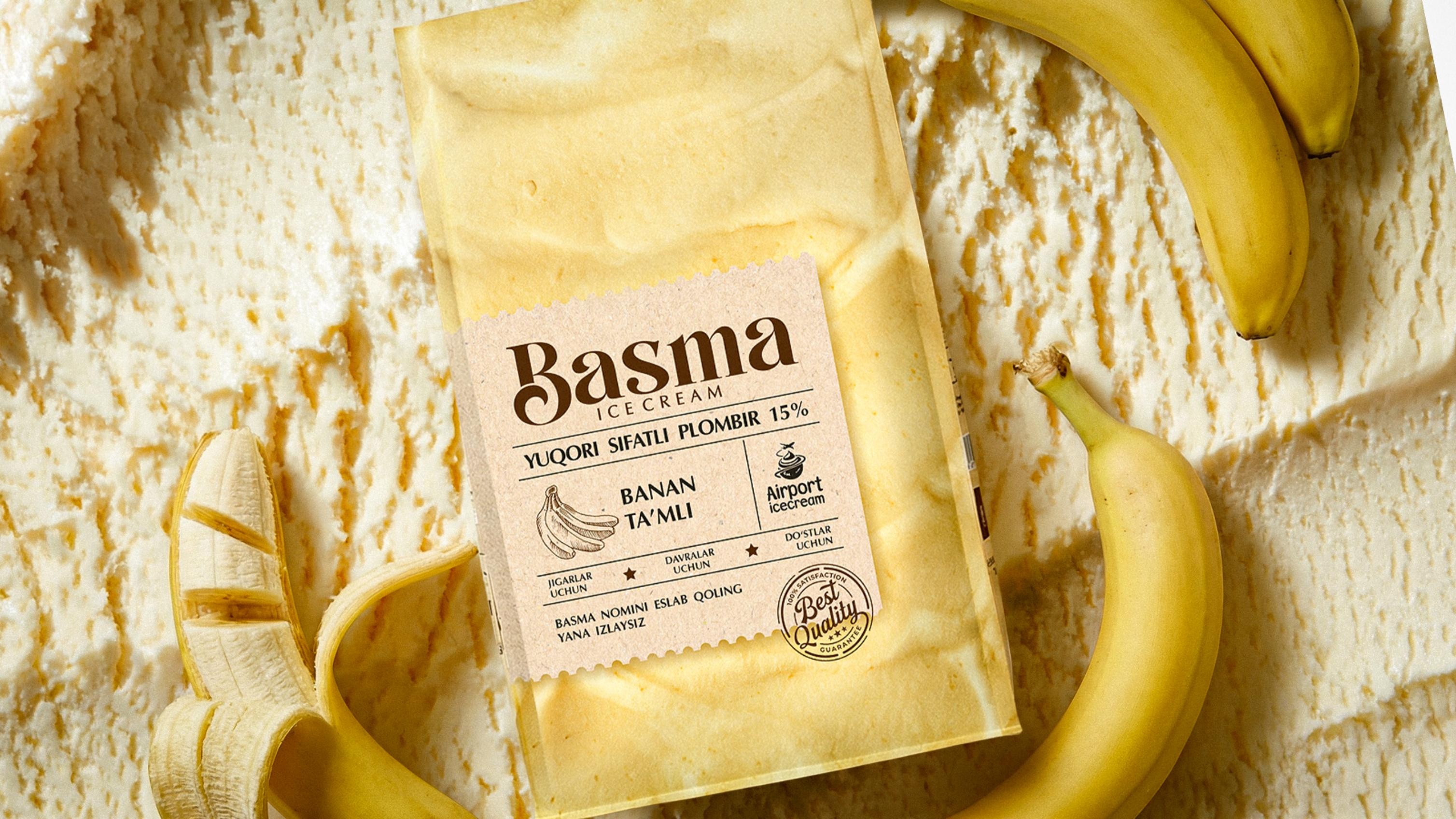
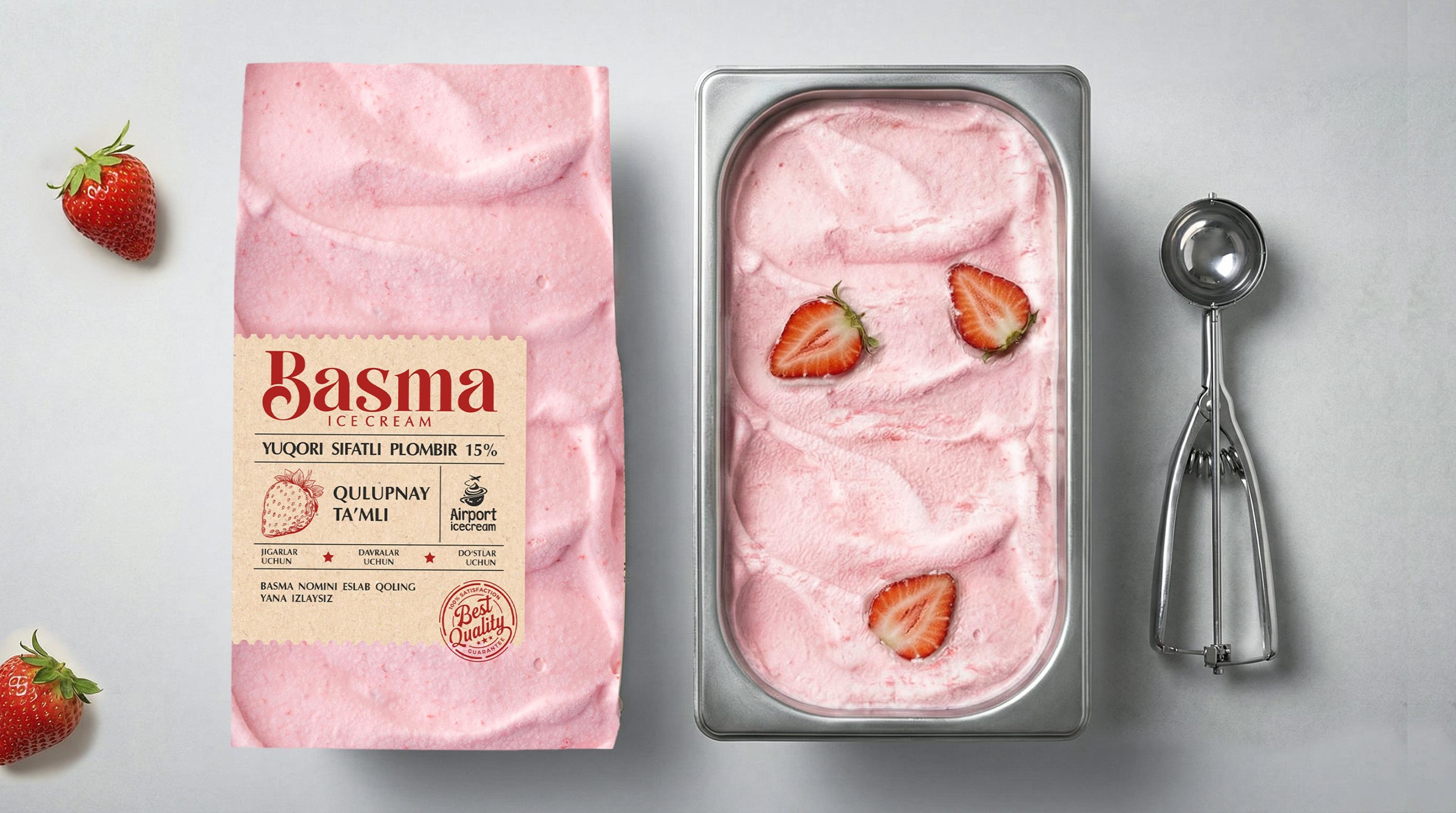
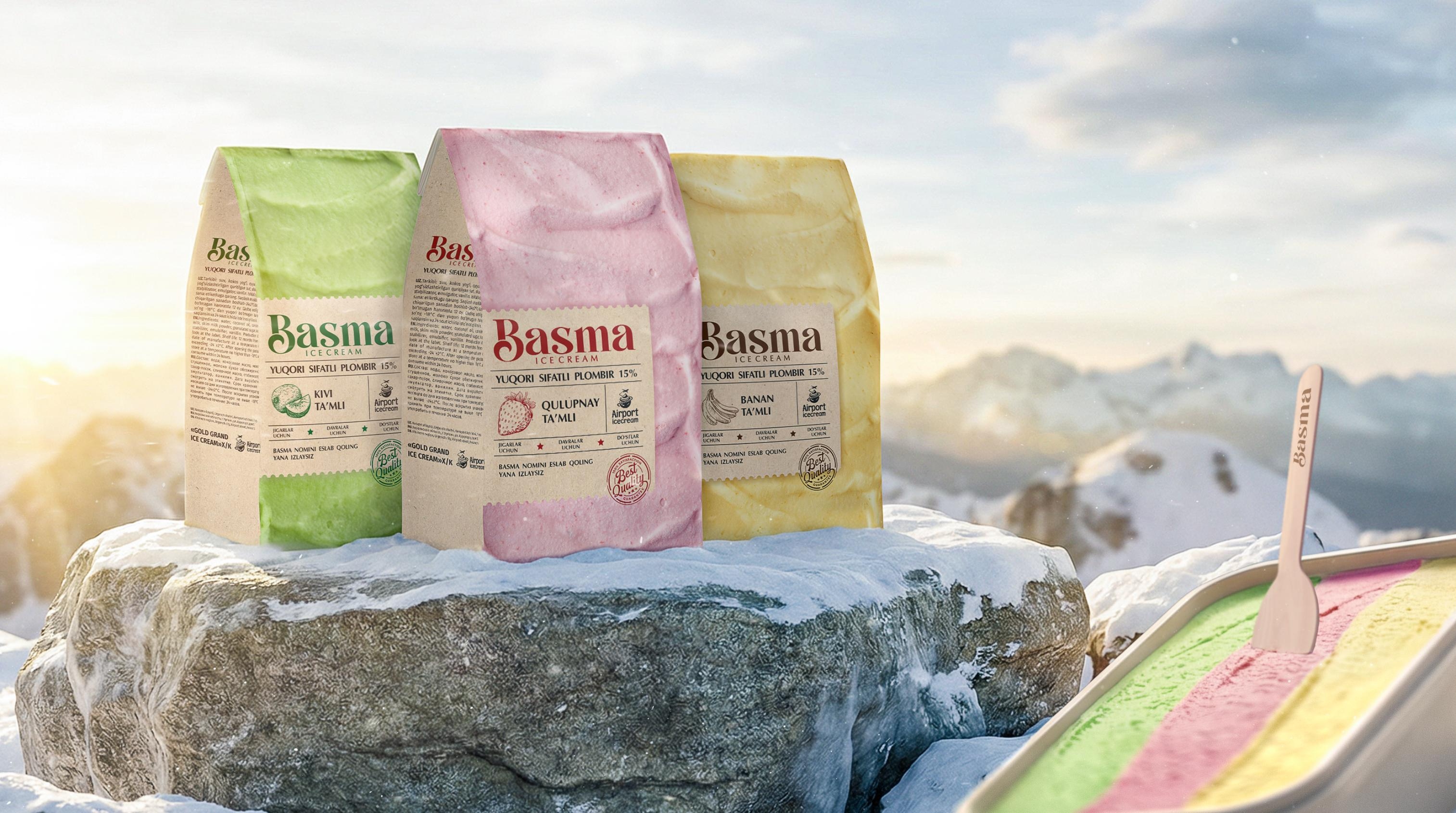
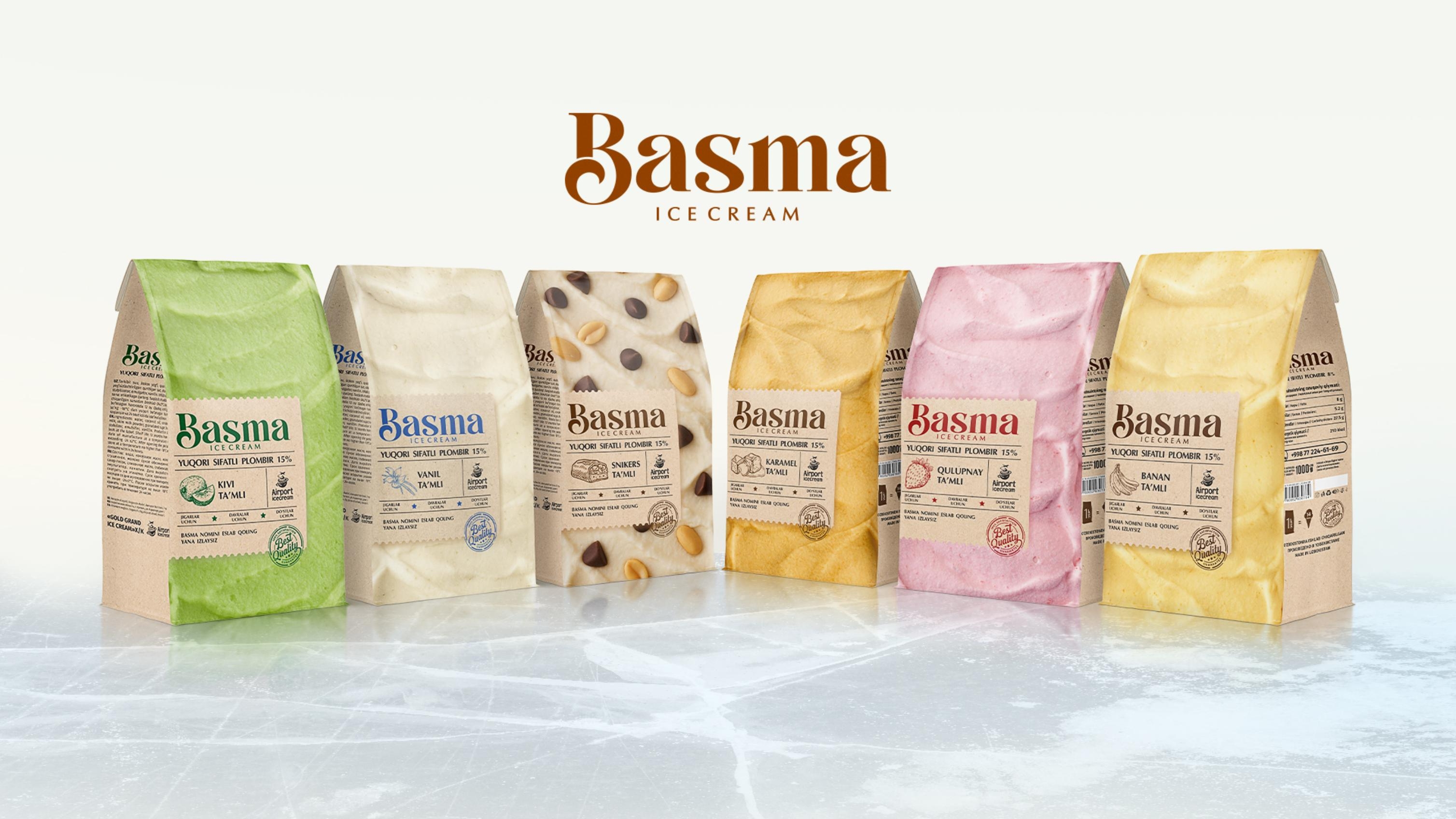
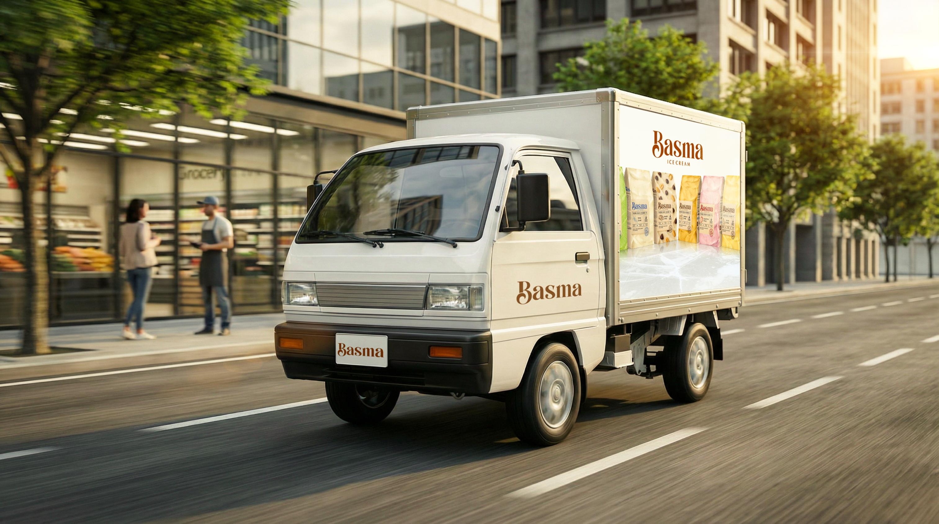
Real texture as the hero: We completely ditched boring, solid-color backgrounds. Instead, we covered the entire packaging with a hyper-realistic, top-down texture of the ice cream itself (whether it’s strawberry, vanilla, or kiwi). As a result, the packaging literally turns into a massive, appetizing scoop! The buyer doesn’t just see a graphic; they see the treat itself.
A focus on naturalness: In today’s era of artificiality, people crave authenticity. That’s why we styled the main info label to look like craft paper. Subconsciously, this sends a warm signal of a handcrafted, clean, and natural product.
The human touch: We custom-drew all the icons and infographics in a hand-written style, as if a calligrapher just sketched them. This stripped away that cold, corporate “stamped” look, bringing life and soul to the design.
The Result
The end result is a design that doesn’t just catch the eye, but makes the customer think: “Wow, they really nailed it!” The harmony between the realistic texture and the natural craft vibe significantly elevated the product’s perceived value. Now, Basma isn’t just a favorite solo treat—it’s the centerpiece of the table for big gatherings and family moments.
Did you enjoy this case study? If your product also needs a powerful design that practically sells itself, we’re right here. Reach out, and let’s discuss your next big project.
CREDIT
- Agency/Creative: Minim Design
- Article Title: Basma – Family-Size Ice Cream Packaging Design by Minim Design
- Organisation/Entity: Agency
- Project Type: Packaging
- Project Status: Published
- Agency/Creative Country: Uzbekistan
- Agency/Creative City: Tashkent
- Market Region: Asia
- Project Deliverables: Packaging Design
- Format: Bag, Pouch
- Industry: Food/Beverage
- Keywords: packaging design, branding, Basma, ice cream packaging, family size ice cream, FMCG design, natural packaging, craft style packaging, ice cream texture design, dessert packaging, brand identity, product positioning, USP, JTBD, consumer experience, marketing, design agency, frozen dessert branding
-
Credits:
Agency: Minim Design


