


The Wild Charm of Trivento’s Wine Gin
Trivento’s Wine Gin was born from the idea of crossing two worlds that don’t usually meet this way: the elegance of wine and the vibrant, refreshing spirit of gin. The result is a new kind of expression — unexpected, contemporary, and full of character — where the energy of White Malbec meets the layered complexity of botanicals.
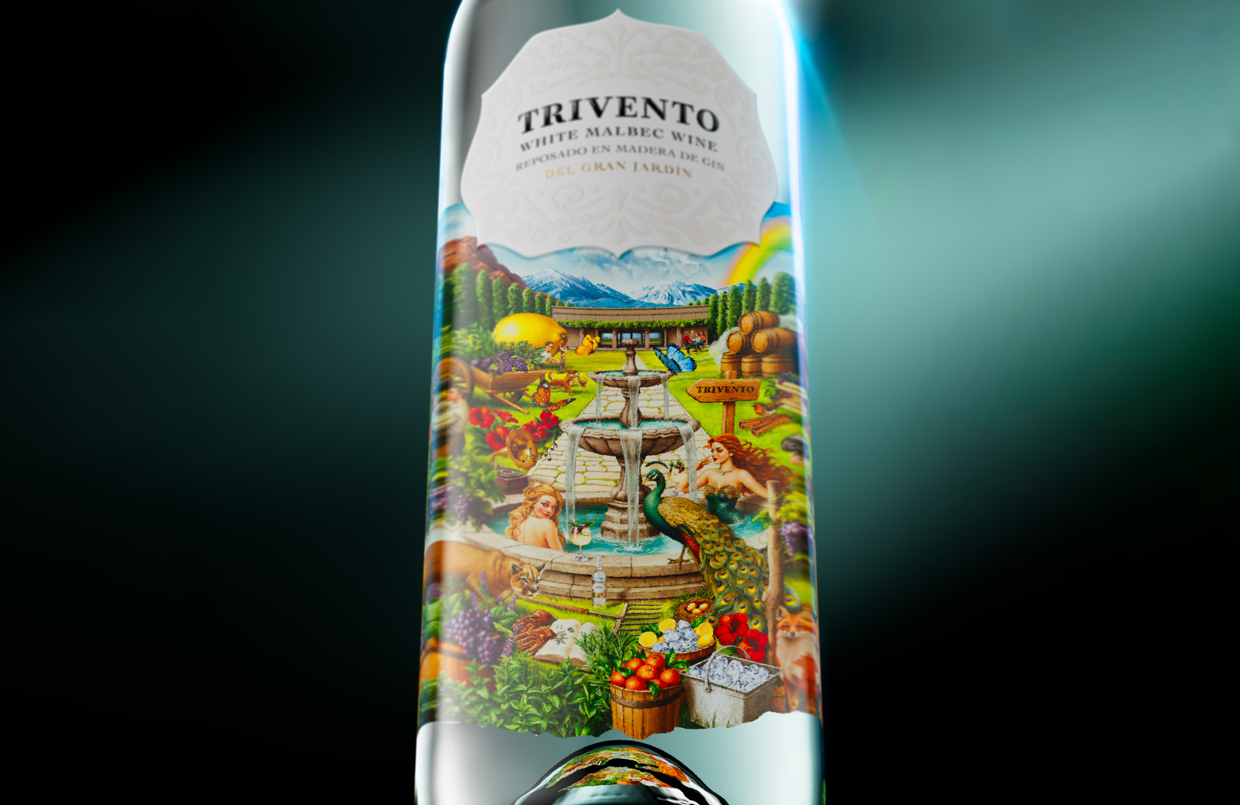
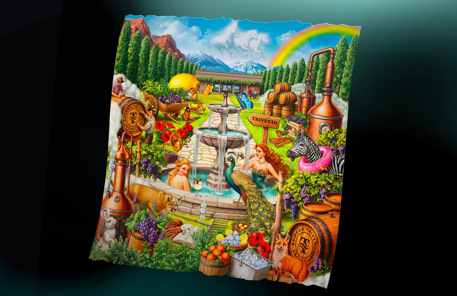
Inspired by the wild charm of Trivento’s Garden, the project moves into a more playful and expressive territory for the brand. Not just in the liquid, but in the way the whole experience is framed. Wine Gin feels fresh, social, slightly untamed, and made for a new kind of ritual: one that is less formal, more versatile, and naturally stylish.
The design challenge was to capture that tension. This wasn’t about making a wine label for a gin, or a gin label with a wine reference. It was about building a visual language for something in between — a product with its own energy, its own tone, and its own way of showing up. Something refined, but not rigid. Distinctive, but still easy and inviting.
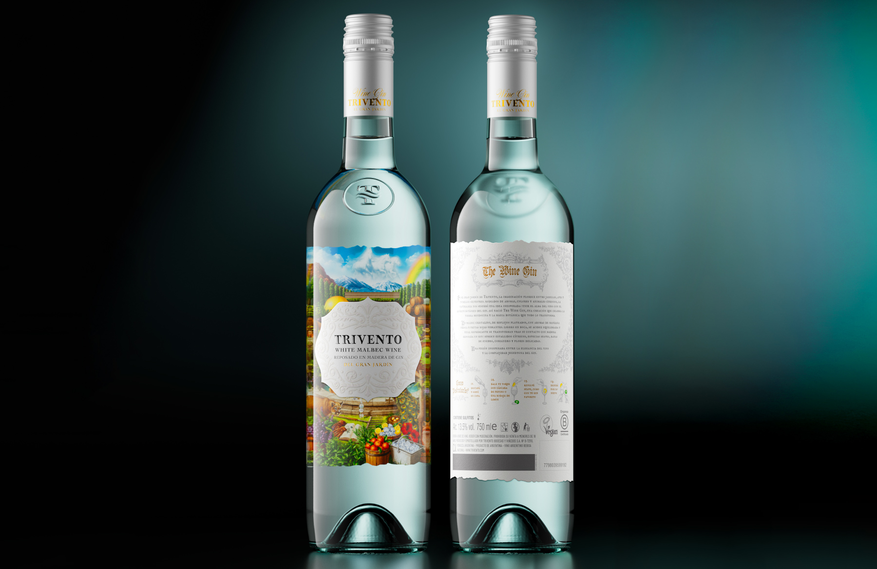
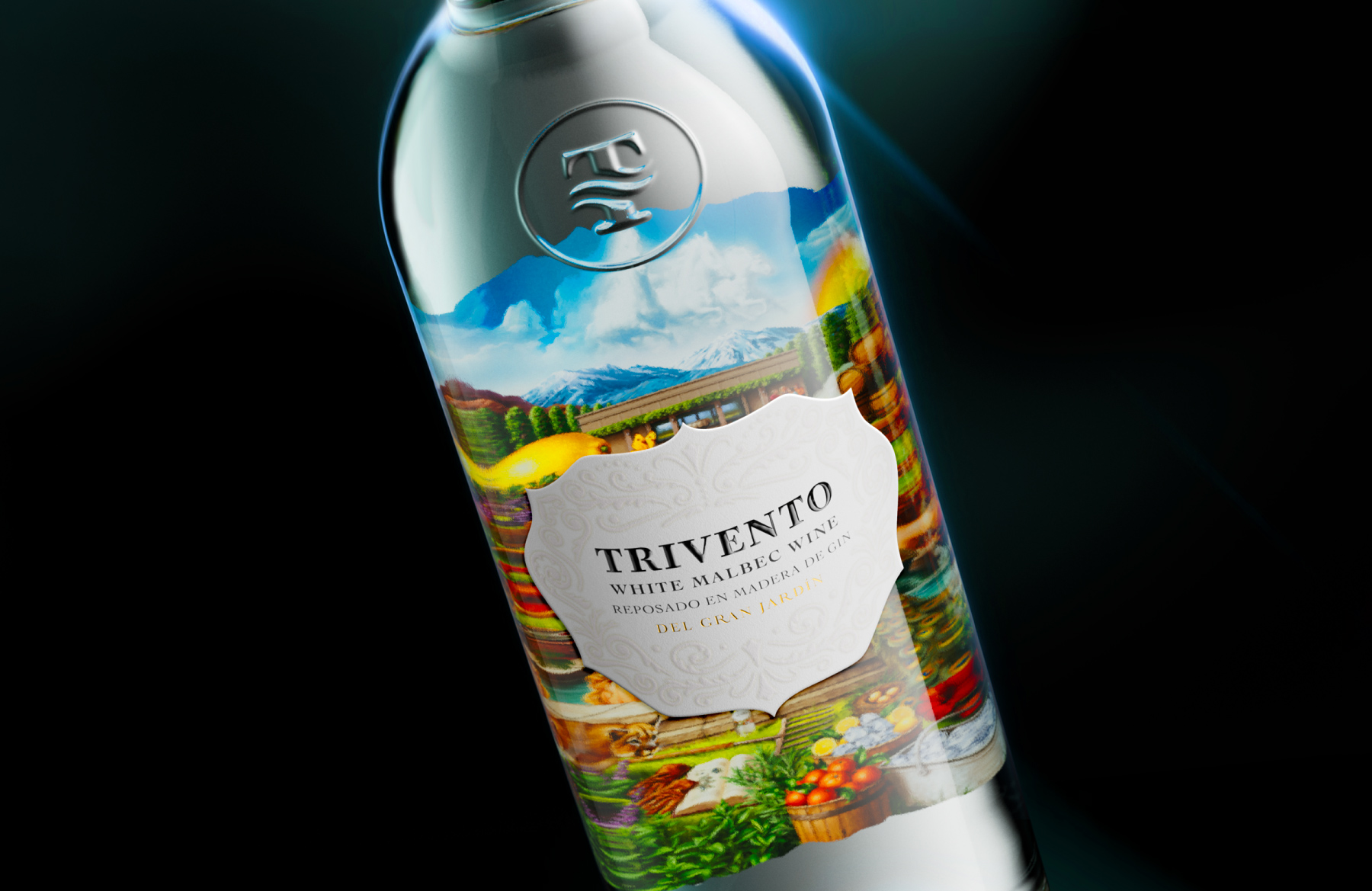
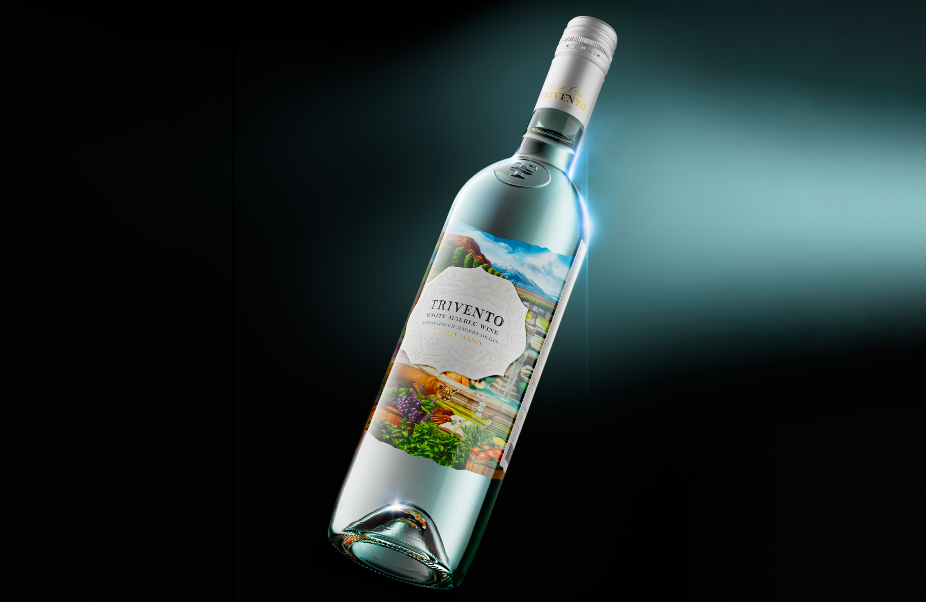
The label was developed as an extension of that idea. Drawing from the atmosphere of a lush, celebratory garden, the visual world feels alive, expressive, and full of movement. There is a sense of spontaneity in the composition, but it is carefully balanced by elegance and structure. The result is a packaging system that feels fresh and rich at the same time — able to communicate sophistication without losing its sense of fun.
More than decoration, the label plays a central role in defining the product’s personality. It helps position Wine Gin as something not bound by the codes of a single category, but free to create its own. A bottle that stands comfortably between wine culture and cocktail culture, heritage and experimentation, polish and energy.
This balance is what gives the project its identity. The liquid introduces a different way of drinking within the Trivento universe, while the packaging gives that idea a memorable face. Together, they create a product that feels expressive, refreshing, and contemporary — designed not only to be tasted, but to be noticed, shared, and remembered.
In that sense, Trivento’s Wine Gin is not simply a fusion of ingredients, but a fusion of moods. A drink shaped by freshness, character, and a certain wild elegance — brought to life through a label that captures the spirit of the garden and turns it into a world of its own.
CREDIT
- Agency/Creative: Jacomy & Mayne Studio
- Article Title: Jacomy & Mayne Studio Designs Trivento Wine Gin With a Visual Language Between Wine and Cocktail Culture
- Organisation/Entity: Agency
- Project Type: Packaging
- Project Status: Published
- Agency/Creative Country: Argentina
- Agency/Creative City: Mendoza
- Market Region: South America, Global
- Project Deliverables: Brand Tone of Voice, CGI, Design, Illustration, Packaging Design, Tone of Voice
- Format: Bottle
- Industry: Food/Beverage
- Keywords: wine, gin, trivento, jacomy, mayne, jacomy mayne, jacomy & mayne, illustration, white wine, malbec, white malbec, packaging, studio, design, label, label design
-
Credits:
Creative Director: Roy Mayne
Designer: Roy Mayne
Account Director: Andres Jacomy


