


About the Brand
Meynmai was created with the idea of promoting natural nutrition and wholesome living. The brand focuses on delivering traditional health mixes and food products that support a balanced and healthy lifestyle.
In today’s fast-paced world, people increasingly look for food that combines authentic ingredients with modern convenience. Meynmai responds to this need by bringing together traditional nourishment and contemporary product presentation.
The brand name itself reflects purity and authenticity. Meynmai represents honesty in ingredients, simplicity in preparation, and trust in quality. The goal was to position the brand as a reliable choice for families looking for healthy food alternatives rooted in traditional nutrition.
Branzone Creative partnered with the brand to develop an identity that communicates natural goodness, trust, and strong shelf presence.
Design Process
The design process focused on creating a visual identity that clearly reflects the brand’s core values of health, authenticity, and warmth.
The first step was understanding the category. Health mix products often rely heavily on traditional cues, but they also need to appear clean and trustworthy to modern consumers.
The design direction was built around three principles:
• Natural ingredients
• Traditional nourishment
• Modern brand clarity
To achieve this balance, the design system uses simple structures and bold visual elements that help the product stand out while maintaining a sense of authenticity.
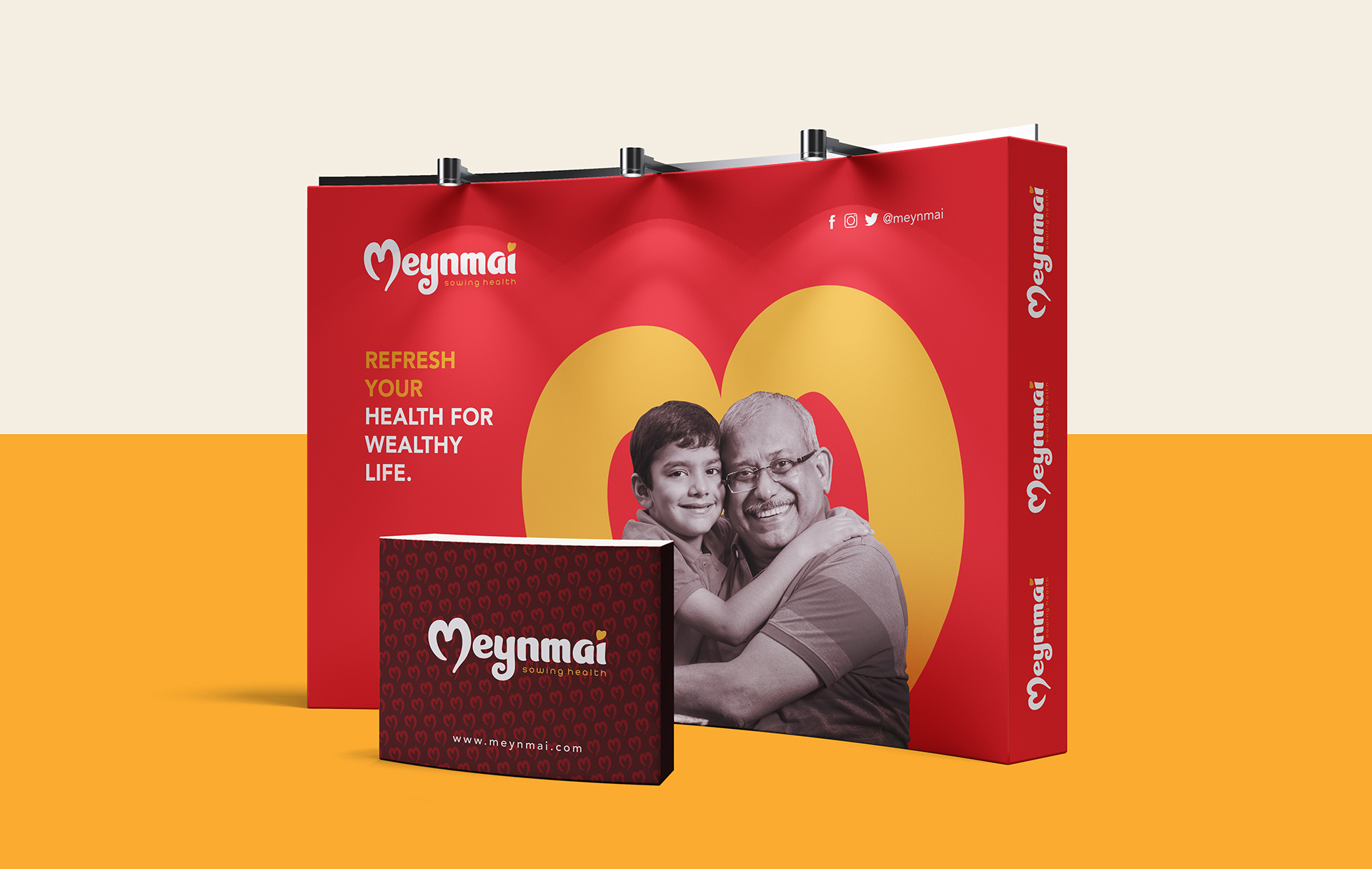
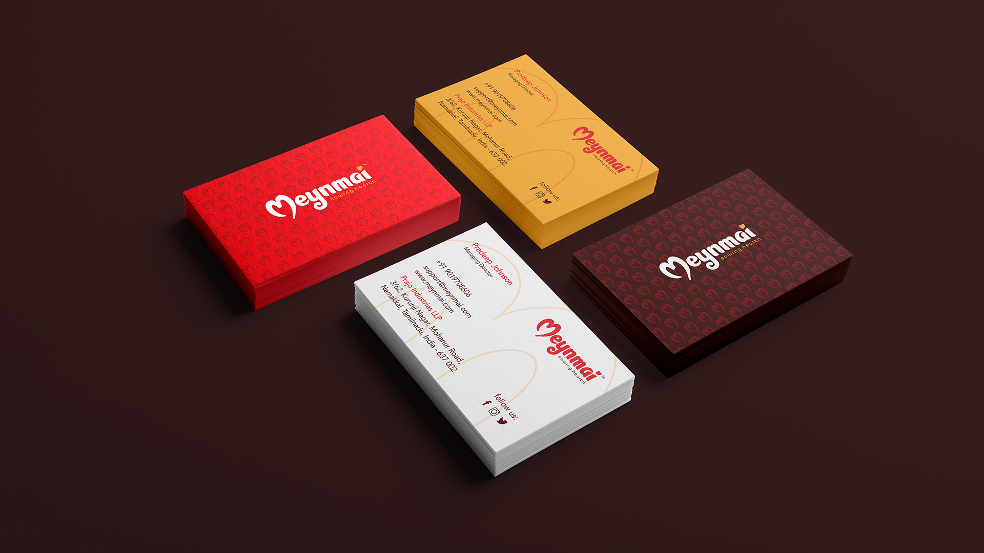
Special attention was given to the packaging layout to ensure clarity of product information, strong shelf visibility, and a consistent brand presence across product variants.
Visual Identity
The Meynmai visual identity reflects warmth, nourishment, and authenticity.
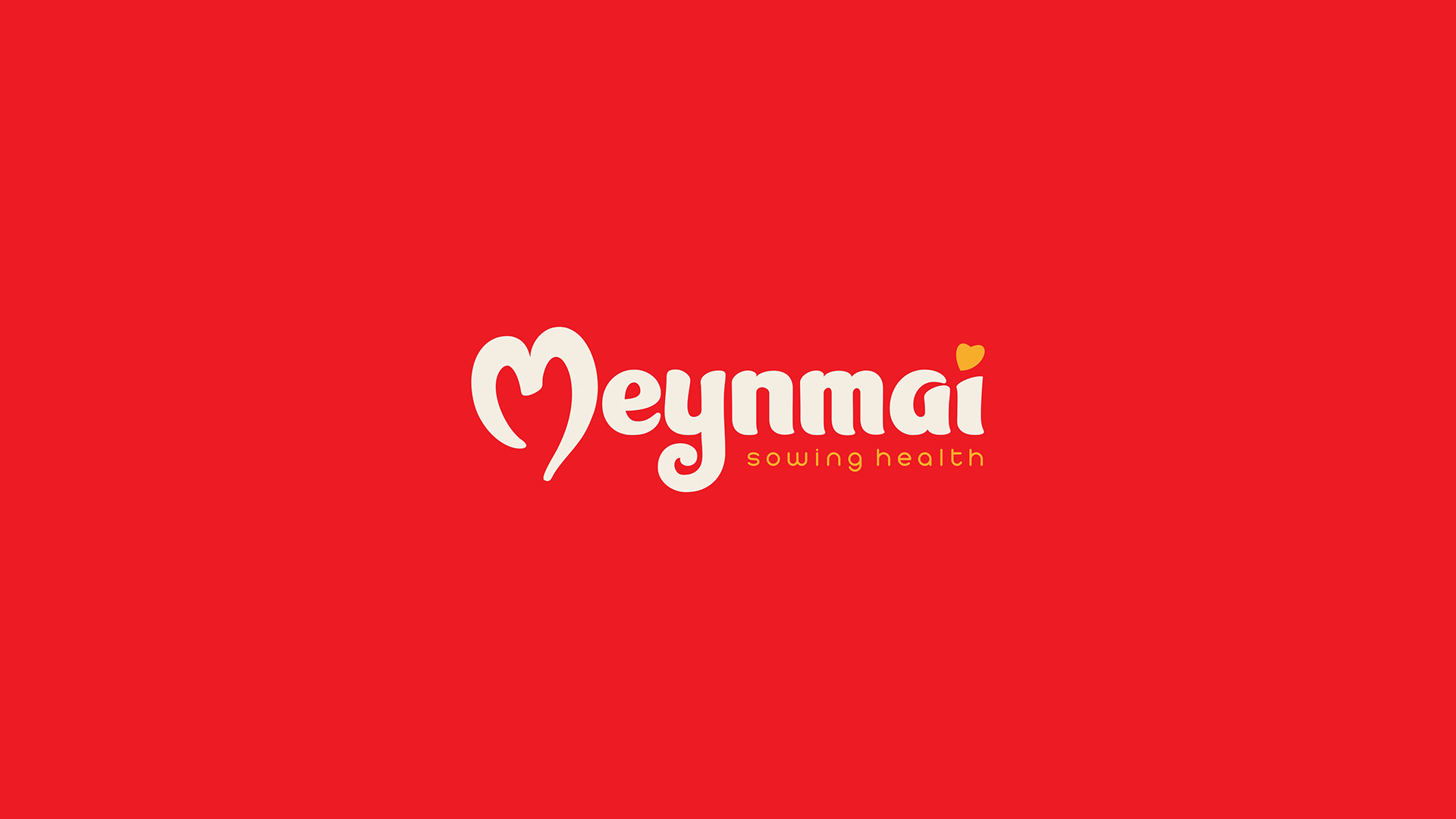
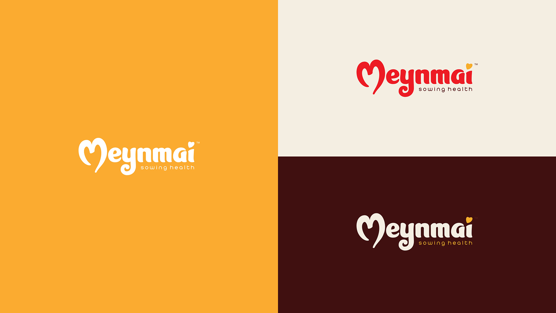
The logo is designed to feel approachable and trustworthy, representing a brand rooted in natural ingredients and honest preparation. The typography carries a strong yet friendly tone, reinforcing the idea of a dependable food brand.
The color palette uses rich, earthy tones combined with warm highlights to represent grains, natural ingredients, and wholesome food traditions. These colors help the packaging feel vibrant while maintaining a strong connection to natural nutrition.
Packaging elements were designed to maintain clarity while visually communicating freshness and quality. The structured layout ensures that the brand name, product information, and ingredient cues are immediately visible.
Supporting visual elements and patterns help build a consistent brand language across packaging, marketing materials, and digital communication.
Outcome
The final identity positions Meynmai as a brand that celebrates natural nutrition while maintaining a modern market presence.
Through a balanced combination of strong branding, thoughtful packaging, and clear visual communication, Meynmai now stands as a recognizable and trustworthy health food brand.
The identity system allows the brand to expand into multiple product lines while maintaining consistency and recognition across retail shelves and digital platforms.


CREDIT
- Agency/Creative: Branzone Creative
- Article Title: Meynmai: Packaging Design for a Natural Nutrition Brand by Branzone Creative
- Organisation/Entity: Agency
- Project Type: Identity
- Project Status: Published
- Agency/Creative Country: India
- Agency/Creative City: CHENNAI
- Market Region: Asia
- Project Deliverables: Brand Design, Brand Identity, Packaging Design
- Industry: Food/Beverage
- Keywords: Food package design, brand identity design, logo design
-
Credits:
Creative Director: Suman M


