


Diwine — Brand Creation for a Wine Line
Where We Started
With wine, of course.
But since we’re data-driven creatives, the real starting point was conversations with people who regularly buy wine. We wanted to understand how our audience perceives the category — what they pay attention to and what actually creates friction when choosing a bottle. What we discovered was simple: most wine brands talk about themselves almost exclusively through the product. They describe flavor profiles, production techniques, regions of origin. For consumers, this has become the standard set of information — and it rarely influences the decision. People expect something more alive from wine communication. Yes, they want to know the wine tastes good. But just as importantly, they want the brand to carry a story — something worth sharing while everyone gathers around the table. So we decided to dig deeper than product attributes when defining the strategic message. Strategy & Naming Looking into wine’s cultural and historical role, we noticed an intriguing pattern. Wine has always existed at the border of two worlds. It belonged both to gods and to everyday human life. It brought together opposites — purity and sin, sacredness and indulgence. This observation became the foundation of the brand idea: wine as the fine line where the divine and the earthly coexist. The name Diwine emerged from a play on the word divine. It carries the sound of something heavenly, but also hints at a subtle provocation. A reminder that within every divine moment there is always something deeply human. With that, the brand gained a narrative that reaches beyond the wine category and speaks about human nature itself. Design Approach
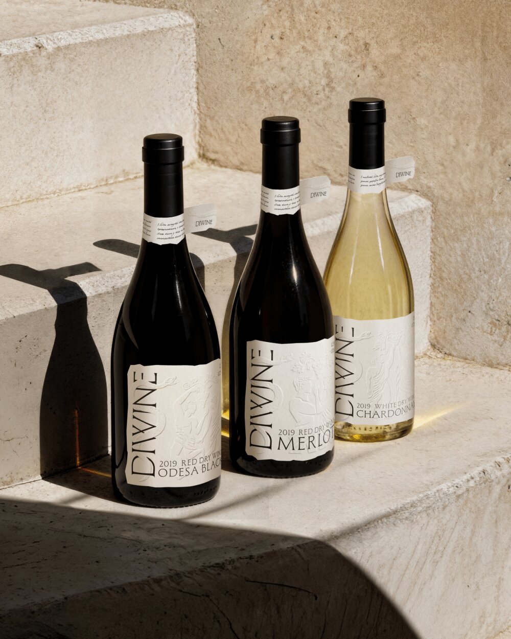
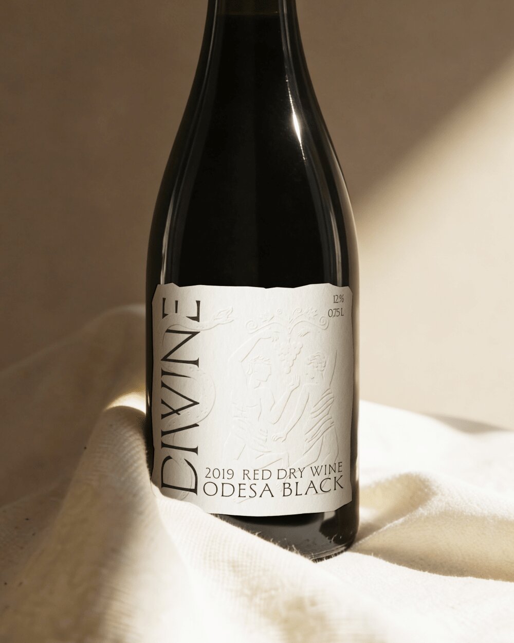
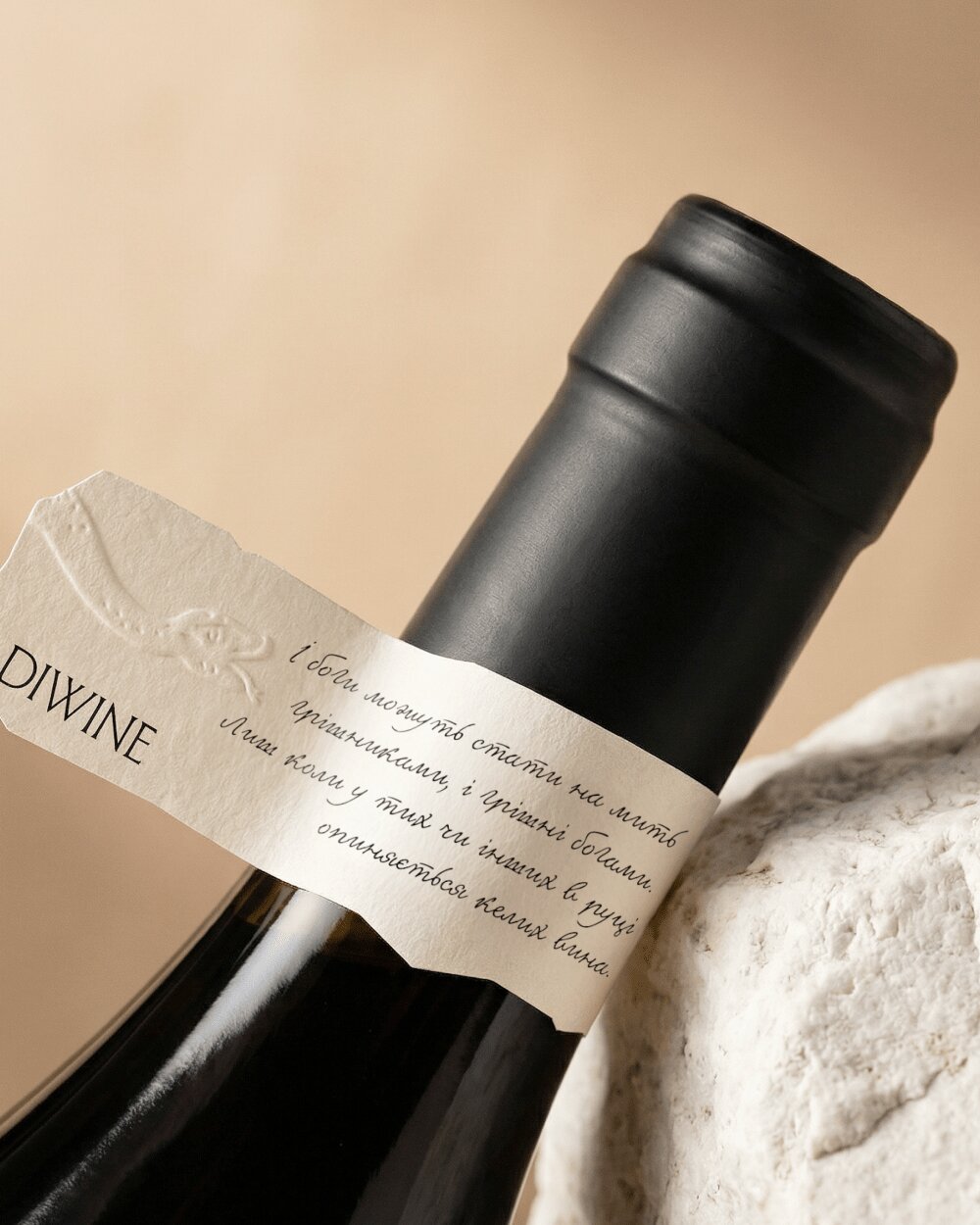
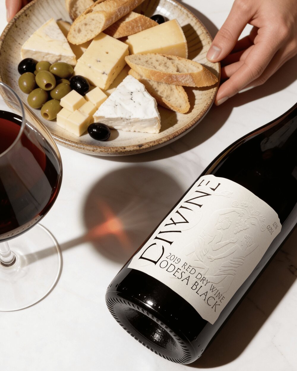
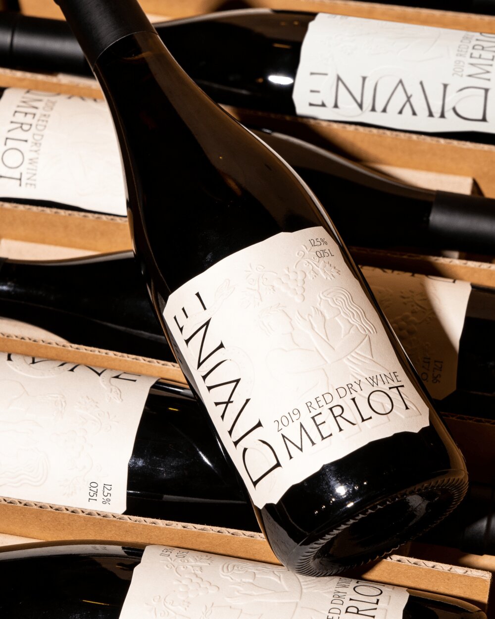
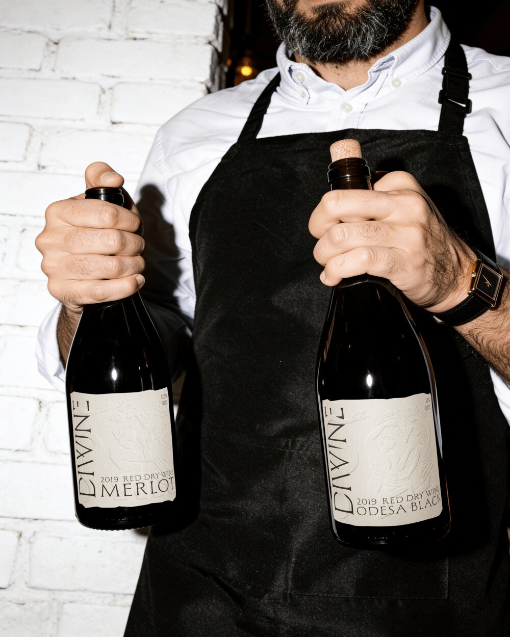
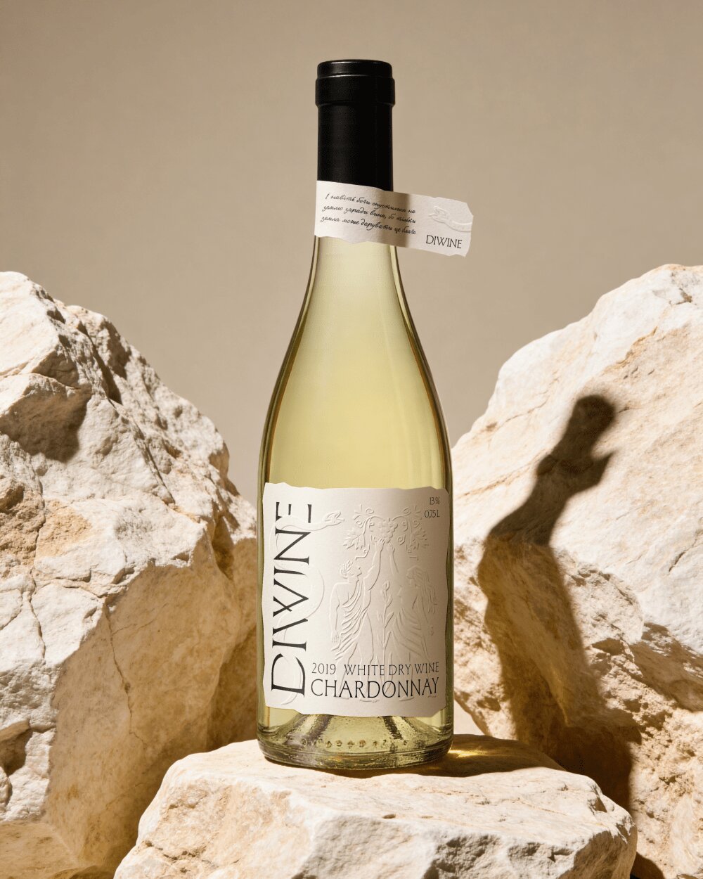
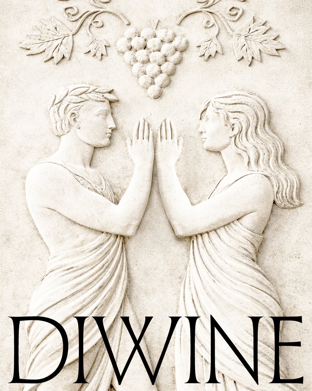
In the visual language, we aimed to reveal the story born during the strategy phase The label sits on a light, neutral background that resembles a fragment of stone or an ancient slab carved with history. The intention was to create the feeling that the brand wasn’t invented from scratch — but rather rediscovered as part of an old cultural layer. Illustrations are present, yet they don’t reveal themselves immediately. The scenes appear gradually when light hits the bottle at a different angle or when someone looks closer. The characters in these scenes remain deliberately ambiguous. It’s impossible to say whether they are gods or people. This uncertainty is precisely what connects the two worlds. The Diwine logo draws inspiration from typefaces used in ancient Roman inscriptions once carved into stone. At the same time, it maintains clarity and versatility across applications. Another storytelling element is the neck label, featuring copy that expands on the narrative of the divine and the earthly. It wraps around the bottle like a small manuscript.
P.S. We’ve long wanted to work with wine and create something thoughtful and layered. This project confirmed our hypotheses from the research stage and resulted in a brand that sparks conversation, invites reflection, and speaks about people as carriers of both something noble and something deeply human. A quiet harmony of opposites — just like wine itself.
CREDIT
- Agency/Creative: Bloom Büro
- Article Title: Bloom Büro Creates Diwine With Stone Slab Label Design and Light Revealed Illustrations
- Organisation/Entity: Agency
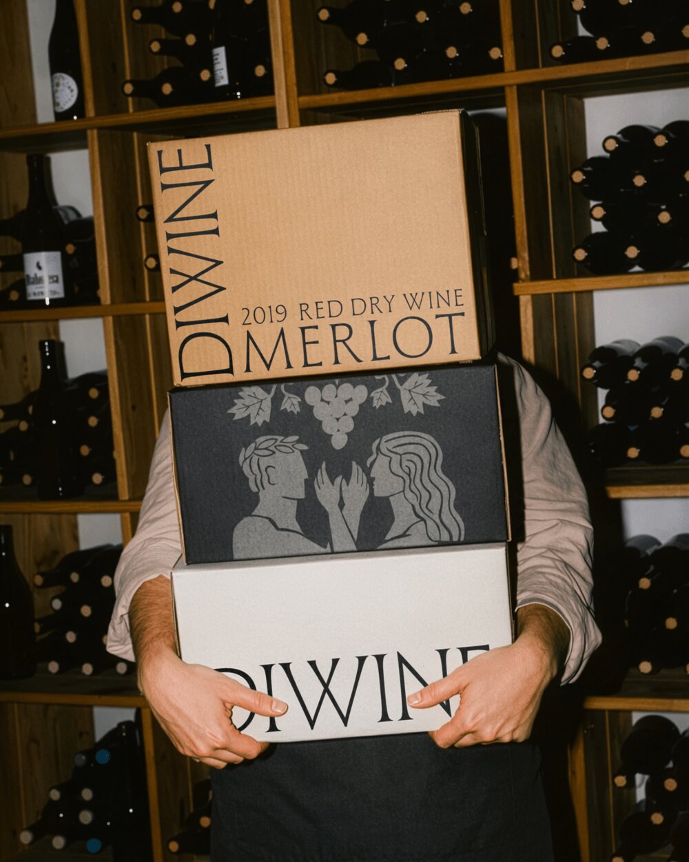
- Project Type: Packaging
- Project Status: Published
- Agency/Creative Country: Ukraine
- Agency/Creative City: Lviv
- Market Region: Europe
- Project Deliverables: Brand Naming, Brand Strategy, Label Design, Packaging Design
- Format: Bottle
- Industry: Food/Beverage
- Keywords: wine branding, wine packaging design, brand strategy, naming, label design, premium wine, storytelling branding, alcohol packaging, wine label, visual identity, FMCG branding, packaging design, concept-driven branding, luxury packaging, cultural storytelling
-
Credits:
Art Direction: Oleksandra Bobak
Graphic Design: Julie Grechukh
Brand Strategy & Naming: Elza Sagura
Project Management: Marta Tynna


