


For La Maison du Lapin, Klay Create explored how the familiar charm of a traditional Parisian bakery could be reimagined through a more expressive and contemporary visual language.
While classic pâtisseries often rely on delicate pastels and predictable layouts, this concept intentionally introduces stronger contrasts and graphic elements to create a brand that feels both rooted in tradition and visually disruptive.
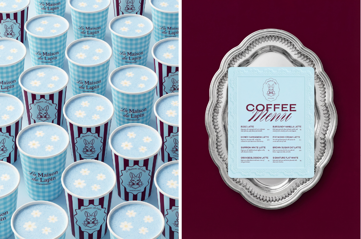
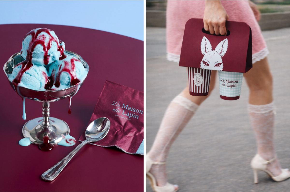
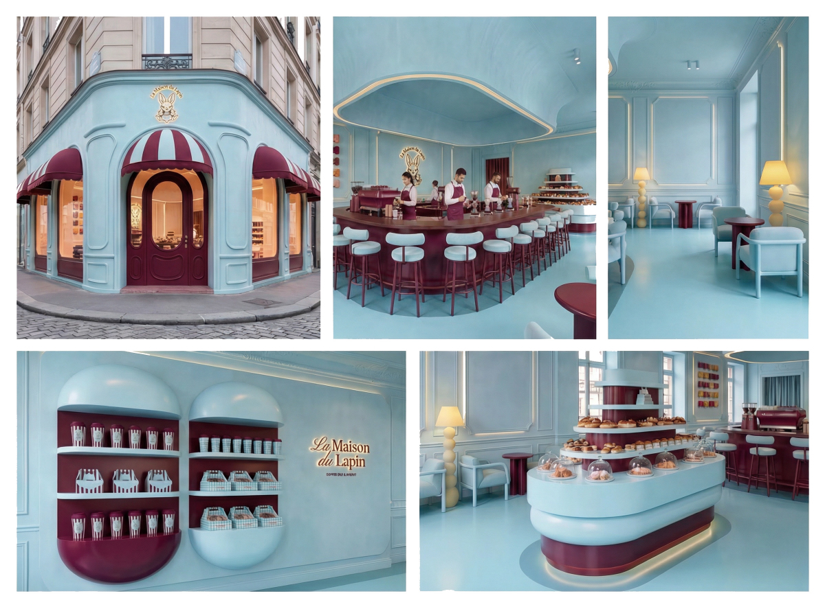
One of the most distinctive features of the identity is the use of bold striped patterns. Inspired by traditional French café awnings and pastry shop facades, the stripes are reinterpreted as a graphic system that appears across packaging, interiors, and brand materials. The pattern creates rhythm and movement while reinforcing the brand’s playful personality.
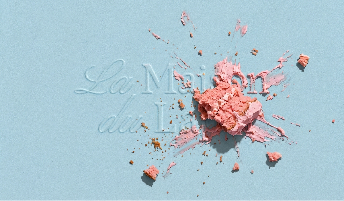
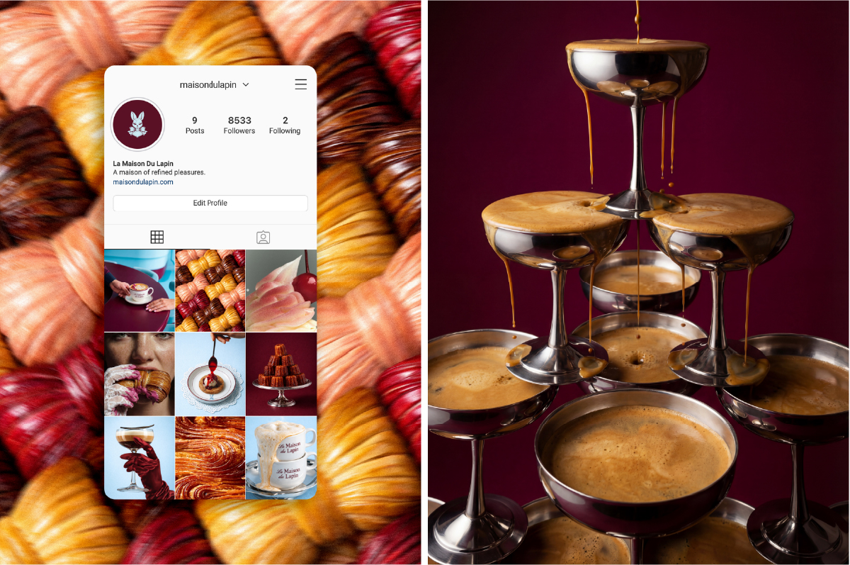
The color palette further amplifies this visual energy. Instead of the muted tones typically associated with bakery branding, the design embraces a confident combination of rich and contrasting colors. This choice allows the brand to stand out both in physical retail environments and across digital platforms, making the visual identity immediately recognizable.
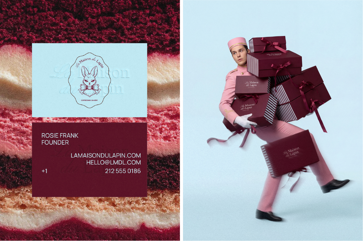
At the center of the brand universe sits the lapin, the rabbit mascot that gives the bakery its name. Rather than functioning as a simple logo element, the rabbit becomes a narrative device that adds character and memorability to the brand. Its presence introduces a subtle sense of storytelling while maintaining a refined aesthetic that aligns with the bakery’s premium positioning.
The concept also extends into interior design, where the identity translates into a physical space that feels immersive and cohesive. Graphic elements, color blocking, and branded surfaces transform the bakery into an environment where packaging, architecture, and visual identity operate as a single experience. The result is a space that feels vibrant, modern, and instantly recognizable.
Through this project, Klay Create demonstrates how a classic cultural institution like the Parisian bakery can evolve without losing its charm. By combining bold graphic elements, a distinctive mascot, and an immersive visual system, La Maison du Lapin becomes more than a bakery concept, it becomes a playful yet sophisticated brand universe.
CREDIT
- Agency/Creative: Klay Create
- Article Title: Klay Create Reinvents the Parisian Pâtisserie Experience with La Maison du Lapin
- Organisation/Entity: Agency
- Project Type: Identity
- Project Status: Published
- Agency/Creative Country: United States
- Agency/Creative City: Sheridan
- Market Region: North America, Global
- Project Deliverables: Art Direction, Brand Design, Brand Identity, Brand Mark, Creative Direction, Packaging Design
- Industry: Food/Beverage
- Keywords: Bakery Branding, Food Branding, Brand Identity, Packaging Design, Hospitality Branding, Parisian Bakery, French Bakery, Mascot Branding, Character Design, Pattern Design, Retail Branding, Interior Branding, Contemporary Branding
-
Credits:
Art Director: Rita Saaidi


