


Barely’s Intimate Renew Moisturiser is thoughtfully designed around the principles of subtlety, confidence, and care. Every element of the packaging reflects a deep understanding of intimacy – where softness meets strength, and minimalism communicates trust. The design language is intentionally restrained, allowing the product to speak with quiet assurance rather than loud claims.
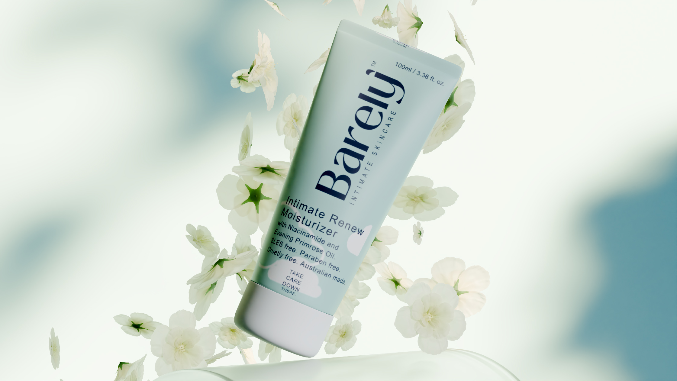
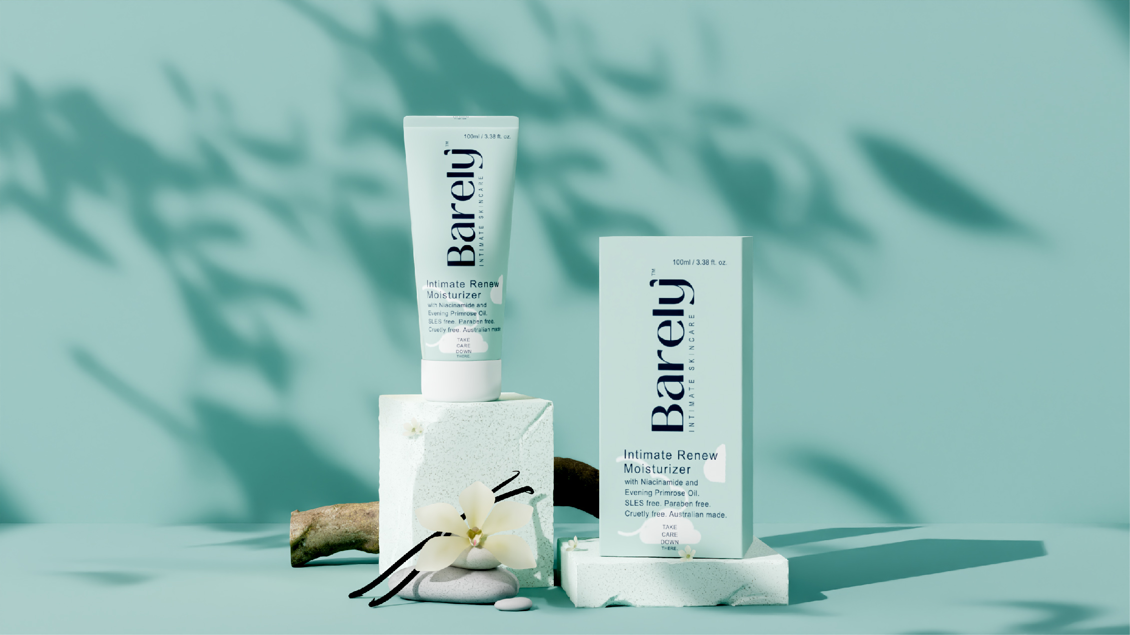
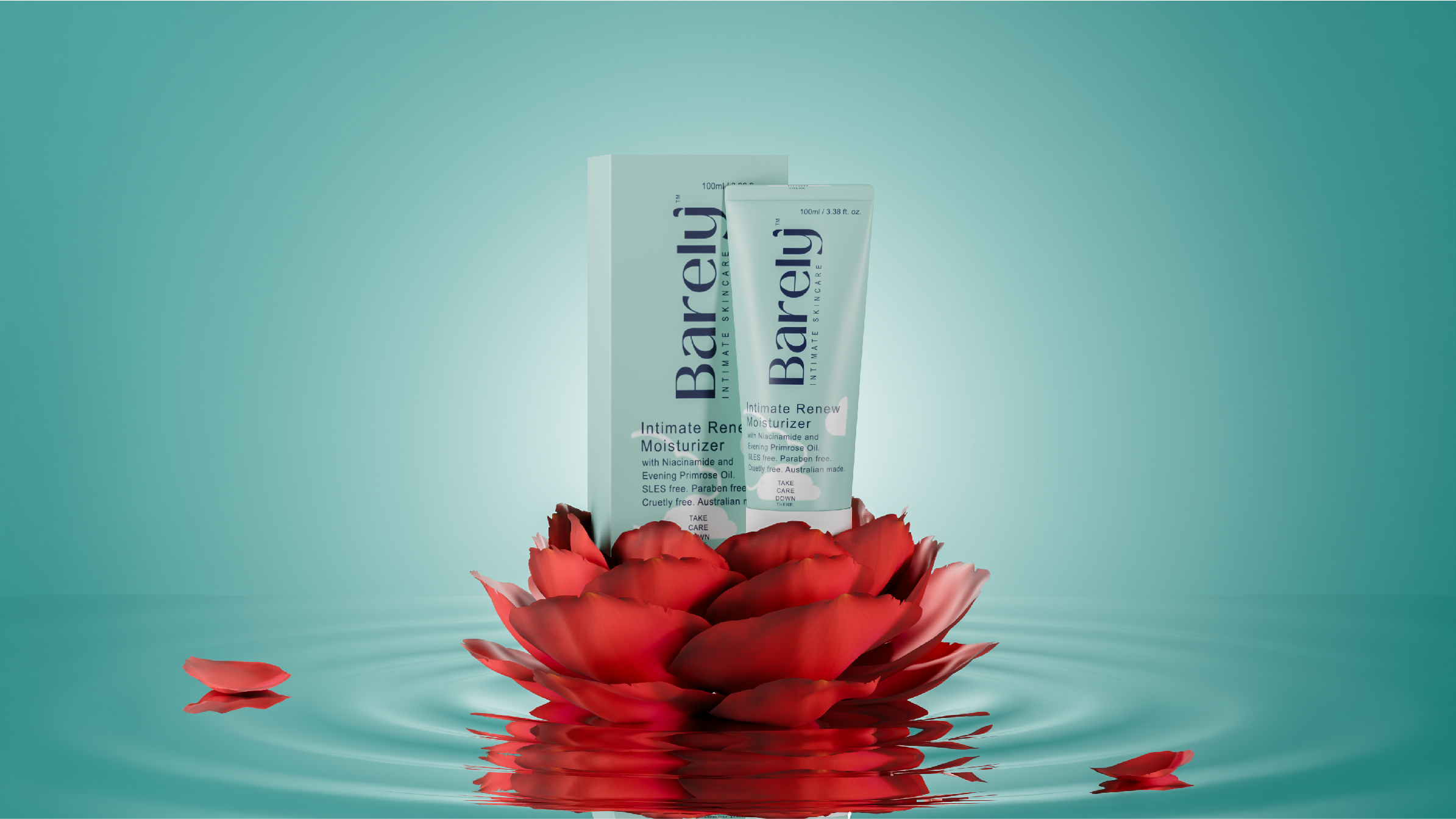
The visual identity centers on purity and comfort. A muted pastel palette creates an immediate sense of calm, while the gentle tonal transitions evoke warmth and sensitivity. These hues are carefully selected to signal safety, tenderness, and modern femininity without overwhelming the viewer. The overall color story feels breathable and light, reinforcing the product’s nurturing and skin-loving formulation.
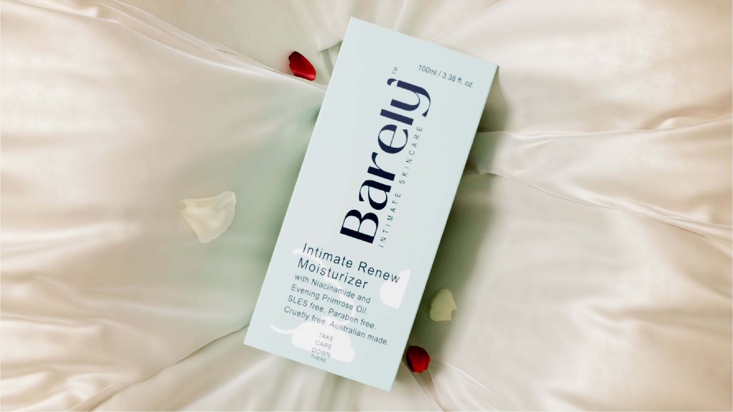
Typography plays a key role in expressing elegance and intimacy. Delicate, well-spaced letterforms lend sophistication while maintaining approachability. The type hierarchy is clean and balanced, ensuring clarity without clutter. Subtle detailing in the font choice enhances the feeling of refinement, mirroring the product’s gentle yet effective purpose. Nothing feels harsh or excessive; every line is intentional and thoughtfully placed.
The packaging structure follows a minimalist philosophy. Clean surfaces, ample negative space, and soft edges contribute to a tactile and visual softness that aligns seamlessly with the moisturiser’s function. The design avoids unnecessary embellishments, instead focusing on simplicity and confidence. This restraint strengthens brand credibility and positions Barely as a modern, premium intimate care solution.
Overall, the packaging embodies a sense of quiet luxury. It feels personal, safe, and reassuring – a product meant to be trusted and embraced. By combining soft aesthetics with contemporary elegance, Barely’s Intimate Renew Moisturiser stands as a refined expression of care, comfort, and understated confidence in the intimate wellness space.
CREDIT
- Agency/Creative: Sorted Branding
- Article Title: Sorted Branding Gives Barely’s Intimate Renew Moisturiser a Quietly Confident Intimate Care Identity
- Organisation/Entity: Agency
- Project Type: Packaging
- Project Status: Published
- Agency/Creative Country: India
- Agency/Creative City: Mumbai
- Market Region: Asia
- Project Deliverables: Branding
- Format: Bottle
- Industry: Food/Beverage
- Keywords: Packaging Design
-
Credits:
Project Manager: Arpika Singh


