


From the beauty of small stumbles, strength is born. Falling is part of the ritual and part of the grind behind every meaningful achievement. Café Derrota reclaims that word and turns it into character. It embraces discomfort and friction, transforming what is usually avoided into something deliberate and powerful. There is no victory without error, no growth without resistance, and no depth of flavor without bitterness.
The brand narrative positions defeat not as weakness, but as a necessary phase of becoming. In a culture obsessed with success, Café Derrota shifts the focus toward endurance, process, and resilience. It honors the effort behind mastery—the repetition, the mistakes, the discipline. The name becomes a statement: a reminder that friction builds identity.
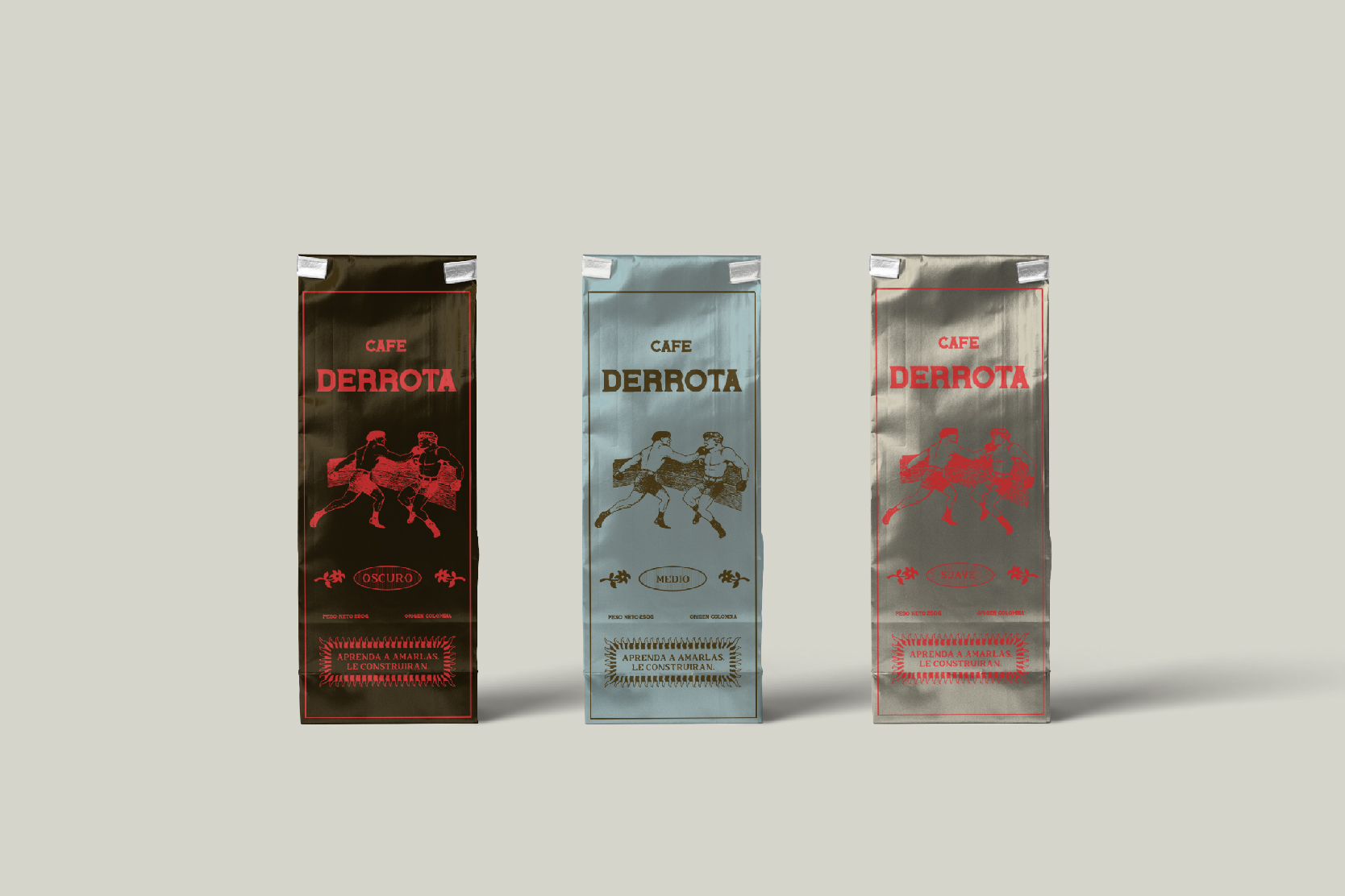
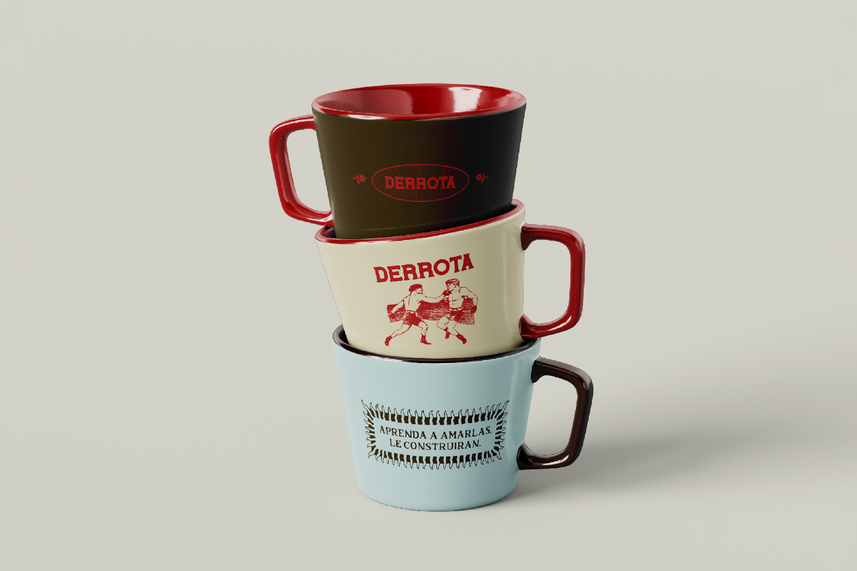
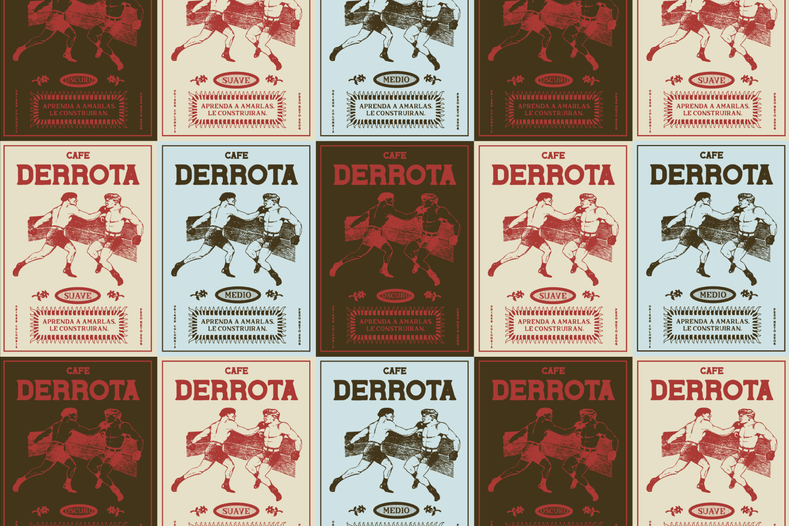
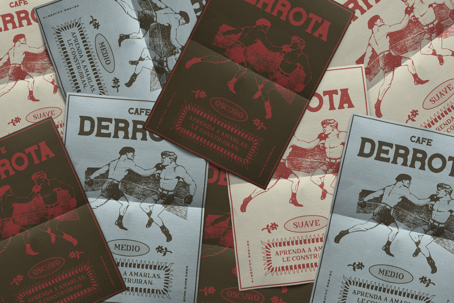
The visual identity is built on tension and contrast. Two figures in combat symbolize effort, discipline, and persistence. They are not enemies but forces in balance, representing the internal struggle that precedes every achievement. The typography is bold and unapologetic, asserting presence with clarity and strength. A structured and almost rigid layout reinforces stability and control, counterbalancing the emotional charge of the concept.
A restrained yet intentional color palette distinguishes intensities—dark, medium, smooth—each representing a different way of facing the day. The hierarchy of tones mirrors the depth of flavor profiles, creating a system that is both functional and symbolic.
The packaging carries the concept forward through materiality and composition. Every bag becomes a statement of identity and attitude, designed not only to contain coffee but to communicate conviction. Strong typographic blocks, high-contrast graphics, and disciplined alignment create a bold shelf presence while remaining conceptually cohesive.
Café Derrota understands defeat not as an ending, but as momentum—the necessary tension that builds strength, clarity, and flavor with purpose and conviction. It celebrates the grind, the repetition, and the quiet persistence that transforms bitterness into character and effort into identity.
CREDIT
- Agency/Creative: Pueblo Estudio
- Article Title: Café Derrota by Pueblo Estudio Turns Bitterness, Strength, and Process Into Striking Packaging Design
- Organisation/Entity: Agency
- Project Type: Packaging
- Project Status: Published
- Agency/Creative Country: Argentina
- Agency/Creative City: Pueblo Estudio
- Market Region: South America
- Project Deliverables: Brand Creation, Brand Design, Packaging Design
- Format: Pouch
- Industry: Food/Beverage
- Keywords: Packaging Graphic Design Art Direction
-
Credits:
Graphic Design: Cyntia Padilla


