


Chips That Don’t Pretend
Task
Real Chips is a new corn chips brand aimed at a young audience that craves bold flavor, intense sensations, and lively communication. The product is natural, crunchy triangles with daring flavors and a dense, satisfying crunch. No false modesty.
Our objectives:
Develop a visual identity with character — loud, confident, and anything but boring;
Create a design that stands out on a highly competitive shelf;
Communicate the focus on “realness”: natural flavor, expressive texture, vibrant spices;
Build an easily scalable flavor range with clear navigation and cohesive branding.
Solution
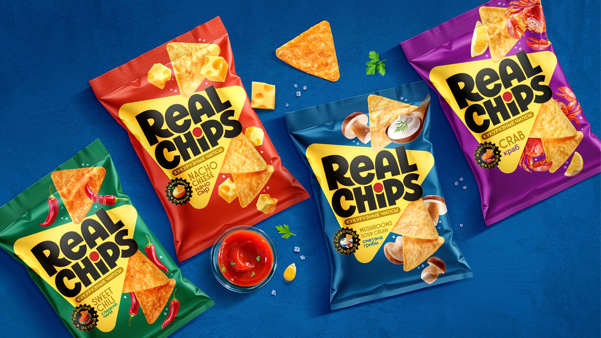
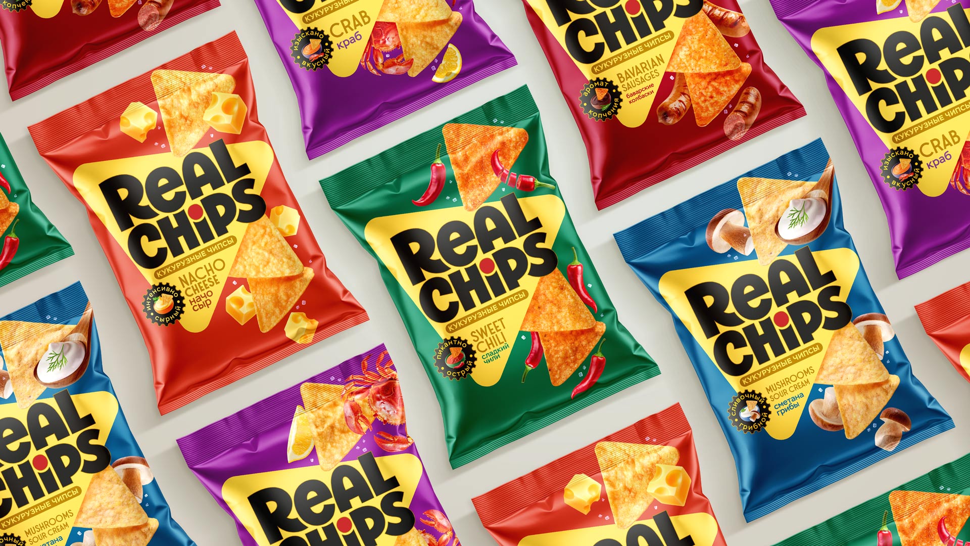
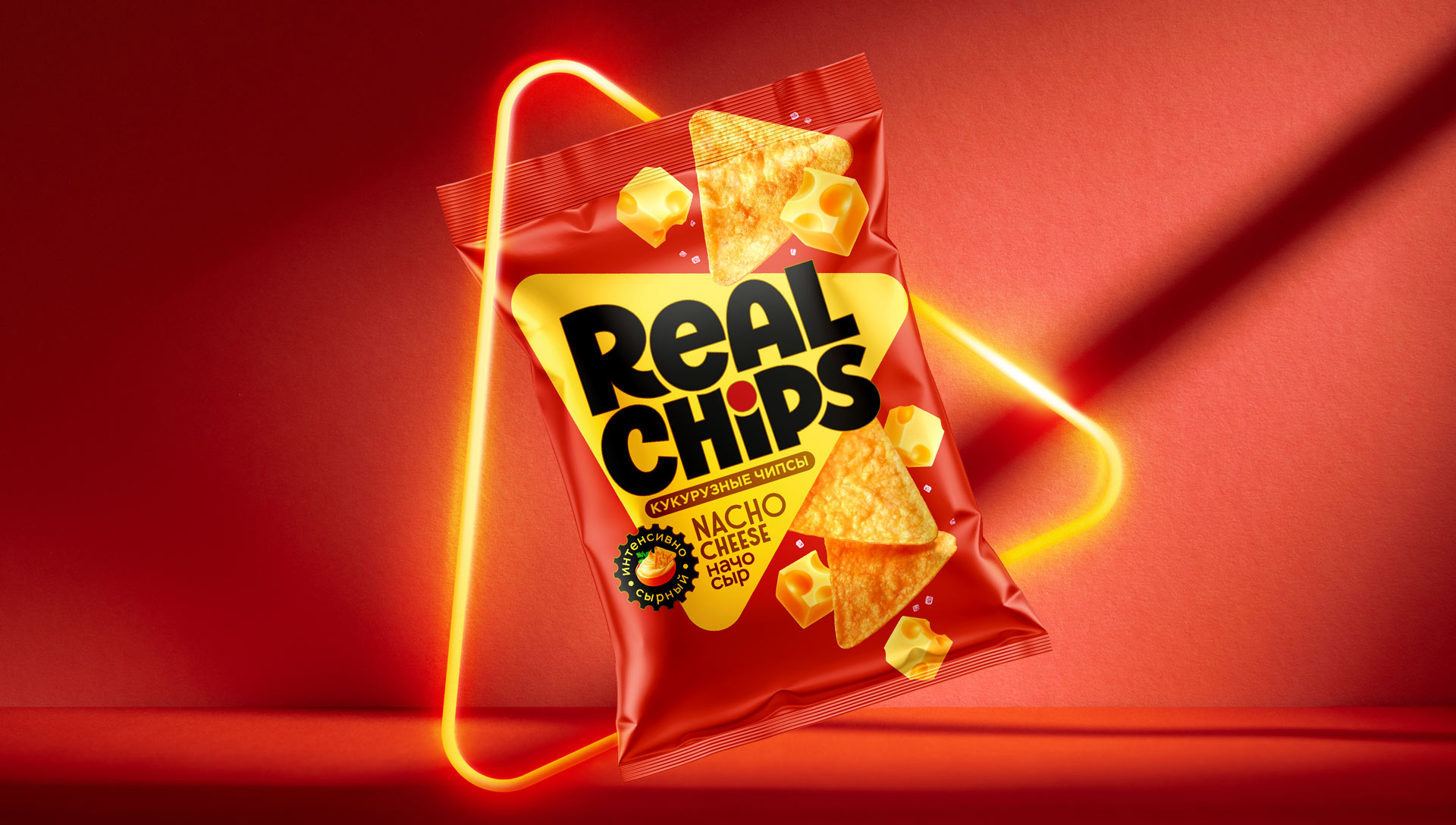
We made the triangular shape the brand’s key visual element. It mirrors the shape of the chip itself — a sharp angle, a bold edge, a confident presence. The entire packaging system is built around this triangle, which acts as both a compositional anchor and a strong visual symbol.
The logo is embedded inside the shape — large, bold, and concise. Black against a bright background creates contrast and attitude. The dot over the “i” is not just a typographic detail; it’s a spice, a flash of flavor, a provocation within the word.
Each flavor received its own насыщенный, vibrant background. Bright colors make the choice easy on the shelf while keeping the lineup cohesive.
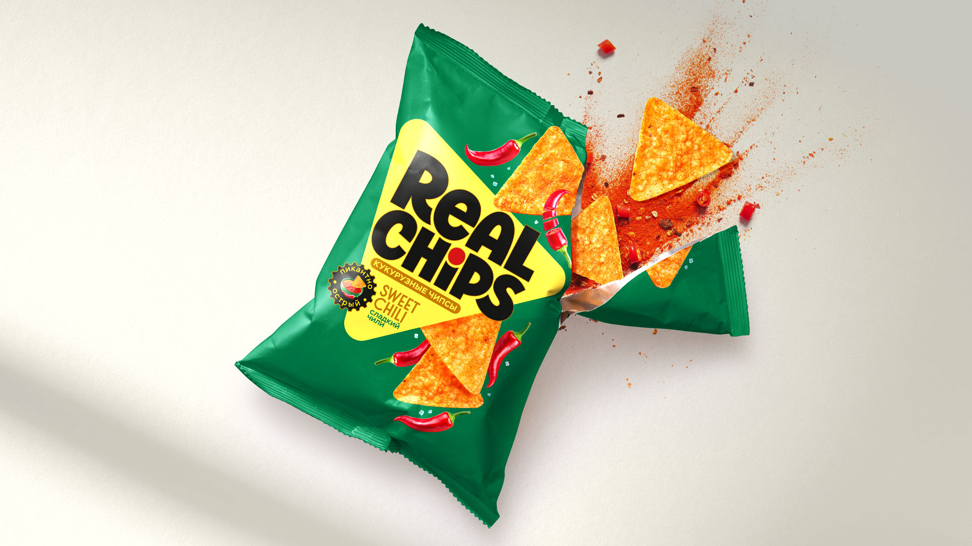
The food zone is максимально аппетитная and impactful. Chips appear large and highly textured, with visible grains of salt and spices. Pieces of cheese, peppers, crab, mushrooms — everything looks juicy, realistic, and honest. No illusions — just flavor.
The design is not overloaded with details — everything on the pack works toward emotion, taste, and instant recognition. We created a brand that says at first glance: this is truly delicious. Real Chips don’t pretend — they honestly show what’s inside.
The result is packaging that looks crunchy, stands out brightly on the shelf, and delivers strong visual impact.
This isn’t just a snack. It’s a visual strike against boredom and neutral brands.

CREDIT
- Agency/Creative: PROFSOYUZ
- Article Title: Profsoyuz Gives Real Chips a Loud Packaging Identity Built for Shelf Impact
- Organisation/Entity: Agency
- Project Type: Packaging
- Project Status: Published
- Agency/Creative Country: Russia
- Agency/Creative City: Mascow
- Market Region: Europe
- Project Deliverables: Packaging Design
- Format: Bag
- Industry: Food/Beverage
- Keywords: Chips Nacos
-
Credits:
Packaging Designer: Anton Danilov


