


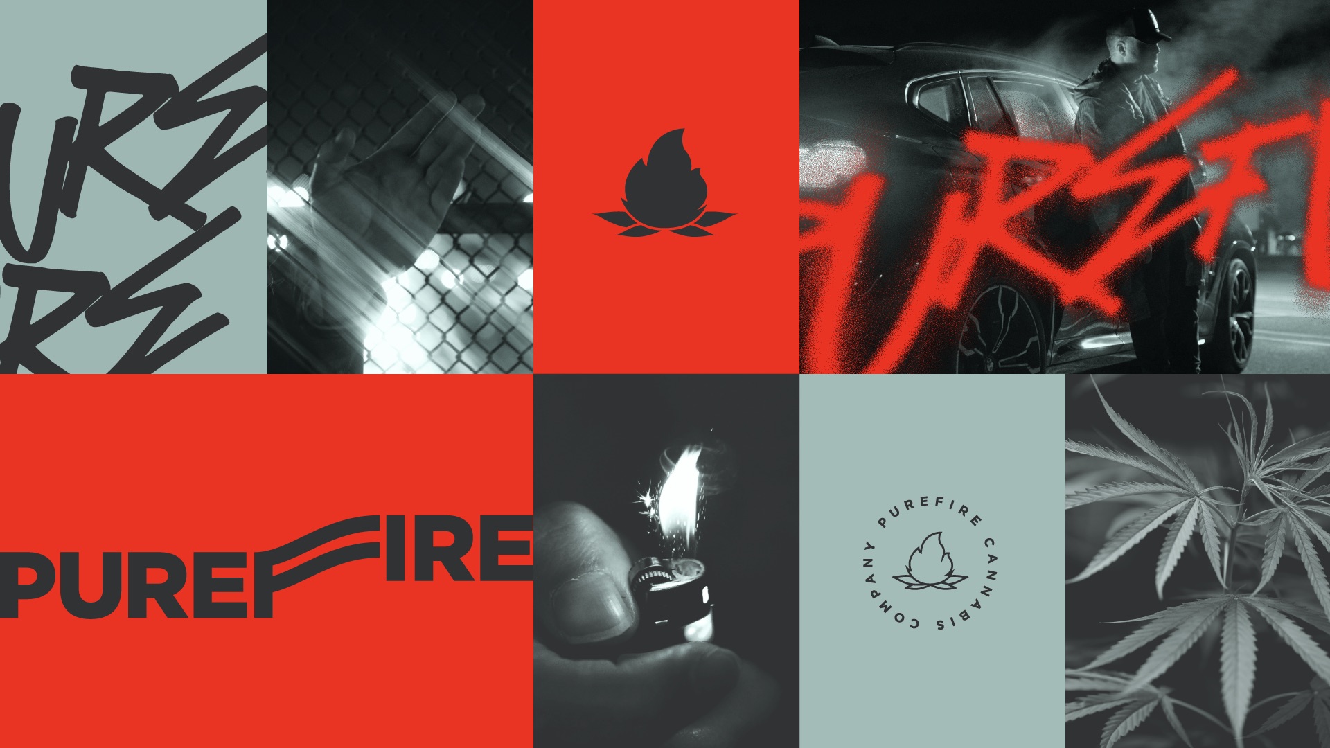
PUREFIRE® was conceived to capture the ritual, energy, and cultural intensity surrounding modern cannabis consumption in Colorado. In a market often saturated with predictable visual codes — soft greens, botanical references, and wellness-driven minimalism — we deliberately moved in the opposite direction. Rather than portraying cannabis as passive or purely medicinal, PUREFIRE® positions itself as ignition. It is bold, urban, expressive, and culturally charged.
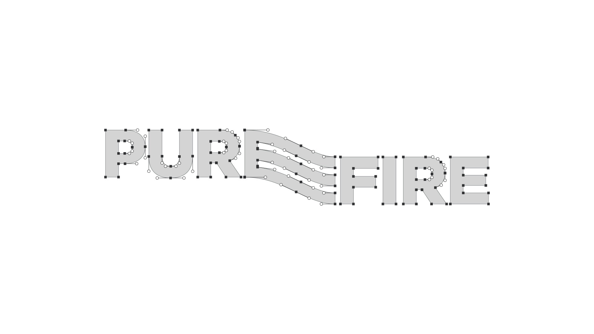
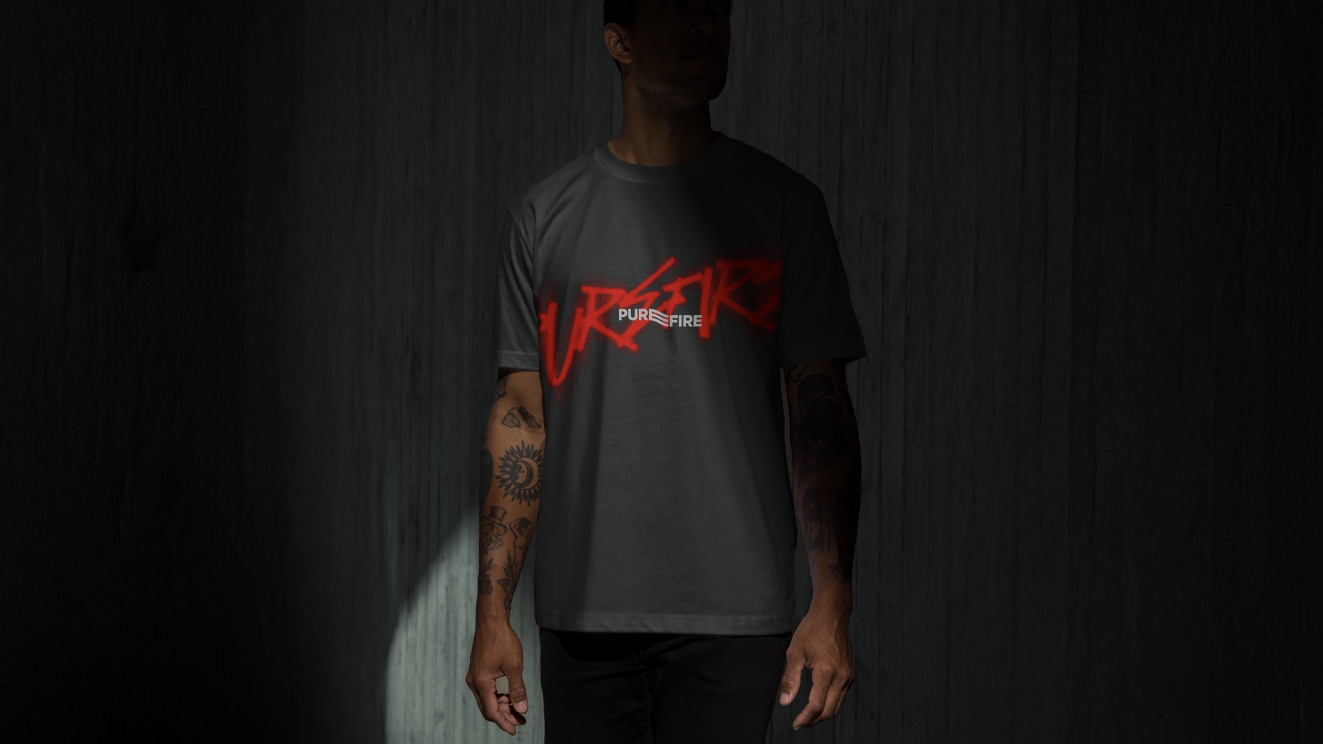
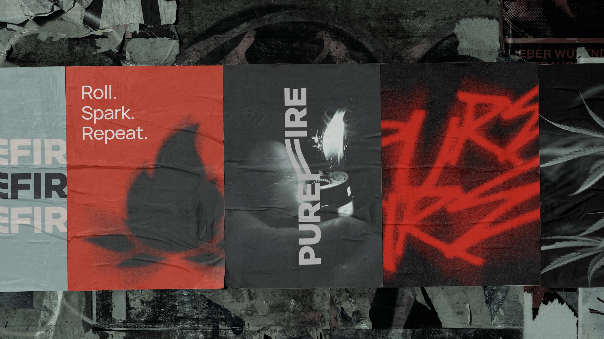
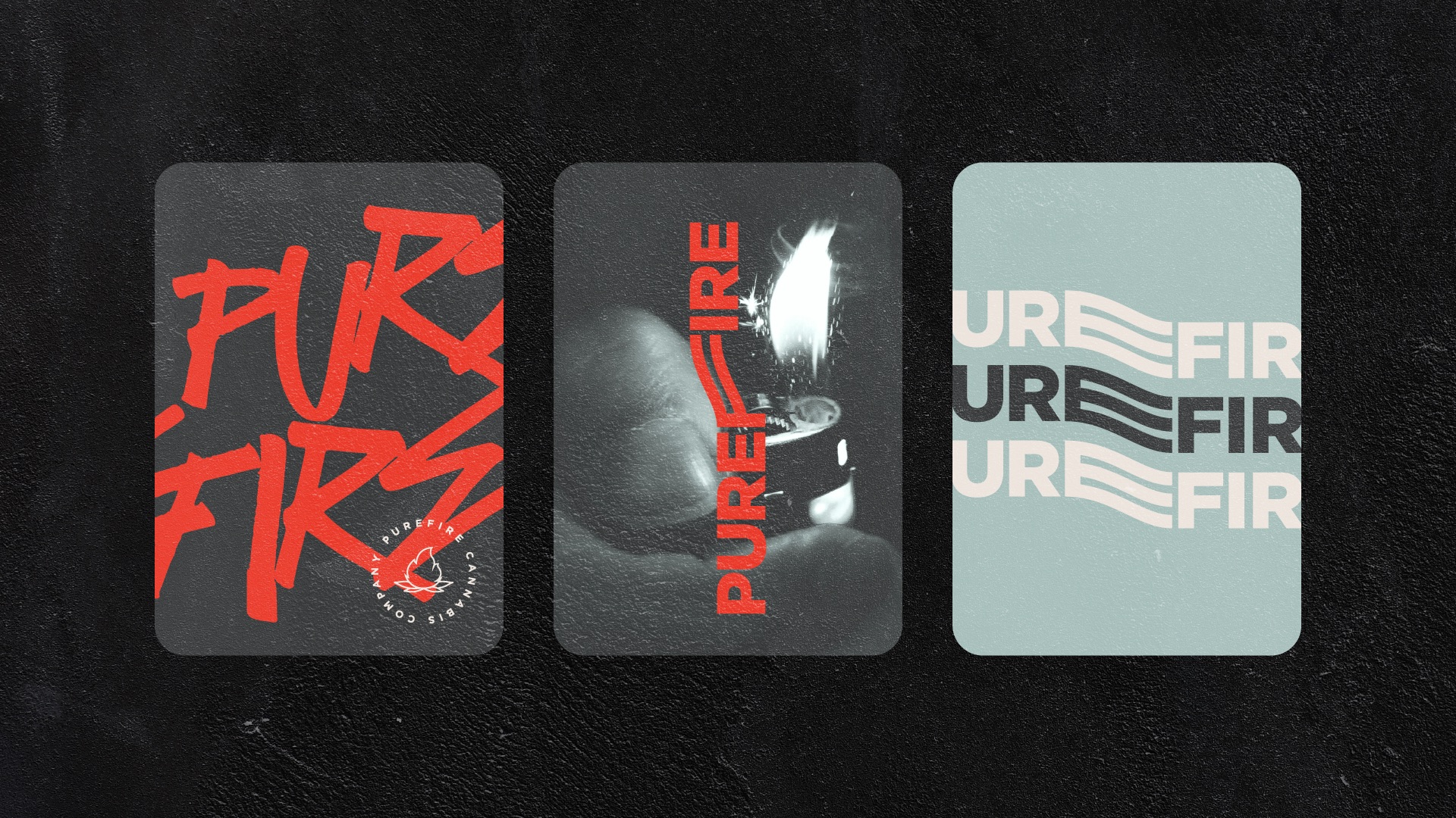
At its core, the brand is built on tension. Raw versus refined. Street versus structured. Ritual versus rebellion. This duality informs every design decision. The custom wordmark features integrated flowing linework that weaves through the letterforms, evoking heat, smoke, movement, and rhythm. These gestures are not decorative; they embody repetition and ritual, reinforcing the brand mantra: Roll. Spark. Repeat.
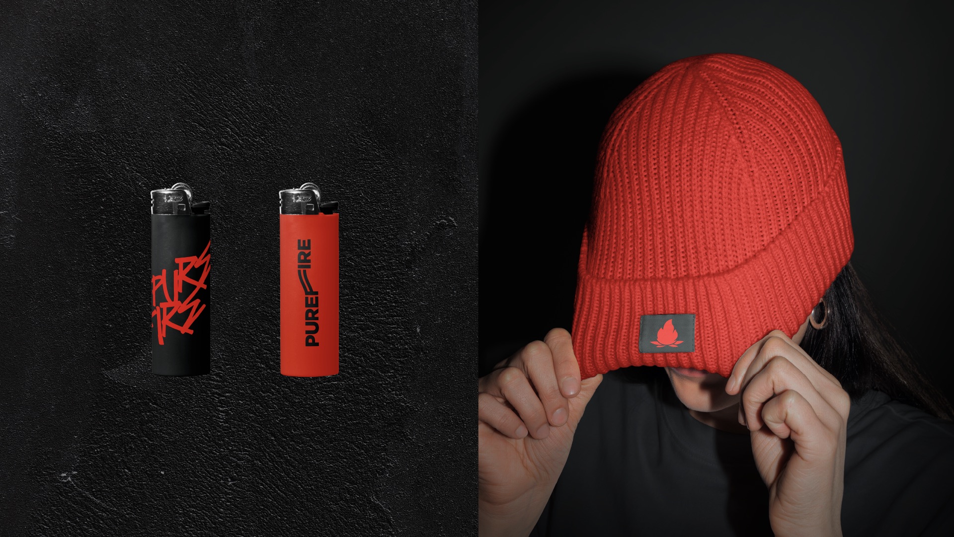
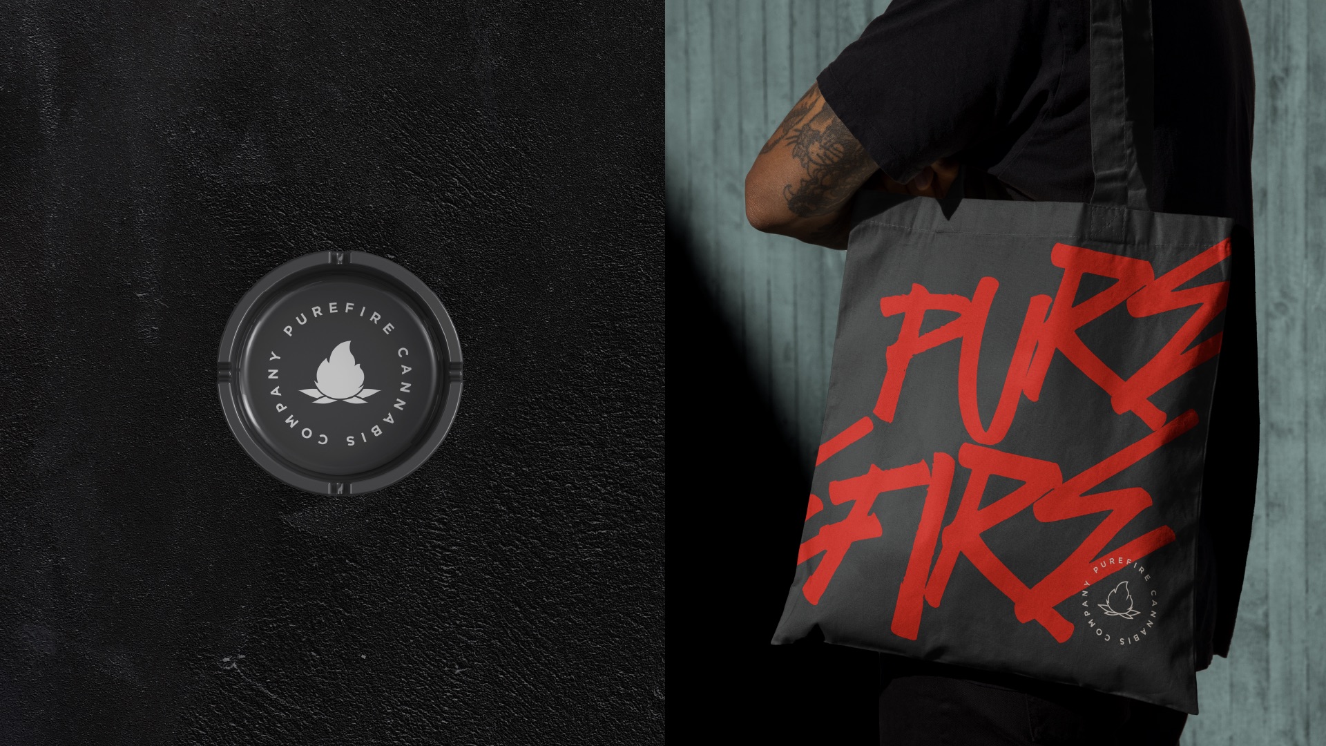
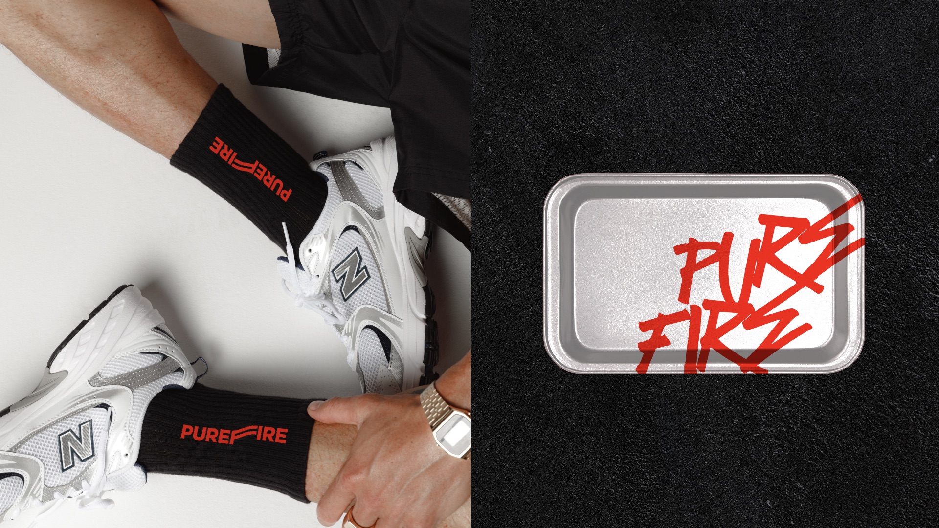
The visual system balances discipline with disruption. A minimal typographic foundation provides clarity and structure, while expressive red graffiti overlays inject attitude and immediacy. High-contrast photography and stark black-and-white textures amplify the urban sensibility, grounding the brand within contemporary street culture. The flame emblem functions as a seal — a mark of purity, intensity, and authenticity — adaptable across packaging, apparel, retail materials, and lifestyle extensions.
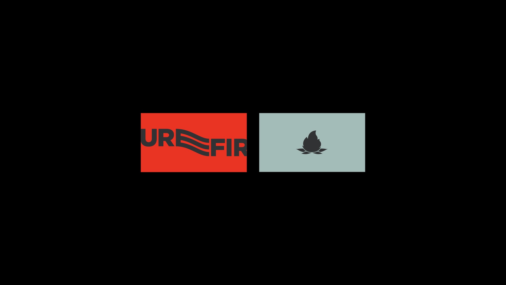
Color plays a strategic role in shaping perception. Muted sage introduces an unexpected calm, deep charcoal anchors the system with sophistication, and aggressive red ignites the composition with urgency and heat. The result is a palette that reflects both combustion and control — a deliberate contrast between restraint and expression.
Beyond aesthetics, PUREFIRE® establishes a scalable identity framework designed for growth. The system performs seamlessly across product packaging, branded merchandise, social campaigns, and in-store experiences, ensuring consistency without sacrificing edge.
PUREFIRE® is not about passive consumption. It is about presence. It is about spark. It is about identity.
CREDIT
- Agency/Creative: INDUSTRIA®Branding Co.
- Article Title: Industria Branding Co. Ignites Purefire With a Cannabis Identity Built for Urban Culture
- Organisation/Entity: Agency
- Project Type: Identity
- Project Status: Published
- Agency/Creative Country: Brazil
- Agency/Creative City: Porto Alegre
- Market Region: North America
- Project Deliverables: Brand Creation, Brand Design, Brand Experience, Brand Guidelines, Brand Identity, Brand Mark, Brand Naming, Brand Strategy, Brand Tone of Voice, Brand World, Branding, Creative Direction, Graffiti, Graphic Design, Icon Design, Identity System, Logo Design, Packaging Design
- Industry: Entertainment
- Keywords: Branding, Cannabis branding, Packaging design, Lifestyle brand identity, dispensary branding, retail branding, bold positioning, urban positioning, colorado cannabis market, brand strategy, cannabis brand identity design, cannabis packaging design, marijuana branding agency, dispensary brand identity, cannabis logo design, lifestyle cannabis branding, premium cannabis packaging, weed brand identity design, cannabis product branding, colorado cannabis branding, urban cannabis brand design, modern cannabis packaging, cannabis retail branding, cannabis brand positioning, thc product branding, cbd brand identity design
-
Credits:
Brand Strategy and Identity: INDUSTRIA®Branding Co.


