


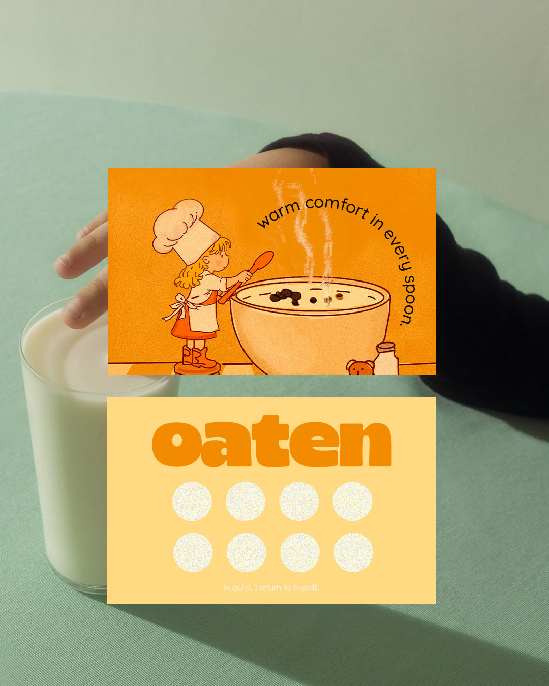
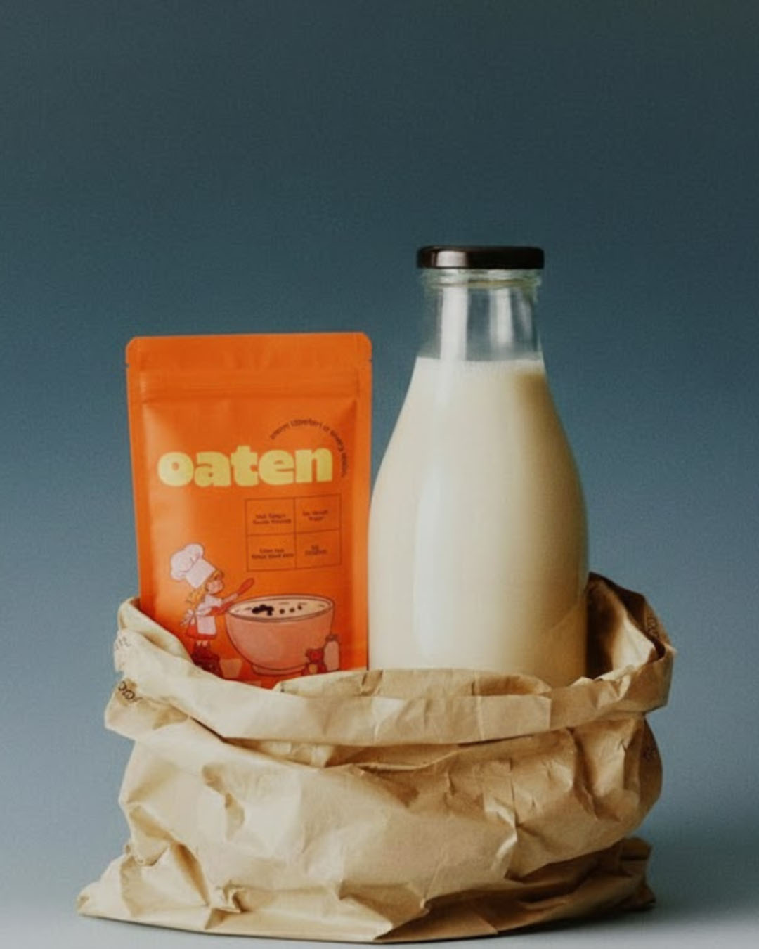
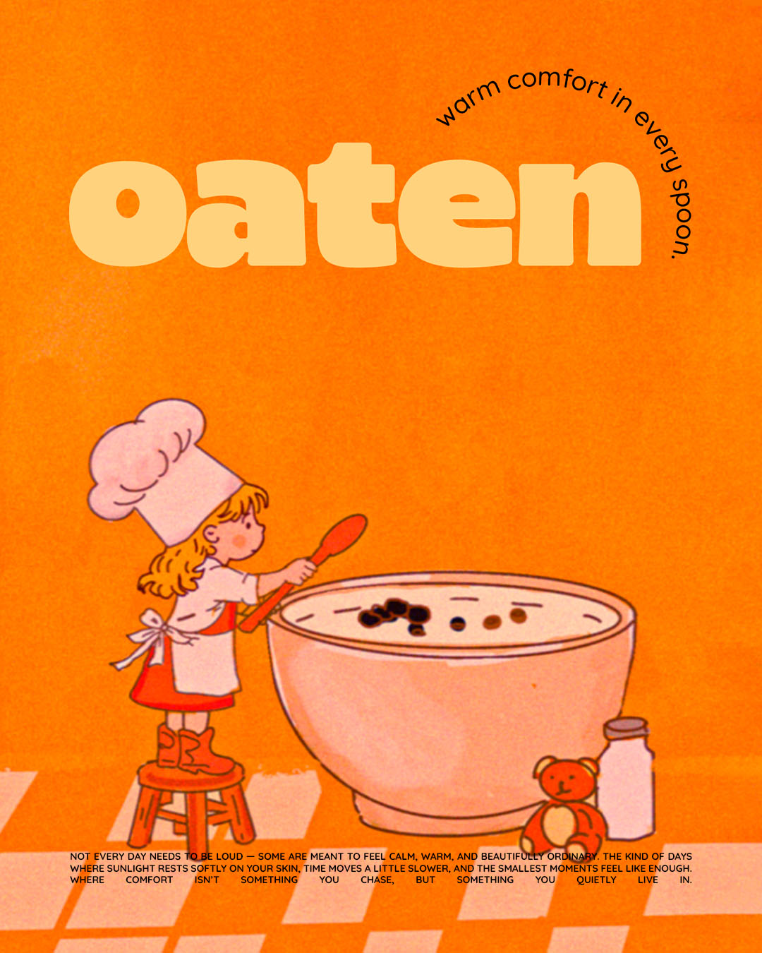
This packaging is designed to feel like a quiet morning wrapped in warmth — the kind of slow, golden beginning where light gently fills the room and everything feels calm and unhurried. The rich orange tones create an immediate sense of comfort, radiating heat and familiarity, while the soft, delicate illustration style adds tenderness and emotional depth. Together, these elements evoke memory, nostalgia, and the gentle rhythm of home — the simple rituals that shape our everyday lives in the most meaningful ways.
At the heart of the design stands a small girl beside an oversized bowl, a subtle yet powerful visual metaphor. Her presence symbolizes care, innocence, and simplicity. The scale contrast between the child and the bowl quietly emphasizes abundance, nourishment, and protection — suggesting that what’s inside is not just food, but a source of warmth and reassurance. She represents the joy found in everyday moments: sitting at the kitchen table, holding a warm spoon, feeling safe and present. It is a reminder that comfort often lives in the smallest rituals.
The color palette is intentionally warm and cohesive, dominated by rich oranges and soft complementary hues that mimic sunrise tones. These colors psychologically signal warmth, appetite, and positivity, strengthening the emotional connection between the product and the consumer. The illustration avoids harsh lines or excessive detail, instead embracing softness and fluidity to maintain a gentle visual rhythm.
Clean, minimal information architecture ensures that nothing distracts from the emotional narrative. Typography is calm and balanced, allowing breathing space around each element. This restraint reinforces the feeling of clarity and sincerity — the product does not need to shout to be noticed. It speaks quietly, confidently, and warmly.
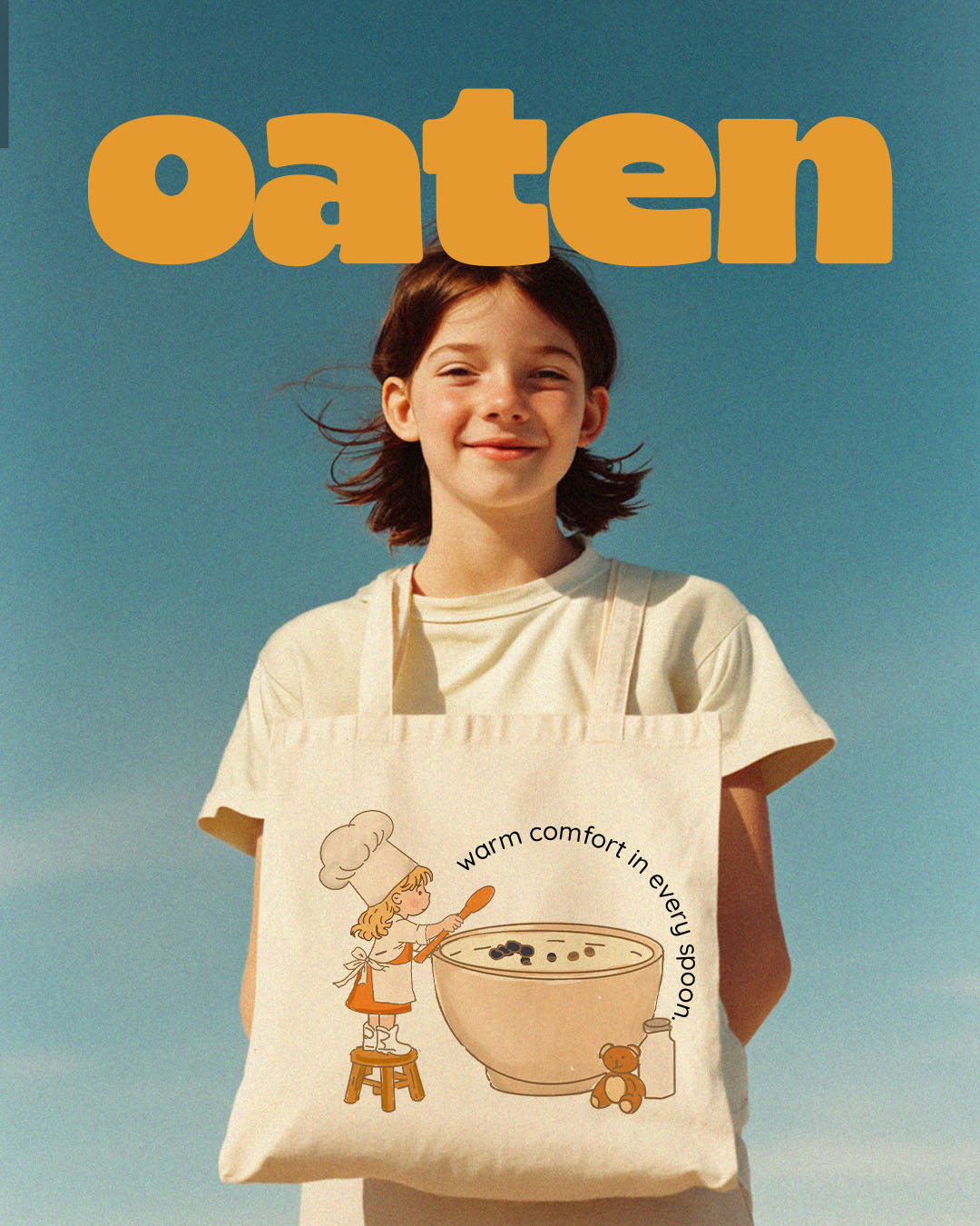
Altogether, this packaging does more than present a product on a shelf. It tells a story. It captures a feeling. It invites the viewer into a peaceful morning moment and promises warmth in every spoonful — not just as nourishment for the body, but as comfort for the soul.


CREDIT
- Agency/Creative: Jamila Ahmadova
- Article Title: Oaten: Home in Every Spoon by Jamila Ahmadova
- Organisation/Entity: Freelance
- Project Type: Graphic
- Project Status: Non Published
- Agency/Creative Country: Azerbaijan
- Agency/Creative City: Baku
- Market Region: Global
- Project Deliverables: 2D Design, Brand Design, Logo Design, Packaging Design
- Industry: Food/Beverage
- Keywords: packagingdesign oatmeal porridge


