


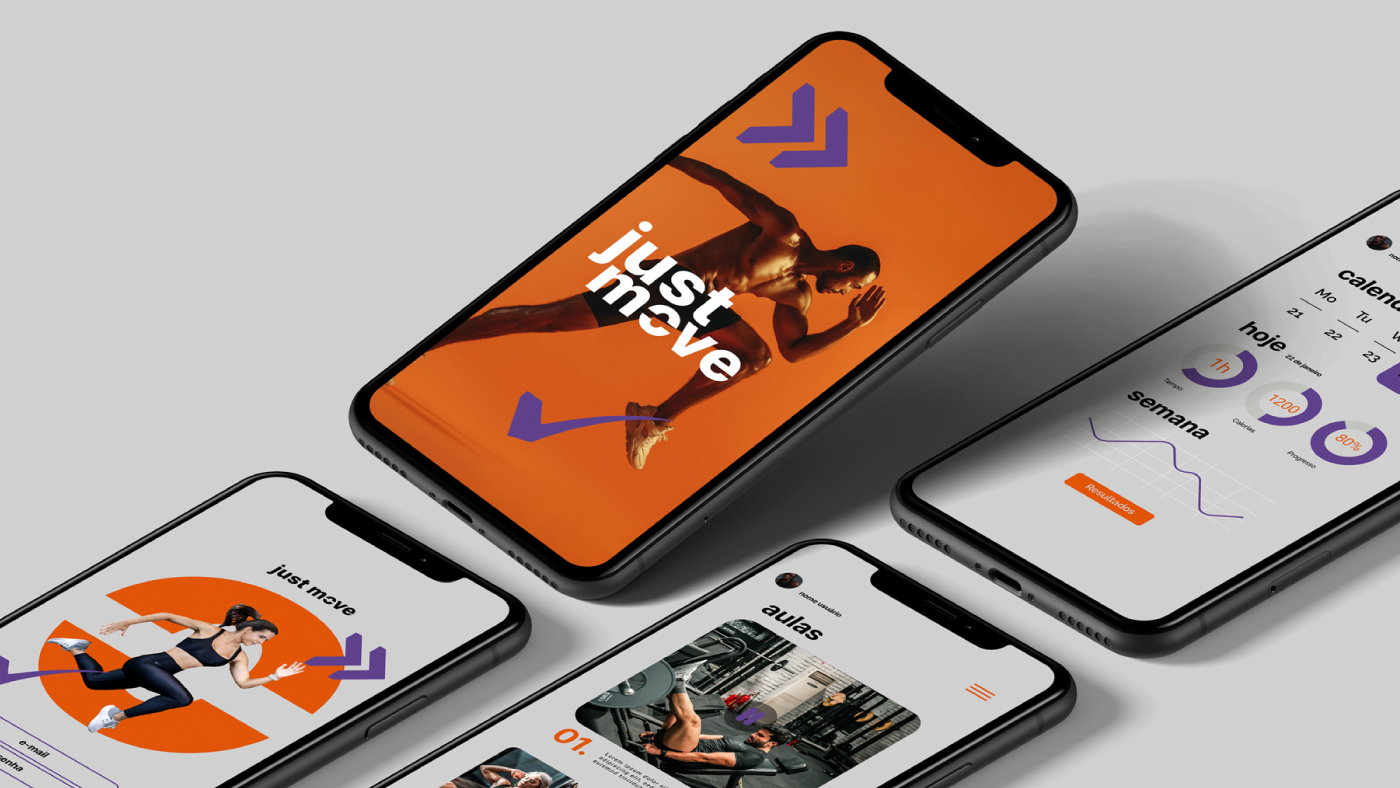
The Just Move rebranding and redesign project was developed to reposition the brand as a symbol of clarity, performance, and purposeful movement. The objective was not only to modernize its visual identity, but to create a system that communicates strength, direction, and sophistication while remaining human and accessible.
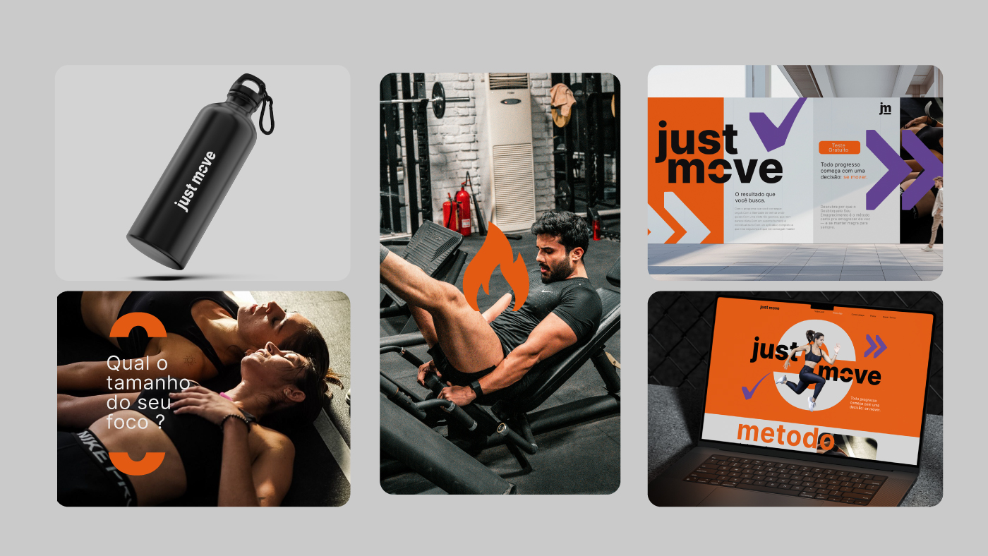
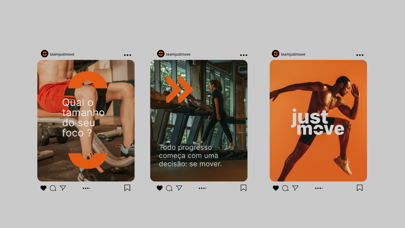
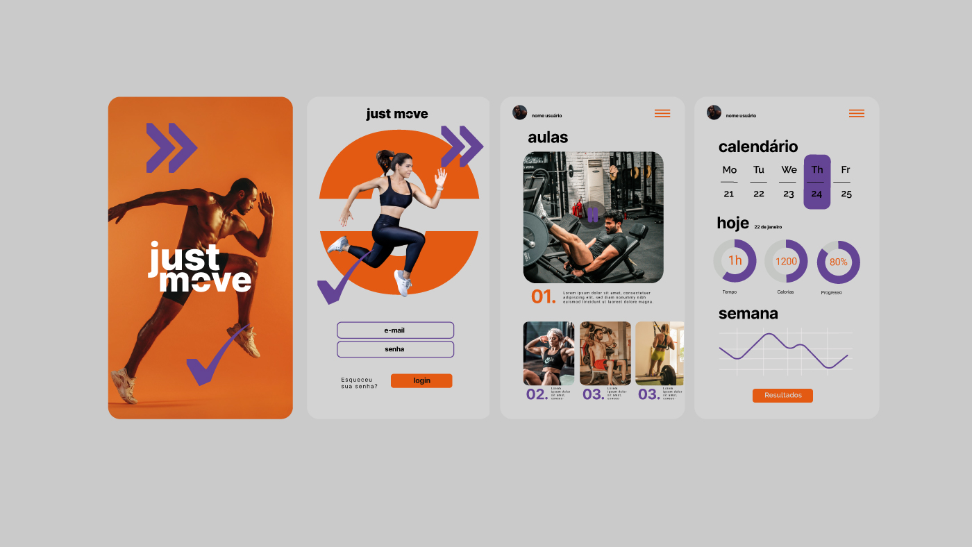
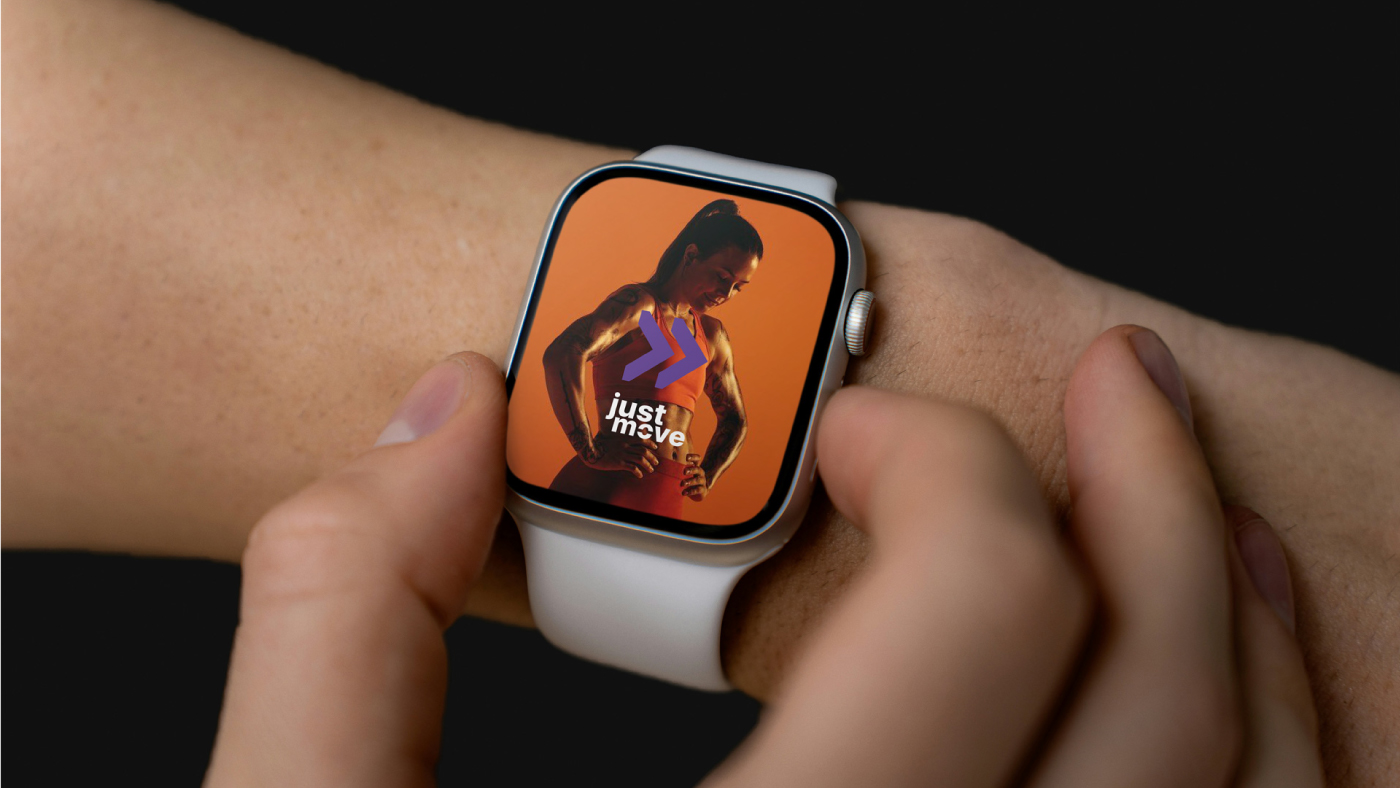
The color palette is built on a precise balance between power, energy, and refinement. Black forms the structural foundation of the brand, sustaining authority, focus, and strong visual presence across all touchpoints. Orange introduces dynamic energy, creating contrast and rhythm while guiding attention to key elements and calls to action. Violet adds a technological and innovative dimension, reinforcing intelligence, vision, and differentiation in a competitive fitness market. Off white works as breathing space within the compositions, organizing information, creating balance, and elevating perceived sophistication in a subtle and natural way.
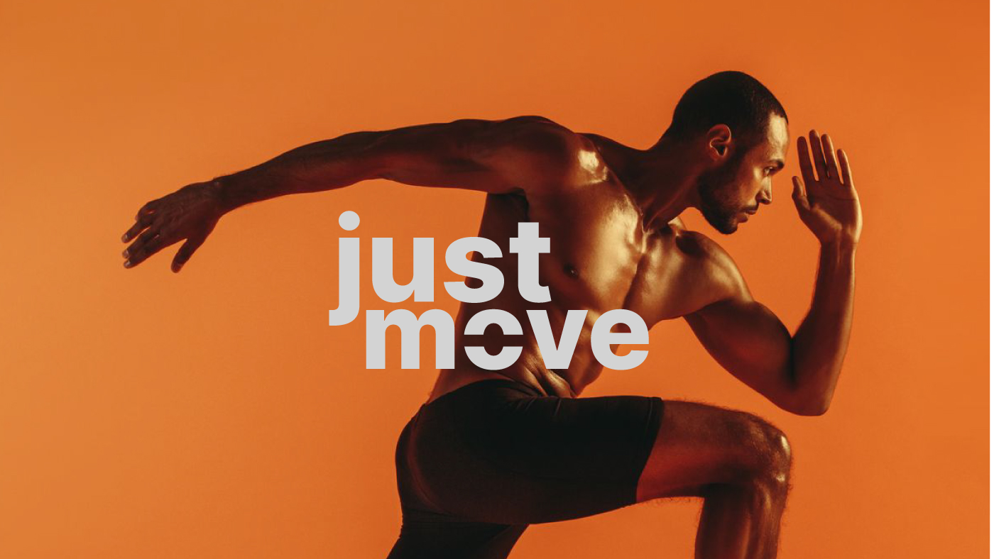
The logo expresses movement with intention. The cut integrated into the letterforms represents direction, precision, and clarity of purpose. It symbolizes the elimination of excess in order to concentrate energy on what truly matters: progress. The bold typography reinforces strength, intensity, and action, positioning the brand as active and determined. The use of lowercase letters creates proximity and approachability, bringing a contemporary, digital, and human tone aligned with modern product brands.
At its core, Just Move is built on belief. Progress is individual. No body is the same. Real transformation happens when you understand your own rhythm. We do not sell shortcuts. We sell clarity. We sell movement.
Our purpose is to transform doubt into action, inertia into consistency, and intention into measurable results. Through science, technology, and human support, we simplify the path so training and nutrition become part of life, not a burden.
Because the body evolves when the mind understands the process. And the mind evolves when the body begins to respond.
Every day counts. Every choice moves. Every result is yours.
Just Move. The movement that transforms.


CREDIT
- Agency/Creative: Bass. Estúdio Gráfico
- Article Title: Bass. Estúdio Gráfico Rebrands Just Move With a Clear Fitness Identity Built for Progress
- Organisation/Entity: Agency
- Project Type: Identity
- Project Status: Published
- Agency/Creative Country: Brazil
- Agency/Creative City: Piracicaba
- Market Region: South America
- Project Deliverables: App Design, Brand Creation, Brand Design, Graphic Design
- Industry: Health Care
- Keywords: just move
-
Credits:
Bass.: Marcos Basseto


