


Carrying Ritual Across Borders
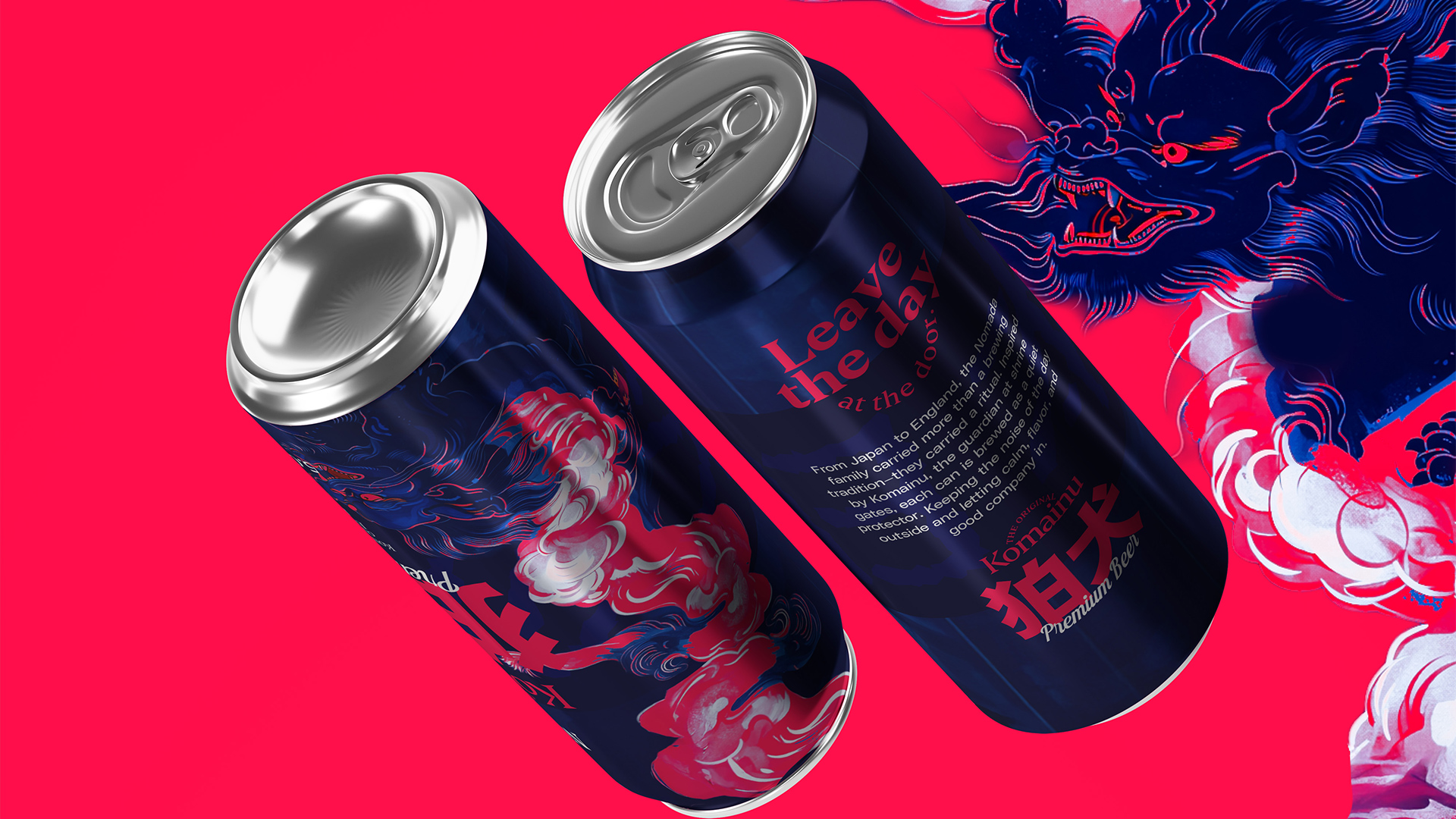
From Japan to England, the Nomada family brought more than recipes—they carried a philosophy of brewing rooted in patience, precision, and cultural memory. What began as small-batch production using traditional Japanese techniques evolved into a premium beer line ready for scale. The challenge was not only to modernize production, but to preserve the quiet depth of heritage within every can.
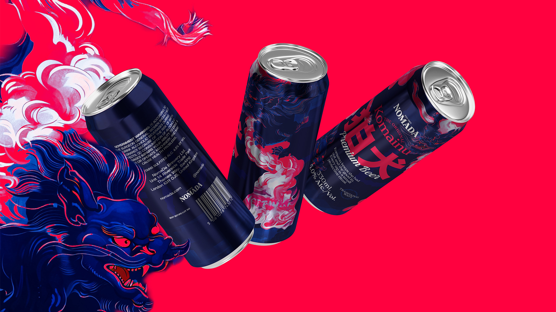
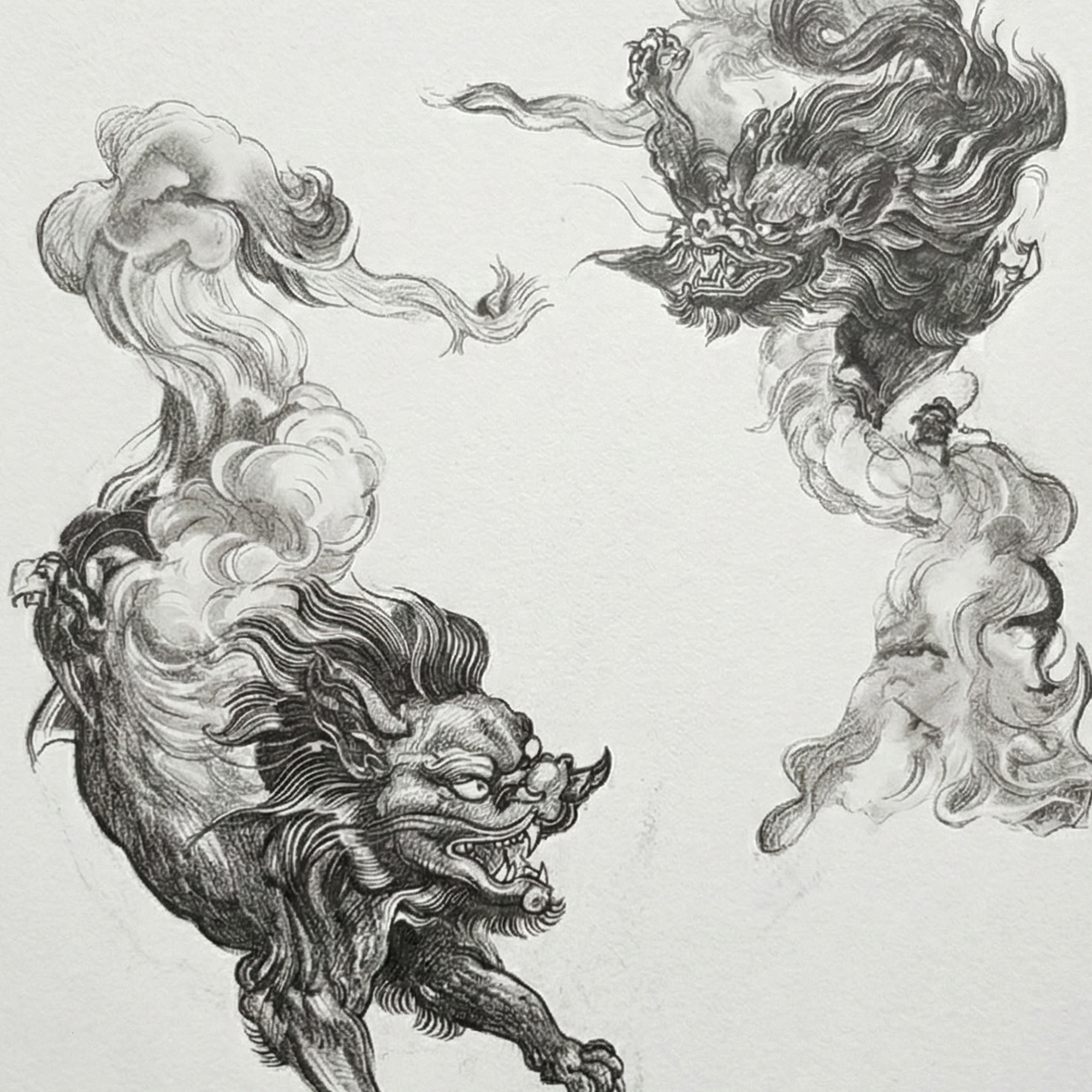
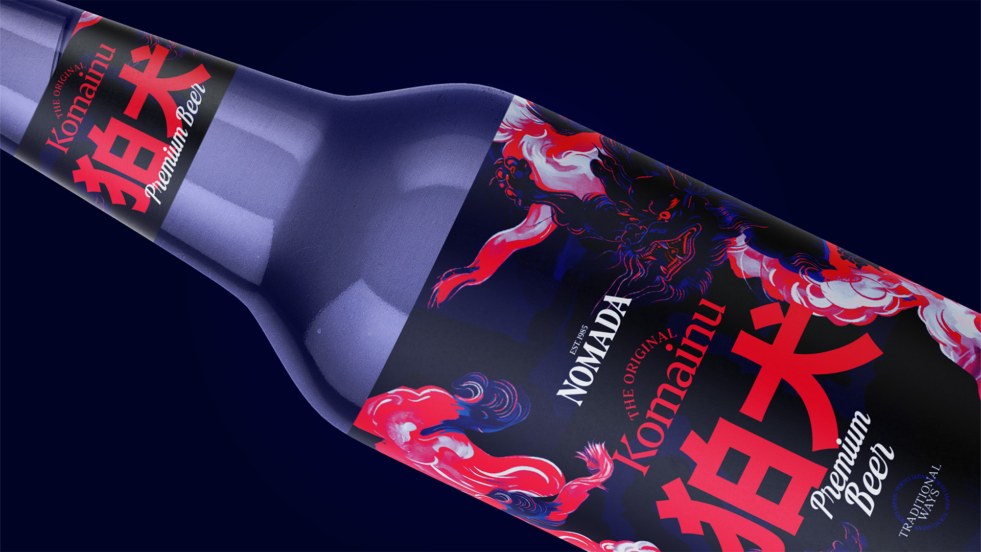
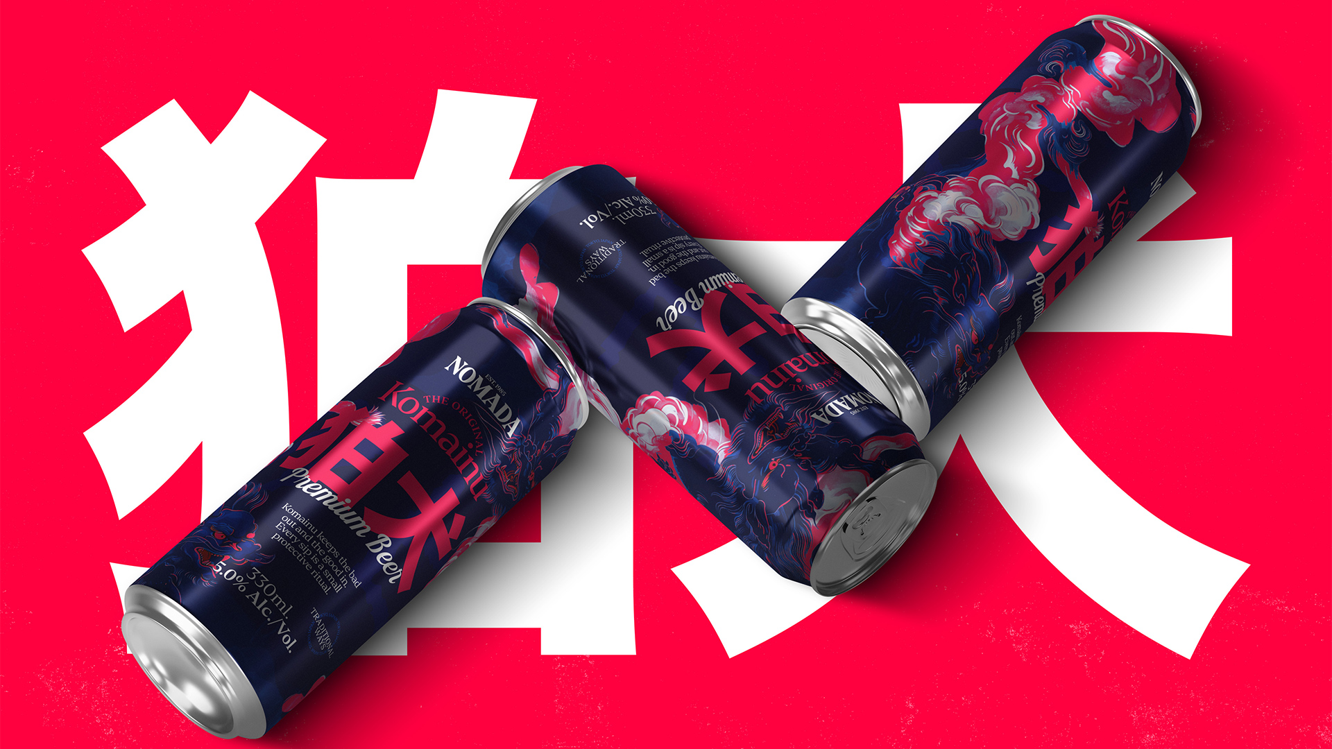
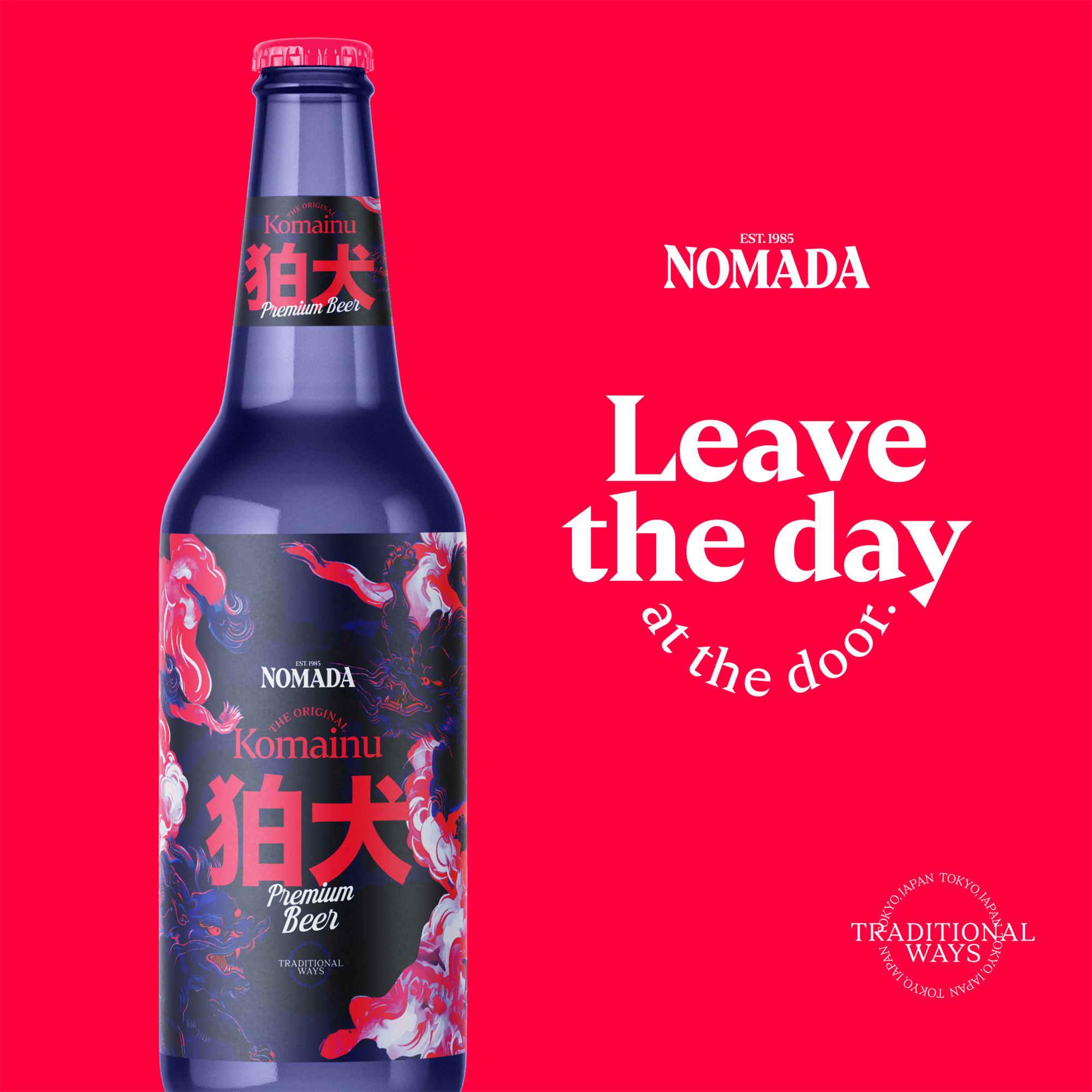
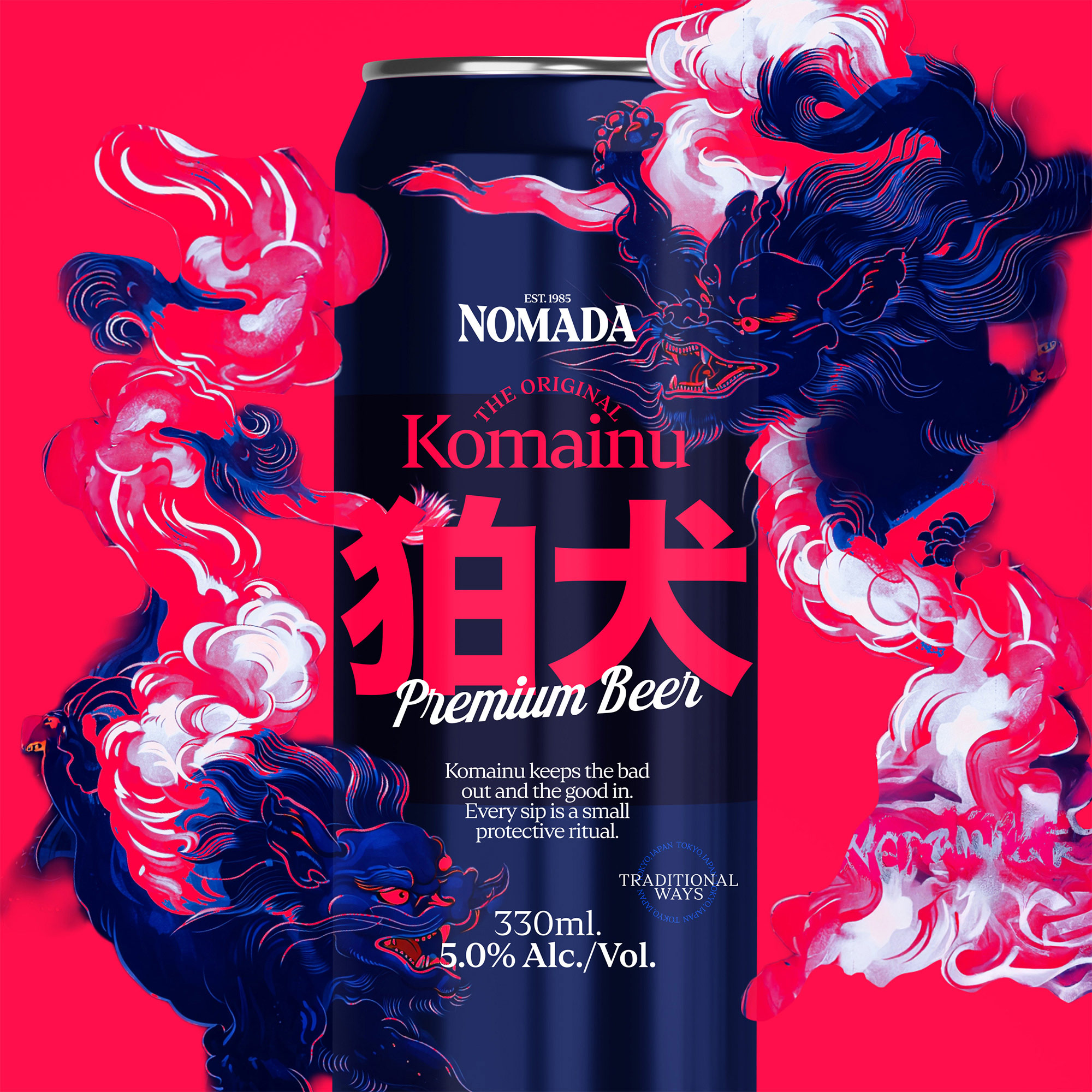
The beer, named after Komainu, draws from the symbolism of guardianship found at shrine entrances across Japan. This reference reframes the act of drinking as a small ritual—one that protects moments of calm, connection, and presence. The brand narrative positions the product as a bridge between tradition and contemporary life, where heritage is not decorative but functional.
Tradition, Reinterpreted in Form
The project explores how Japanese cultural codes can be translated into a modern premium identity. Visual language takes cues from classical Japanese art, shrine architecture, calligraphic balance, and material restraint, while avoiding nostalgia. Instead, these references are distilled into minimal compositions, bold symbolism, and refined typography that communicate authenticity without imitation.
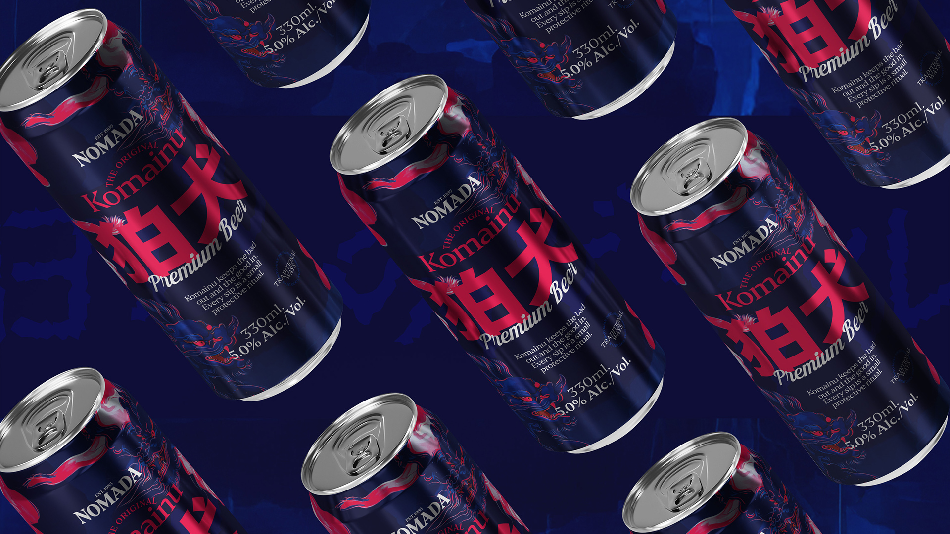
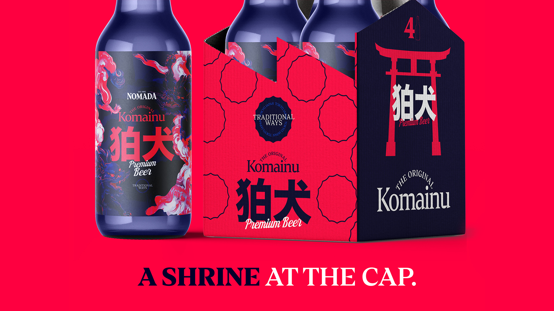
Our objective was to create a brand system that allows Nomada to scale into serial production while maintaining the intimacy of craft. This meant building a flexible visual framework: packaging that feels collectible, iconography that carries narrative weight, and a tone of voice that treats beer as experience rather than commodity. Every element was designed to function across editions, batches, and future expansions without losing coherence.
A Ritual Made Contemporary
Komainu becomes the central metaphor that holds the project together—protection, threshold, and transition. The final outcome positions Nomada as a brand living between two worlds: Japanese heritage and British brewing culture, craft tradition and modern distribution, quiet ritual and everyday use. The result is a contemporary premium beer identity that does not simply reference culture, but carries it forward.
CREDIT
- Agency/Creative: Cem Kutlu
- Article Title: Nomada Komainu Beer Packaging by Cem Kutlu Translates Shrine Symbolism Into Collectible Modern Cans
- Organisation/Entity: Freelance
- Project Type: Packaging
- Project Status: Published
- Agency/Creative Country: Turkey
- Agency/Creative City: Cem Kutlu
- Market Region: Europe
- Project Deliverables: Motion Graphics, Packaging Design
- Format: Bottle, Can
- Industry: Food/Beverage
- Keywords: beer, japanese, can, bottle
-
Credits:
Graphic Designer: Cem Kutlu


