


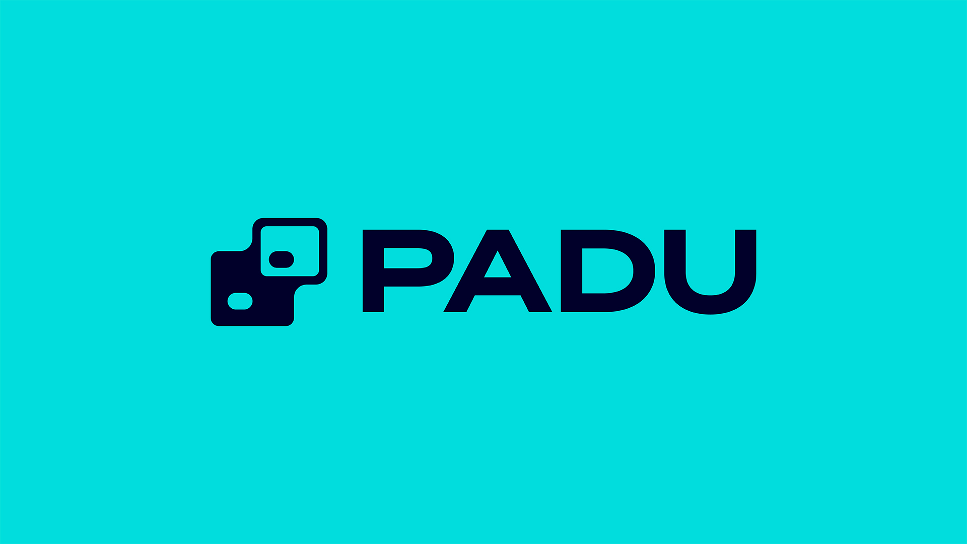
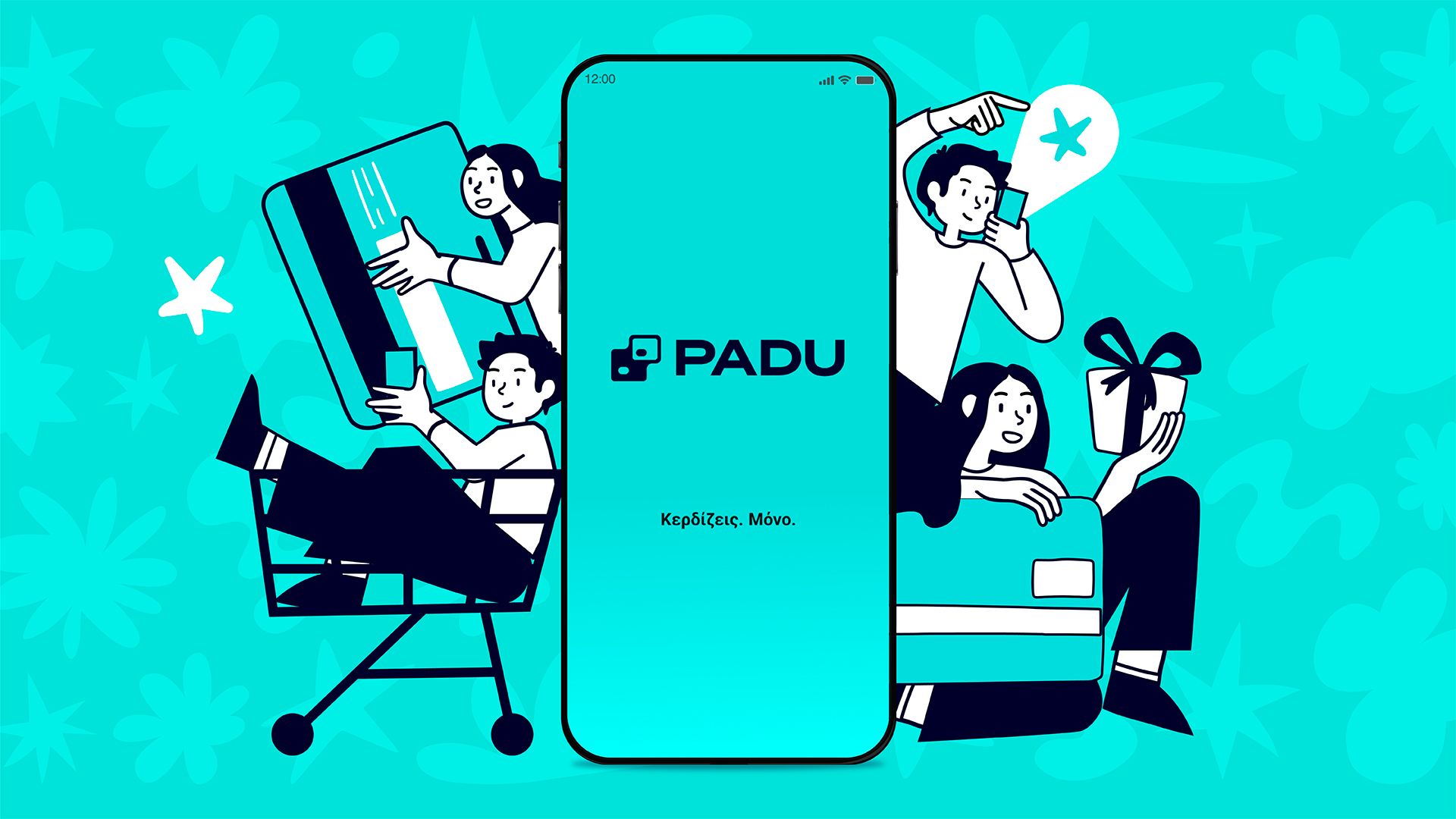
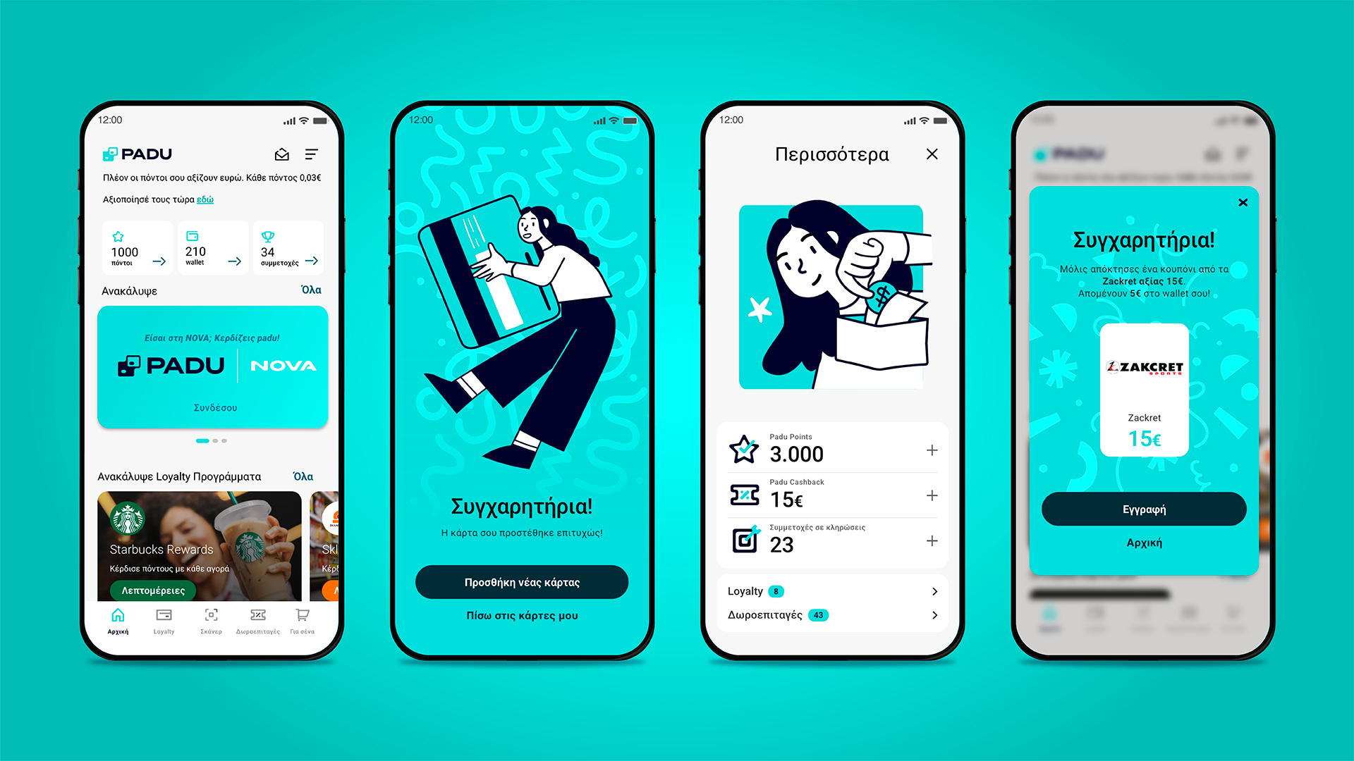
Padu is a rewards app that allows users to collect benefits and cashback by scanning receipts after everyday purchases. Designed to work seamlessly across different retailers and transactions, Padu turns a routine action into a rewarding digital experience.
The design challenge was to rebrand Padu, whose previous identity felt outdated, generic, and visually indifferent. The existing logo lacked impact and failed to communicate the platform’s purpose or value. The new identity needed to move away from neutrality and toward a system that feels dynamic and contemporary, while clearly expressing trust — a critical factor for a platform handling transactions and personal data. At the same time, the rebrand aimed to give Padu a distinctive, memorable character with a clear high-tech sensibility, capable of standing out in a crowded digital environment.
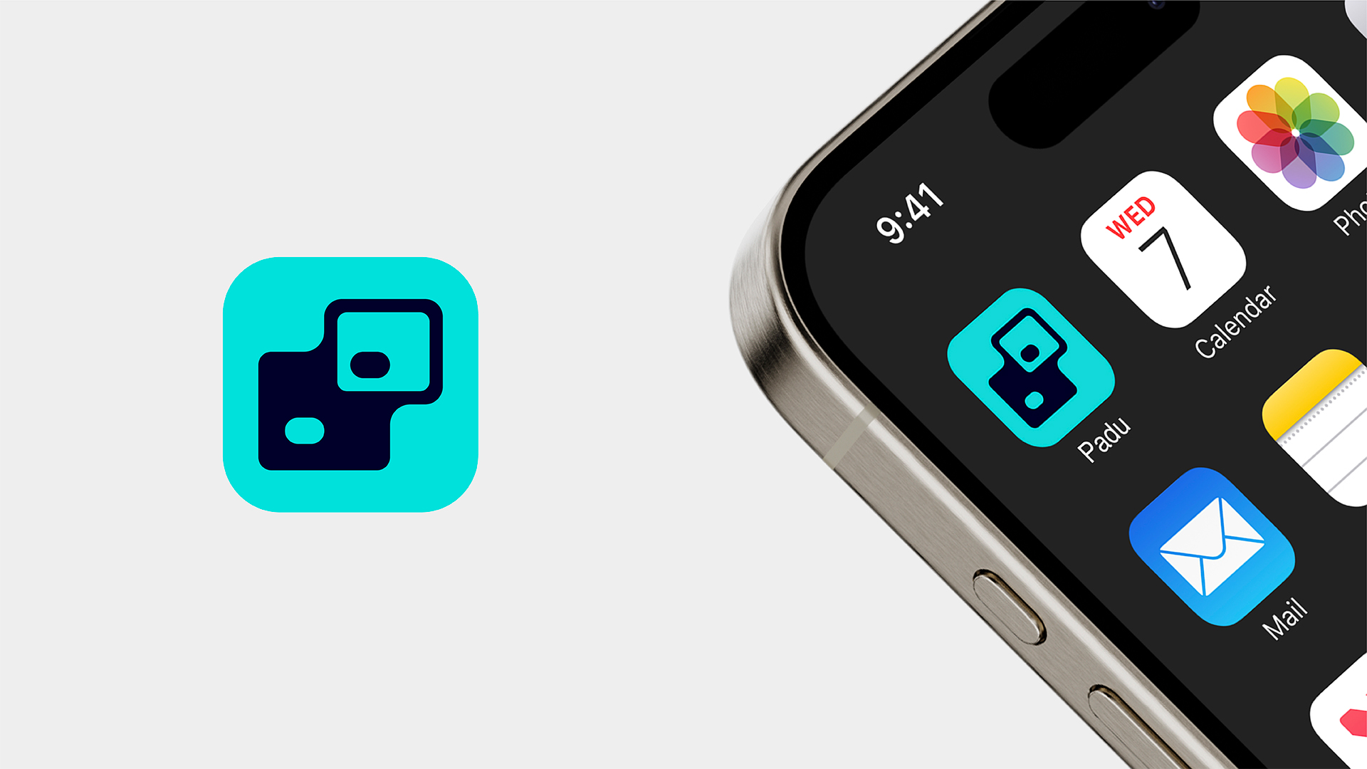
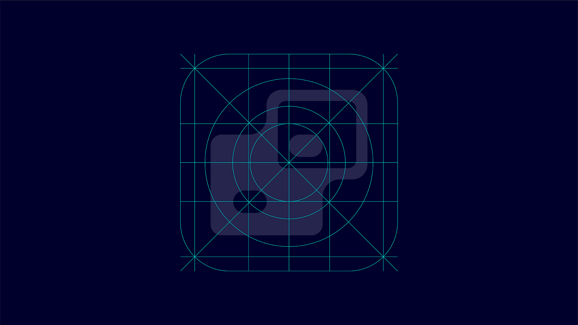
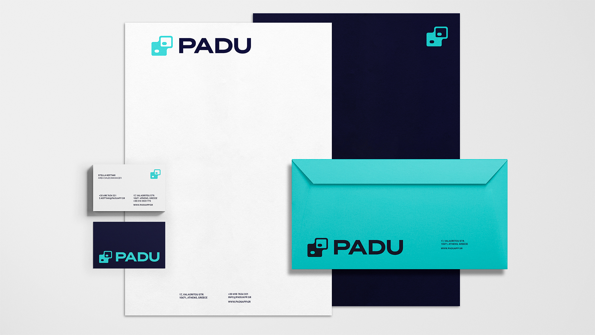
The new identity evolves around its new symbol. Its design is based on the idea of the touchpoint: the moment where the physical and the digital meet. Two levels coexist within its shape. One represents the real world of transactions, such as the credit card, the POS terminal, or the mobile device. The other represents the digital layer, the app, through which rewards are generated and delivered. The symbol visualises this point of contact and exchange, expressing connection and transition rather than depicting a literal object.
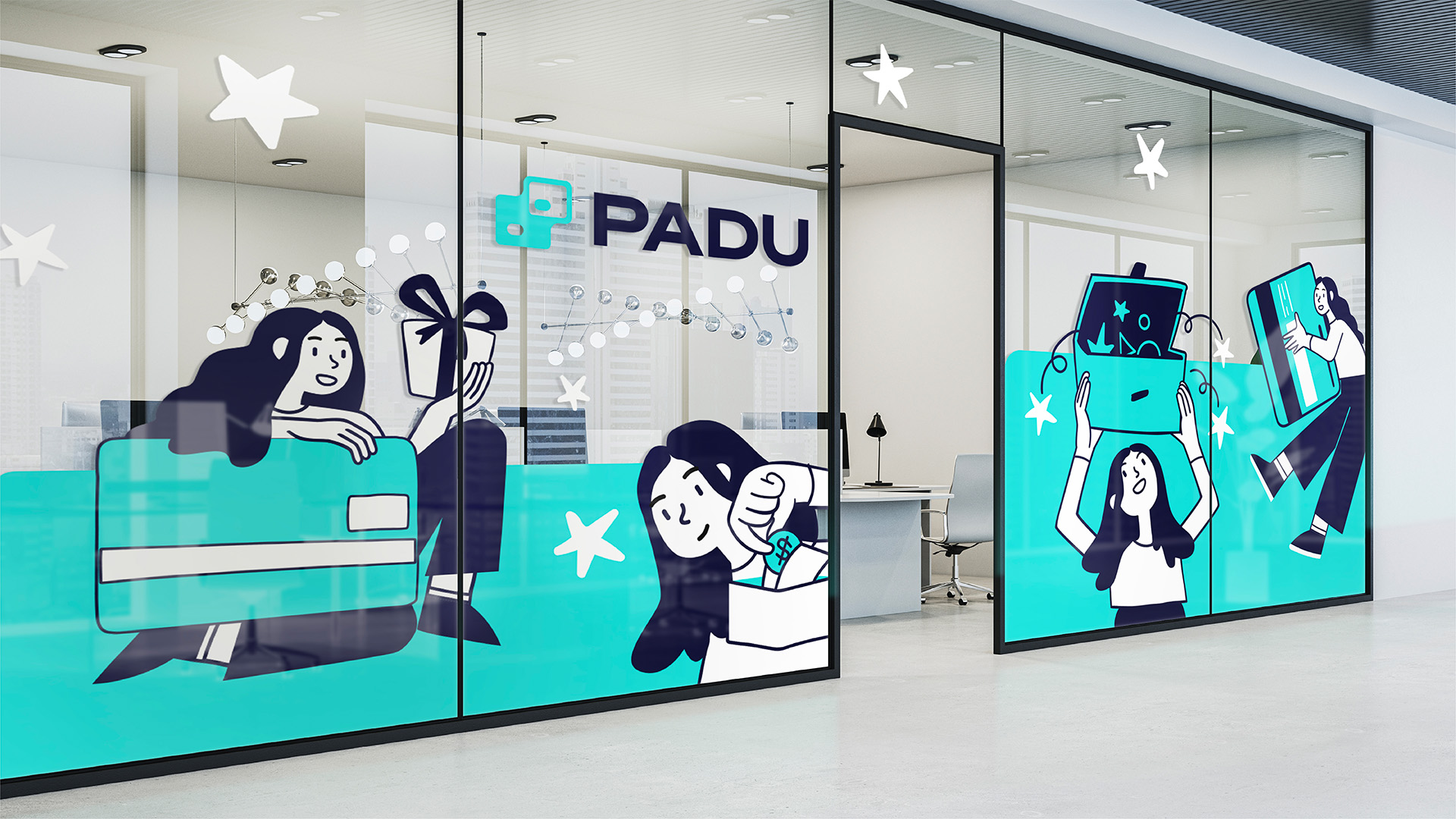
This core idea extends across the entire design system. Layouts, compositions, and graphic elements are built around layered forms and aligned structures, reinforcing the concept of two worlds interacting. The visual language remains clean and controlled, allowing the system to feel technological without becoming cold or abstract. Emphasis is placed on clarity, rhythm, and balance, ensuring the identity remains approachable and easy to navigate.
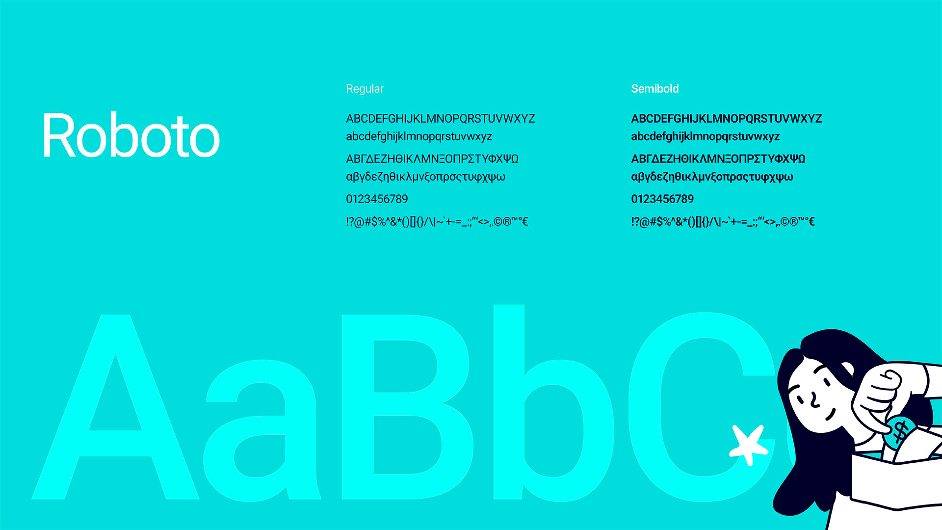
Typography plays a key role in establishing confidence and accessibility. Bold, uppercase letterforms communicate stability and reliability, qualities essential for a platform associated with financial transactions. At the same time, their simplicity keeps the brand friendly and contemporary. The typographic system performs consistently across digital interfaces, corporate material, and communication touchpoints, supporting both usability and recognition.
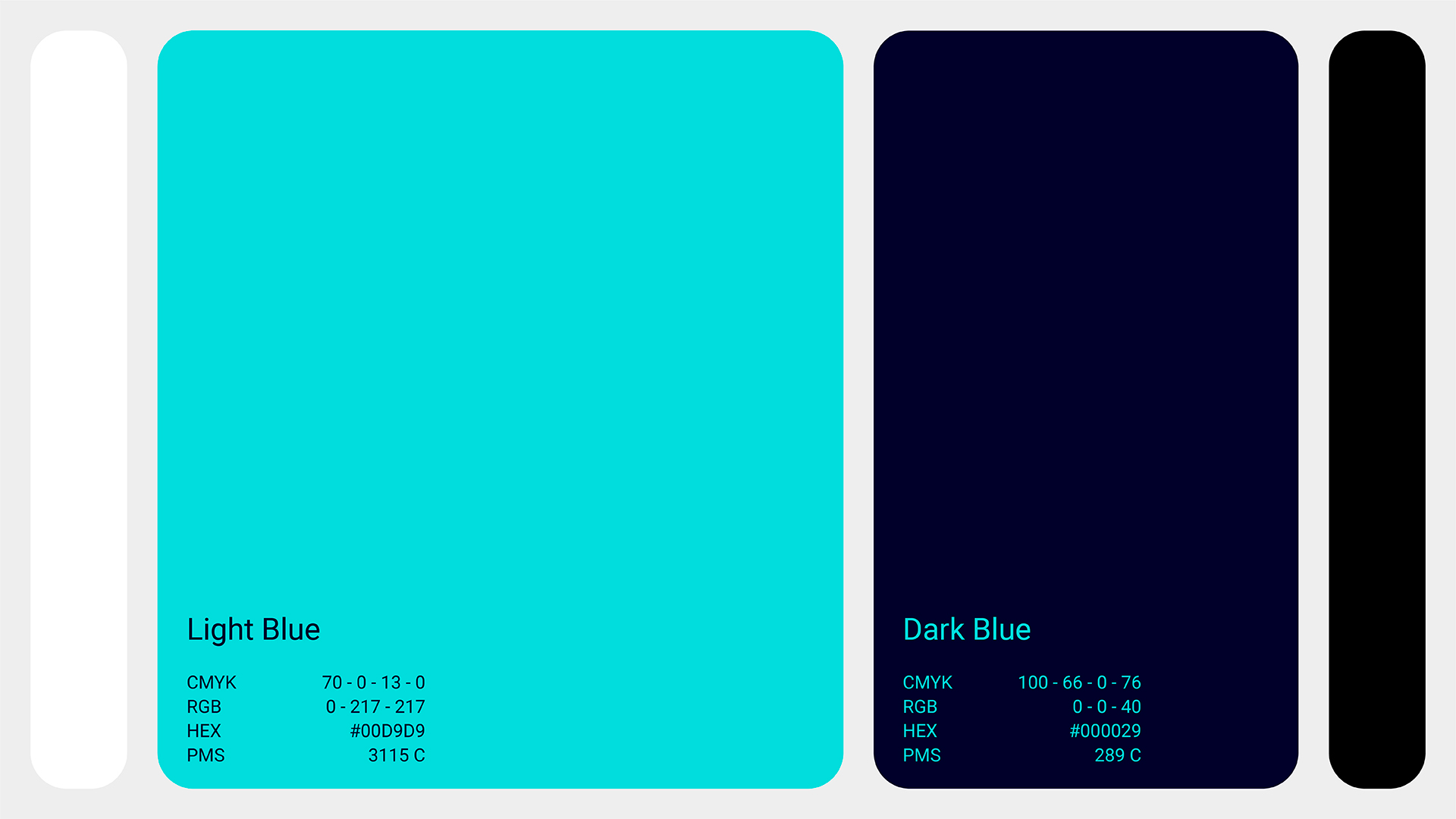
Colour functions as both an emotional and structural tool. The palette balances trust and freshness, helping guide attention and define hierarchy across applications. Used consistently, it strengthens brand recognition while allowing flexibility as the platform grows.
Padu’s corporate identity was designed as a scalable, future-proof system. By focusing on the moment where a physical action becomes digital value, the design translates an invisible process into a clear, trustworthy, and memorable brand experience.

CREDIT
- Agency/Creative: A.S. Strategy Branding & Communication
- Article Title: A.S. Strategy Branding & Communication Gives Padu a Dynamic New Identity for Digital Rewards and Cashback
- Organisation/Entity: Agency
- Project Type: Identity
- Project Status: Published
- Agency/Creative Country: Greece
- Agency/Creative City: Athens
- Market Region: Europe
- Project Deliverables: App Design, Brand Identity, Brand Redesign, Identity System
- Industry: Financial
- Keywords: app, rebrand, identity
-
Credits:
Creative Director: Antonia Skaraki
Art Director: Evangelos Tsirikos


