


About The English Tutor
The English Tutor was founded with a clear ambition: to become a language center that represents credibility, academic excellence, and measurable outcomes. More than a place to study English, it is built as a structured yet supportive system that enables learners to confidently achieve their goals — from international certifications to real-world communication fluency.
While many academic environments lean toward rigidity, The English Tutor challenges that convention. The center embraces a friendly and comfortable learning atmosphere, designed to reduce pressure and increase absorption. The belief is simple: students learn better when they feel safe, understood, and motivated. Every touchpoint — from classroom interaction to visual identity — reflects this balance between professionalism and warmth.
At its core is a team of passionate, highly capable instructors who value closeness as much as competence. The experience is intentionally designed to feel less like a formal institution and more like learning alongside trusted mentors or close friends — approachable, encouraging, and genuinely invested in each learner’s growth.
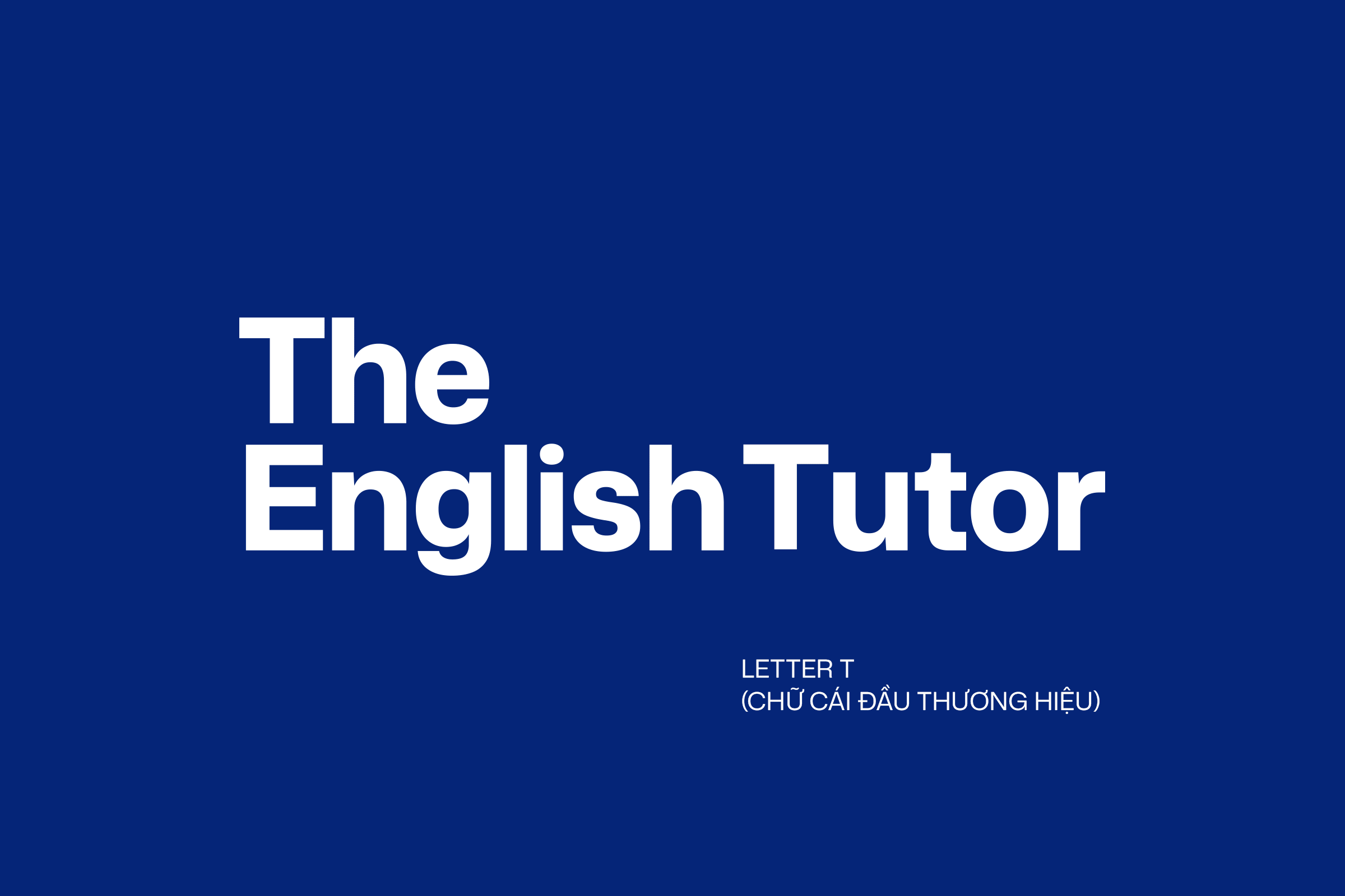
Brand Concept – The Arrow
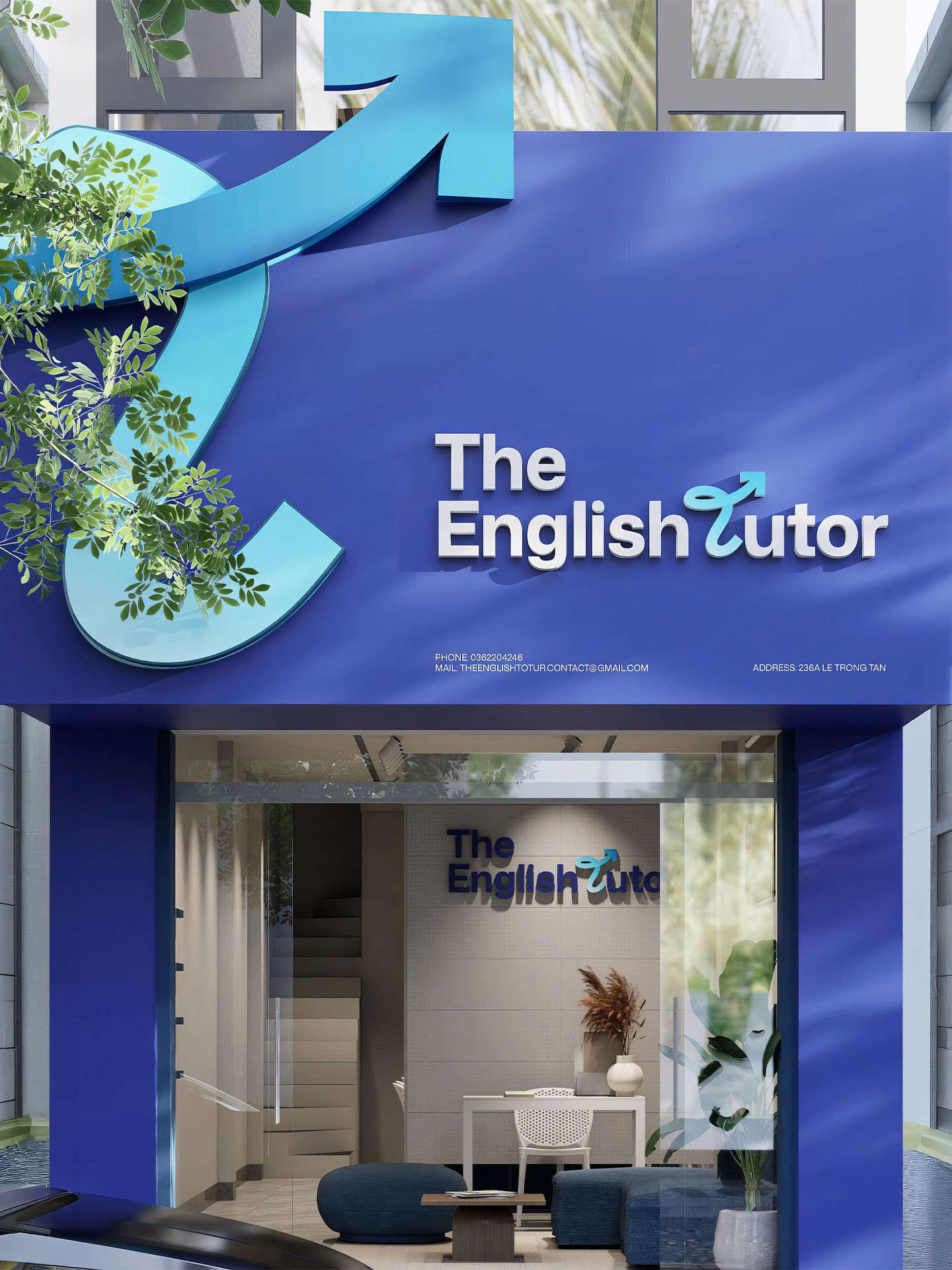
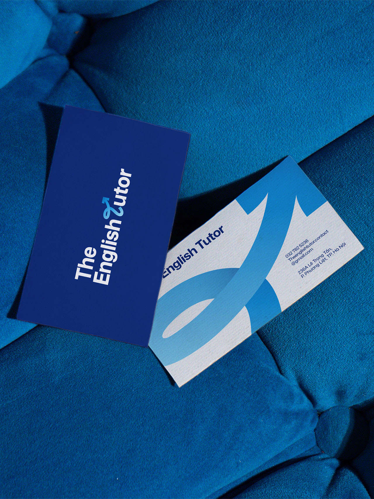
The brand is built around the idea of “The Guide” — positioning The English Tutor not just as a knowledge provider, but as a directional force in each learner’s journey.
The arrow symbol replaces the letter “T” in “Tutor,” transforming typography into meaning. While the original “T” is static, the arrow introduces motion, intention, and forward energy. This subtle shift becomes the core of the visual identity system.
The arrow represents guidance, clarity, and measurable progress. It reflects the philosophy that learning is not passive — it is dynamic and goal-oriented. Rather than simply delivering lessons, The English Tutor drives learners forward: learning smarter, progressing faster, and achieving clear, defined outcomes.
Through this visual metaphor, the identity communicates momentum, continuous advancement, and purpose — reinforcing the brand’s commitment to direction, progress, and long-term growth.


CREDIT
- Agency/Creative: Trịnh Minh Đạt
- Article Title: The English Tutor by Trịnh Minh Đạt Brings Academic Credibility and Warmth Into One Guided Brand System
- Organisation/Entity: Freelance
- Project Type: Identity
- Project Status: Published
- Agency/Creative Country: Vietnam
- Agency/Creative City: Ho Chi Minh City
- Market Region: Asia
- Project Deliverables: Brand Design, Brand Guidelines, Brand Identity
- Industry: Education
- Keywords: English center brand identity
-
Credits:
Art Director: Dat Mix


