


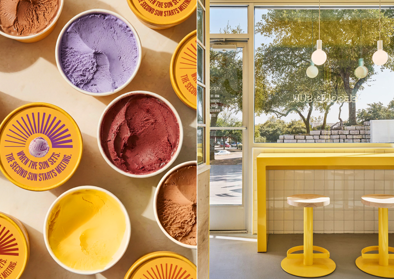
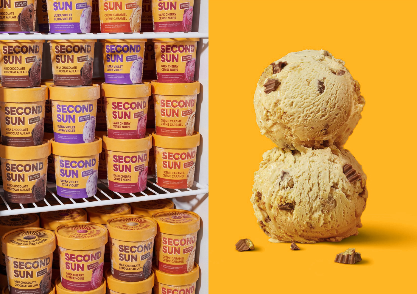
Second Sun is designed to bring warmth, optimism, and quiet pleasure into a crowded and highly competitive ice cream category. In a market saturated with predictable pastel palettes, indulgent product photography, and overly decorative elements, the objective was to create a brand that radiates energy, confidence, and emotional clarity. The ambition was not simply to design attractive packaging, but to build a distinctive shelf presence that feels like a second source of light, something that naturally draws the eye and uplifts the surrounding space.
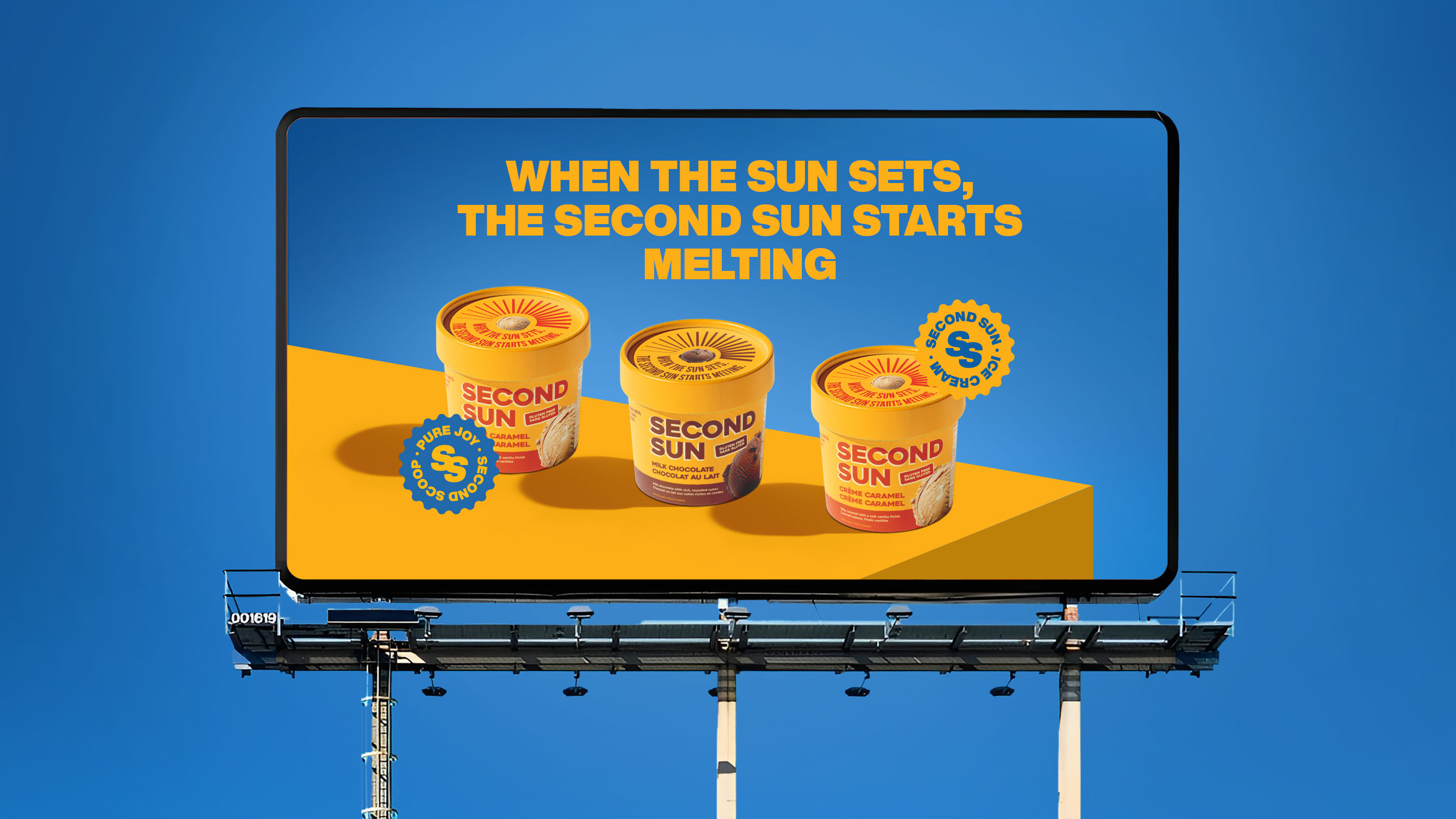
Rather than competing through visual noise, Second Sun competes through presence. It stands calmly yet boldly, creating immediate recognition through graphic strength instead of relying on product imagery. The focus was on crafting an identity that feels warm but structured, expressive yet controlled, joyful yet refined. Every design decision was guided by the idea of clarity and emotional impact.
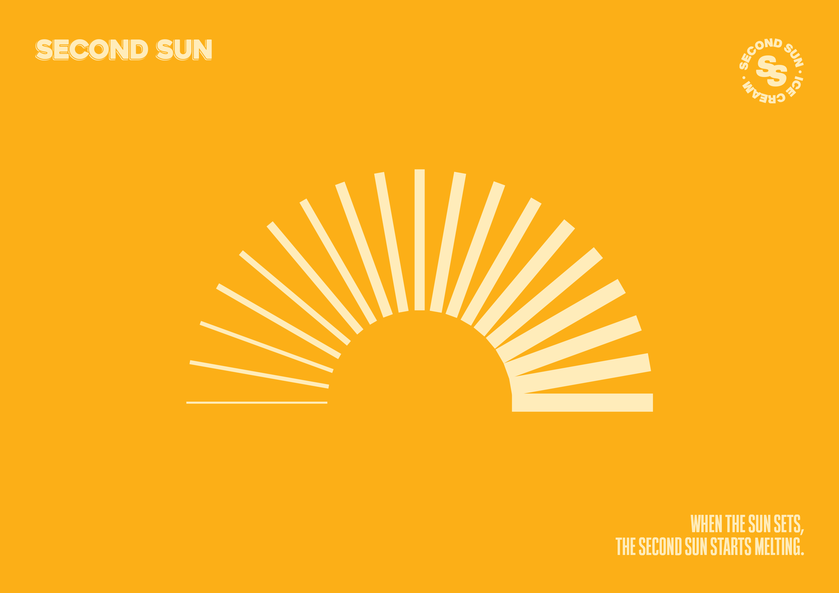
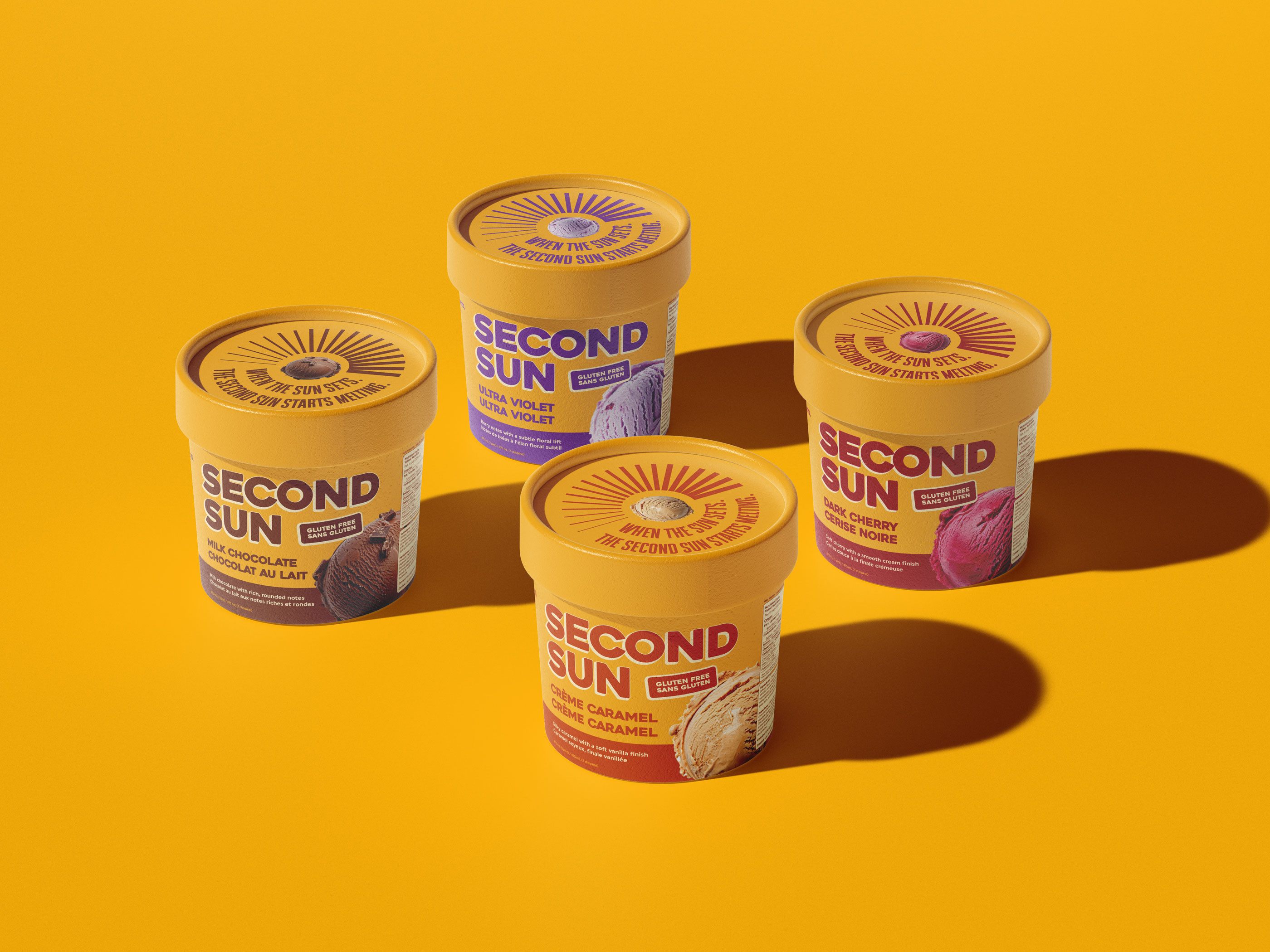
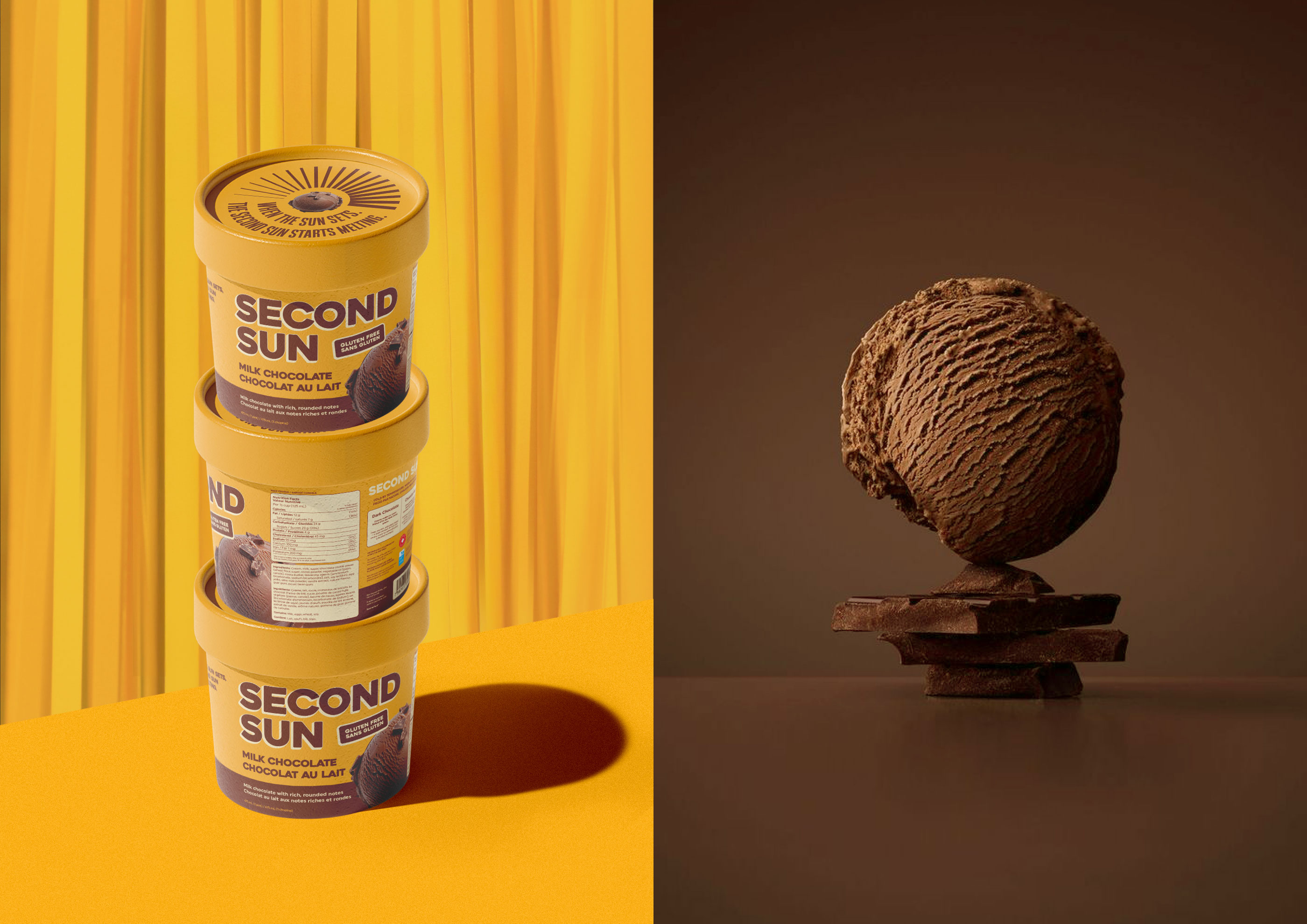
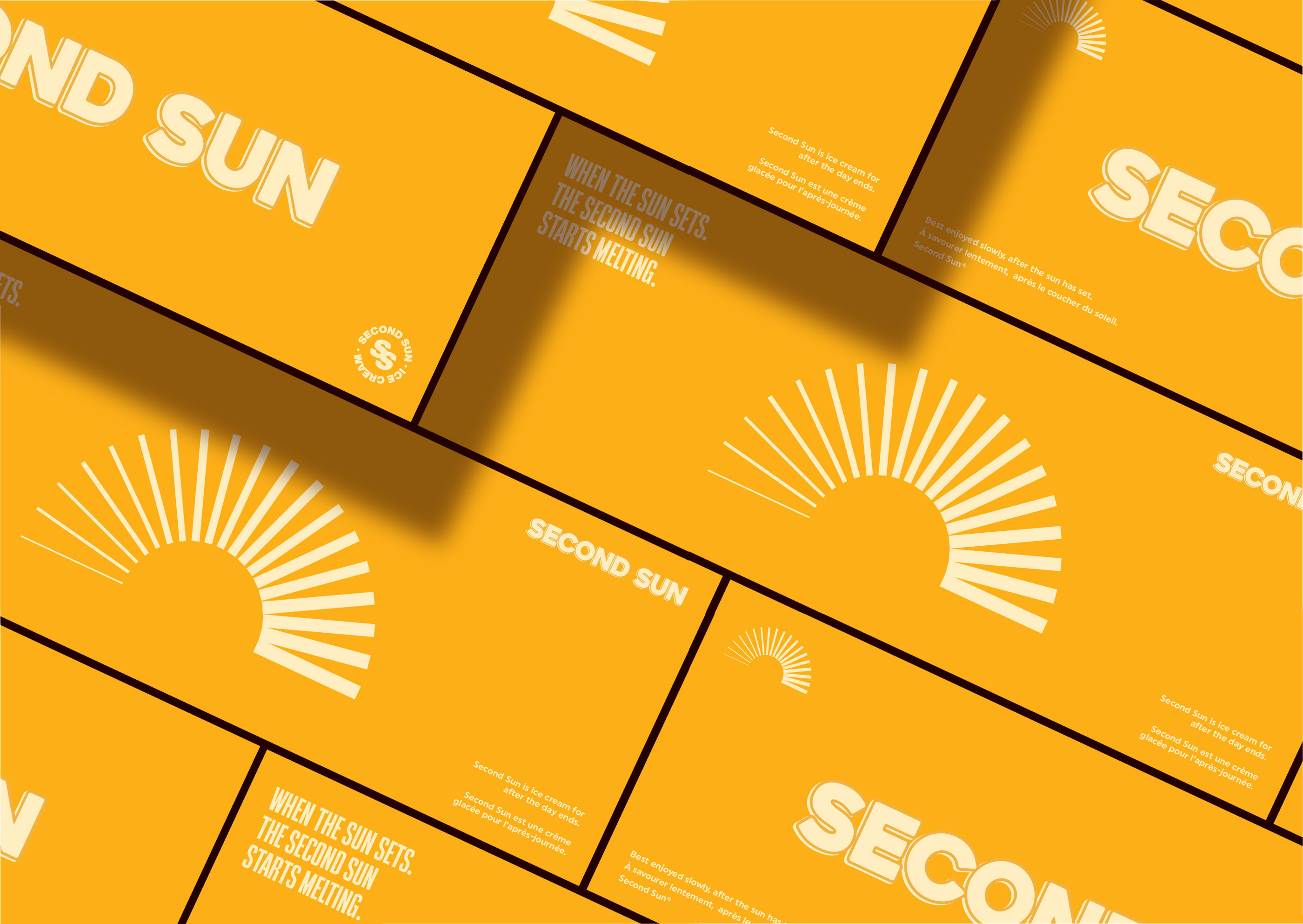
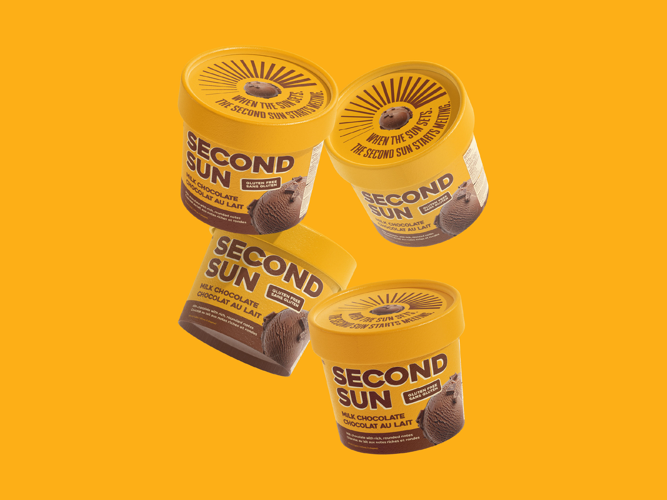
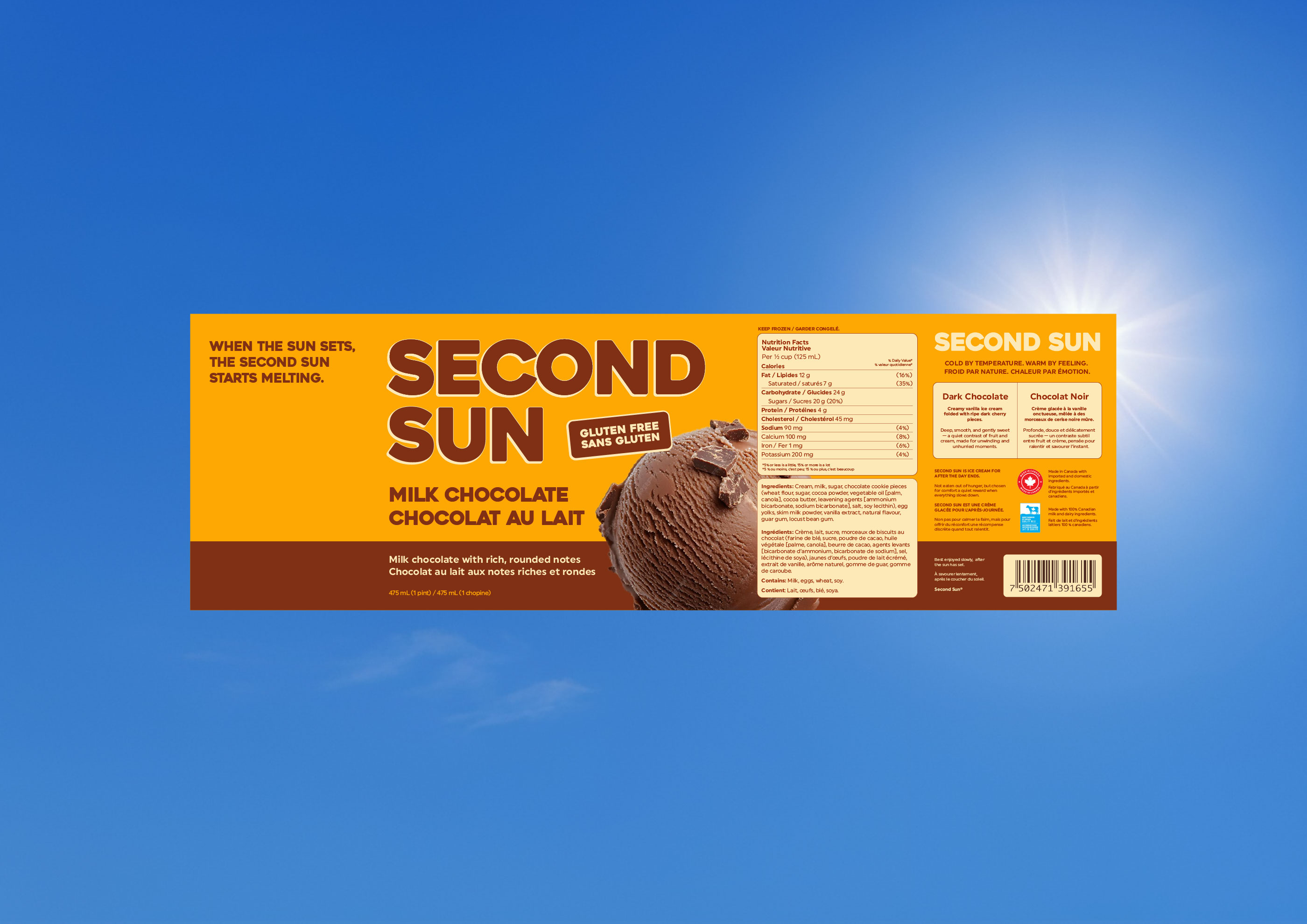
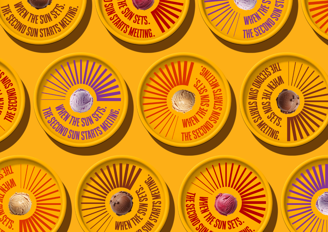
To achieve this, the identity was anchored in a dominant yellow foundation acting as the symbolic sun. This color choice communicates warmth, brightness, and positivity at first glance while creating strong visibility in the freezer aisle. Bold, approachable typography reinforces the joyful and confident personality of the brand while maintaining clarity and readability across formats. The challenge lay in building strong differentiation within a tightly controlled color system. This was resolved through precise hierarchy, disciplined composition, and a confident use of negative space, allowing each element to breathe and contribute to the overall impact.
The result is a graphic first packaging system that stands apart through clarity, balance, and bold visual impact. Instead of blending into the visual clutter of the category, Second Sun commands attention with intentional color blocking, confident structure, and a clean architectural layout.
More than simply protecting the product, the packaging creates a mood and a moment. It positions Second Sun as a modern, design driven alternative, built as a scalable visual system ready to expand across flavors and formats while maintaining its warmth, recognizability, and strong shelf identity.
CREDIT
- Agency/Creative: Halil Kulbak
- Article Title: Halil Kulbak Shapes Second Sun Ice Cream Packaging With a Yellow-First Identity Built for Freezer Shelf Clarity
- Organisation/Entity: Freelance
- Project Type: Packaging
- Project Status: Non Published
- Agency/Creative Country: Canada
- Agency/Creative City: Toronto
- Market Region: North America
- Project Deliverables: Branding, Packaging Design
- Format: Tube
- Industry: Food/Beverage
- Keywords: ice cream, cpg, gelato
-
Credits:
Brand & Packaging Designer: Halil Kulbak


