


Modern Vintage Wine Label Design: The Harmonious Evolution of Via Vinera
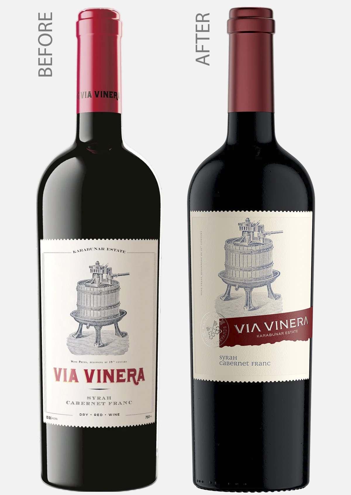
The “Before”: A Fragmented Vintage Vision
The original Via Vinera label was an attempt at a classic aesthetic that, unfortunately, suffered from significant execution flaws. The typography was disjointed, the composition felt cluttered, and the overall shelf presence was weakened by a lack of cohesion between the bottle, the capsule, and the label itself. While the vintage intent was there, the execution didn’t reflect the premium quality of the wine. It was a traditional look that felt dated rather than timeless.
The “After”: Lifting the Vintage Spirit to a Higher Level
In the redesign, my objective wasn’t to destroy the brand’s history, but to perfect and elevate it. This is a Modern Vintage Wine Label Design where every element – the brand, the typography, the illustration, and the print embellishments – lives in a new, sophisticated harmony.
We preserved the “Vintage” soul but corrected the structural problems of the past. The result is a label that doesn’t just sit on the bottle; it belongs to it.
Key Improvements in the New Design:
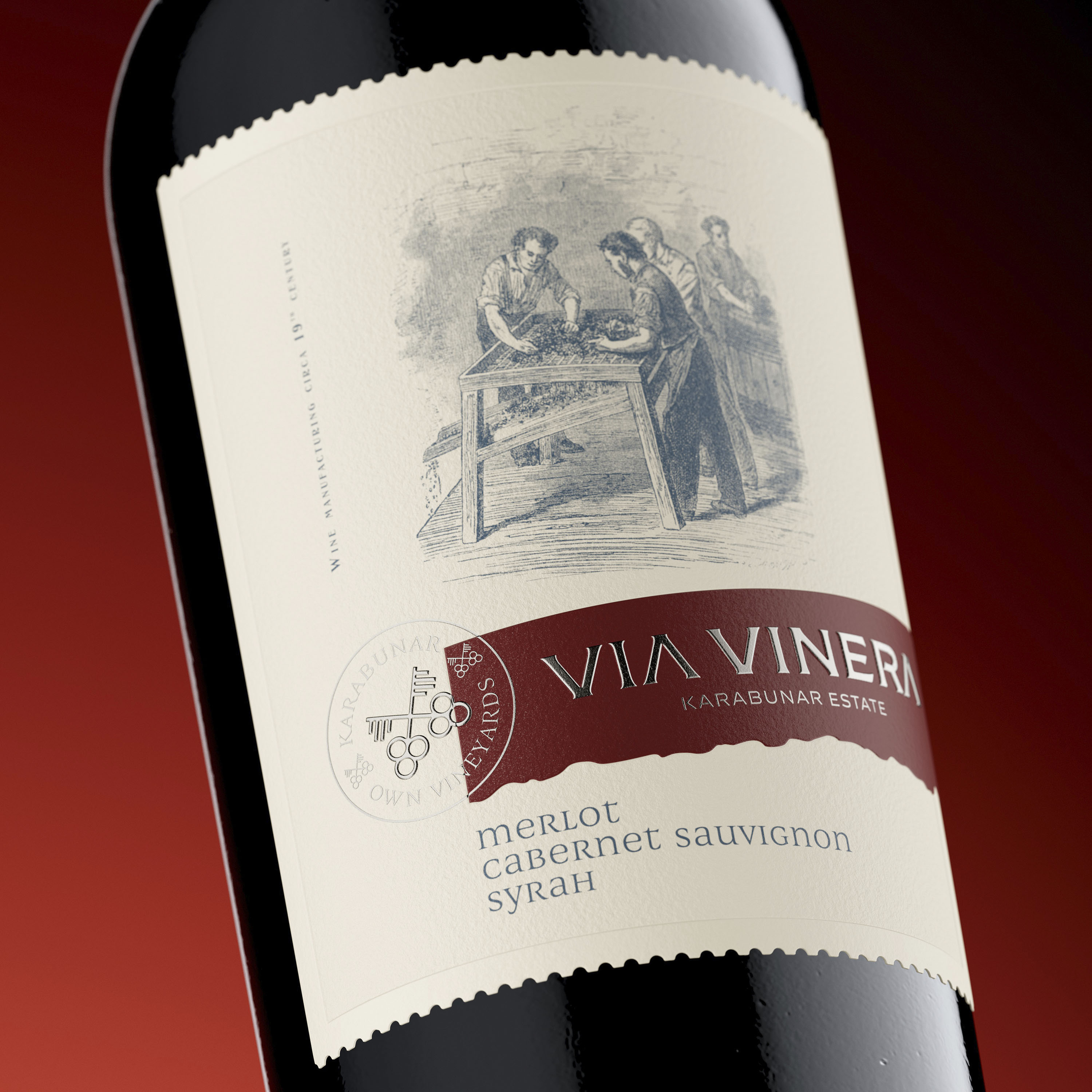
The Typographic Evolution: A Masterclass in Precision
The most critical “healing” process in the Via Vinera redesign was the typographic correction. We replaced the disjointed, chaotic fonts of the past with a sophisticated, harmonious system that breathes life into the brand:
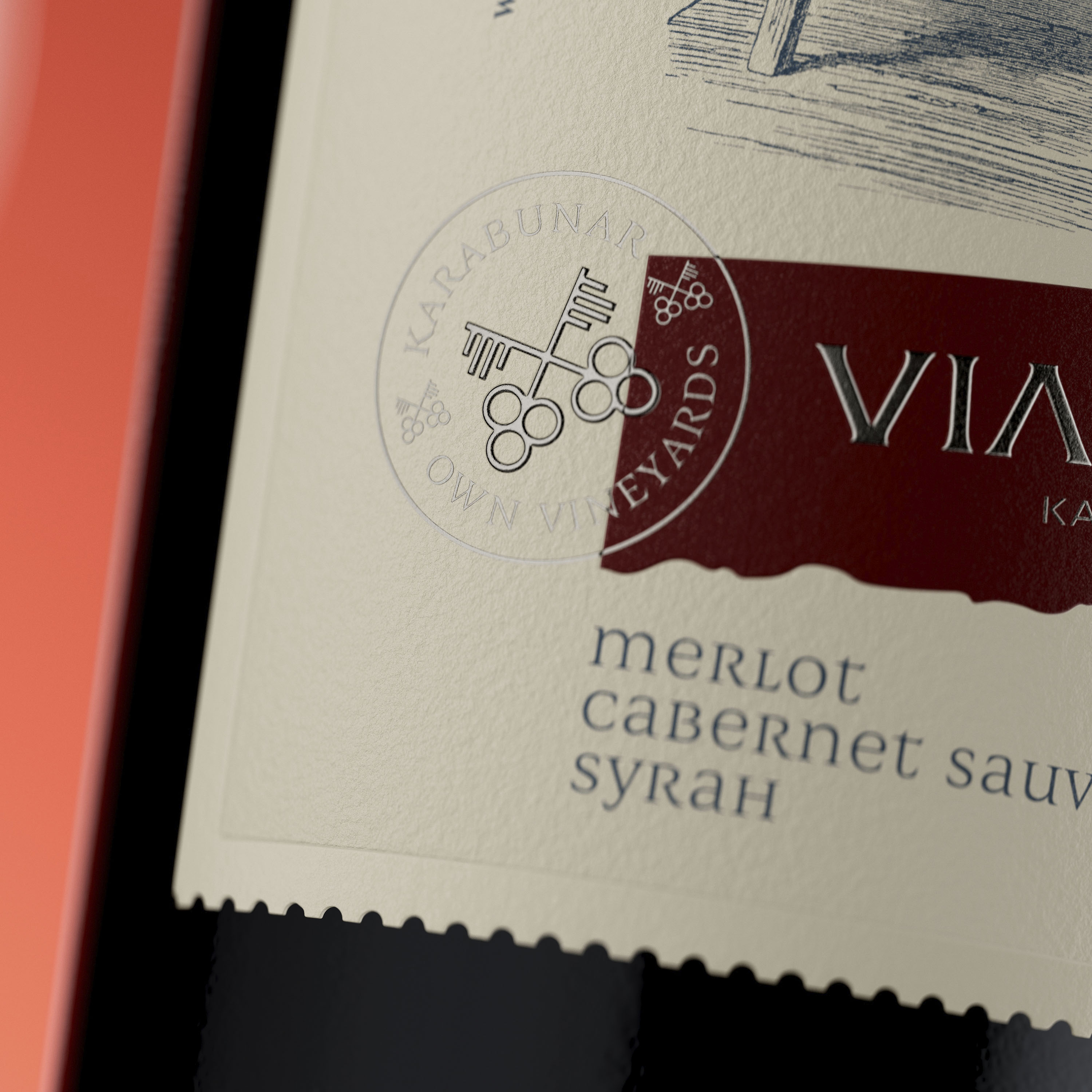
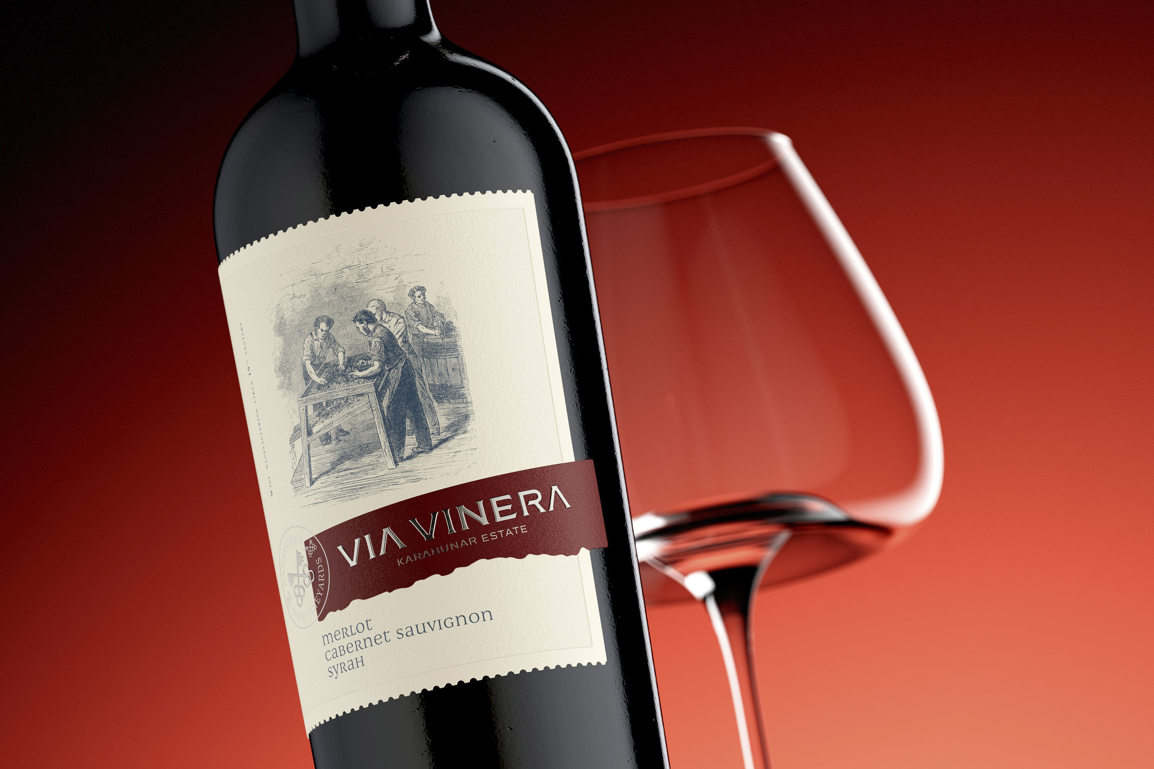
The Custom Brand Identity: The Via Vinera brand name, nestled within the colored band, is rendered in a slightly modified version of the original Bolyar Pro font. This is a significant choice, as Bolyar Pro is the only Bulgarian typeface specifically engineered for wine and spirits label design. Its sharp, assertive forms provide the perfect structural foundation for a premium brand. You can explore this specialized typeface at thefontmaker.com.
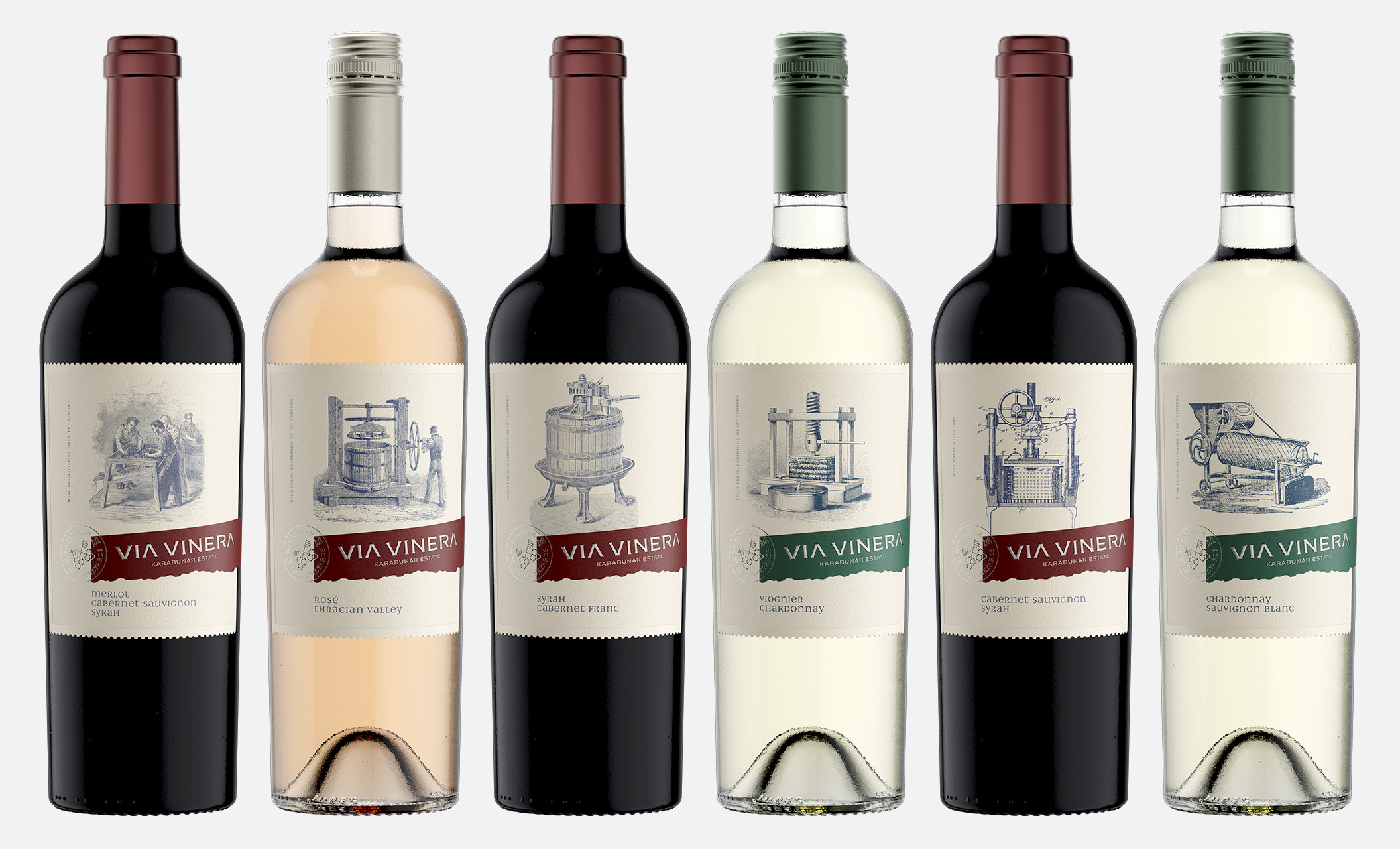
The Varietal Harmony: To maintain a high-level consistency across the entire range, all varietals (Cabernet Franc, Merlot, Chardonnay, etc.) are set in Caravela Titling Unicase. This masterful font, designed by the renowned Kiril Zlatkov, was the perfect match for this project. Its unique unicase structure and elegant proportions bring a refined, contemporary clarity that balances the vintage elements of the label.
A Professional Hierarchy: This combination – Bolyar Pro for the brand and Caravela for the details – creates a professional, legible hierarchy. The typography no longer fights for attention; instead, it anchors the entire composition, proving that the right choice of typeface is the difference between a dated label and an iconic brand.
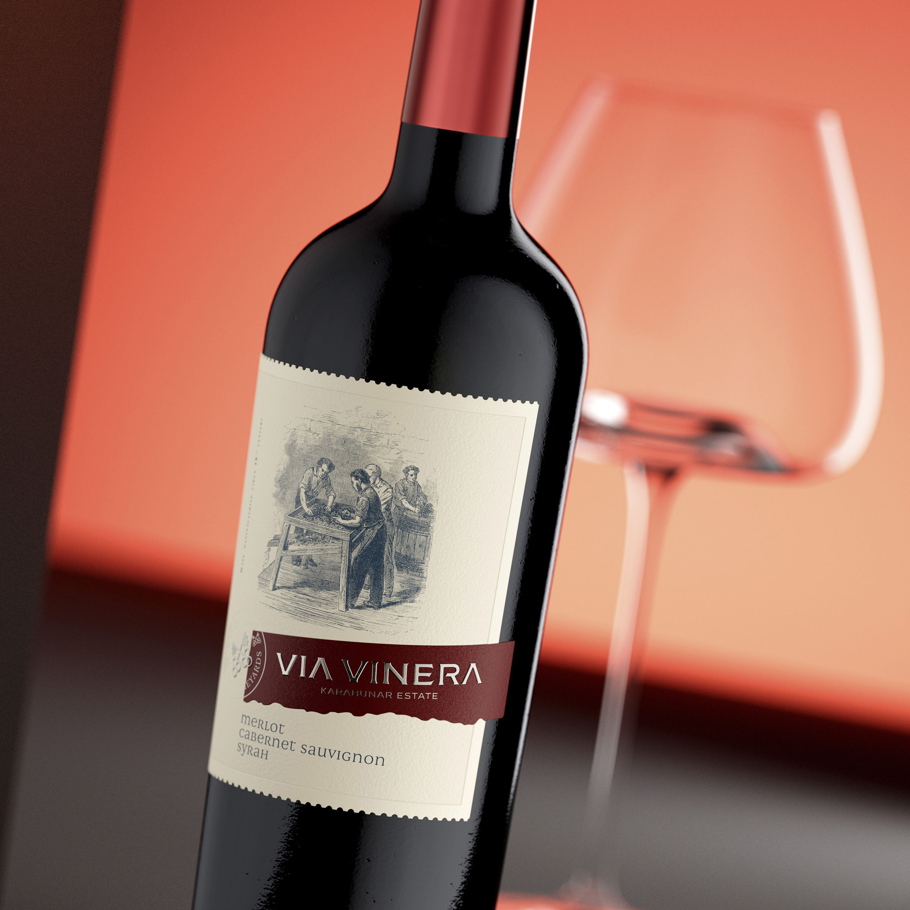
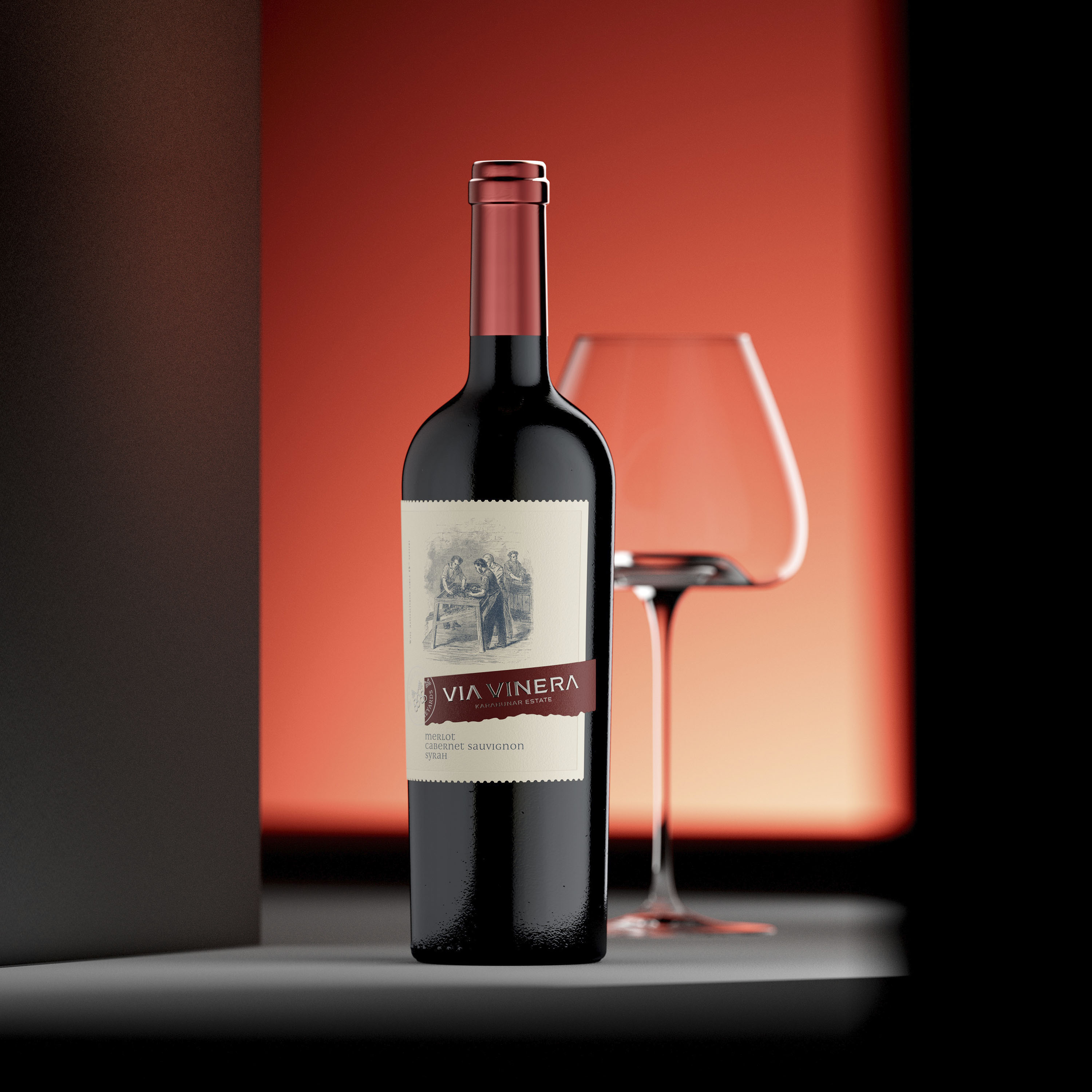
Integrated Illustration: The vintage illustration is no longer a separate entity. It is now woven into the composition, balanced by the strong verticality of the design, creating a seamless visual story.
Total Bottle Harmony: We looked beyond the paper. The label now works in perfect tandem with the capsule and the bottle shape, creating a unified premium object.
The Harmony of Technical Details: Crafting a Modern Vintage Icon
To lift the Via Vinera series to a world-class level, the printing execution by Dagaprint was paramount. We moved away from flat, uninspired printing and introduced a complex layering of tactile effects:
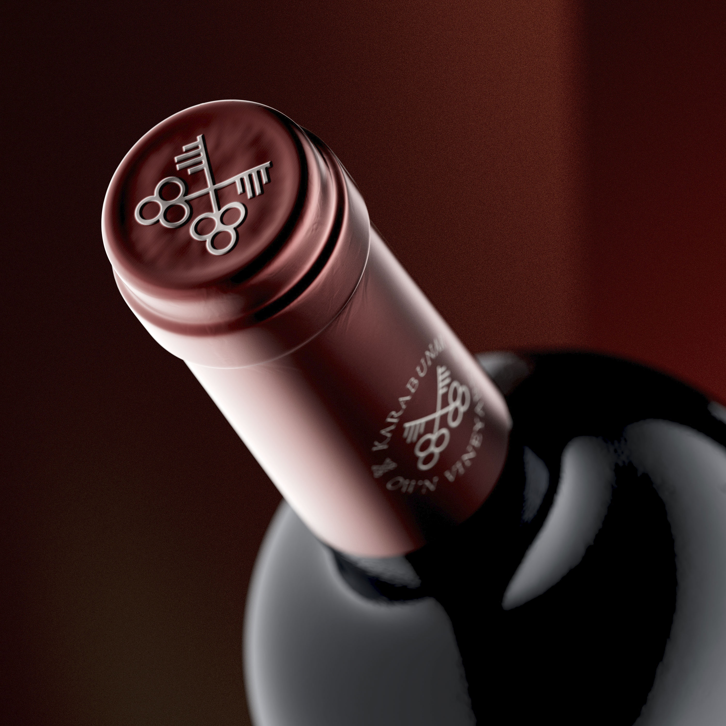
Precision Embossing & Debossing: We achieved a tactile sculptural depth by applying multi-level embossing to the “VIA VINERA” wordmark and the iconic double-key emblem. To create a contrast, we used deep debossing on the colored brand band and the wide, elegant frame that extends to the very edges of the label, adding structural integrity to the entire composition.
Refined Silver Accents: For the secondary branding elements, we utilized a high-end silver hot foil by Kurz. This silver foil was applied with surgical precision over the double-key seal and the brand name, providing a crisp, metallic brilliance that anchors the vintage aesthetic in the modern world.
The Signature Die-Cut: One of the most distinctive features of this project is the custom die-cut shape. The edges of the label are finished with a perforated, postage-stamp style cut. This “philatelic” detail serves as a brilliant bridge between the old and the new, reinforcing the handcrafted, archival feel of the Modern Vintage Wine Label Design.
Tactile Sophistication: Every element – from the choice of substrate to the interplay of silver foil and sculptural relief – was designed to ensure the label feels like a handcrafted artifact. It’s a design that rewards the touch, inviting the consumer to explore the heritage of the wine through their fingertips.
The Result: An Elevated Icon
This redesign proves that a Modern Vintage Wine Label Design is about more than just “looking old.” It’s about taking the best parts of tradition and executing them with the precision of modern technology. We solved the problems of composition and scale to create a brand that is assertive, harmonious, and undeniably high-end. Via Vinera has evolved from a fragmented traditional label into a cohesive, memorable presence on the global stage.
CREDIT
- Agency/Creative: the Labelmaker
- Article Title: the Labelmaker Elevates Via Vinera With a Modern Vintage Label System Built on Precision Typography
- Organisation/Entity: Agency
- Project Type: Packaging
- Project Status: Published
- Agency/Creative Country: Bulgaria
- Agency/Creative City: Sofia
- Market Region: Europe
- Project Deliverables: Brand Creation, CGI, Graphic Design, Label Design, Packaging Design
- Format: Bottle
- Industry: Food/Beverage
- Keywords: Modern Vintage, Wine label design, Brand evolution, Label redesign, Premium packaging, Typography design, Via Vinera, The Labelmaker, Authentic wine branding, Strategic design transformation
-
Credits:
Design & CGI Photo: the Labelmaker


