


Overview
Kuwait Luxury Real Estate is a Kuwaiti real estate company specialized in the luxury property sector. It was established with the vision of redefining the concept of high-end real estate investment in the Kuwaiti market by offering a comprehensive experience that goes beyond traditional brokerage into long-term strategic partnership.
The company focuses on the sale, acquisition, and management of high-value real estate assets, with particular emphasis on luxury villas, penthouses, exclusive residential compounds, and carefully structured investment opportunities with calculated returns. It serves elite investors, business leaders, and capital owners both locally and internationally who seek privacy, trust, and long-term investment stability.
The company believes that real estate is not merely a financial asset, but an expression of status and lifestyle. Therefore, it builds its relationships on transparency, professionalism, and long-term vision, aiming to create sustainable value that grows steadily while reflecting a refined standard of service and reliability.
Logo Concept
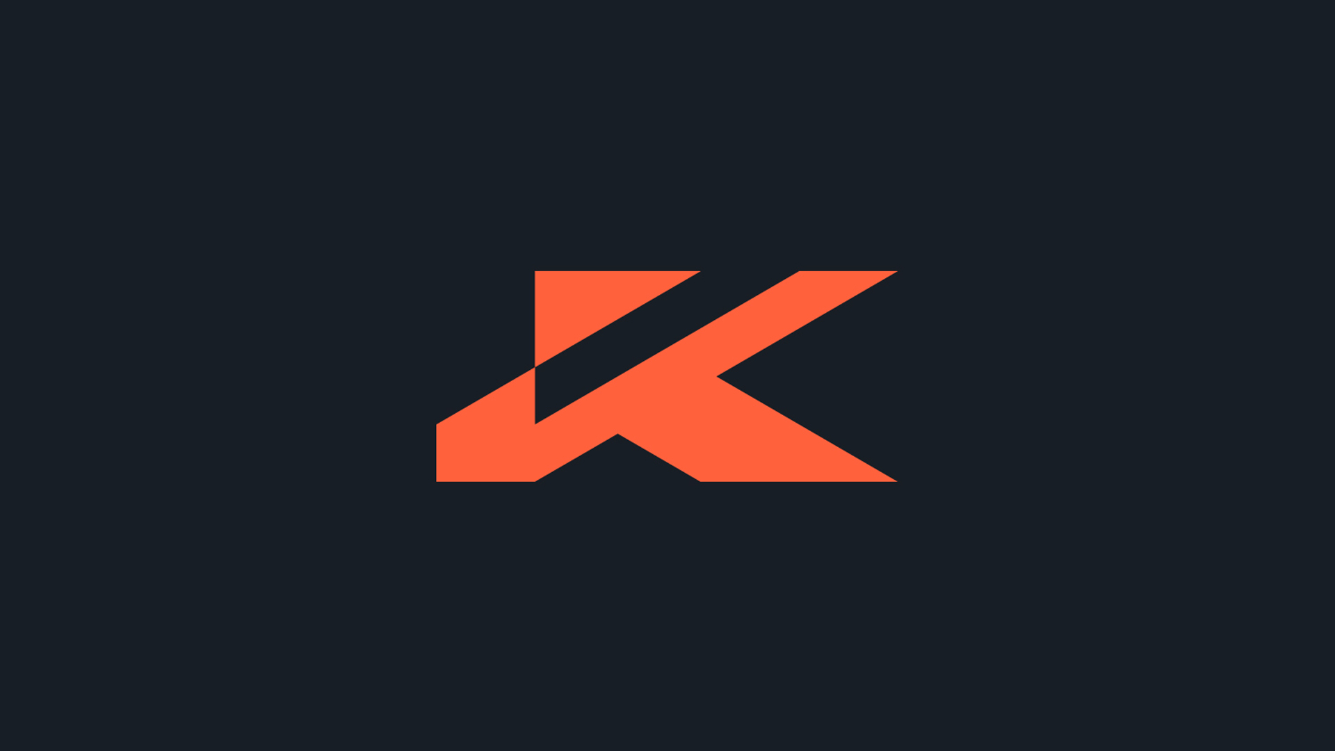
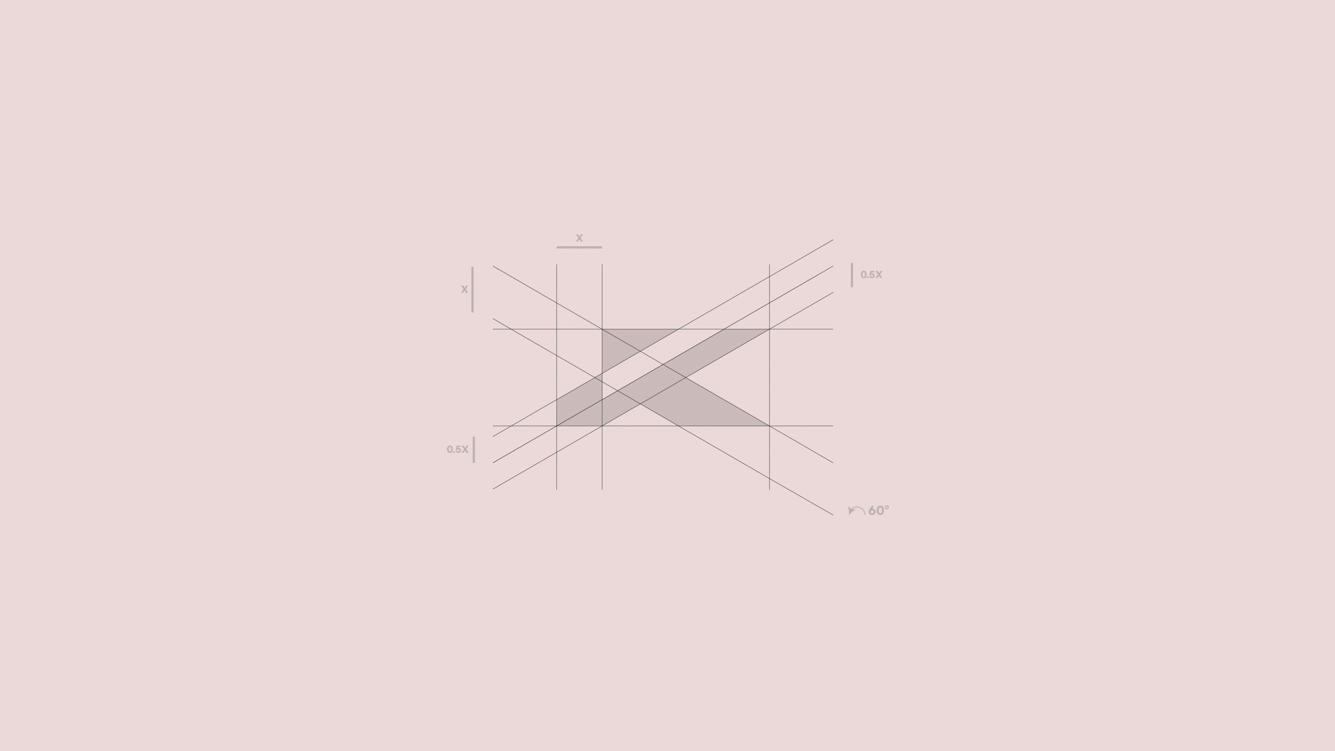
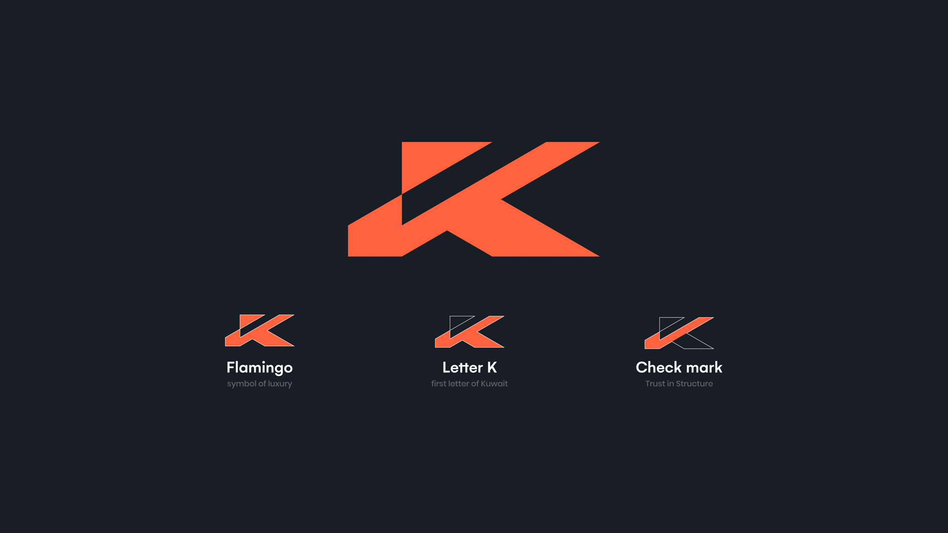
The logo is built upon the concept of “Quiet Luxury”, a clear and confident visual presence without visual clutter or unnecessary complexity. The icon originates from the letter “K,” the first letter of Kuwait, forming the structural foundation of the identity and serving as a direct symbol of local belonging and rooted stability.
The letter is constructed with sharp geometric angles and precise lines that reflect strength and institutional stability, two essential elements in the world of luxury real estate investment.
Within the geometric structure of the letter, an integrated checkmark emerges as part of the symbol’s body, representing trust, quality assurance, and well-calculated investment decisions. The checkmark is not a decorative addition but a structural component of the form, reinforcing the idea that credibility is not a visual claim, but a foundational pillar of the brand identity.
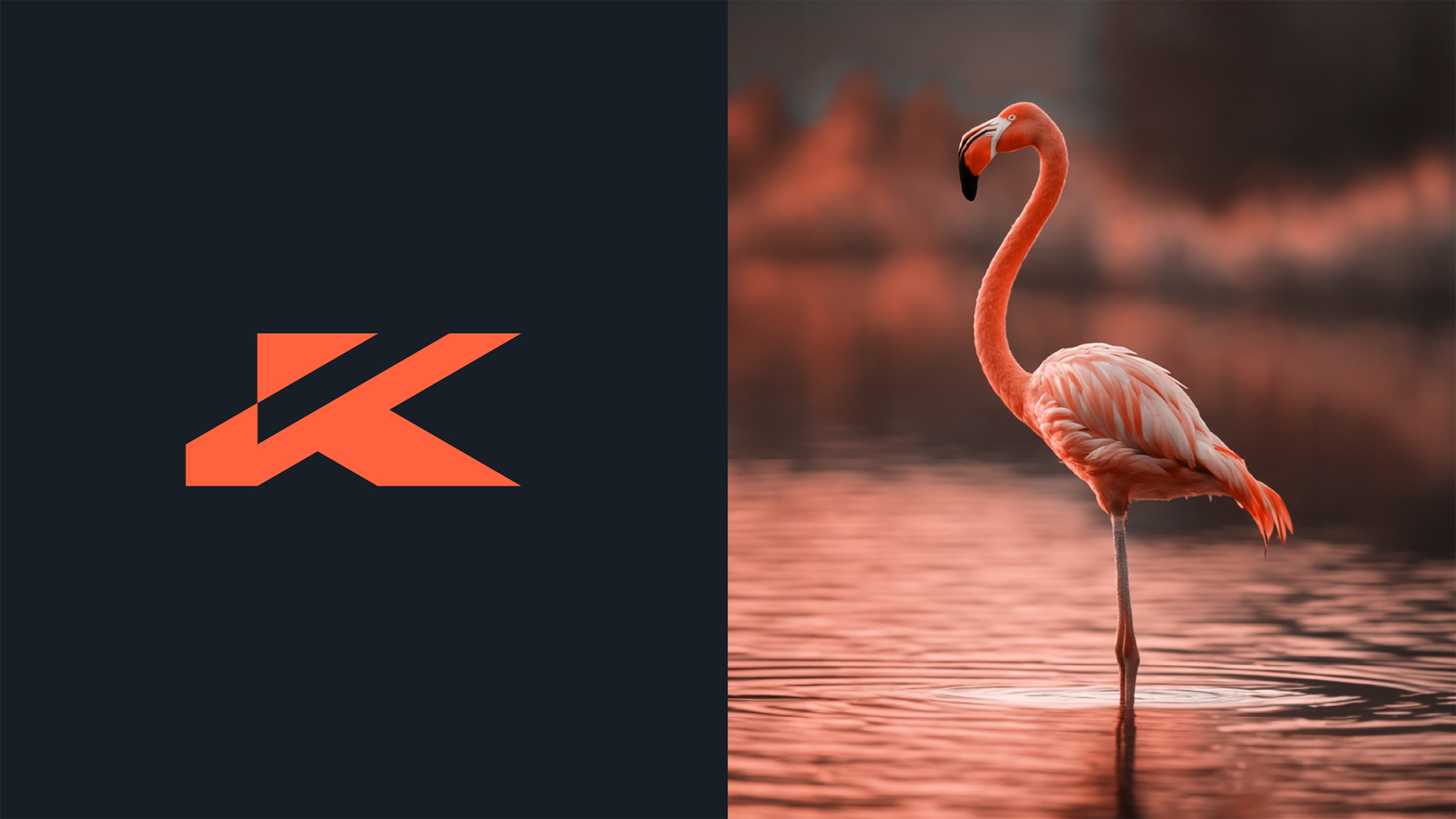
The composition also carries an abstract reference to the silhouette of a flamingo, a symbol of elegance, rarity, and distinction, interpreted through a contemporary visual approach that connects the brand to the refined lifestyle it represents.
The upward visual direction of the logo conveys a sense of growth and value appreciation, making the design a visual translation of a vision centered on continuous development and long-term ascending returns.
Color System
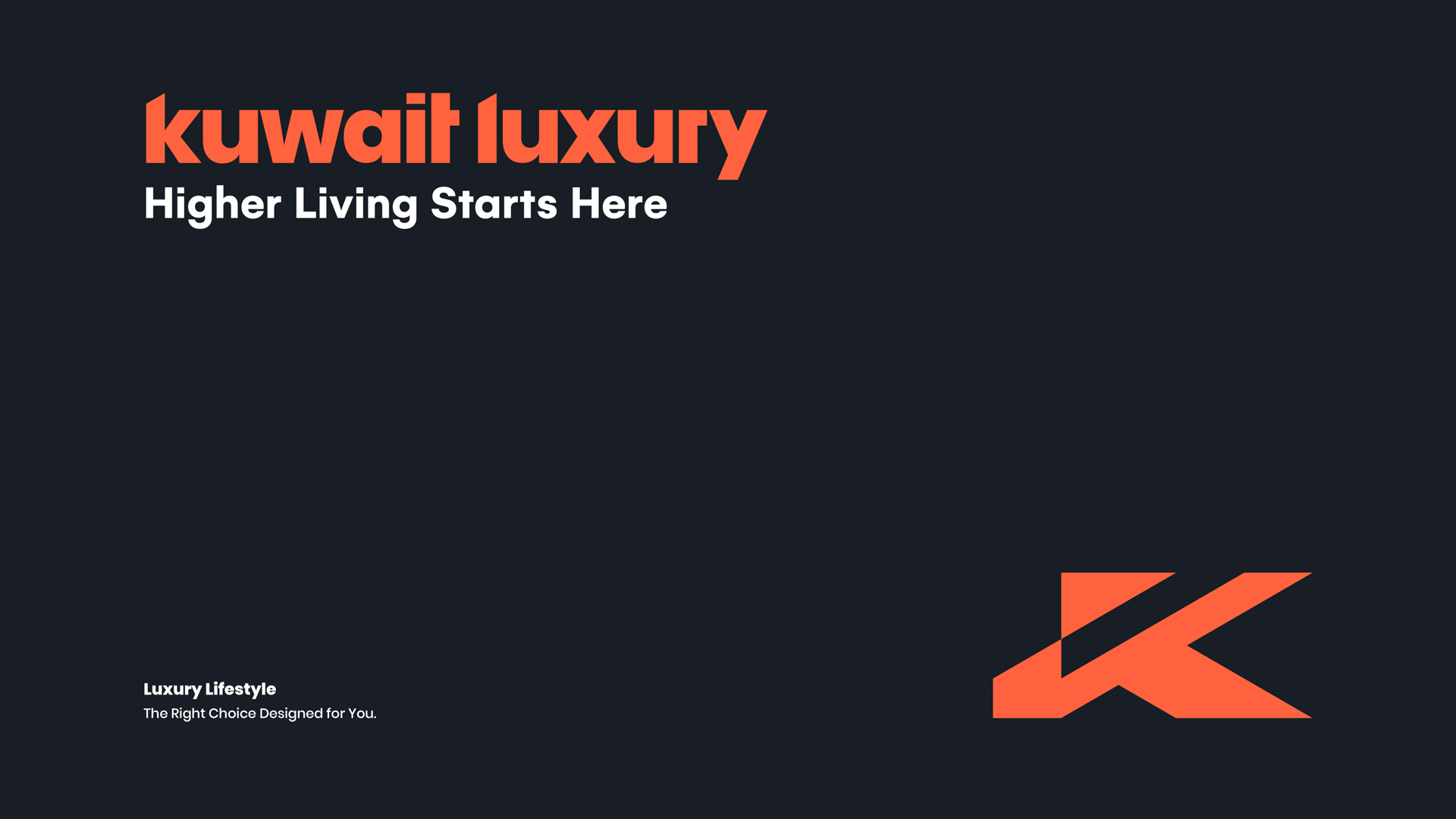
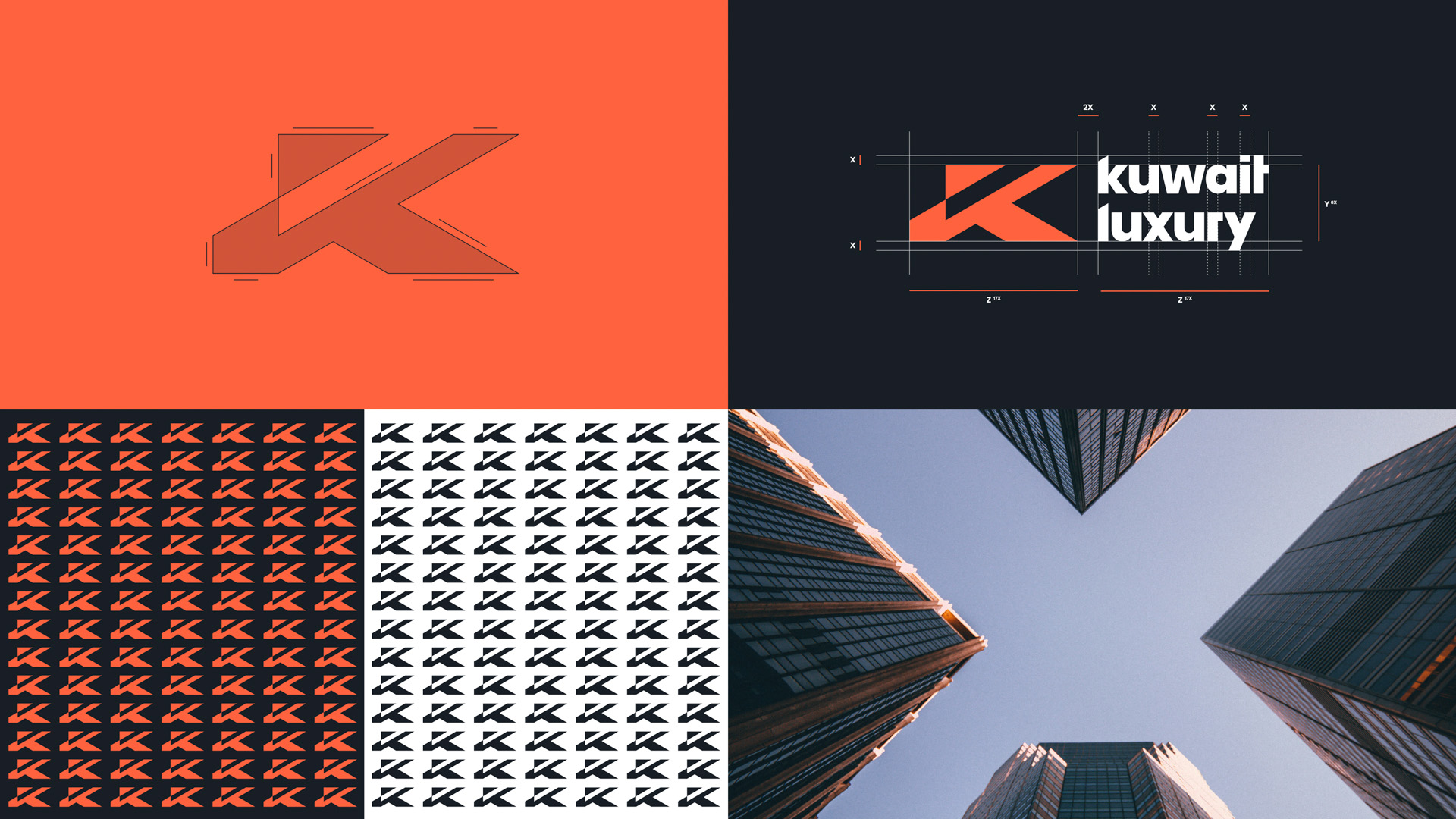
The color system is built on a deliberate contrast between a warm coral tone and a deep dark background.
The coral color represents refined boldness, ambition, and positive energy within a fast-moving and dynamic market, while the dark background enhances the sense of luxury, depth, and confidence.
This balance between vibrancy and sophistication creates a strong visual presence that reinforces memorability and gives the brand a contemporary character suited to the luxury real estate sector.
The color system is highly adaptable across all corporate materials, whether digital or print, ensuring consistency and scalability of the identity.
Visual Philosophy
The visual philosophy is based on intelligent minimalism, achieving the highest semantic density with the fewest possible elements.
The design does not rely on ornamentation or superficial visual effects, but on clarity of concept and strength of geometric construction. This approach reflects a brand mindset that believes true luxury lies in precision, discipline, and balance.
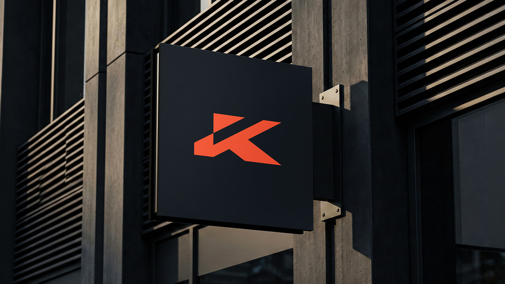
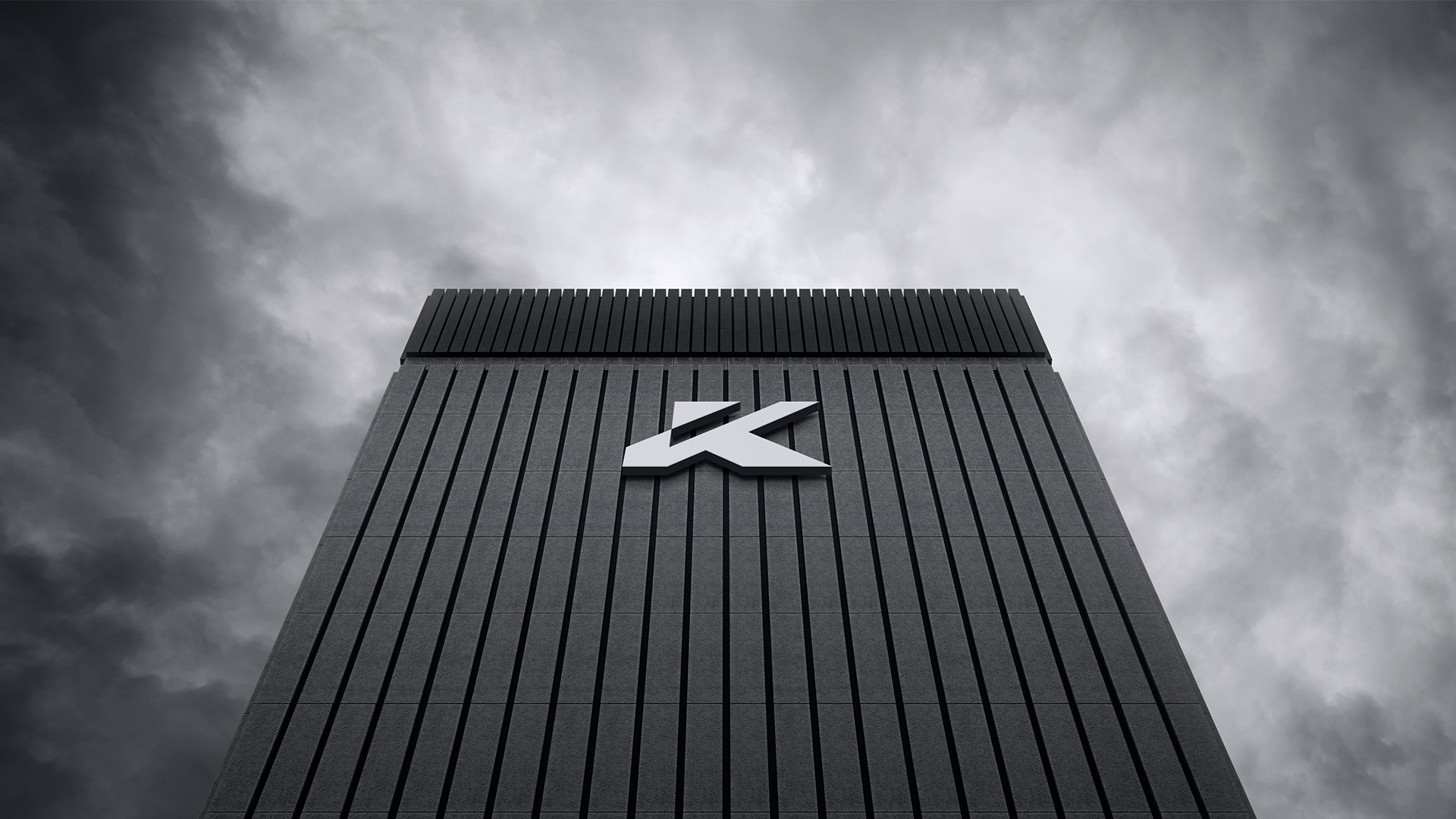
The balance between sharp lines and negative space grants the logo high flexibility in application and ensures clarity across various scales and platforms, from large-scale signage to digital icons.
As a whole, the identity represents an integrated visual system that embodies trust, growth, and stability, the core values upon which the company is built.
Summary
This project represents more than a logo design; it is the construction of a comprehensive identity system that unites local belonging, institutional trust, global elegance, and long-term investment vision.
Kuwait Luxury Real Estate does not merely sell luxury properties, it delivers sustainable value and a refined experience built on trust and stability. This vision has been translated into a clear, powerful, and cohesive visual language that reflects the essence of the brand and establishes a confident presence within the luxury real estate market.

CREDIT
- Agency/Creative: Ahmed Ghazi
- Article Title: Kuwait Luxury Visual Identity by Ahmed Ghazi
- Organisation/Entity: Freelance
- Project Type: Identity
- Project Status: Non Published
- Agency/Creative Country: Kuwait
- Agency/Creative City: salmiya - kuwait
- Market Region: Asia
- Project Deliverables: Brand Guidelines, Brand Identity, Logo Design
- Industry: Real Estate
- Keywords: kuwait, real estate, flamingo
-
Credits:
Creative Art Director, Brand Designe: Ahmed Ghazi


