


Ek Dulari was conceived as a contemporary Indian fashion label rooted in memory, craft, and generational continuity. The name means “beloved,” carrying intimacy rather than spectacle. From the beginning, the ambition was clear. Build a house that feels inherited, not manufactured.
In Indian fashion branding, there is often a visible split. Heritage is exaggerated through ornament and opulence, or stripped away in favour of global minimalism. Ek Dulari sought a quieter third space. One that feels culturally embedded without becoming nostalgic. Emotional without being decorative. Familiar, yet entirely new.
The brand speaks to women who value lineage but resist overt traditionalism. Women who want to reinterpret memory, not perform it.
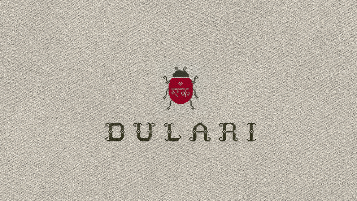
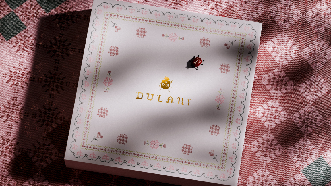
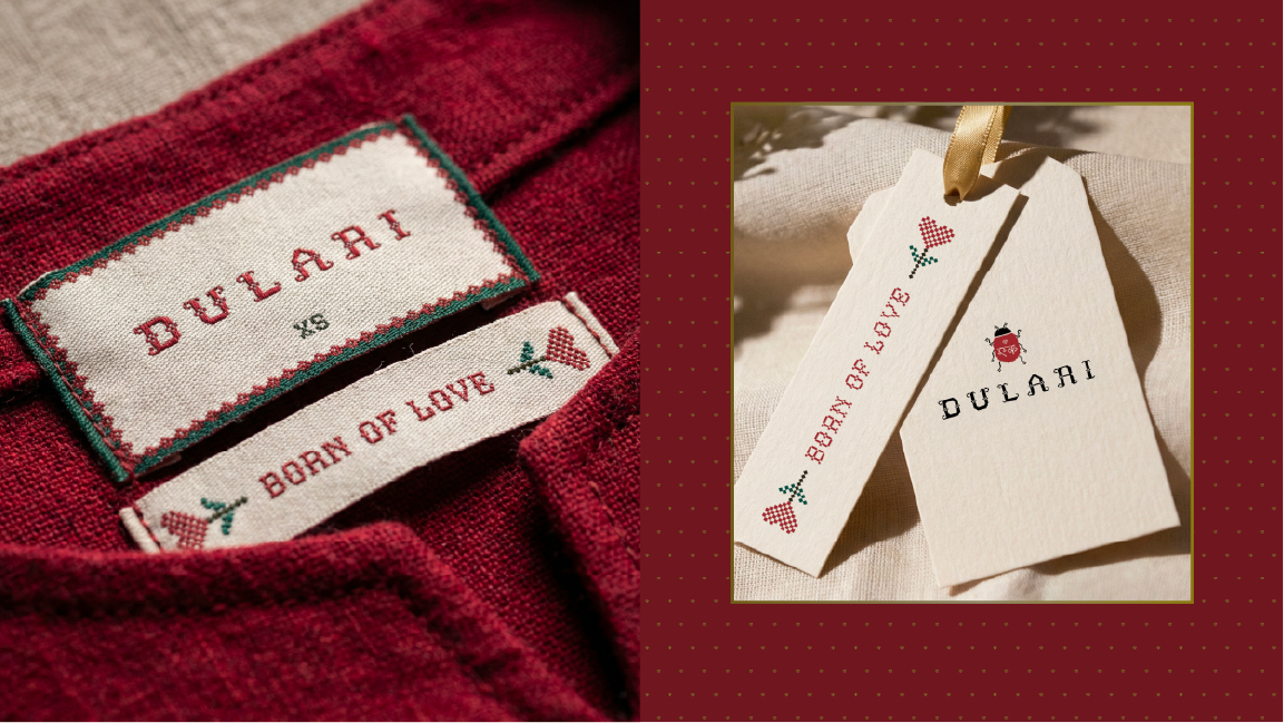
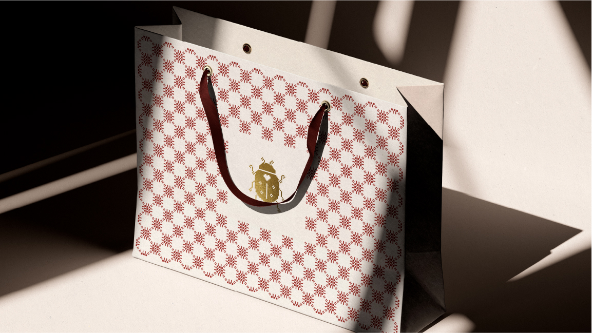
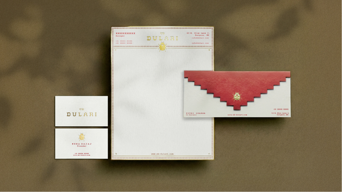
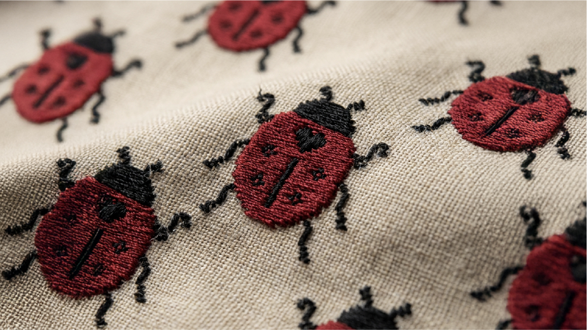
At the heart of the identity is a ladybug. A small symbol of tenderness, protection, and quiet resilience. Rather than designing a loud insignia, we chose a motif that feels discovered, almost stumbled upon. A mark that behaves like something stitched into fabric long ago. The visual language draws from the grammar of Indian textiles. Typography feels sewn rather than printed. Borders behave like hand embroidered frames. Motifs repeat like inherited patterns. Thread becomes metaphor. A carrier of time, continuity, and care.
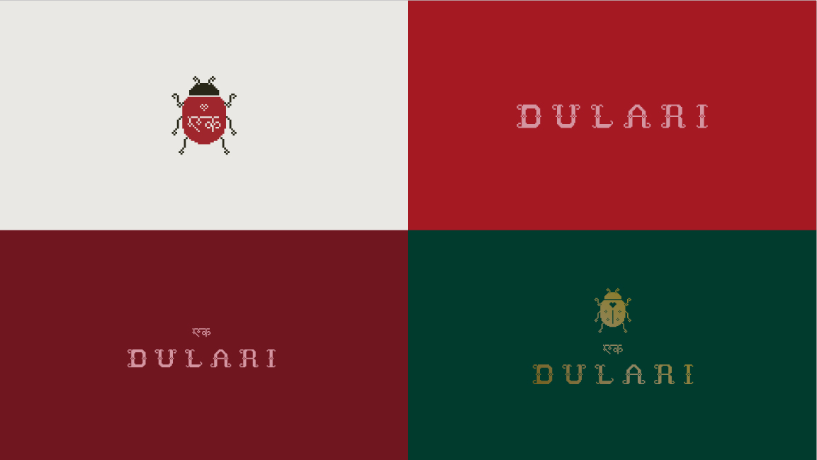
Nothing exists for ornament alone. Every element is constructed to feel crafted, even when scaled. The ladybug shifts between red and gold, sometimes prominent, sometimes subtle. It can be embroidered, stamped, woven, or printed. It lives within the system rather than sitting on top of it.
The colour palette balances richness with restraint. Deep red, forest green, and softened neutrals echo textile memory without theatricality. Patterns expand and contract like fabric itself, allowing the identity to frame, repeat, border, or quietly sign across packaging, garment labels, stationery, and retail materials.
Rather than positioning the brand as designer led authority, Dulari behaves like a personal heirloom. Something carried forward. Something worn close.
The result is an identity system that feels stitched into the product rather than applied to it.
Craft forward without excess.
Intimate without sentimentality.
Distinct without noise.
Dulari does not romanticize the past. It continues it.
A small, quiet heart. Moving forward.


CREDIT
- Agency/Creative: The Neat Trick
- Article Title: The Neat Trick Gives Ek Dulari a Fashion Identity That Feels Inherited, Intimate, and New
- Organisation/Entity: Agency
- Project Type: Identity
- Project Status: Published
- Agency/Creative Country: India
- Agency/Creative City: New Delhi
- Market Region: Asia
- Project Deliverables: Brand Identity, Logo Design, Packaging Design
- Industry: Fashion
- Keywords: Contemporary Indian Fashion, Craft-led Branding, Heritage Reimagined, Textile-inspired Identity, Embroidery-inspired Typography, Emotional Branding, Quiet Luxury, Tactile Design, Modern Heirloom, Fashion Packaging Design
-
Credits:
Creative Director: Shubham Torani
Lead Designer: Mubaraka Aboojiwala


