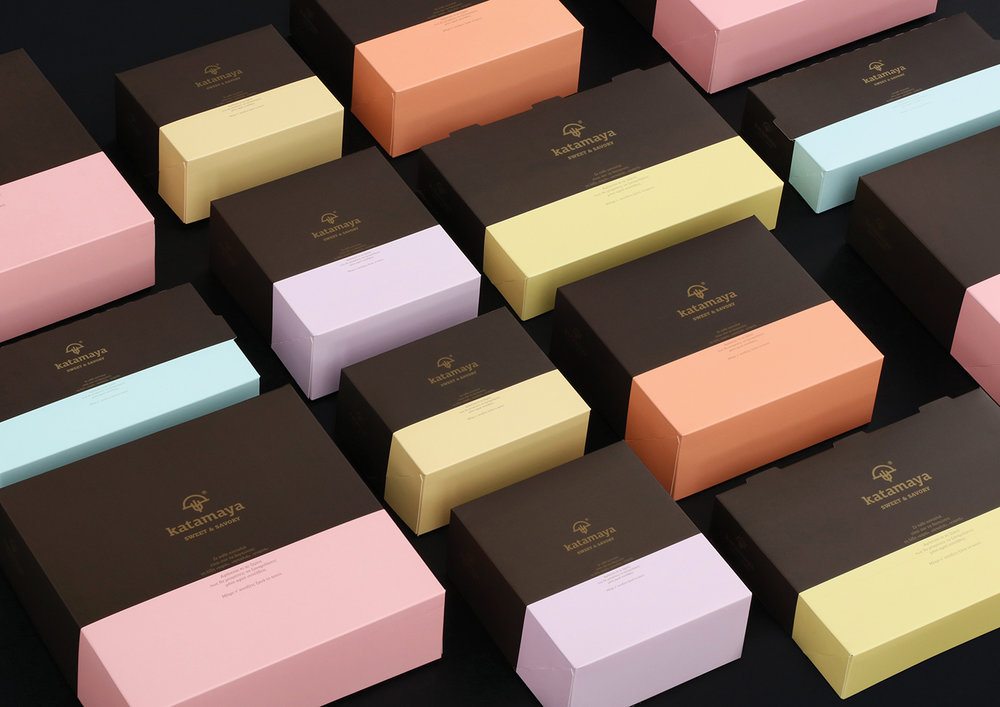
Chris Trivizas – Katamaya Sweet & Savory
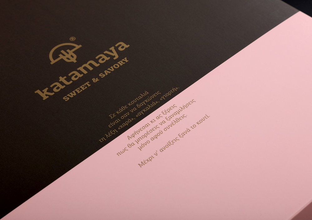
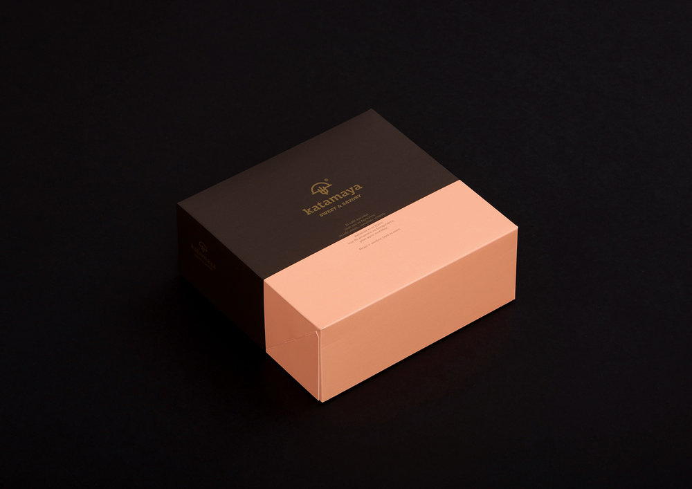
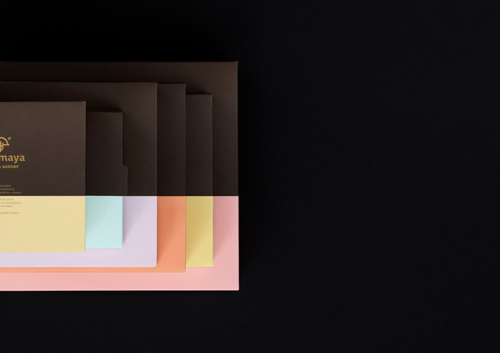
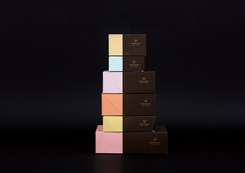
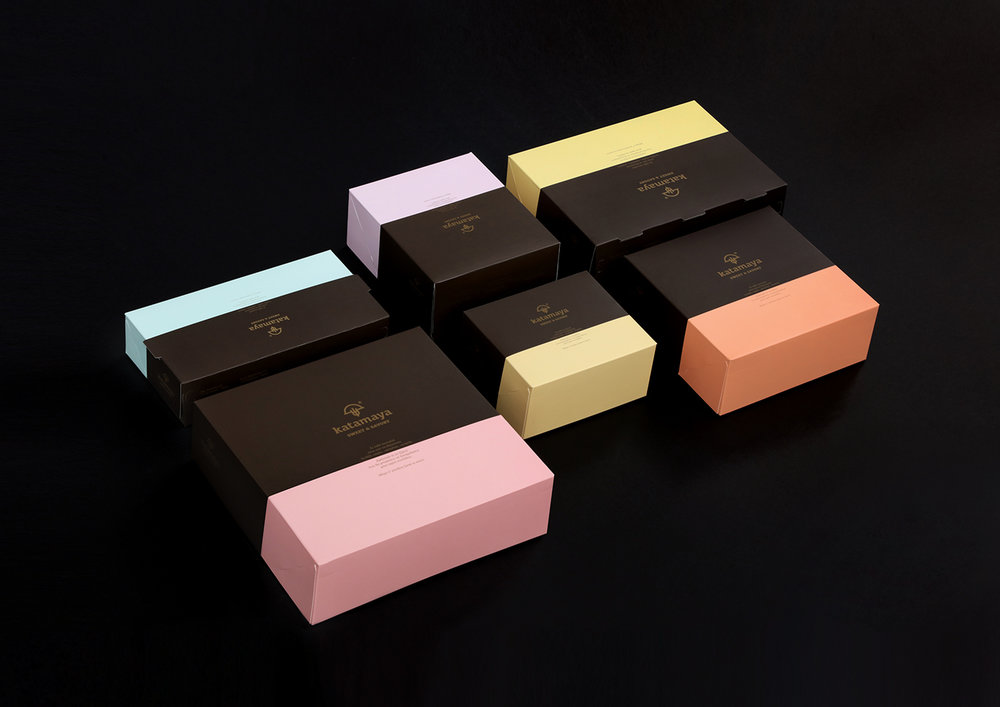
The study conducted on behalf of Katamaya sweet & savory aimed at creating a packaging that would, visually and verbally, suggest the excellent quality of the company’s candy and sweets.The primary colour selected for the packaging is the dark brown, which refers to chocolate. It was combined with a second color, different for each package, inspired by candy colouring.The colour ratio in the packages was created with use of the gold number ‘φ’, thus enhancing the sense of harmony and the importance the company gives to detail and quality.The text on the side of the boxes is intended to positively predispose in regards to what will follow their opening.

CREDIT
- Agency/Creative: Chris Trivizas
- Article Title: Katamaya Sweet & Savory Packaging Design
- Organisation/Entity: Agency Commercial, Published
- Project Type: Packaging
- Agency/Creative Country: Greece
- Format: Box
- Substrate: Pulp Carton
FEEDBACK
Relevance: Solution/idea in relation to brand, product or service
Implementation: Attention, detailing and finishing of final solution
Presentation: Text, visualisation and quality of the presentation


