


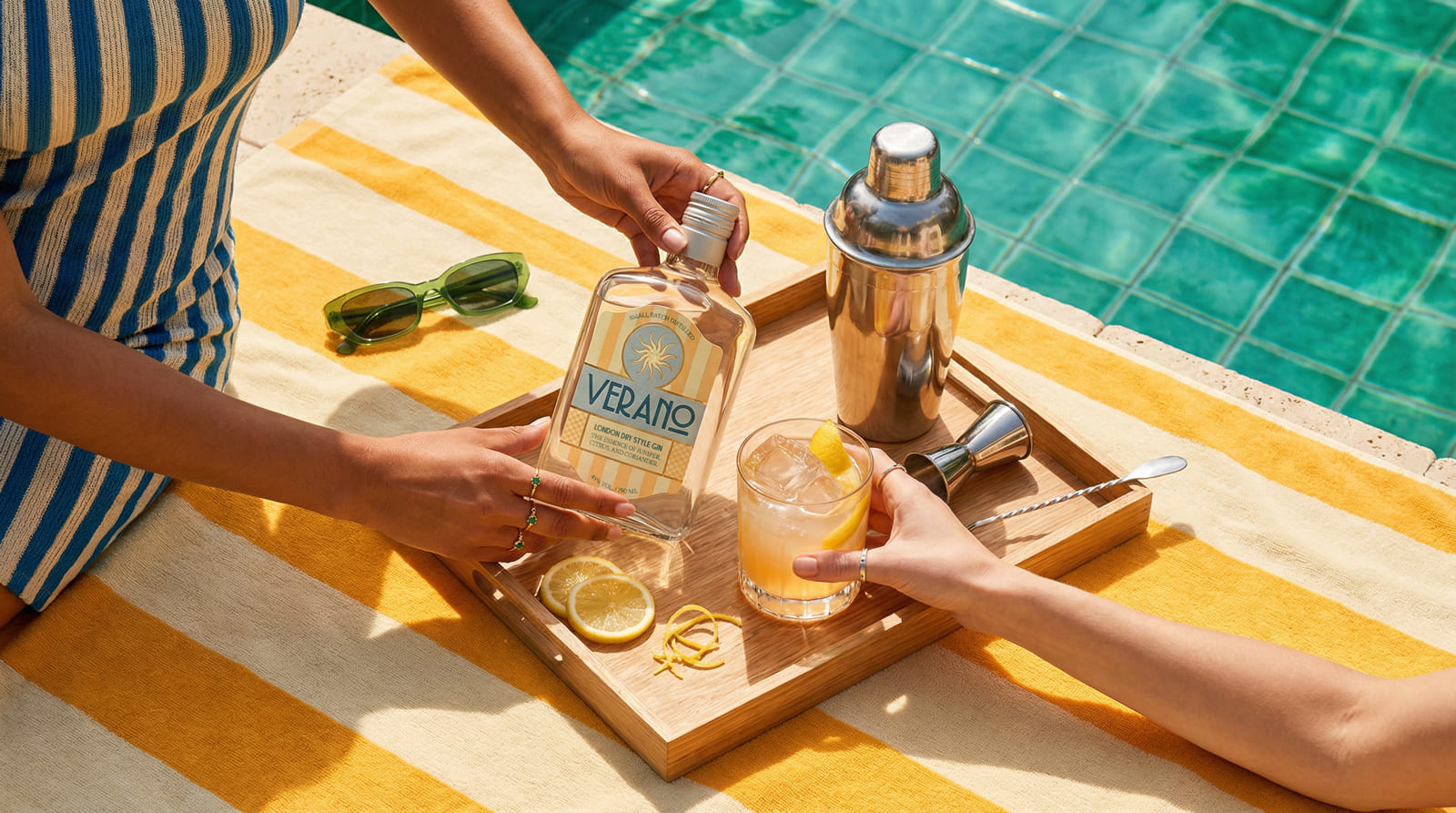
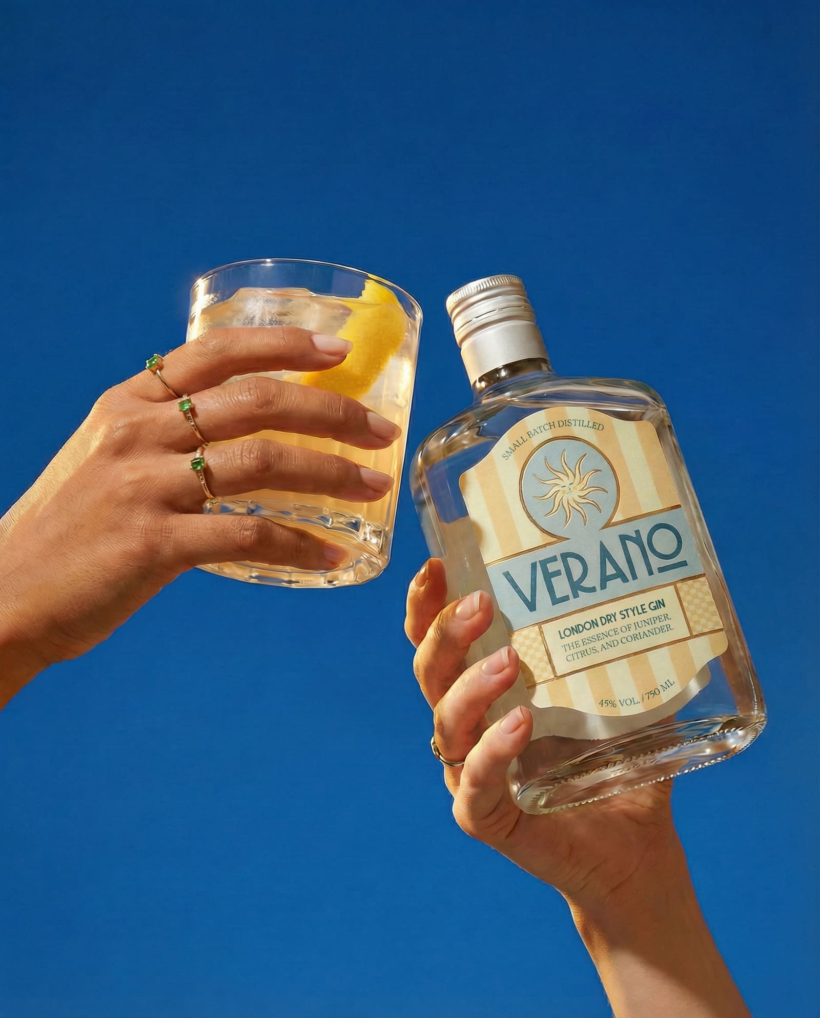
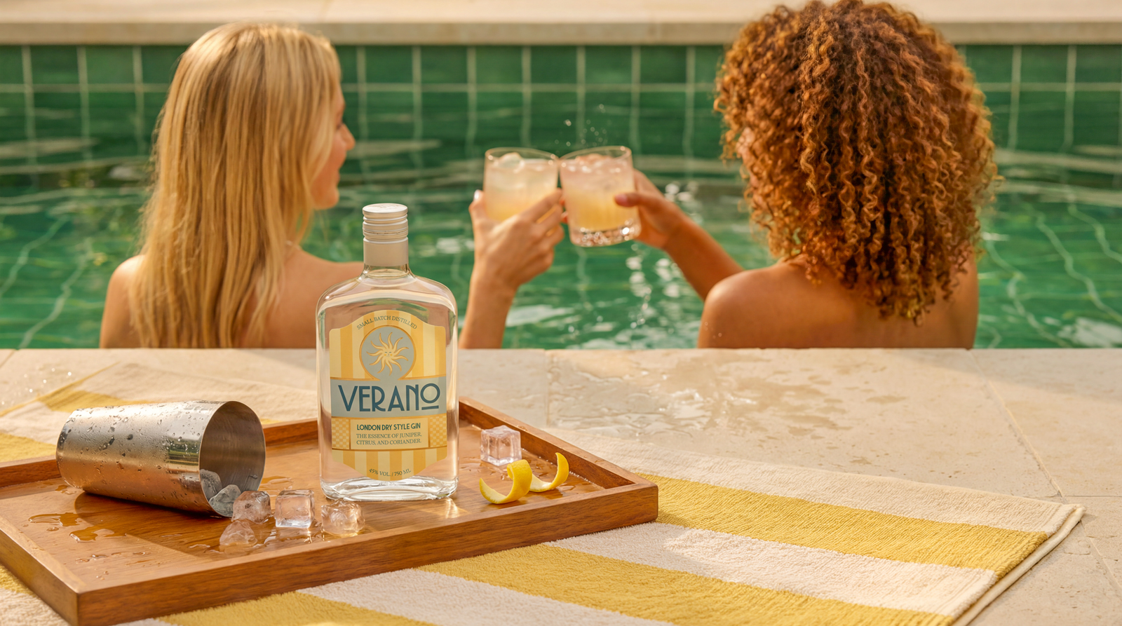
Verano Gin is born from the idea that summer is a state of mind, not just a season. It understands summer less as a date on the calendar and more as a personal perception of time, light and presence. The brand proposes a slower, more sensorial and contemplative summer, designed for a young adult, urban and creative audience that engages with design, photography, fashion and visual culture, and that values well-curated experiences, simple rituals and objects created with intention. Verano speaks to people who appreciate atmosphere as much as function, who see beauty in details, and who treat moments of pause as a form of luxury. In a market saturated with technical narratives, botanical lists and repetitive codes of sophistication, the main challenge of the project was to translate this feeling of calm, warmth and presence into a visual identity that could stand out quietly, without relying on visual noise or exaggerated storytelling.
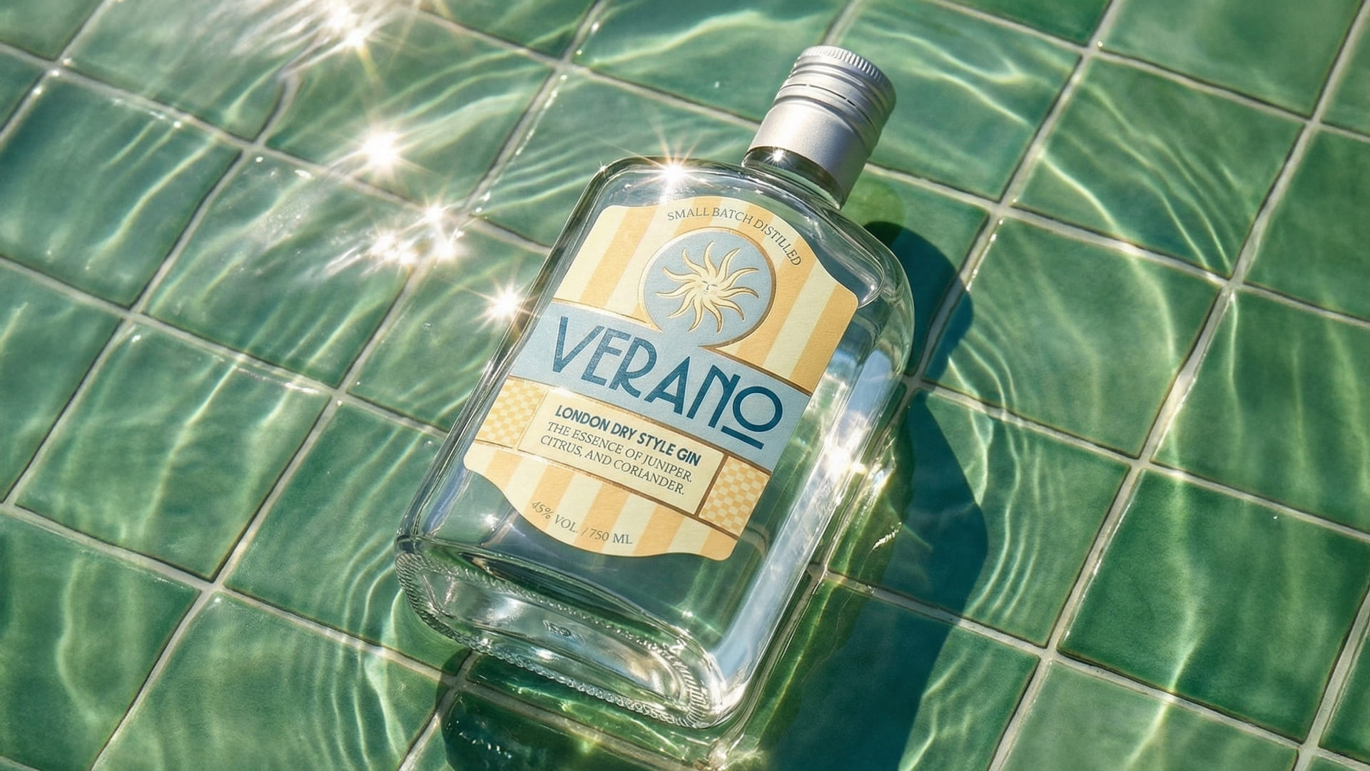
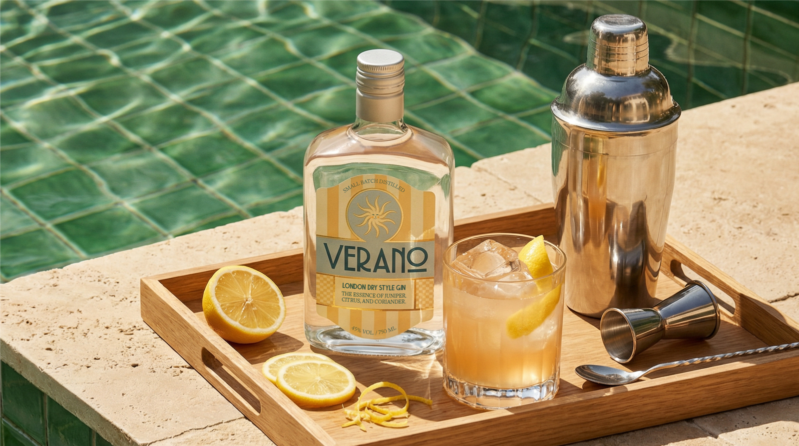
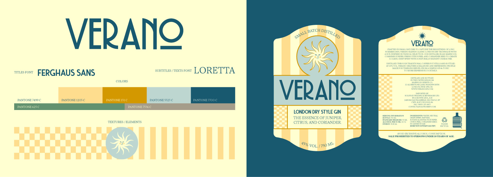
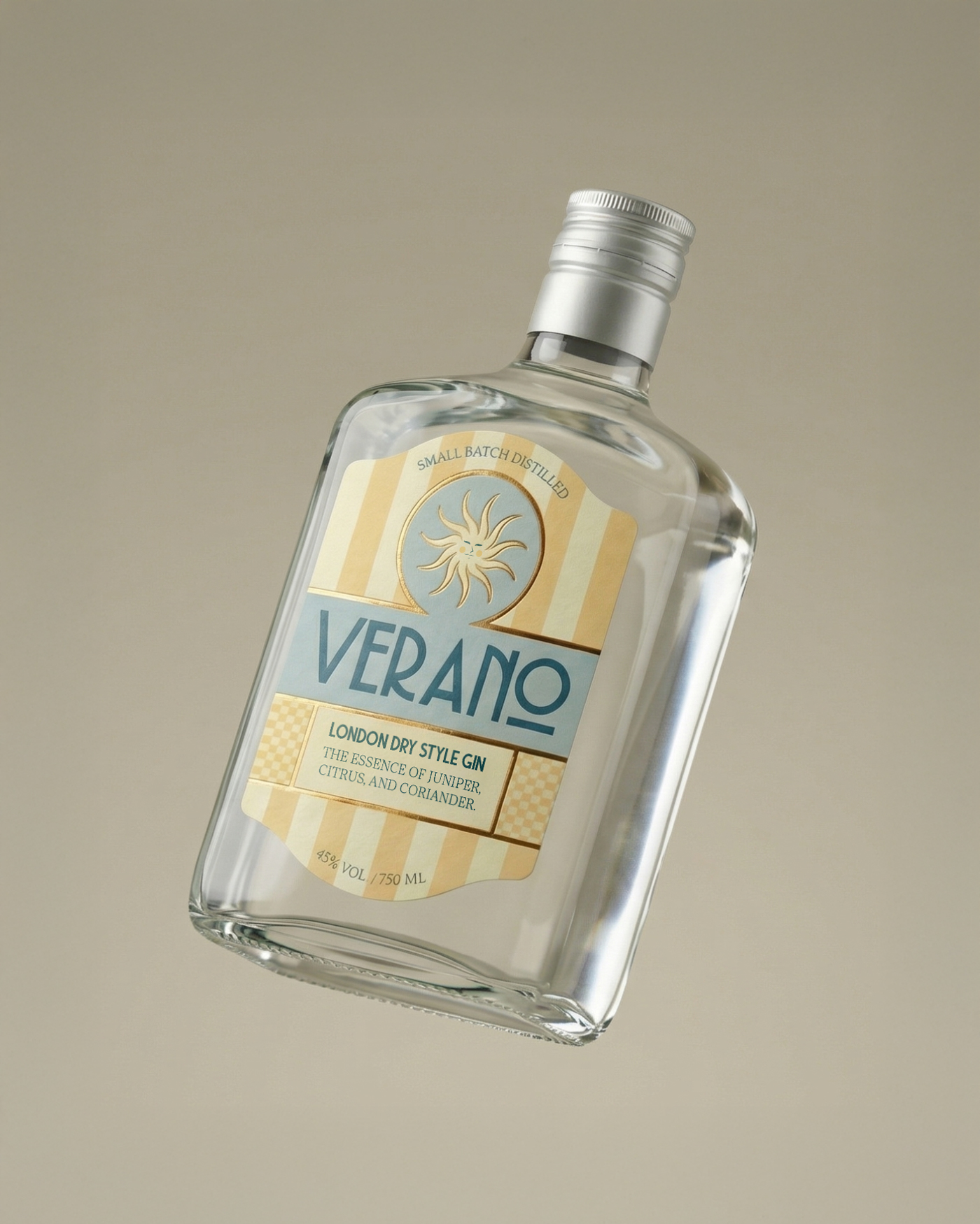
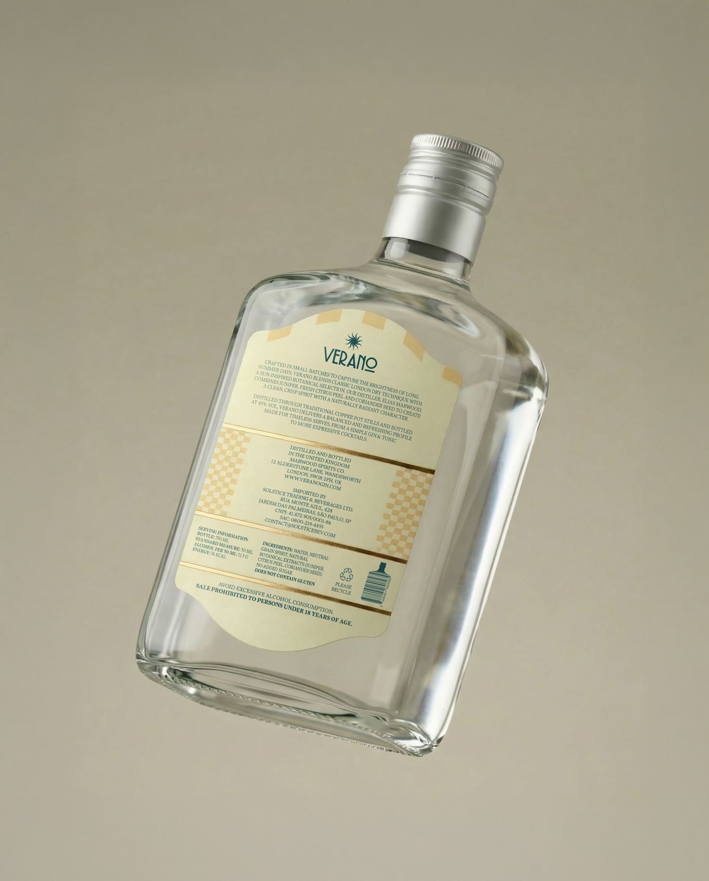
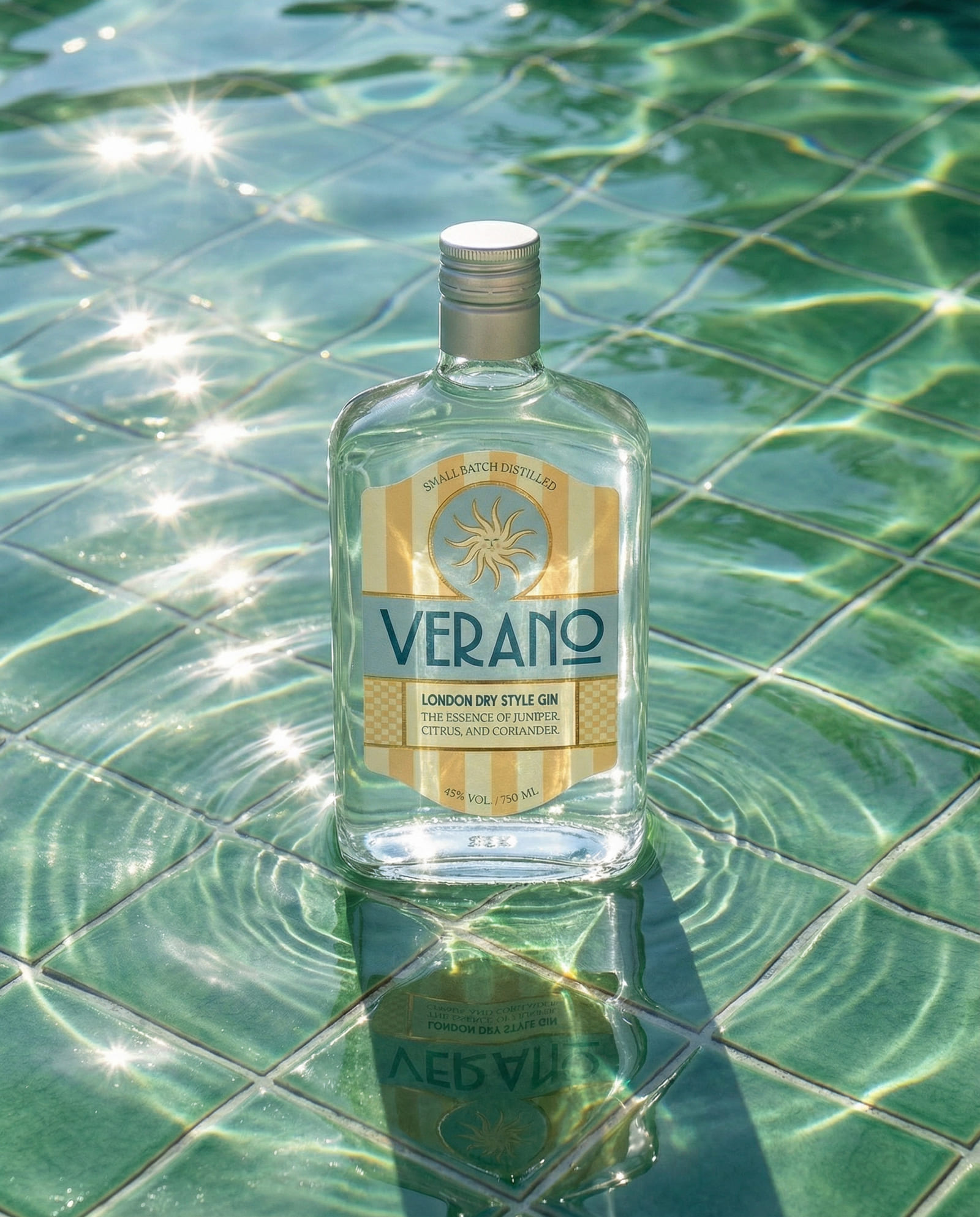
The solution was a design approach that embraces visual silence and atmosphere building as core principles. A light and airy color palette suggests sun-faded surfaces and natural brightness, while vertical stripes subtly evoke sunlight reflections, beach umbrellas and the passage of time throughout the day. The centered composition creates balance and a sense of stillness, inviting the eye to rest. The sun symbol works as a poetic anchor, reinforcing the idea of summer as a continuous emotional state rather than a temporary season. Clean, well-spaced typography supports a calm reading rhythm and avoids urgency, aligning with the brand’s slower tempo. The use of transparent glass allows natural light to interact with the liquid, making the environment part of the label’s expression. As a result, the bottle does not just carry a label, it carries a mood. The identity positions Verano as a gin that invites people to slow down, notice their surroundings and experience summer with greater sensitivity, intention and awareness.
CREDIT
- Agency/Creative: Primata Studio
- Article Title: Primata Studio Creates Verano Gin Packaging That Uses Natural Light and Transparent Glass as Design Elements
- Organisation/Entity: Freelance
- Project Type: Packaging
- Project Status: Published
- Agency/Creative Country: Brazil
- Agency/Creative City: São Paulo
- Market Region: South America
- Project Deliverables: Art Direction, Graphic Design, Label Design
- Format: Bottle, Jar
- Industry: Food/Beverage
- Keywords: Gin, Bottle Gin, Label Design, Summer
-
Credits:
Graphic Designer: Henrique Oliveira Paiva


