


Introduction
Bunliy is more than a bakery—it’s a lifestyle space built around warmth, comfort, and daily connection. As a neighborhood bakery designed to function from early mornings to cozy evenings, Bunliy needed a brand that could seamlessly communicate familiarity, ritual, and a premium sense of care. We developed the full brand ecosystem for Bunliy—starting with strategy, naming, and story—and extending through every brand touchpoint: logo, tone, packaging, interior experience, and customer rituals.
The goal: to build a bakery that feels like home, but looks like it belongs in a design museum. Every part of Bunliy’s world—from the croissant bag to the bench you sip coffee on—was crafted to be soft, sincere, and unforgettably warm.
Naming & Strategy
We started with the name. It had to feel fresh, human, and ownable—while being simple enough to live on a coffee cup, a bag, and a neon sign. “Bunliy” is a soft and inviting invented word derived from bun (comfort, warmth, bread) and a suffix evoking friendliness and modernity. It’s sticky, phonetic, and intuitive. A name you can say with a smile.
We built the brand strategy around a core positioning idea: Bunliy is a third-place bakery. A space that lives between home and work. A location where people gather for small routines and big moments. Our core strategic values were:
Warmth over perfection
Everyday design
Crafted community
Morning to night relevance
Logo & Typography
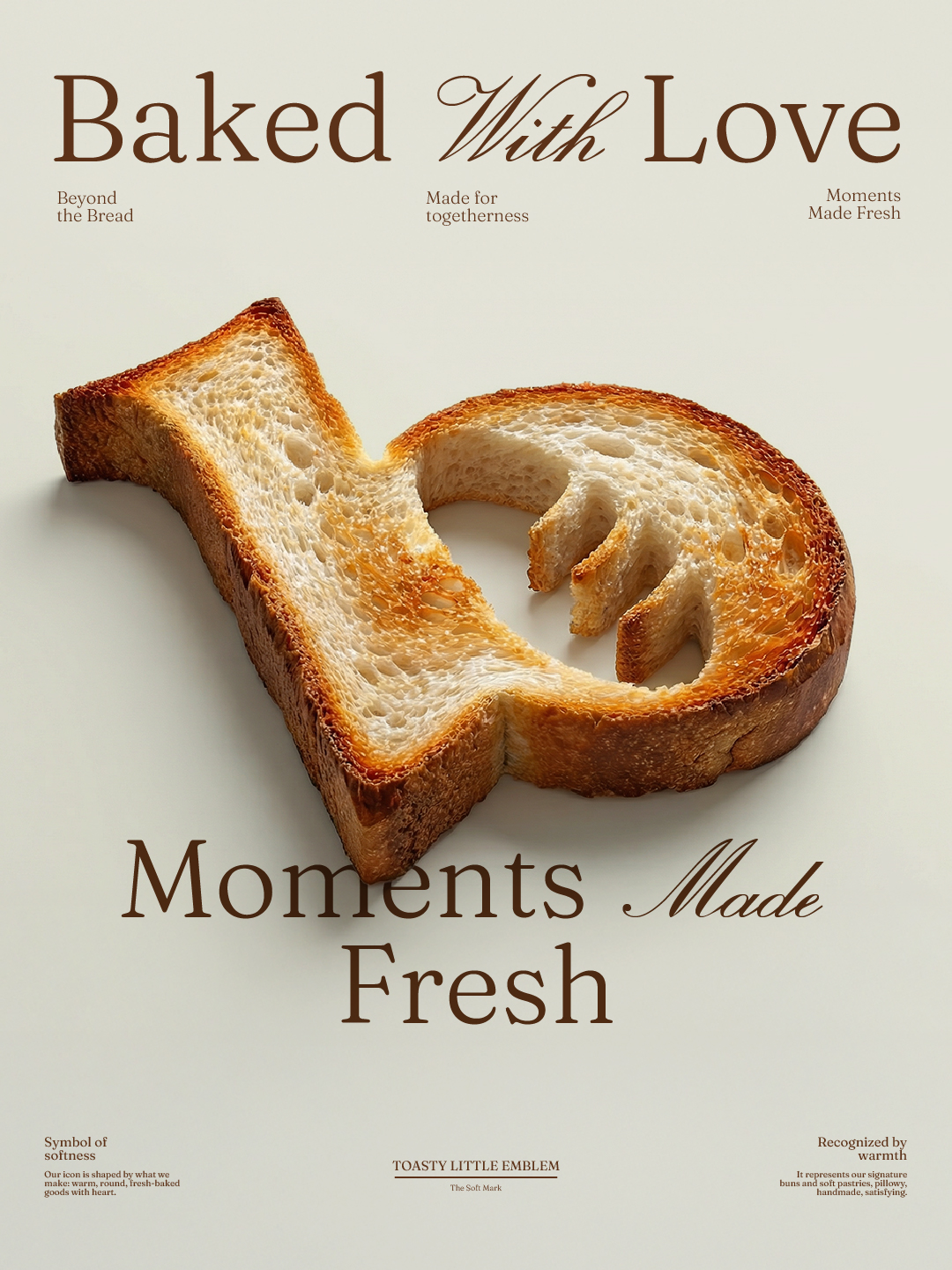
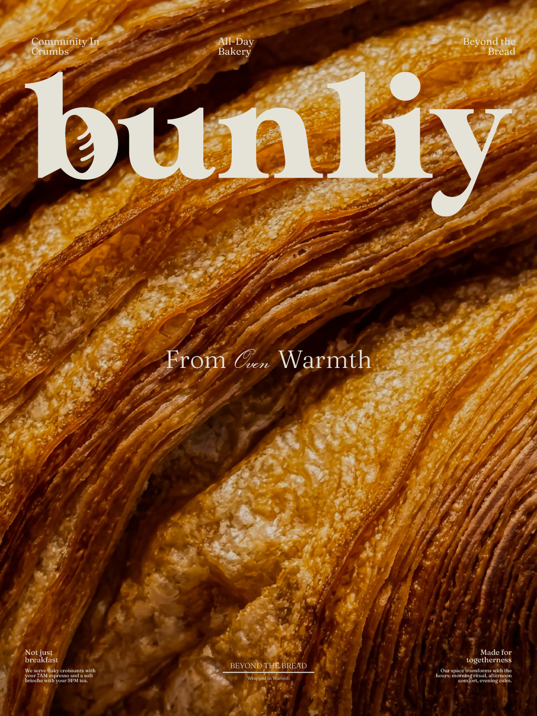
The Bunliy logotype is bold but soft. Built from custom letterforms, it balances structure and emotion. The lowercase letterforms reflect approachability, while the generous spacing suggests airiness and calm. The key detail? The letter “u” holds a soft bun texture—a subtle mark baked into the name itself.
Our typography system blends elegance with informality. Headlines are set in a serif with nostalgic curves, while supporting copy leans on a soft, geometric sans. This combination evokes both heritage baking and contemporary hospitality.
Color Palette
The palette is a mix of dough-tones, oven browns, and milky whites. We drew inspiration from proofing flour, crusts, and creamy lattes. Accents of dark chocolate and warm caramel anchor the visual world. The palette feels edible, seasonal, and emotionally rich.
Color was also intentionally designed to behave differently across dayparts. Lighter tones in the morning, deeper tones as evening approaches. A nod to the brand’s “from sunrise to moonlight” concept.
Visual Language & Iconography
Beyond the logo, Bunliy uses a circular emblem—the “bun mark”—to represent soft ritual and community. Its rounded form appears on aprons, window vinyls, and to-go bags.
We created a custom set of illustrated icons, using soft lines and hand-drawn shapes to depict bakery moments: steam rising from a bun, hands sharing a pastry, a croissant and coffee placed side by side. These tiny touches humanize the system and create brand recall across packaging.
Packaging Design
Packaging was treated as the ultimate expression of daily ritual. We crafted three key packaging families:
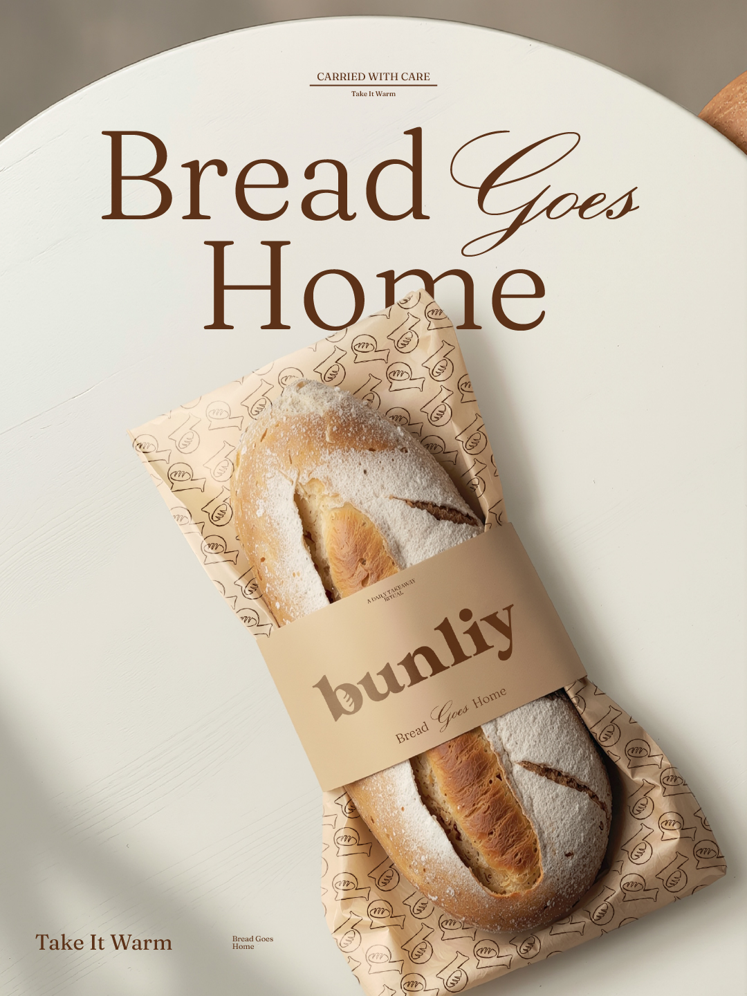
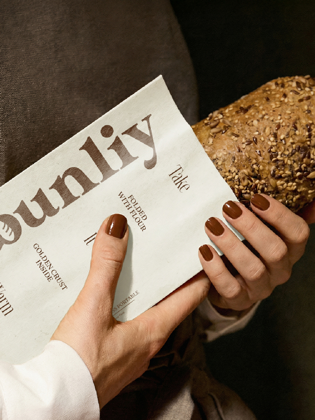
Bread Bags — Each paper bread bag is stamped with a rotating quote, plus a bold call-to-action: “Take it warm.” They are color-coded by time of day (gold for morning, kraft for midday, deep brown for evening).
Pastry Wraps — Designed to cradle croissants and galettes, the wraps feature line art and “baked-in” phrases. The inside paper texture is soft-touch to prevent sticking and tearing.
Cup Packaging — Hot and cold cups use minimal typography, always paired with micro-quotes like “Let Life Rise” or “Warm Hands, Warm Heart.”
Each element is built to be touched, photographed, and carried through the street. The system encourages reusability, collectability, and Instagrammable delight.
Merchandise & Apparel
We extended the brand into fabric and utility. Aprons are chestnut-brown, thick-woven canvas, with embroidered logo seals. The uniforms feel like part of a trusted, premium coffeehouse—but speak bakery.
Tote bags were made with wide handles, designed for daily grocery or bread runs. Each one printed with a different phrase (e.g. “Golden Crust Inside” or “Bread Goes Home”).
Our packaging typography was repurposed into wearable elements: sleeve quotes, back-of-shirt messaging, and apron badges. Every detail reinforces the daily nature of the Bunliy experience.
Environmental Branding & Interior Experience
The Bunliy space was designed around natural flow. We mapped the interior into three experiential zones:
The Early Zone: bright, energizing, close to the counter and coffee. Built for takeaways, commuters, and espresso chats.
The Slow Zone: tucked into the back, with long tables, power outlets, and soft lighting. Built for laptop mornin
CREDIT
- Agency/Creative: the brainew
- Article Title: Bunliy Bakery Branding by the brainew Builds a Warm Third-Place Experience From Packaging to Interiors
- Organisation/Entity: Agency
- Project Type: Identity
- Project Status: Published
- Agency/Creative Country: Egypt
- Agency/Creative City: cairo
- Market Region: Middle East
- Project Deliverables: Art Direction, Branding
- Industry: Food/Beverage
- Keywords: #BakeryBranding #VisualIdentity #BrandDesign #BakeryLogo #PackagingDesign BrandingStudio BrandStrategy BakeryPackaging LogoInspiration CoffeeShopBrand MinimalBranding ArtDirection DesignFeed TypographyDesign GraphicDesignLovers BrainewDesign CroissantCulture DesignWithTaste BakeryAesthetic CarouselDesign BrandInspiration
-
Credits:
Brand designer: Omar Taaha


