


This logo doesn’t just sit on the label
Dragonfly Wine is a conceptual exploration of how a brand asset can move beyond decoration and become embedded in product behaviour.
The project began with a provocation: what if the logo didn’t just represent the brand, but performed for it? In many packaging systems, symbols act as identifiers — they label, decorate, or signal heritage. Here, the ambition was to challenge that passive role and imagine identity as something active, something capable of participating in the moment of use.
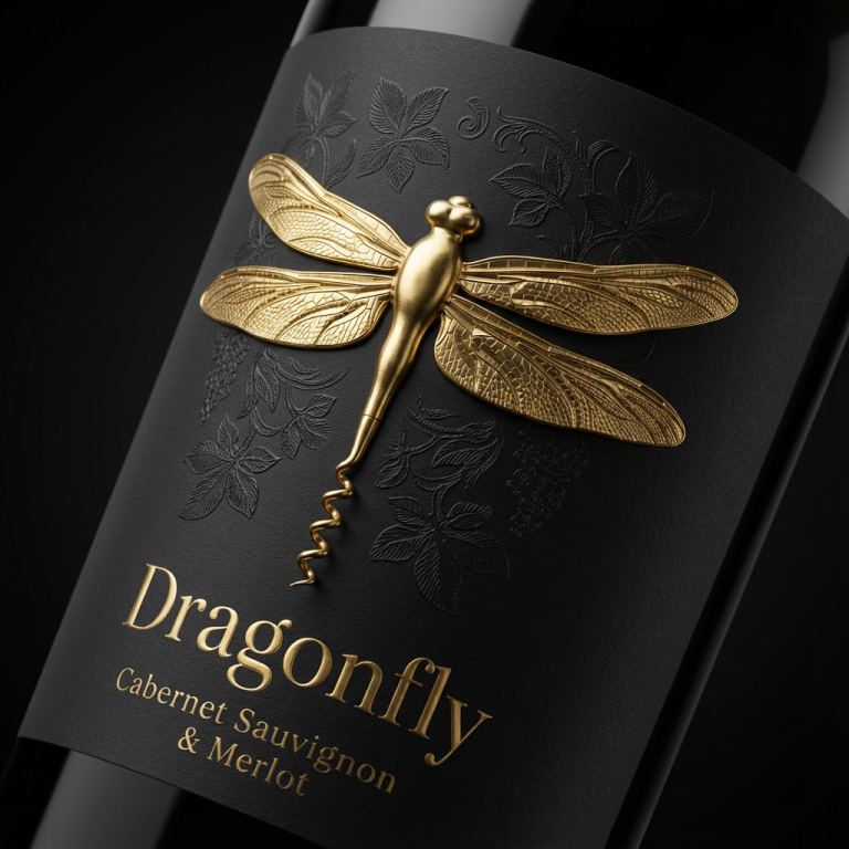
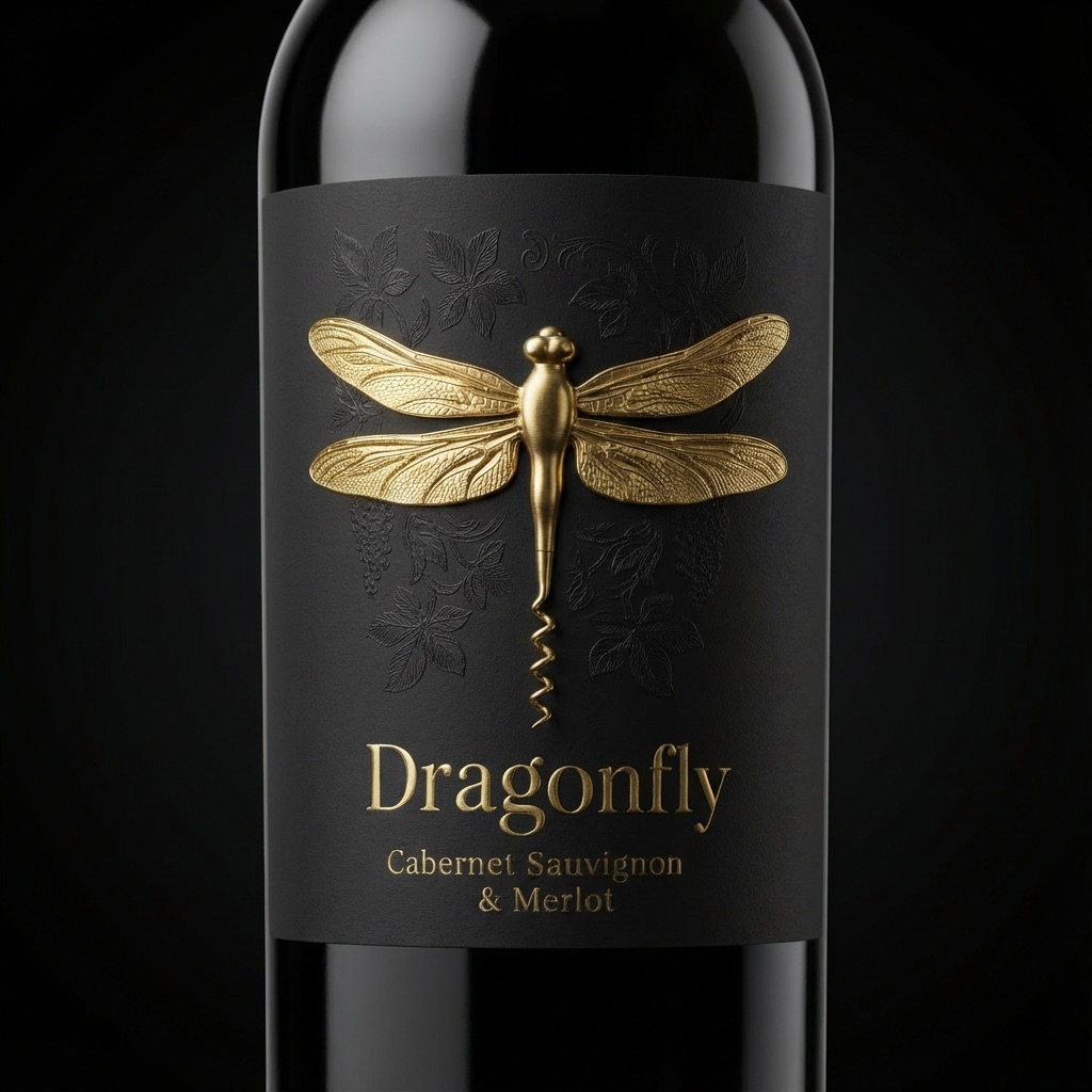
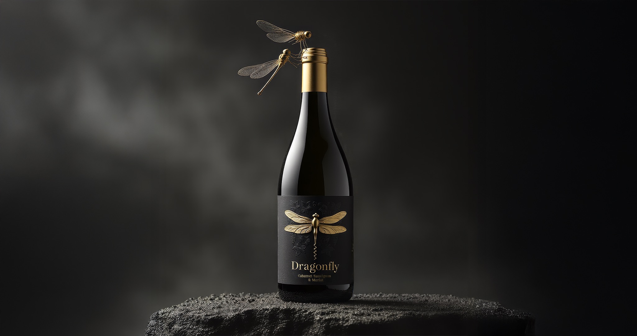
Inspired by the delicacy, balance, and technical precision of a dragonfly, the tail of the creature was reinterpreted as a corkscrew. With a single gesture, the icon transforms from a graphic sign into a functional tool, linking brand meaning directly to the act of opening the bottle. The identity is no longer observed; it is held, used, and experienced.
By integrating symbolism with utility, the design reframes packaging as a participant in the consumption ritual. The act of opening wine — already loaded with anticipation and ceremony — becomes the moment where brand and behaviour intersect. This approach proposes a shift from visibility to performativity: the brand does not merely appear, it acts.
Such transformation elevates memorability. When interaction replaces ornament, the user forms a tactile and emotional connection with the identity. The corkscrew becomes more than an accessory; it becomes a narrative device that reinforces authenticity, craftsmanship, and intention.
The visual system was developed to protect and amplify this hierarchy. A restrained matte black label creates a quiet, architectural stage for the sculptural gold dragonfly, allowing material contrast and light to define presence. Subtle botanical engravings introduce nuance and context without competing with the emblem, supporting a dialogue between nature and refinement.
Typography remains intentionally understated, operating as a framework rather than a focal point. This restraint ensures the symbol retains its authority while the overall composition communicates confidence, clarity, and premium positioning.
Ultimately, the project asks how identity can behave in contemporary packaging. In a market saturated with visual noise, perhaps distinctiveness emerges not from adding more elements, but from allowing one powerful idea to carry both meaning and function.
Dragonfly Wine imagines a future where logos are not only seen, but enacted — where form, story, and ritual converge into a single, coherent experience.

CREDIT
- Agency/Creative: Packagenius Design Studio / Dragonfly Wine Rebranding
- Article Title: Dragonfly Wine Packaging Design by Packagenius Design Studio Turns a Logo Into a Functional Corkscrew
- Organisation/Entity: Freelance
- Project Type: Packaging
- Project Status: Non Published
- Agency/Creative Country: Turkey
- Agency/Creative City: Packagenius Design Studio
- Market Region: Asia
- Project Deliverables: Label Design, Logo Design, Packaging Design
- Format: Bottle
- Industry: Food/Beverage
- Keywords: Wine, wine label, label design
-
Credits:
CD & Designer: Erhan OZDEN


