


The Wild Side brand project is born from the powerful connection between Brazil and the United States , two cultures that share intensity, freedom, and a deep relationship with movement, expression, and attitude. This connection brings together instinct, the open road, and a rebellious mindset, shaping a visual identity that is direct, bold, and unapologetic. There are no excesses, no decorative compromises, and no attempt to soften its message. Everything in Wild Side is built to communicate truth, energy, and presence.
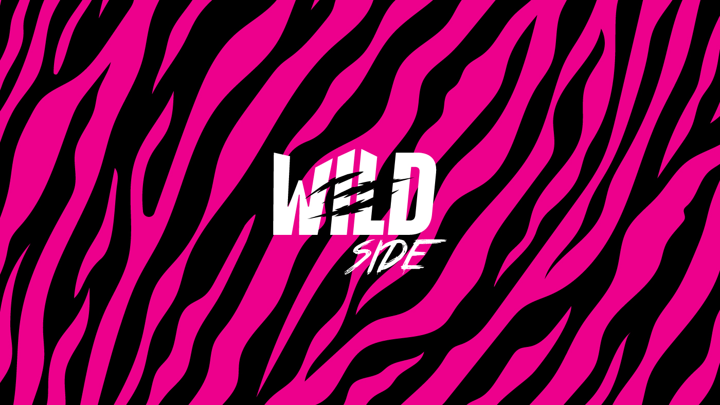
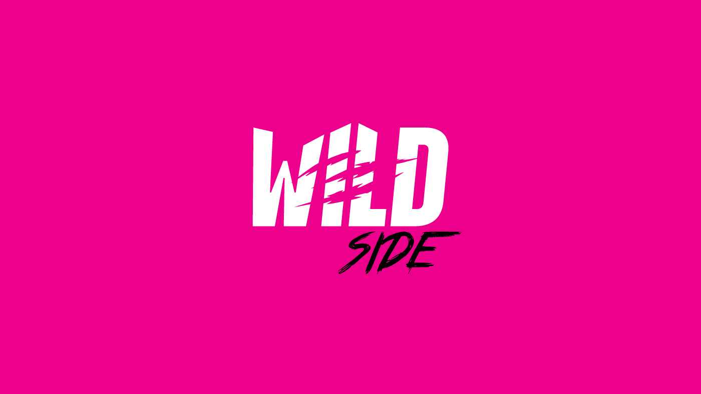
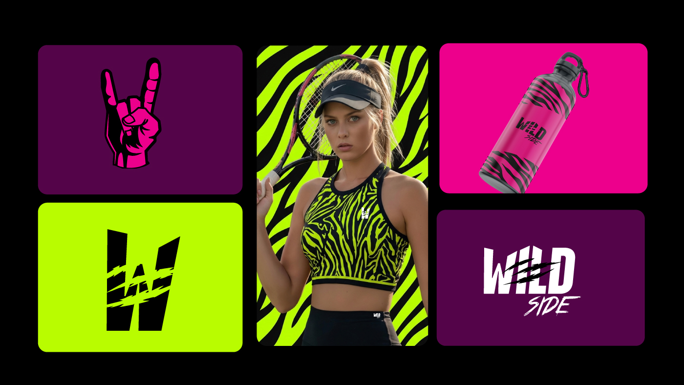
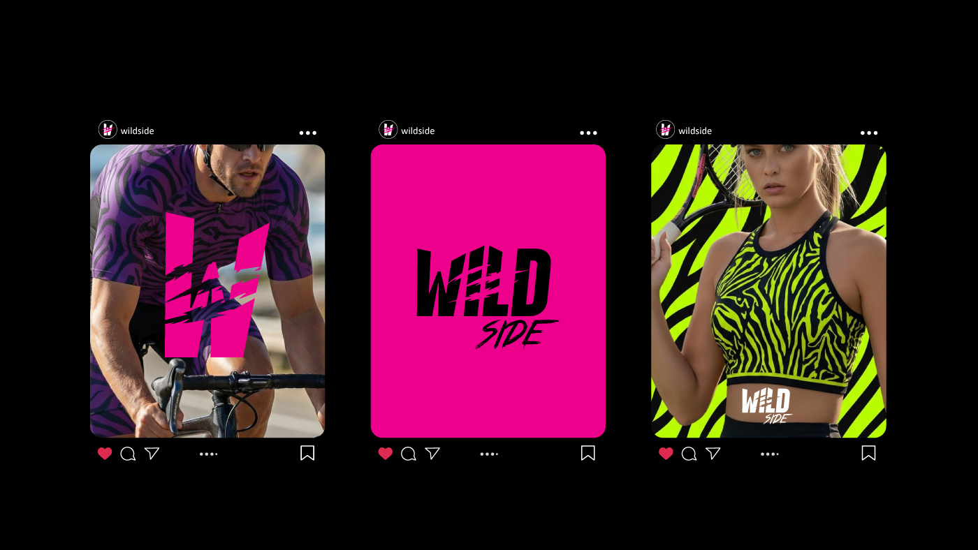
The logotype translates the very DNA of the brand through strength, impact, and intentional tension. Each letter is designed to impose itself visually, creating an immediate sense of authority and confidence. The heavy, compact uppercase typography reinforces this posture, delivering solidity and power at first glance. At the same time, the strategic cuts in the lettering introduce rupture, movement, and raw energy. These visual interruptions evoke action, friction, and acceleration, referencing speed, contact, resistance, and a lifestyle lived in constant motion. Nothing feels static or perfectly preserved, because perfection is not the goal. The deliberate imperfections communicate authenticity, struggle, and attitude. Nothing is entirely intact, and that choice is essential to the language of the brand.
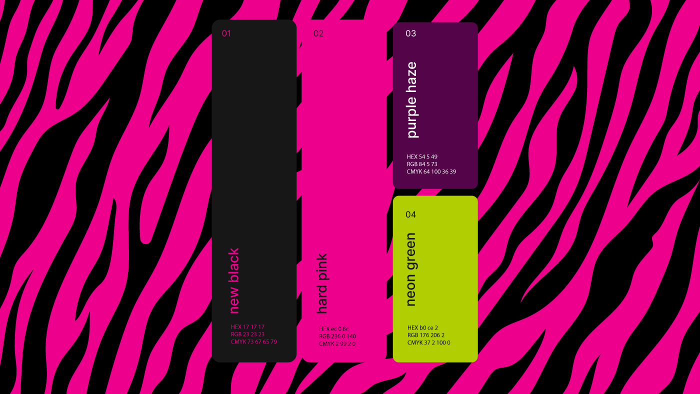
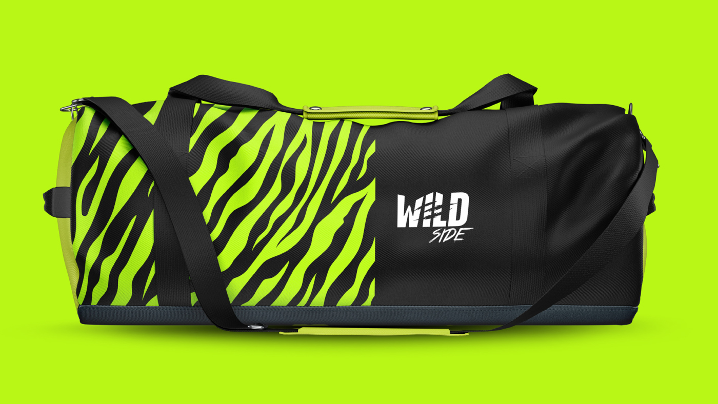
The color palette further strengthens this narrative through contrast and attitude. It balances depth, intensity, and boldness to create a visual system that feels strong, visceral, and unmistakably original. Each color works not just as an aesthetic choice, but as an emotional amplifier, reinforcing impact and recognition while supporting a cohesive, proprietary visual universe that cannot be ignored or confused with anything else.
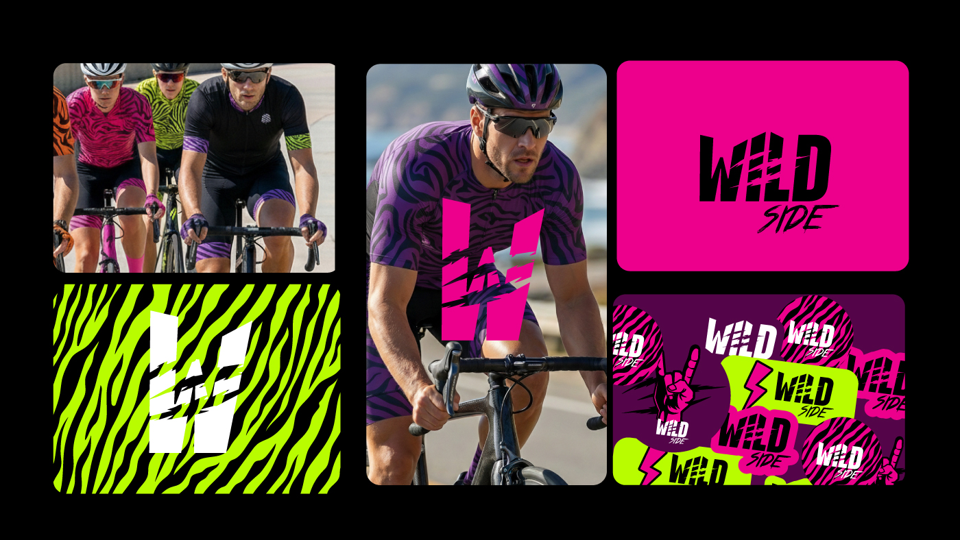
Everyone carries a wild and rockstar side within themselves, a force that pushes beyond comfort zones and predefined expectations. Wild Side exists to reveal and amplify this inner strength. The brand is not limited by specific disciplines, categories, or rigid rules. It stands for freedom, self-expression, and the courage to live with intensity, authenticity, and attitude, wherever the road may lead.
CREDIT
- Agency/Creative: Bass. Estúdio Gráfico
- Article Title: Bass. Estúdio Gráfico Builds a High-Impact Brand Identity for Wild Side
- Organisation/Entity: Agency
- Project Type: Identity
- Project Status: Published
- Agency/Creative Country: Brazil
- Agency/Creative City: Piracicaba
- Market Region: South America
- Project Deliverables: Brand Identity, Brand Mark, Graphic Design
- Industry: Fashion
- Keywords: Wild, Side, branding, basss, visual identity, logo, sports
-
Credits:
Bass.: Marcos Francisco Altafim Basseto


