


Water is essential to life and to health. No one would dispute this statement and so most, if not all, people would agree that none of us should neglect to give our bodies good, clean, and healthy water. However, there are those among us who underestimate just how important water is, which leads to headaches and various other mental and physical health problems.
To that point, one could say our thirst is a blessing for without it we would not know what our bodies need. Hence, the creation of Blessed Thirst, a brand that sets out to remind us of the importance of water in day-to-day healthy lives. Blessed Thirst does not stop there though, because, honestly, drinking water is just the tip of the iceberg. Truly, a thirst for water should have a noble companion – a thirst for health.
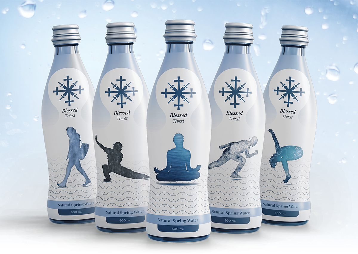
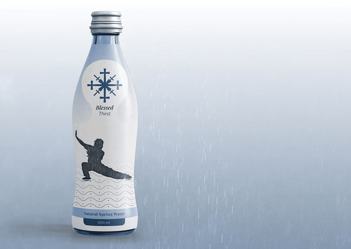
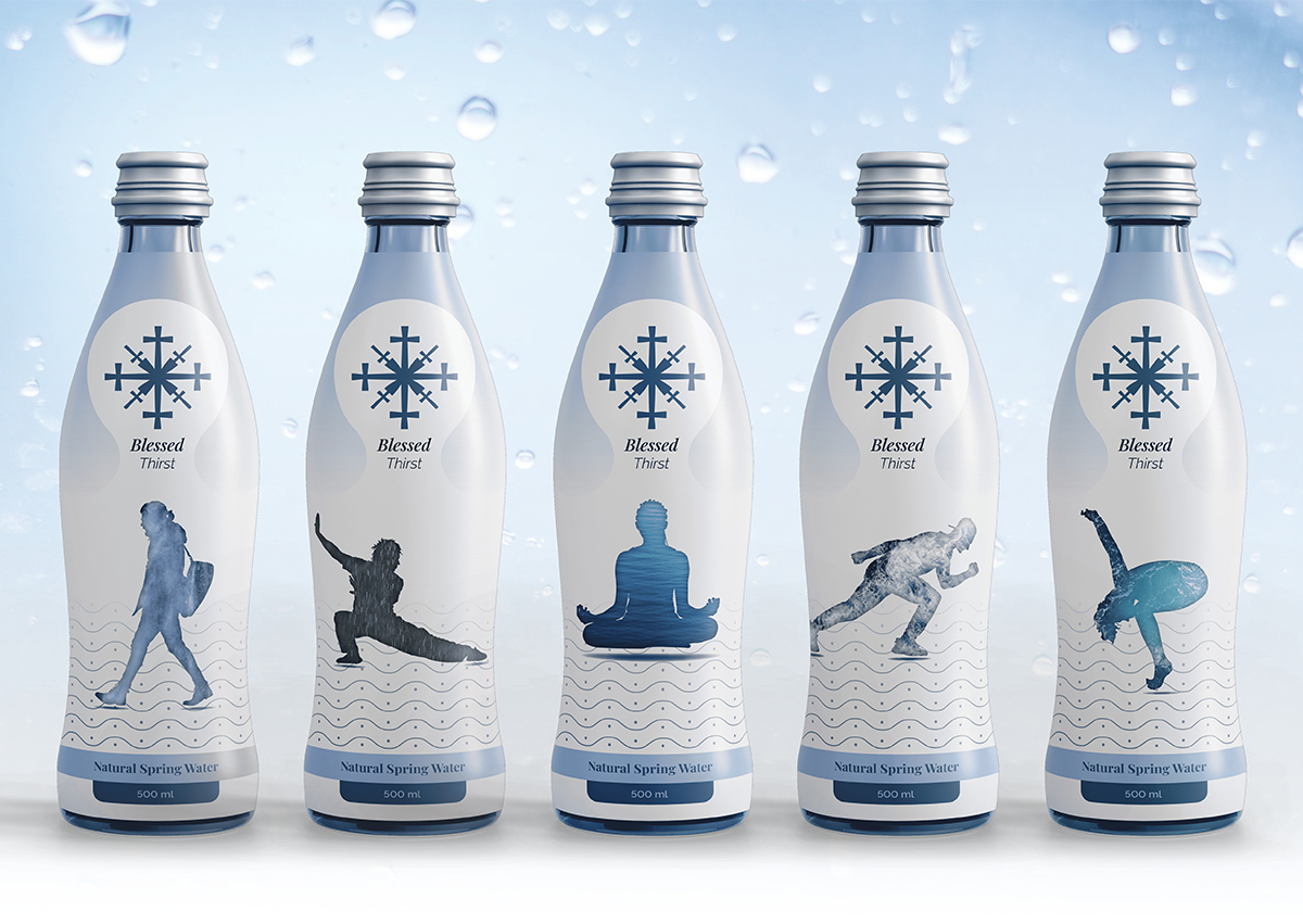
So then, Blessed Thirst is not just a water brand, it is a reminder of the importance of the marriage of mental health and nature (i.e., running and water, walking and water, Tai Chi and water, and so on). Overall, we want our water brand to be a nudge toward the importance of looking after yourself because, after all, looking after oneself goes beyond just drinking water.
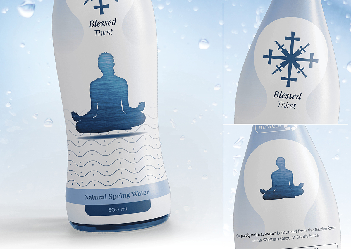
In fact, the illustration used on any one bottle is a strong visual representation of the connection between water, exercise, and thus, mental health. Also, note that each illustration features a different form of water to represent the various emotions one may feel while exercising and the life those emotions fill us with. They give us form and allow us to build character, flowing and changing with each new development upon our personal health journeys. Flowing and changing just like water!
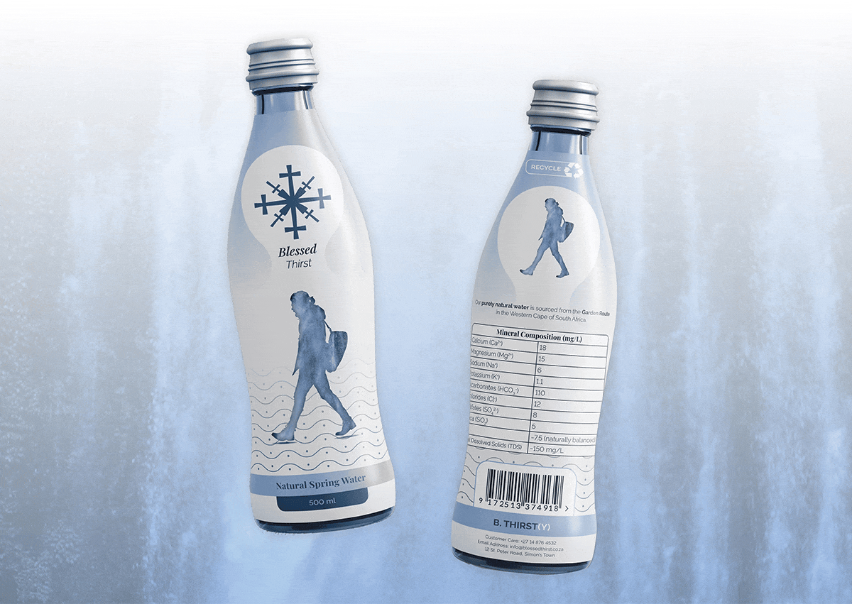
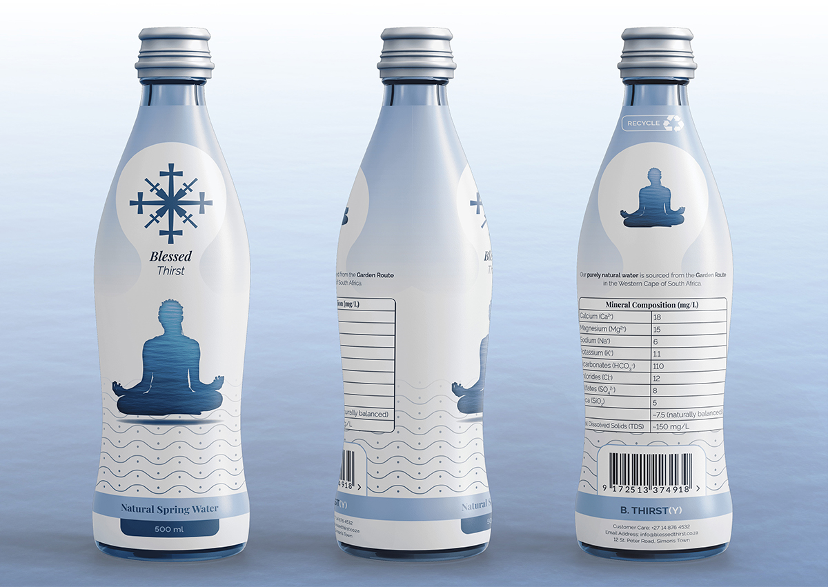
Blessed Thirst’s mission may be a genuine one but, like most brands, it needs support. In Blessed Thirst’s case, that support comes in the form of clever design symbols and choices. The illustrations have already come up, but the strength of this brand’s design relies on more than just those design elements alone. For example, those with a keen eye will notice that the illustration, both on the front and back of the bottle, sits within an upside-down water droplet. This is a fun, clever and simple “easter egg” because it is only properly visible when you put the bottle in a pretty unconventional position – completely upside down!
Although an interesting “easter egg,” as far as symbols go, a water droplet is fairly on the nose. Blessed Thirst’s logo on the other hand, is more out of the box. It features two main symbols and neither of them are often associated with bottled water. One is the repeated cross, which represents the word “Blessed” and that is pretty on the nose as well. However, the magic comes in when you see that this repeated cross creates the second symbol, a snowflake. A snowflake is strongly reminiscent of water and so, in this instance, it represents the word “Thirst.”
Already one can see that there are levels to this brand’s design. However, one of the more challenging design aspects is yet to make an appearance. Blessed Thirst’s slogan, which is “B. Thirst(y),” not only challenges normal spelling and so helps attract attention, but also has the brand’s name creatively hidden inside it. The “B.” is for the word “Blessed” and then “Thirst(y)” keeps the “y” in brackets to suggest its exclusion, which would leave us with the word “Thirst.” It takes a fair amount of imagination to notice, but it is different, interesting, and memorable.
In closing, Blessed Thirst will stand out on the shelves with its clever design, symbolism, and overall aesthetic appeal. Furthermore, we will attract the right people and begin reigniting the fire for health maintenance. People matter, your health matters, and our water, as well as the strong reminders it embodies, can lead you to a fuller life!
CREDIT
- Agency/Creative: Thomas Burke
- Article Title: Blessed Thirst Packaging Design Concept By Thomas Burke
- Organisation/Entity: Student
- Project Type: Packaging
- Project Status: Non Published
- Agency/Creative Country: South Africa
- Agency/Creative City: Cape Town
- Market Region: Africa
- Project Deliverables: Graphic Design, Identity System, Packaging Design
- Format: Bottle
- Industry: Food/Beverage
- Keywords: Graphic Design, innovative design, creative packaging, water branding, water packaging, conceptual packaging, symbolism, clever design, health conscious
-
Credits:
Graphic Designer: Thomas Burke


