


Hans Arp’s Biomorphic Universe
Project Objective: The key task was to create a unique typeface that would become the core of the exhibition’s visual identity. This typeface was to serve not simply a utilitarian function, but also a fully-fledged artistic statement—a visual translation of Hans Arp’s philosophy and aesthetics into the language of typography. It had to be instantly recognizable, associated with the master’s style, and set the tone for the entire project, built on the expressiveness of letterform.
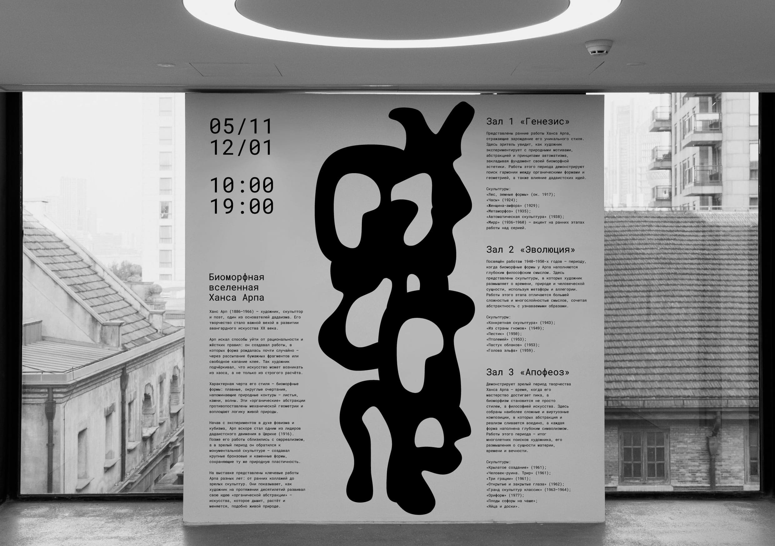
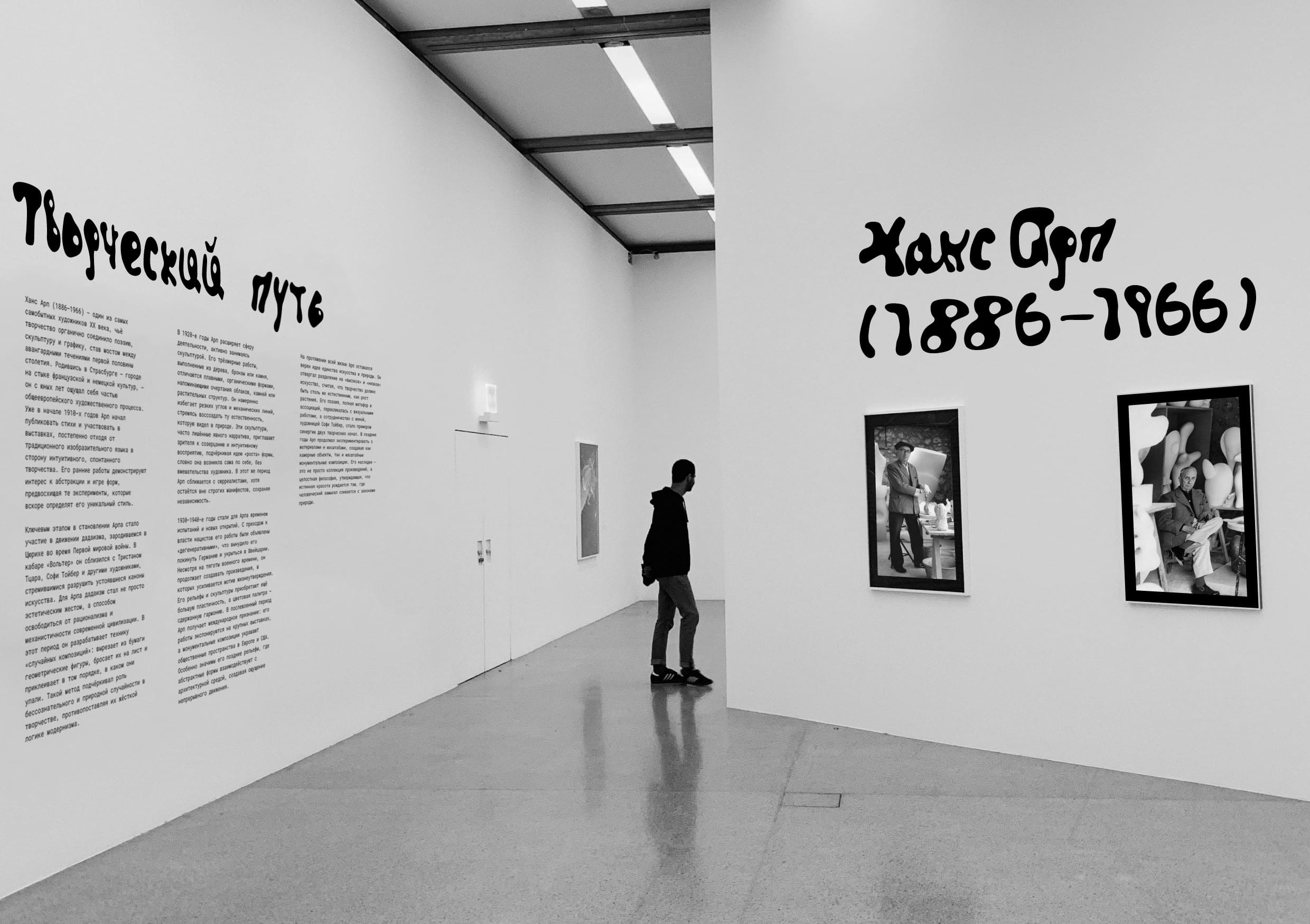
About the artist: Hans Arp is one of the key figures of 20th-century art, the founder of Dadaism, a poet, and a sculptor inspired by the profound processes of nature. His sculptures are not depictions of specific objects, but rather essences of growth, respiration, and transformation embodied in wood, bronze, or marble. They are distinguished by smooth, streamlined contours, organic dynamics, and a complete absence of rigid geometry. Arp’s most important creative principle is chance. The artist consciously minimized rational control, allowing form to emerge through process, bringing the act of creation closer to natural, almost biological, phenomena.
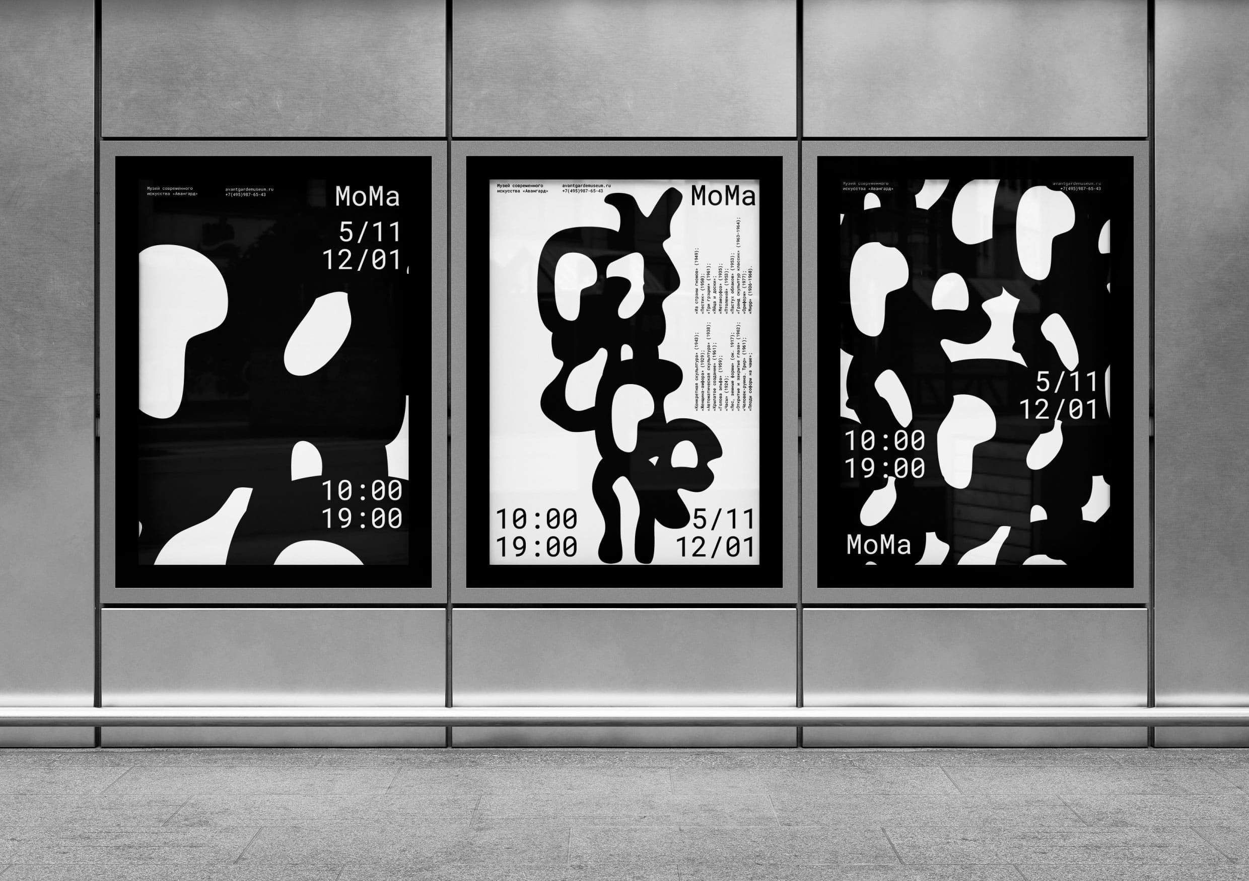
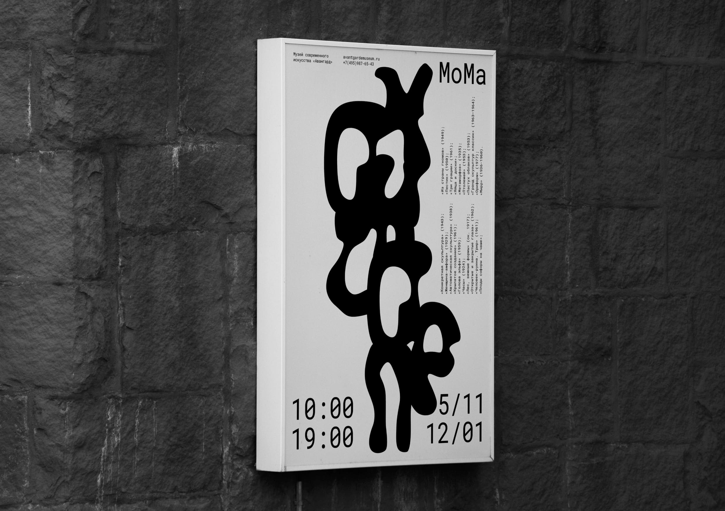
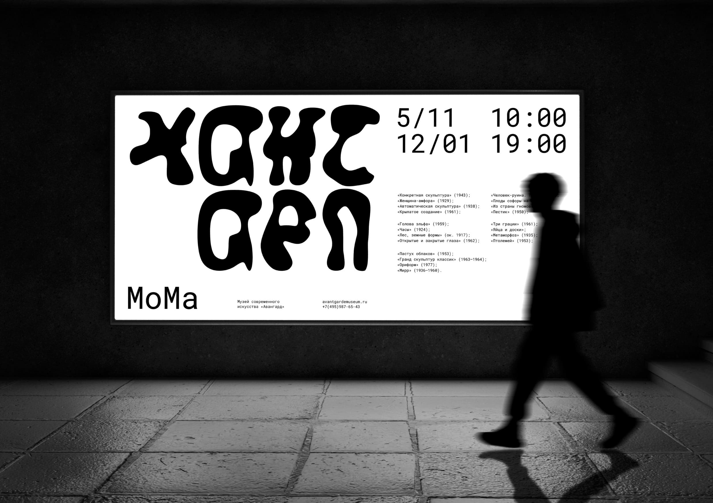
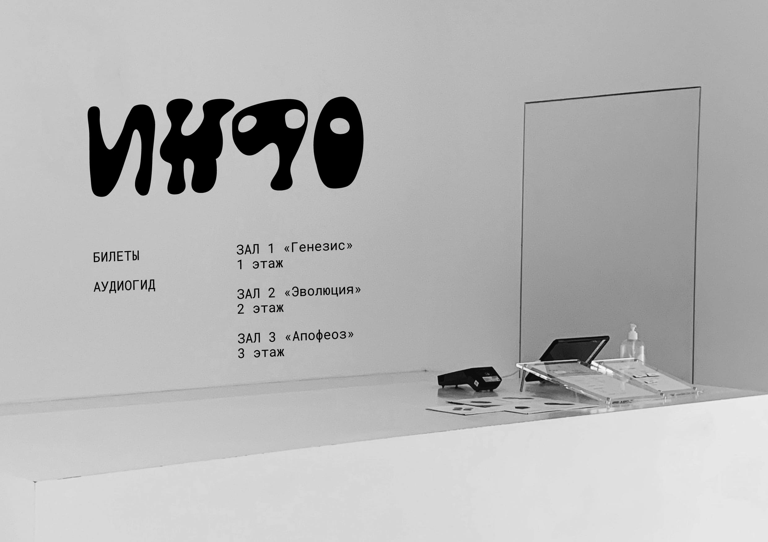
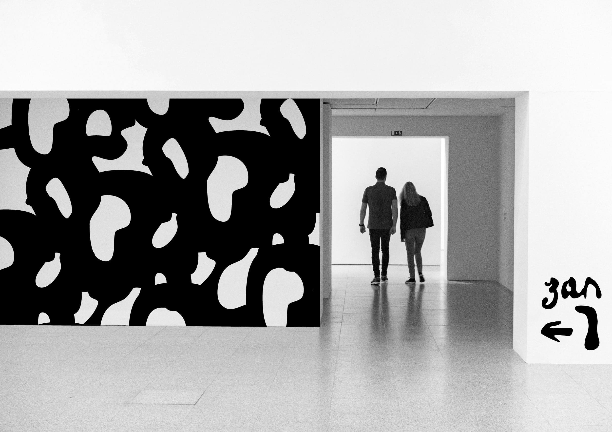
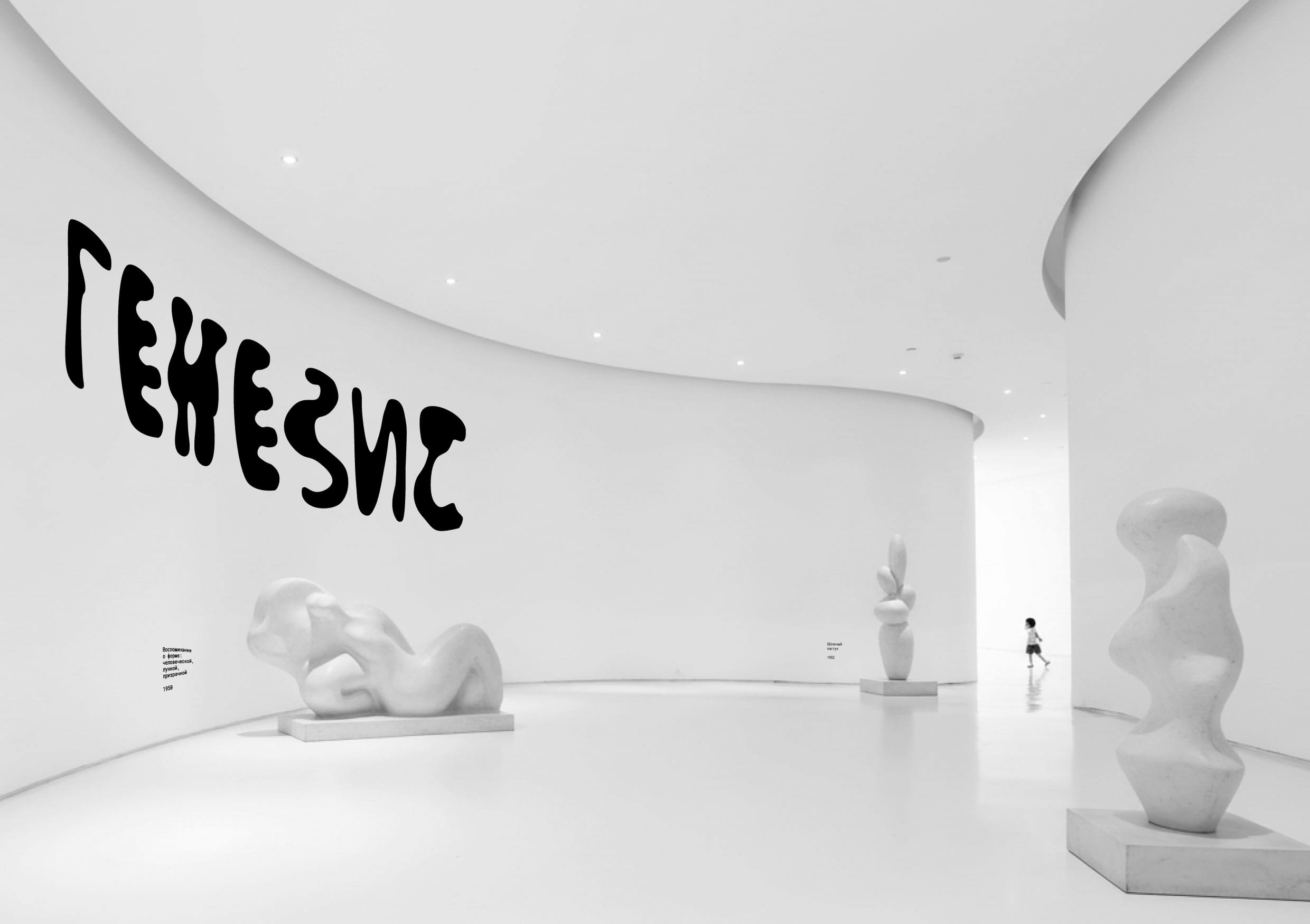
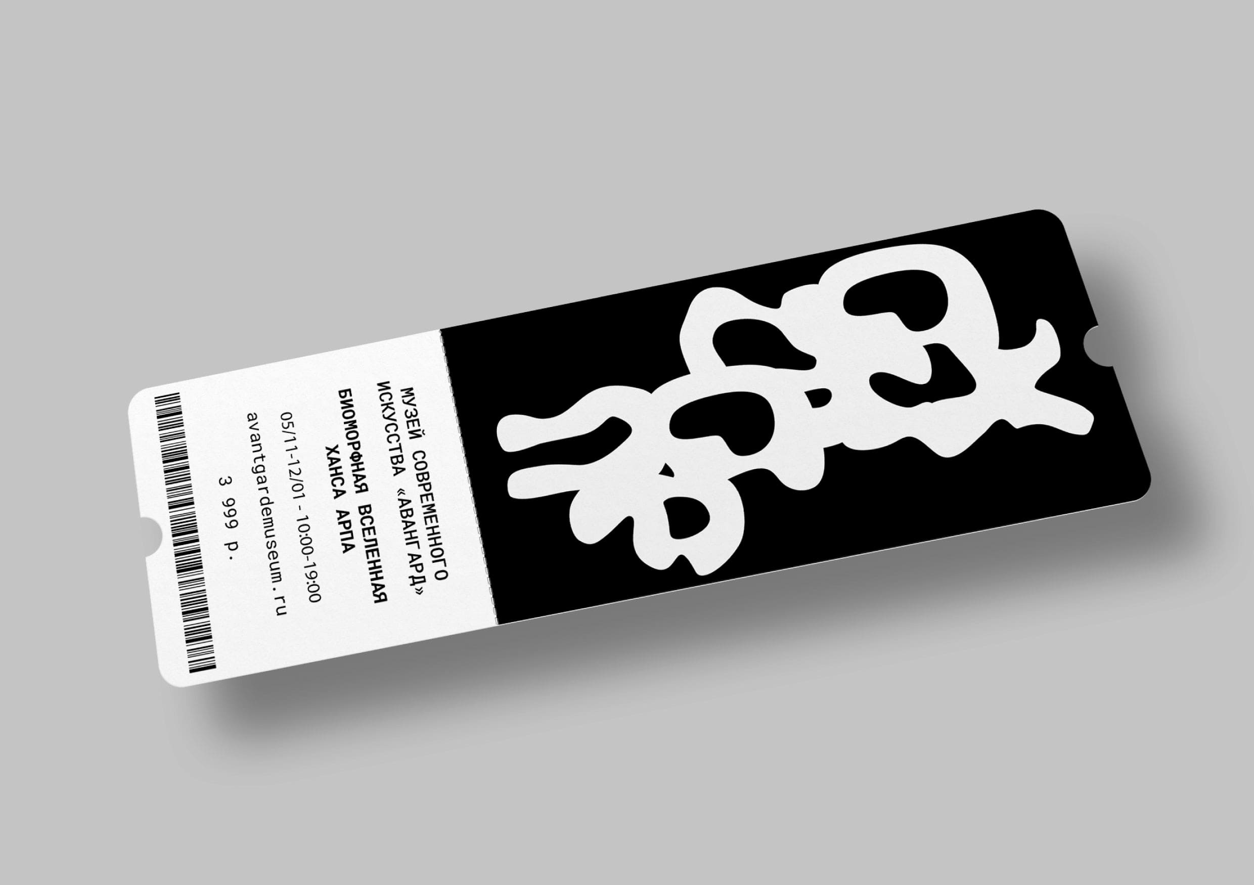
Project Description: The exhibition’s visual identity is built entirely on a custom-designed typeface, a direct typographic interpretation of Arp’s biomorphic sculptures. Each letter of the alphabet is an independent abstract composition, existing according to the artist’s organic forms: with soft curves, amoeba-like contours, and an internal pulsation.
The typeface’s distinctive feature is its combinatorial and variability. The letters are not static: when brought close together, they can merge, flowing into one another, forming new hybrid forms, like living cells. This reflects Arp’s principle of randomness—each inscription is unique, its precise appearance not fully predetermined.
The project’s main “Easter egg” is hidden in negative space. The spaces between and within the characters are not simply air, but an active part of the composition. These gaps form the precise silhouettes of Arp’s famous sculptures, such as the “Leaf Vase” and “Ptolemy.” Thus, even the most utilitarian text typeset becomes a hidden gallery, where letter and sculpture, positive and negative space, coexist equally. This creates a play of perception, where the viewer, peering closer, discovers a second, sculptural dimension of typography, becoming completely immersed in Hans Arp’s “biomorphic universe.”
CREDIT
- Agency/Creative: Anna Garibaldi
- Article Title: Anna Garibaldi Translates Hans Arp’s Biomorphic Universe Into a Living Exhibition Typeface
- Organisation/Entity: Student
- Project Type: Identity
- Project Status: Published
- Agency/Creative Country: Russia
- Agency/Creative City: HSE Art & Design School
- Market Region: Global
- Project Deliverables: Graphic Design, Identity System, Type Design
- Industry: Education
- Keywords: Graphic Design, Identity System, Type Design
-
Credits:
Designer: Anna Garibaldi
Curator: Alexander Blucher


