


Packaging designs for Jahnke’s innovative new product licorice & fruit on behalf of Cavendish & Harvey
On behalf of Cavendish & Harvey Confectionery GmbH, I developed an illustrative packaging design for Jahnke Süßwaren, covering both window bags and candy flow packs.
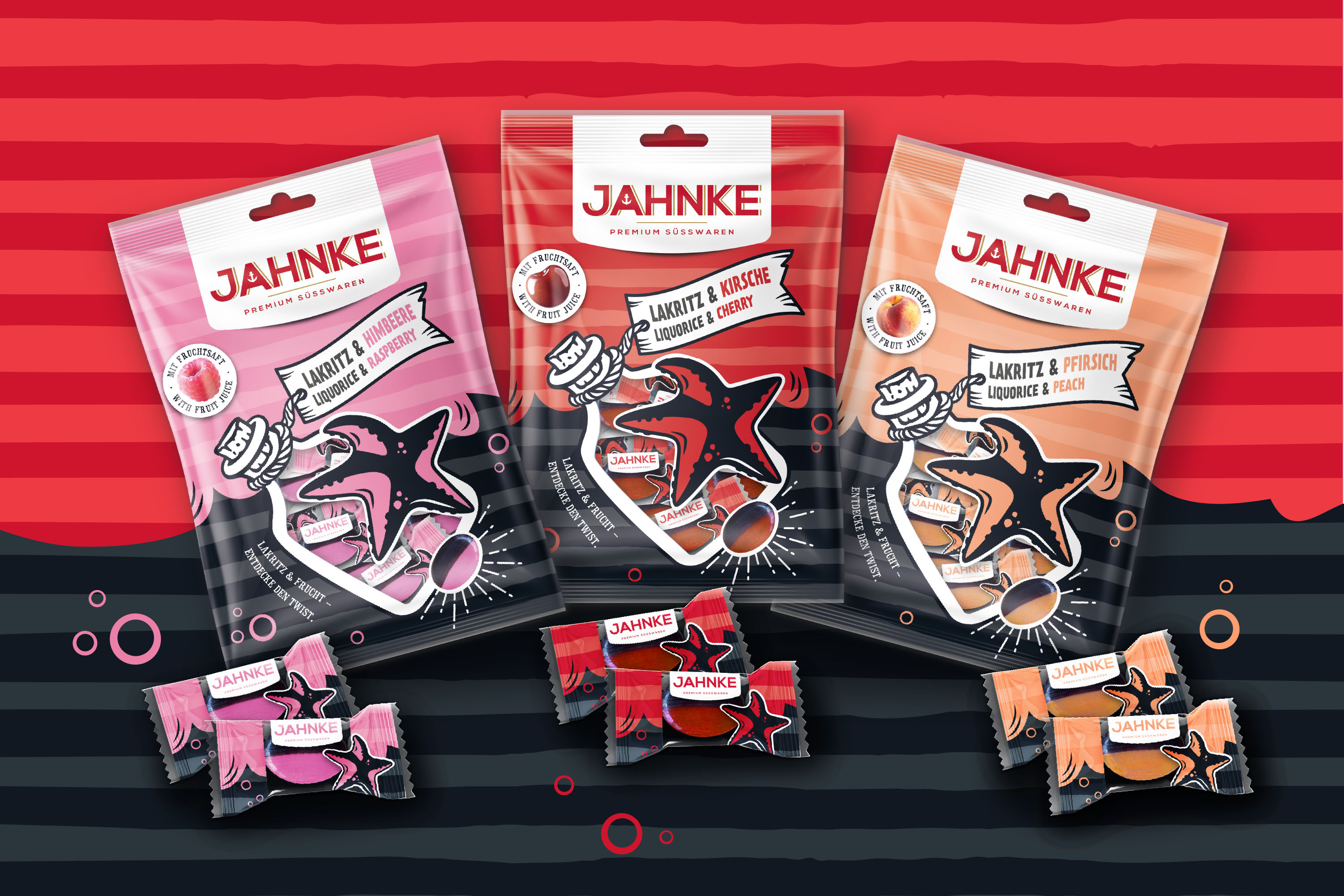
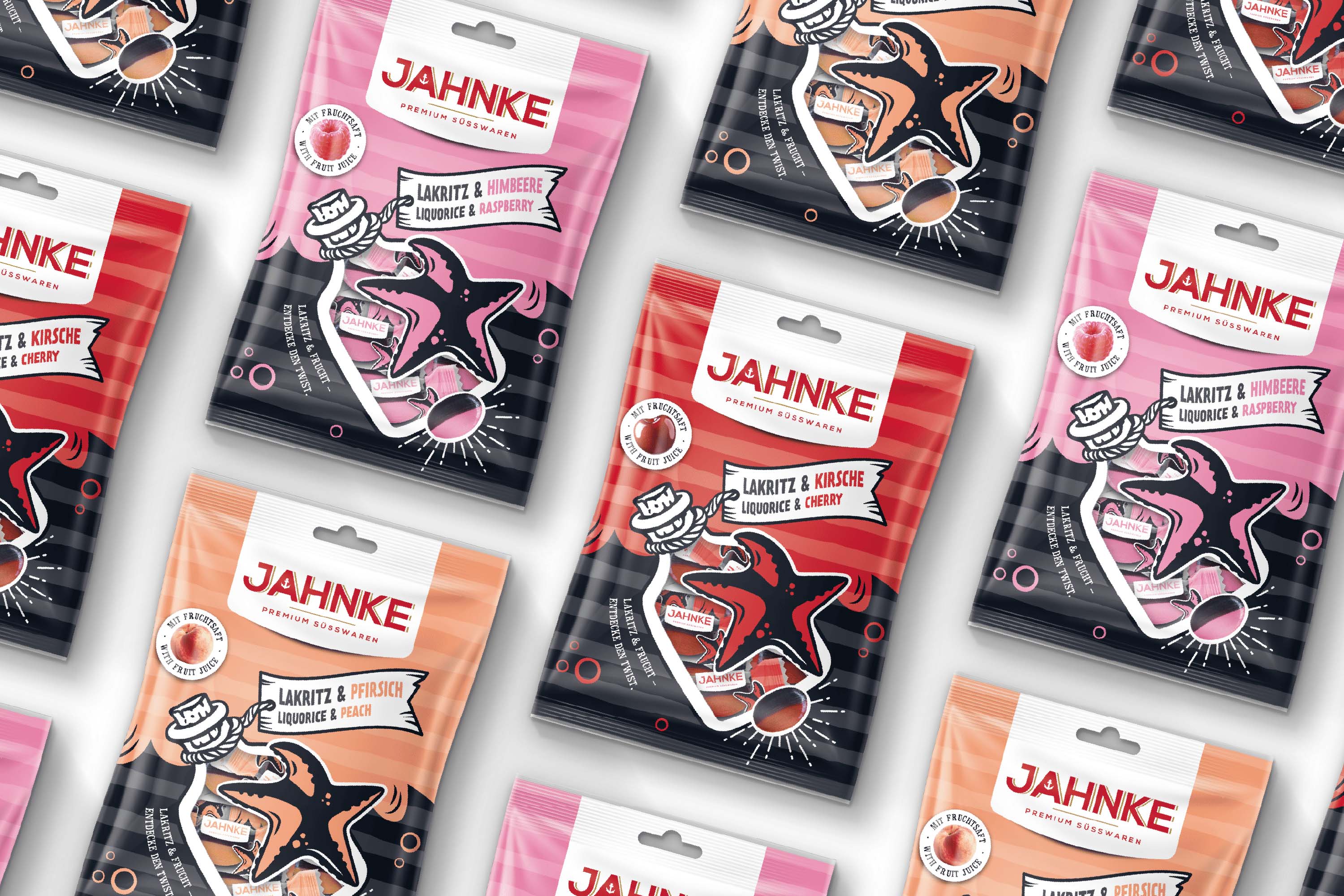
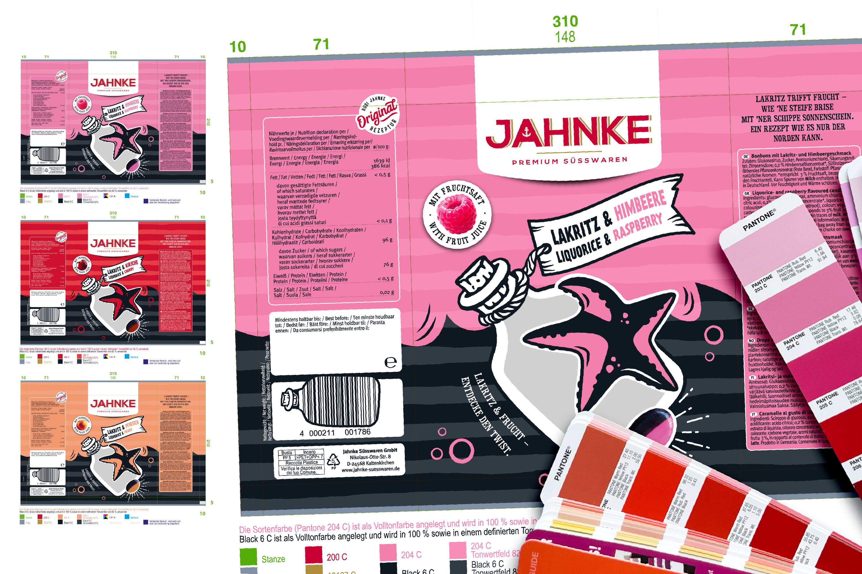
The brief was to create a design concept for the innovative duo product combining licorice and fruit—with a clear goal: strong shelf impact, distinct flavor differentiation, and a striking visual translation of the duo character.
The design concept reflects current consumer trends such as storytelling, authentic origin imagery, and reduced yet expressive illustration, transforming them into a clear and impactful visual structure.
The design continues Jahnke’s Nordic brand positioning, conveying the confident flavor combination of licorice and fruit at first glance.
Maritime elements like a message in a bottle and a comic-style starfish add an emotional layer, evoking a sense of adventure and craftsmanship.
Bold color fields, strong contrasts, and distinctive typography ensure maximum shelf attention. The design merges contemporary aesthetics with a premium appeal, targeting a style-conscious audience.
The new range features three varieties—Licorice & Raspberry, Licorice & Cherry, and Licorice & Peach—each clearly distinguished by its own signature color.
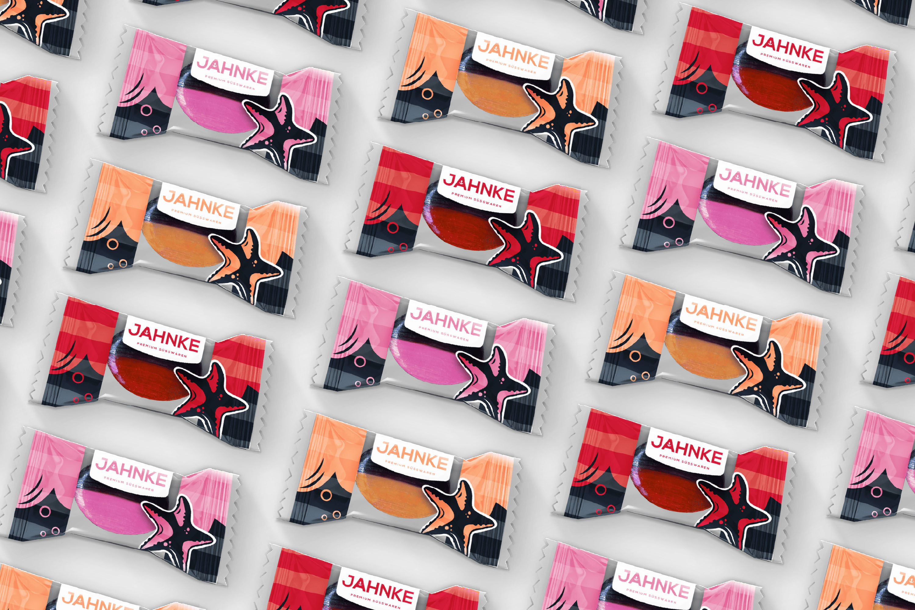
The product is an innovative hard candy composed half of licorice and half of fruit. Each candy is individually wrapped in a flow pack wrapper that visually aligns with the bag design. The center section of the wrapper is transparent, allowing a direct view of the product.
The layout design for both the bag and the flow pack was created using selected Pantone spot colors to define the flavor tones. The striped look was achieved through 82% tints of the 100% spot colors, adding depth and texture to the packaging surface.
To emphasize the fruit juice content in a bold and appetizing way, I developed photorealistic fruit illustrations and designed a circular callout icon for the front of the pack.
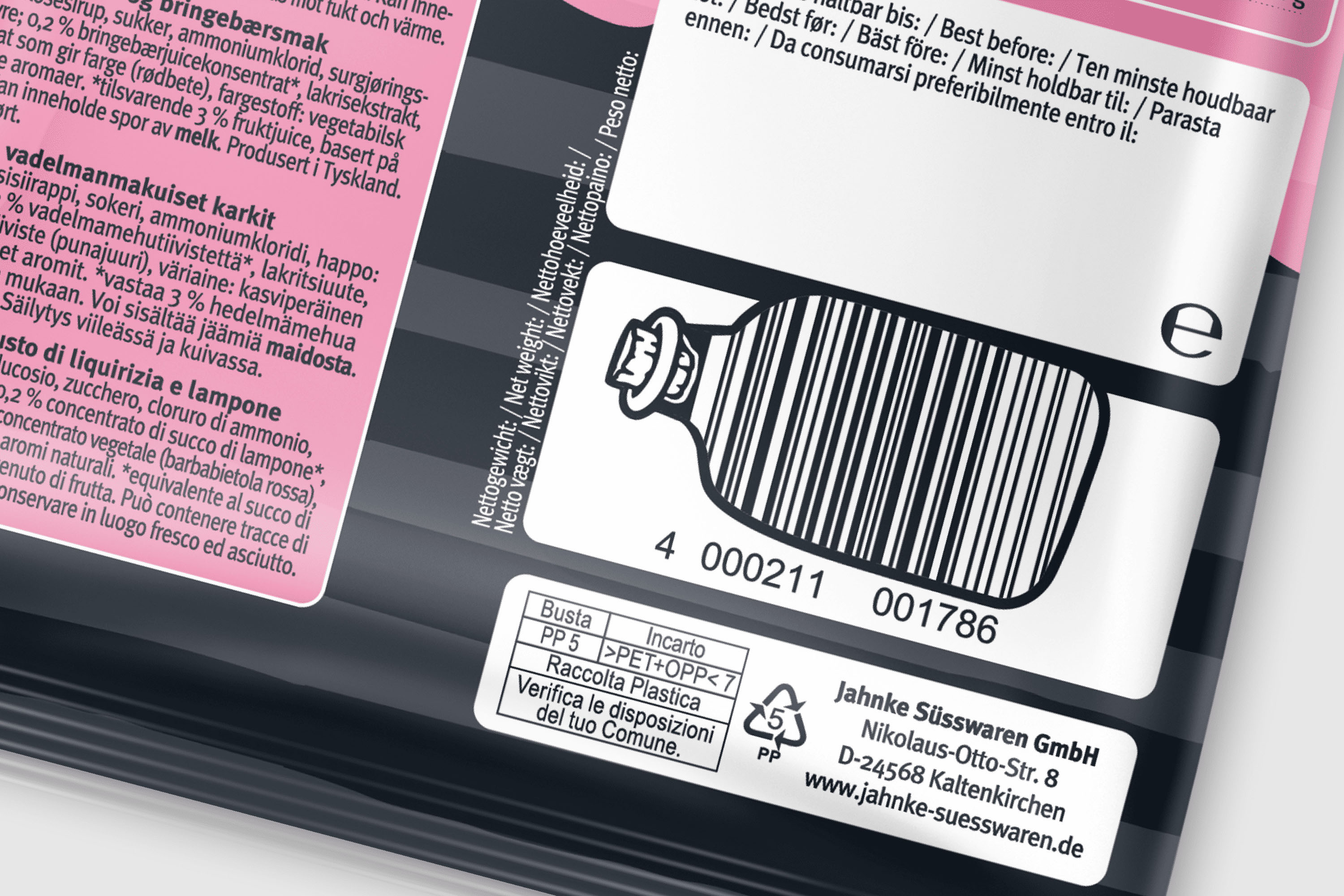
The EAN code on the back continues the maritime design theme of the front, illustrated in the shape of a message in a bottle to add a playful, distinctive touch.
As an experienced illustrative designer specializing in packaging and brand design, I managed the entire creative process—from concept development and visual route definition to final layout preparation for lithography.
The design process focused on four key aspects:
Brand alignment:
Building on Jahnke’s existing maritime comic style, I integrated the brand’s signature striped look and reinterpreted it within a fresh storytelling context.
Illustrative branding:
Creation of a striking, comic-inspired visual language with custom illustrations that clearly express the unique duo character of the product.
Duo-look packaging:
Integration of a transparent window, a staged starfish hero element, and photorealistic candy renderings for strong visual impact.
Consistent design system:
Ensuring cross-range recognizability through a unified design approach while maintaining clear flavor differentiation.
The design deliverables included both the primary packaging (flow pack wrapper) and the secondary packaging (window bag), ensuring a cohesive brand appearance across all formats.
CREDIT
- Agency/Creative: Stefanie Twellmann
- Article Title: Illustrative Premium Packaging for Innovative Liquorice & Fruit Duo Stefanie Twellmann
- Organisation/Entity: Freelance
- Project Type: Packaging
- Project Status: Published
- Agency/Creative Country: Germany
- Agency/Creative City: Hamburg
- Market Region: Europe
- Project Deliverables: Brand Design, Brand Identity, Illustration, Packaging Design
- Format: Flow-Pack, Pouch
- Industry: Food/Beverage
- Keywords: cavendish & harvey, jahnke, sweets, packaging, illustrative packaging design, brand design, fmcg
-
Credits:
Art direction, concept, design, illustration, preparation of print data: Stefanie Twellmann


