


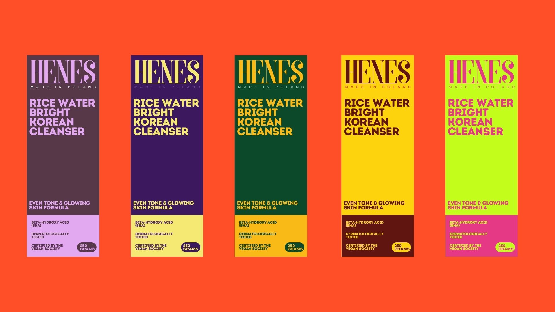
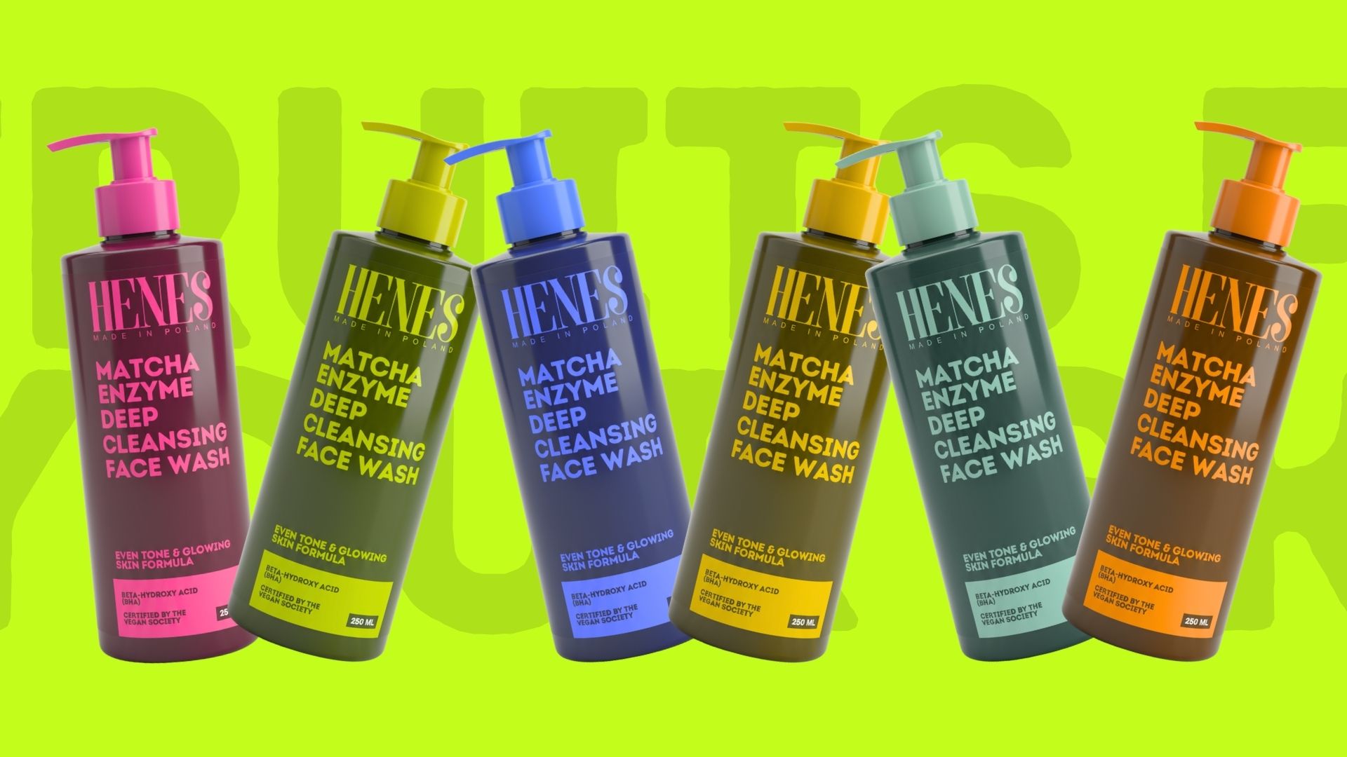
HENES was developed as a clarity driven brand system for a new product launch, with a focused intent to test product market fit within a highly competitive and visually dense category. The project began with an in depth study of contemporary consumer behaviour, shelf interaction patterns, and attention economics, particularly how users process visual information in fast decision making environments. Research highlighted a clear shift toward brands that communicate value instantly, reduce cognitive effort, and prioritise legibility over visual excess. In response, the brand strategy was anchored in simplification, removing unnecessary layers to ensure that messaging, structure, and form worked together as a single, coherent system.
The design process placed strong emphasis on information hierarchy, typographic clarity, and contrast based decision making. Each element was evaluated for its ability to perform under real world conditions, including quick scanning, partial visibility, and repeat exposure. Instead of relying on trend led aesthetics or decorative storytelling, the visual language was built to function as a tool for validation, allowing the product to be tested honestly in market without visual noise influencing perception. This approach enabled clearer insights into consumer response, comprehension, and recall during the launch phase.
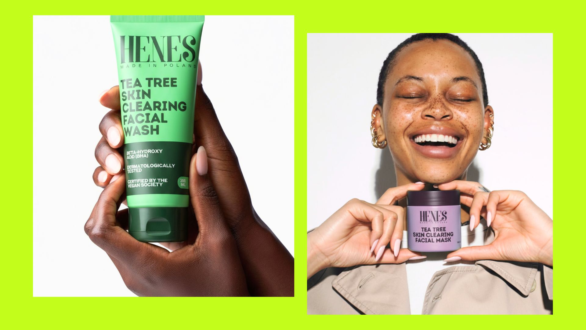
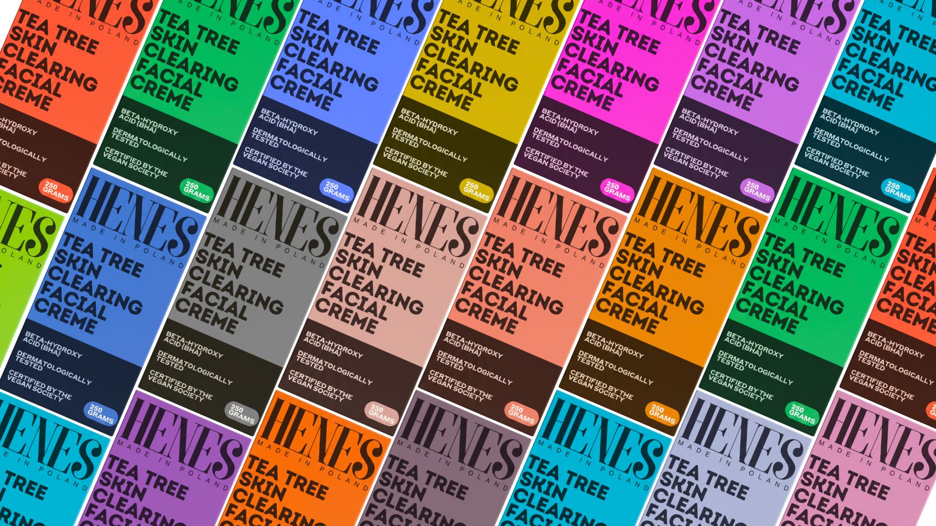
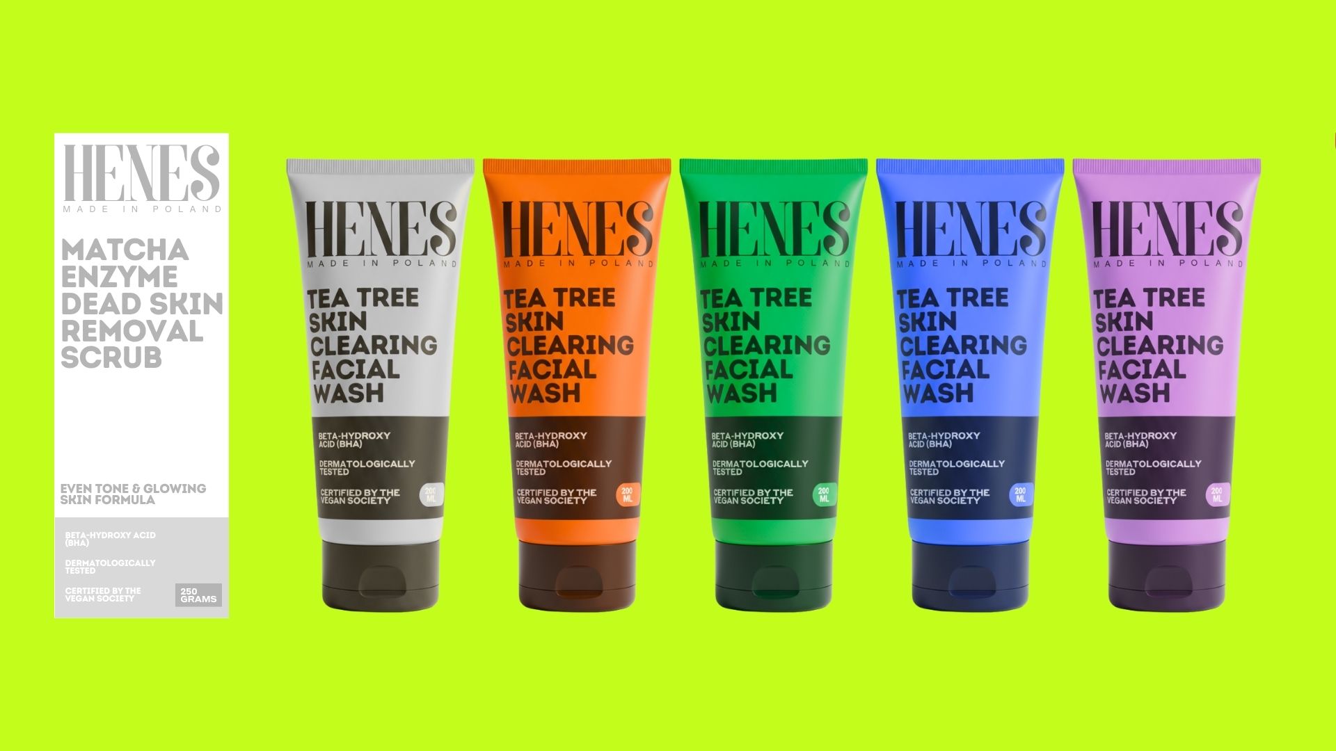
Visually, HENES adopts a direct and functional aesthetic supported by a restrained palette, bold typographic presence, and structured layouts. These choices were informed by research into minimal cognition branding systems, where reduced visual complexity has been shown to improve recognition and trust in early stage products. The system was designed to remain adaptable, ensuring scalability across formats and the flexibility to evolve as insights emerged from market feedback. The final outcome is a brand identity that balances precision with openness, serving both as a launch framework and a research driven foundation for long term brand growth.


CREDIT
- Agency/Creative: Studio Moccha
- Article Title: Henes: Where Design Speaks Clearly, Quickly, and Without Distraction by Studio Moccha
- Organisation/Entity: Agency
- Project Type: Identity
- Project Status: Published
- Agency/Creative Country: India
- Agency/Creative City: studio moccha
- Market Region: Asia
- Project Deliverables: Brand Identity, Brand Strategy, Branding, Visualisation
- Industry: Beauty/Cosmetics
- Keywords: colourful, simple, direct, fmcs
-
Credits:
Designers: Studio Moccha
Packaging Consultant: Ansh


