


Independent brand agency Brandon is pleased to share news of its collaboration with household cleaning brand Fabulosa, which includes the launch of a new visual brand identity system, portfolio architecture strategy, and packaging design system.
“Fabulosa might just be the greatest challenger brand story post-Covid. In 2019, Mike and James Sharpe identified an opportunity for their family-run manufacturing business to develop a range of fragrance-led household cleaning products that truly work. With rapid expansion both at home and abroad, there was a clear opportunity to turn this manufacturer’s success story into the fierce brand it had the license to become. Together, we’ve set Fabulosa on the path to achieve the Sharpe family’s ambitious growth plans.”
– Richard Taylor, Co-Founder of Brandon Consultants
Spend a few minutes scrolling TikTok and you’ll see how Fabulosa sparks joy in people’s lives. Not just because the range of over 150 products both work and smell great, but because using Fabulosa makes cleaning fun and joyful.
Where most household cleaning brands focus on efficacy claims, Brandon saw Fabulosa as more of a positive lifestyle brand – a brand that celebrates the joy in the process and embodies the notion that a clean home is a happy home. Unlocking this inspired their new design strategy for Fabulosa: turn your ‘to-do’ into ‘ta-da!’.
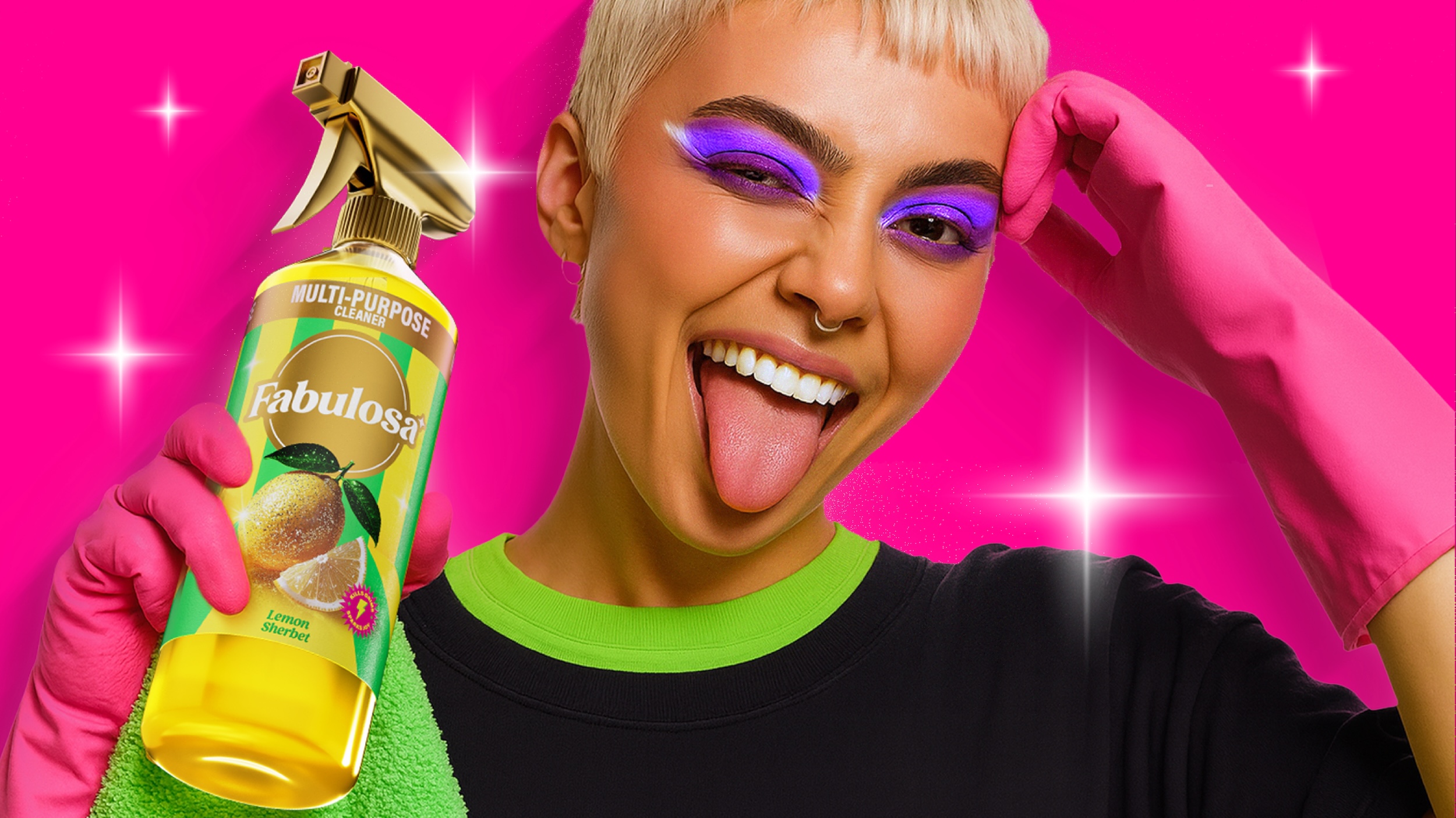
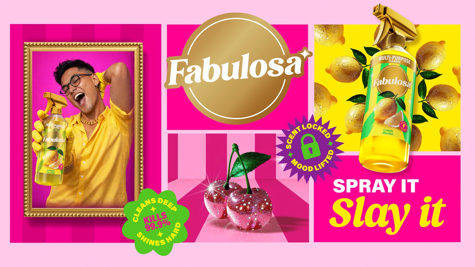
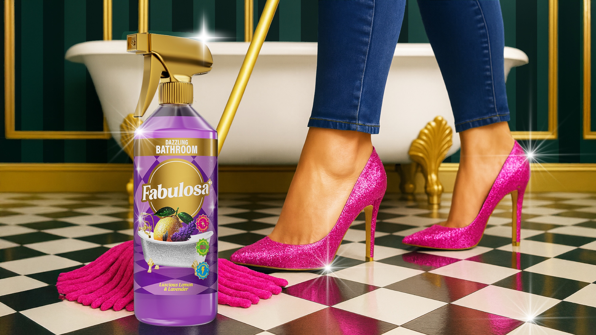
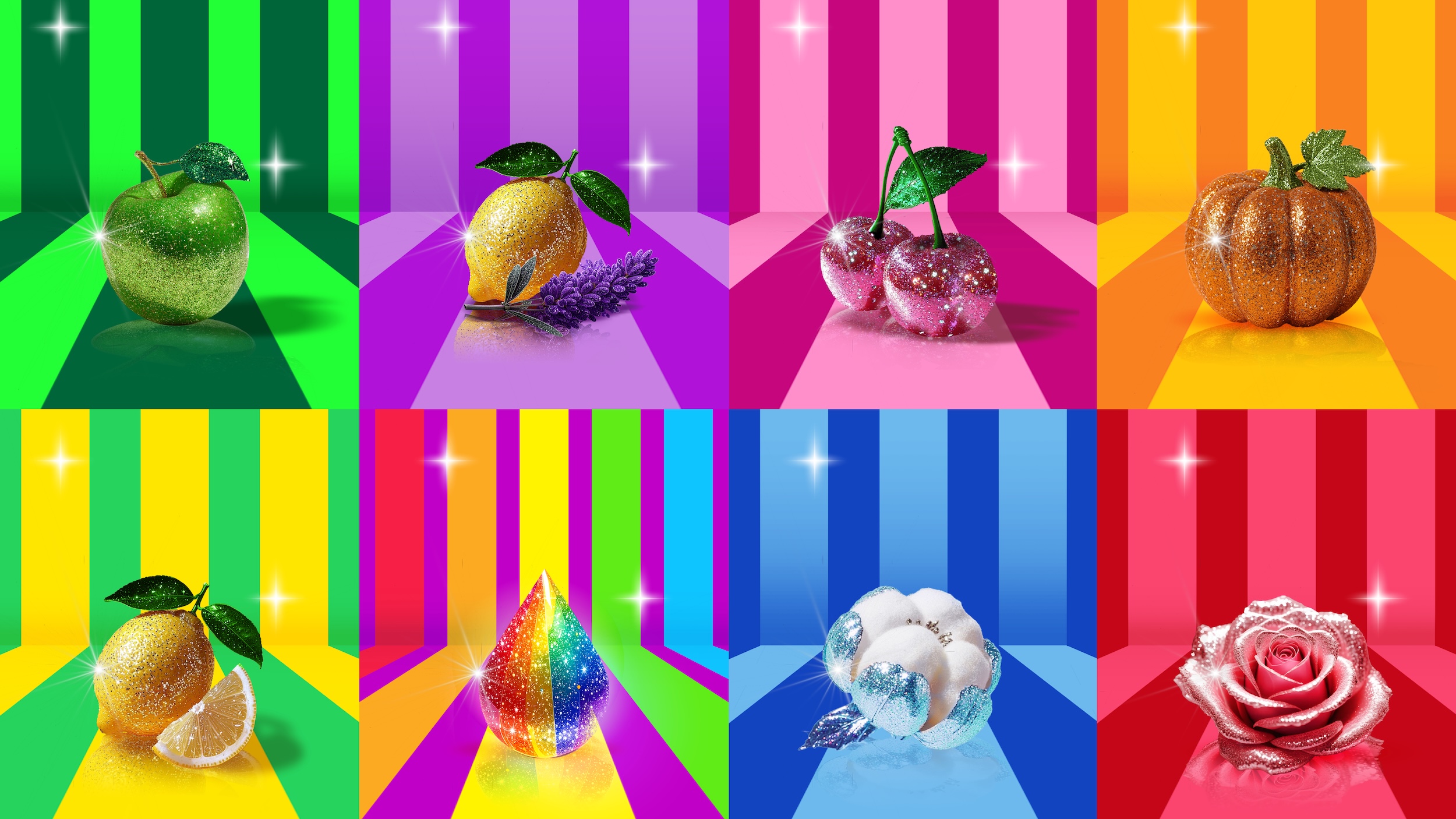
“We knew that fragrance was everything for Fabulosa, so we developed a distinct identity, key brand assets, and playful fragrance cameos that shout scent. We then drenched it all in glitter for that dopamine hit we know connects with the brand’s consumers and makes Fabulosa products stand out from the dull crowd. From fruits and flowers to more abstract representations of fragrance – the sparkly gold lawnmower is a particular team favourite – our dazzlingly deliberate and unapologetically kitschy expressive style is extra, but in a way that only Fabulosa can pull off.”
– Katie Rowley, Design Director at Brandon Consultants
Design details within the new visual brand identity system include:
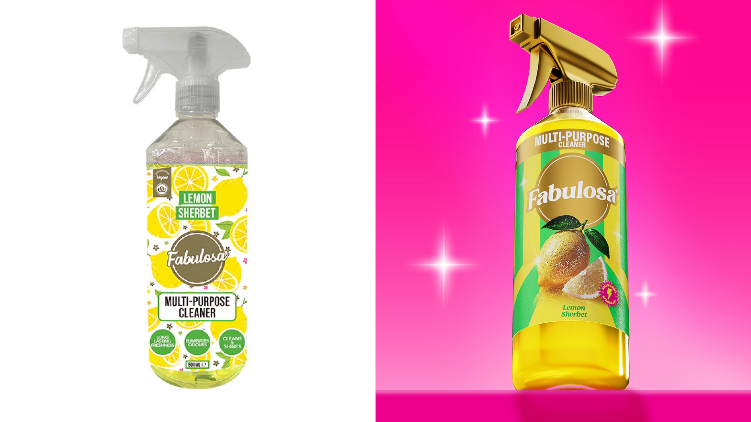
• A recrafted brandmark, which positions the Fabulosa wordmark in a gold circular holding device to drive brand recognition and consistency.
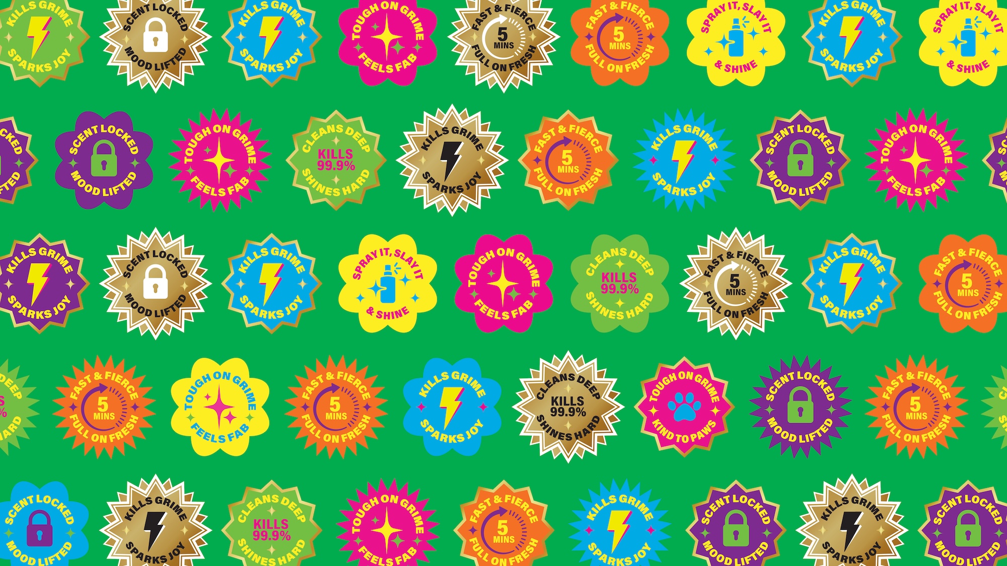
• Introducing the ‘Ding’ as a new key brand asset to highlight details, plus additional ‘Sparkles’ to bring extra personality wherever the brand shows up.
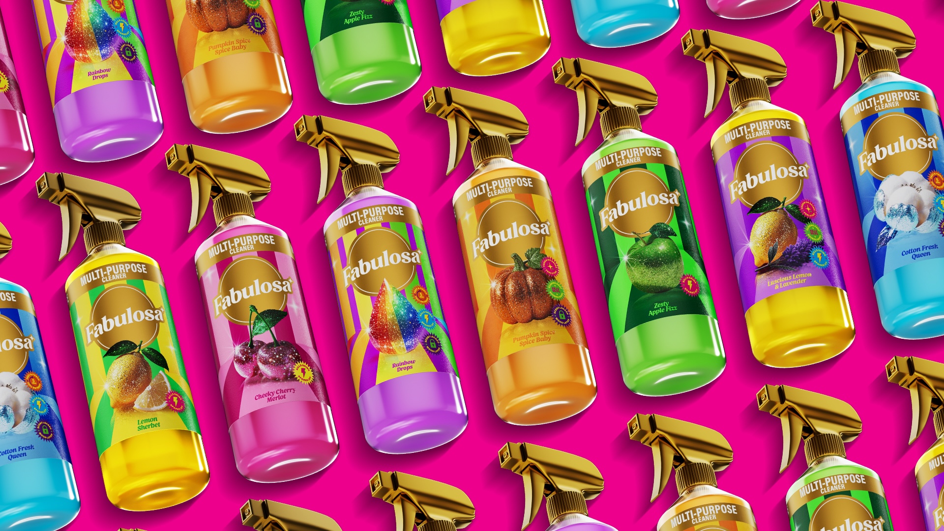
• A carefully balanced colour palette designed specifically to stand out from the muted and more serious tones of competitor brands. The vibrant pink is energetic and ownable to Fabulosa, gold adds the glitz and sparkle, white provides clarity, and yellow injects an extra layer of positivity.
• Dynamic patterns that are used to create 3D environment backdrops to connect the fragrance cameos to real-world product use. These include geometric tiles that reference bathrooms, and graphical prints inspired by wallpapered living and dining spaces.
• New iconography for efficacy and product claims. Crafted in a clean, minimal vector style, these provide balance against the punchy fragrance cues.
• Acumin Variable as the primary typeface for its bold, functional simplicity to help retailers and consumers easily navigate the products on noisy shelves.
• Kangmas Italic as the secondary font to add flair and pace when communicating more expressive scent cues and messaging, both on pack and across broader communications.
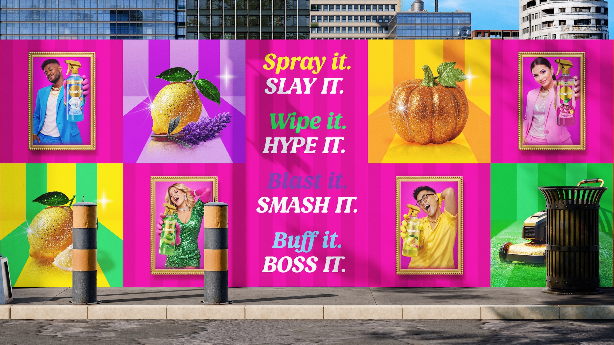
• An uplifting, feel-good photography style that reflects Fabulosa’s consumers and reinforces that satisfying feeling you get when you’ve finished cleaning.
• New Tone of Voice guidelines to ensure that Fabulosa sounds just as playfully sassy as it looks.
With a vast portfolio of products spanning multiple categories and rapidly expanding into new ones, when it came to the packaging, Brandon’s Strategy team worked closely with Fabulosa to explore segmentation opportunities and redefine the product portfolio architecture.
“Our approach was to reflect the consumer mindset around cleaning: Do I want to fragrance my space? Tackle the toughest grime? Or do I just need a product that works for everything without being overwhelmed by choice? Once we’d mapped these out together, we defined a new set of product pillars and developed a supporting packaging design system based on fixed-and-flexible assets, allowing Fabulosa to dial the fragrance and efficacy cues up or down as needed. Delivering clarity for consumers and retailers alike, this new approach has already helped Fabulosa unlock innovation and new listing opportunities.”
– Anna Tolstoluzhska, Brand Strategist at Brandon Consultants
Brandon delivered a comprehensive set of brand guidelines and visual assets, plus the new portfolio architecture and packaging design systems, at the end of 2025. Since then, Fabulosa’s internal design team has been working hard to roll it out across every brand touchpoint – from existing packaging and new products to website and social media, across experiential activations and campaigns, and bringing it to life at Fabulosa’s HQ.
“At Fabulosa we believe that fabulous is a mindset. Through this partnership with Brandon, together we have transformed Fabulosa into the most fabulous version of itself. Working with the new visual brand identity is an absolute joy, and we’ve already received incredible feedback from our retailers and shoppers – they just love it! But more than that, even in these early days of rollout, we’re seeing the commercial benefits, and the rebrand has already helped us land new distribution channels at home with a major multiple, along with overseas orders in new territories including China, India and Vietnam. Thank you to the entire team at Brandon for really getting under the skin of our brand, our growth ambitions, and of course our consumers. It’s helped to set us up well for a fabulous future. Job done!”
– Adam Burnett, Global Brand Director at Fabulosa
CREDIT
- Agency/Creative: Brandon Consultants
- Article Title: Turning Jobs Into Joy: Brandon Partners With Fabulosa to Transform an Iconic Household Cleaning Range Into a Global Brand Set for Growth
- Organisation/Entity: Agency
- Project Type: Identity
- Project Status: Published
- Agency/Creative Country: United Kingdom
- Agency/Creative City: Manchester
- Market Region: Europe, Global
- Project Deliverables: 2D Design, Advertising Photography, Art Direction, Brand Architecture, Brand Design, Brand Guidelines, Brand Identity, Brand Mark, Brand Redesign, Brand Rejuvenation, Brand Strategy, Brand Tone of Voice, Brand World, Branding, Craft, Creative Direction, Design, Graphic Design, Icon Design, Identity System, Illustration, Insight, Logo Design, Packaging Design, Packaging Guidelines, Pattern Design, Photography Styling, Rebranding, Tone of Voice, Typography
- Industry: Retail
- Keywords: Fabulosa, cleaning, household, redesign, rebrand, packaging, packaging design
-
Credits:
Agency: Brandon Consultants
Client: Fabulosa


