


Carlton Collection, a family of hotels and hospitality destinations including two DesignHotels™, has announced a comprehensive rebrand aimed at unifying its diverse portfolio while celebrating the unique character of each property.
The rebrand, led by strategic creative agency D8, marks a pivotal moment in the evolution of the Carlton Collection. The underpinning strategy and bold visual expression, which include a bespoke wordmark and cut-through colour palette, make the collection stand out from competitors, positioning it as a cohesive yet eclectic family of destinations that inspires exploration.
Rosie Street, Managing Director of D8 in Amsterdam says: “The Carlton Collection’s biggest challenge was that it didn’t exist as a brand in the consumer’s consciousness. Each hotel operated independently, with no visible connection to the broader collection. The rebrand has unified these diverse properties under one identity, helping the central team shift from simply selling rooms to promoting the value of the wider collection. This change not only strengthens the brand but also creates new opportunities for growth.”
A unified vision for a diverse collection:
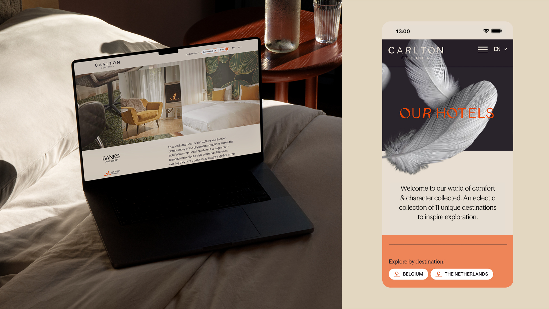
The new brand identity amplifies the collective strength of the group, while celebrating individuality, local character and colour. The new name, Carlton Collection, removes the word ‘hotel’ to encompass the broader range of experiences offered, including restaurants and bars.
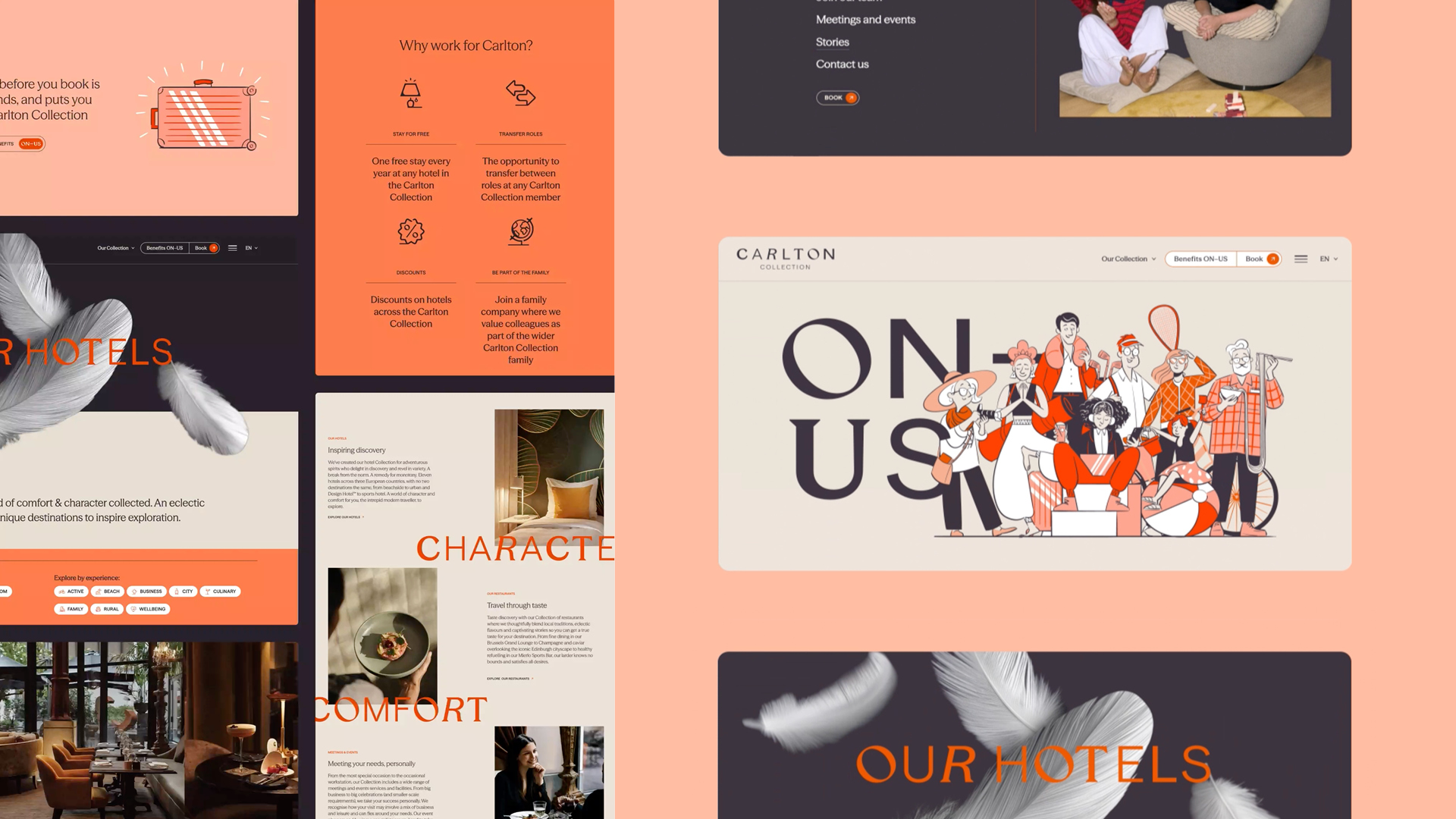
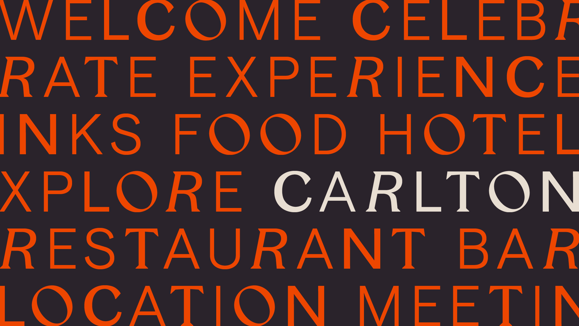
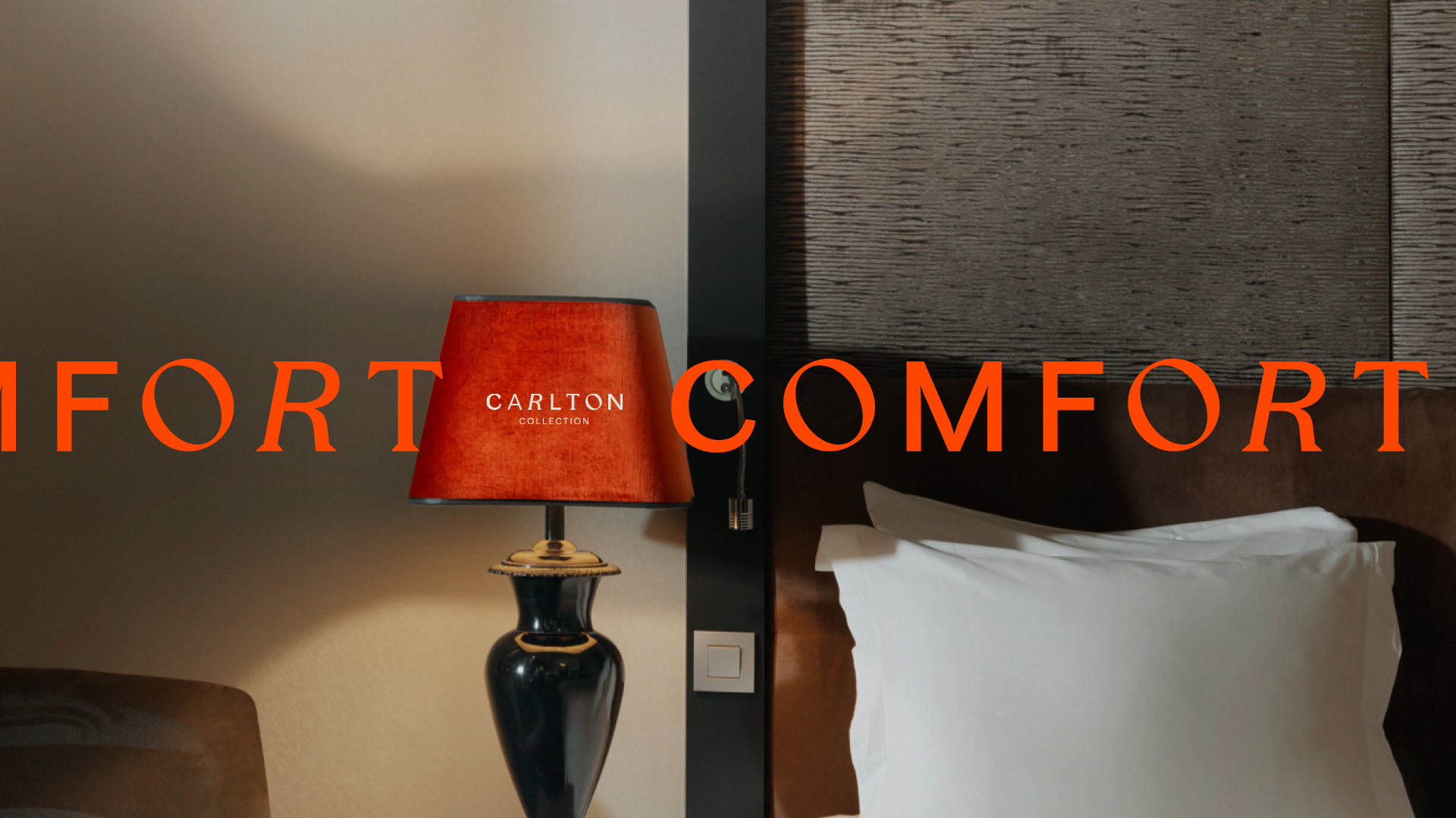
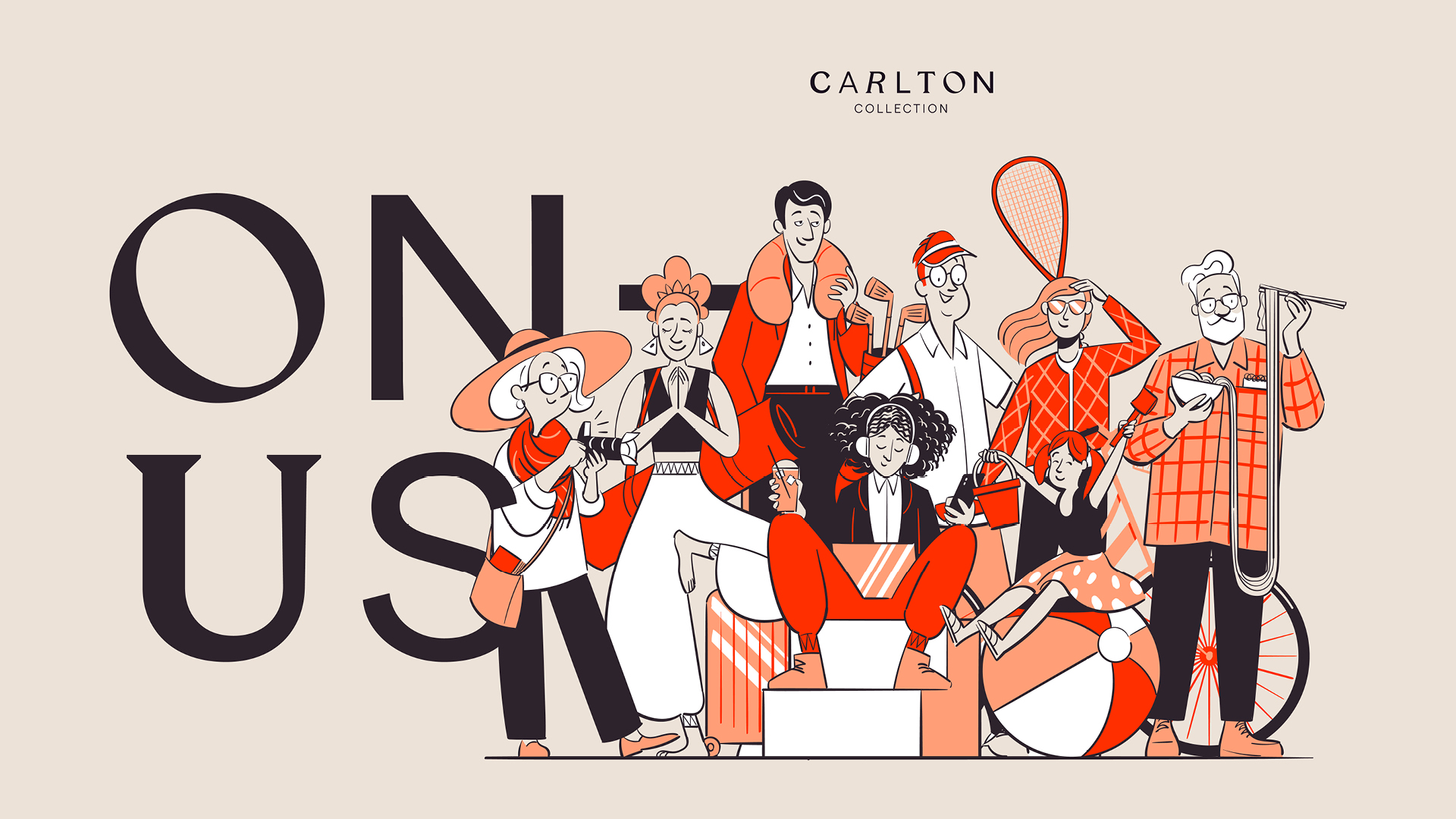
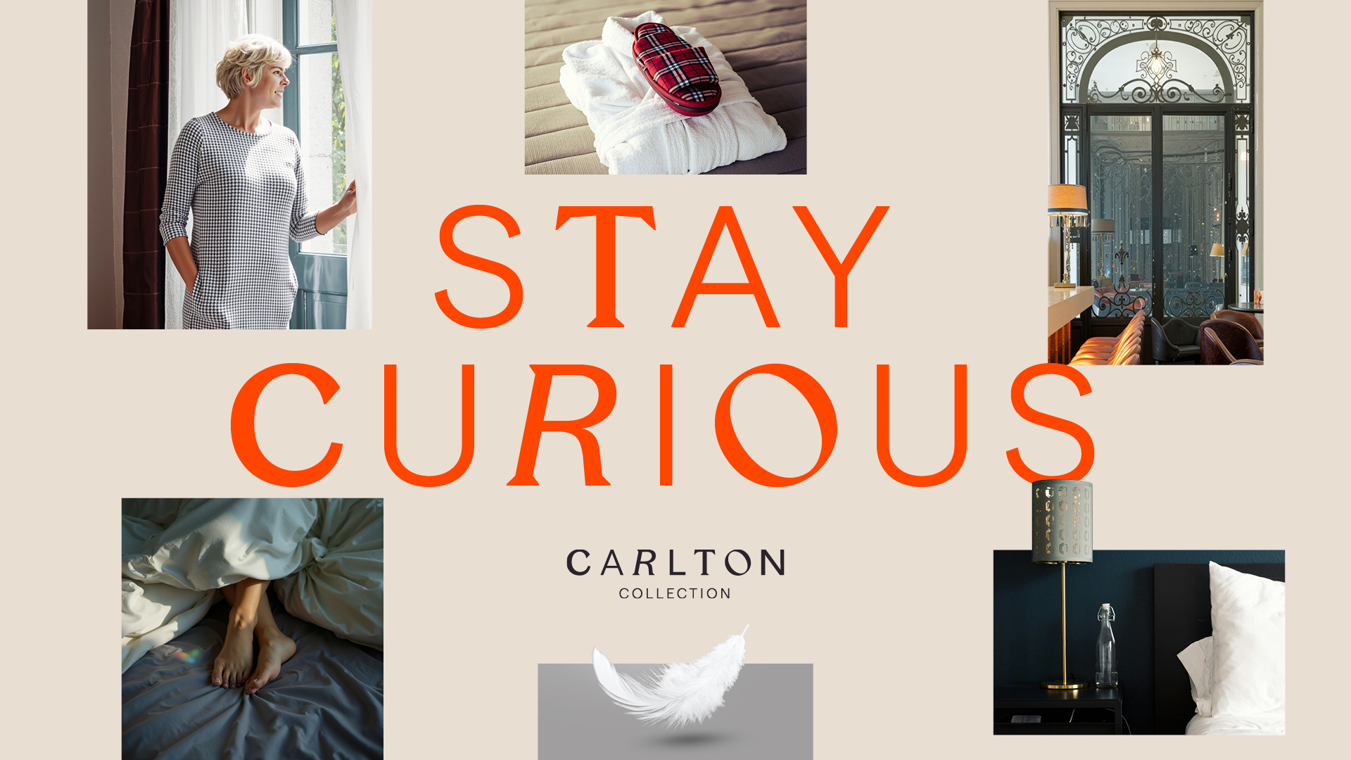
The visual execution further amplifies the Carlton Collection’s eclectic nature and its hotels’ individuality. The logo features individually crafted characters, each unique yet harmonious, symbolising the distinctiveness of every property within the collection. Its design also led to the development of a unique typographic treatment for headline messaging, to infuse all communications with a sense of personality. A simplified colour palette, anchored by a warm blue and a vibrant orange, ensures consistency and cut-through, while allowing flexibility across various applications.
The concept of ‘family’ became a central theme, influencing everything from the brand’s tone of voice to its internal culture. This approach resonates with both the collection’s heritage and modern consumer trends that value authenticity and connection.
Andrew Neely, Creative Director at D8, says: “The visual identity is all about celebrating individuality while maintaining harmony. Each character in the wordmarque is distinctly different, yet together they form a cohesive whole, just like the Carlton Collection itself. This approach reflects the eclectic nature of the brand and creates a sense of curiosity and playfulness that draws people in.”
A new approach to loyalty:
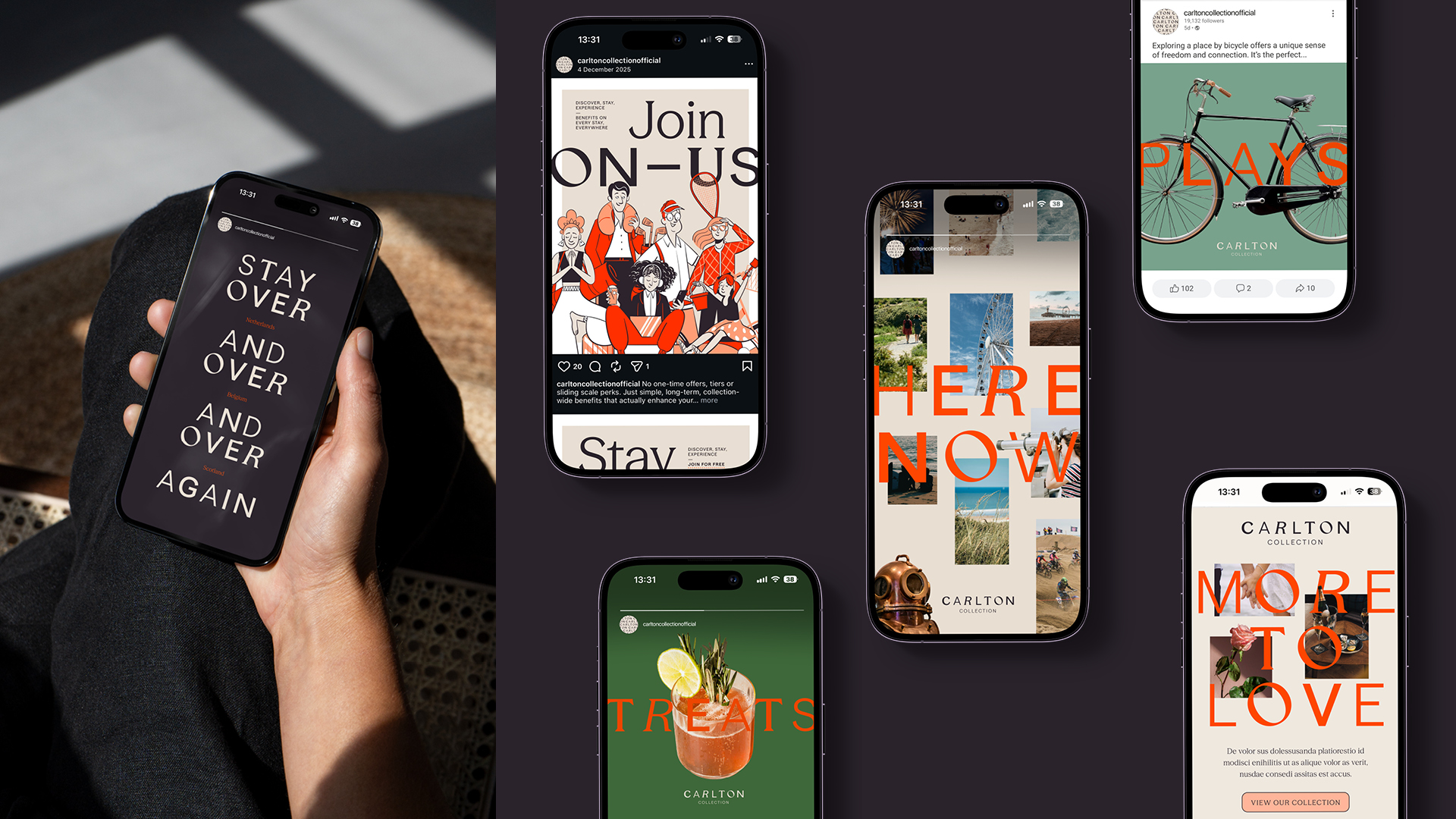
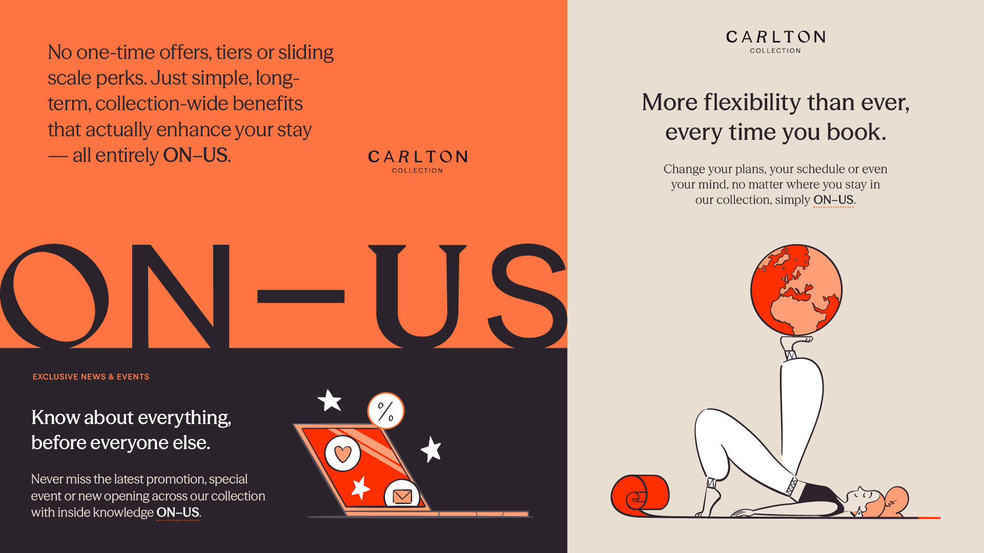
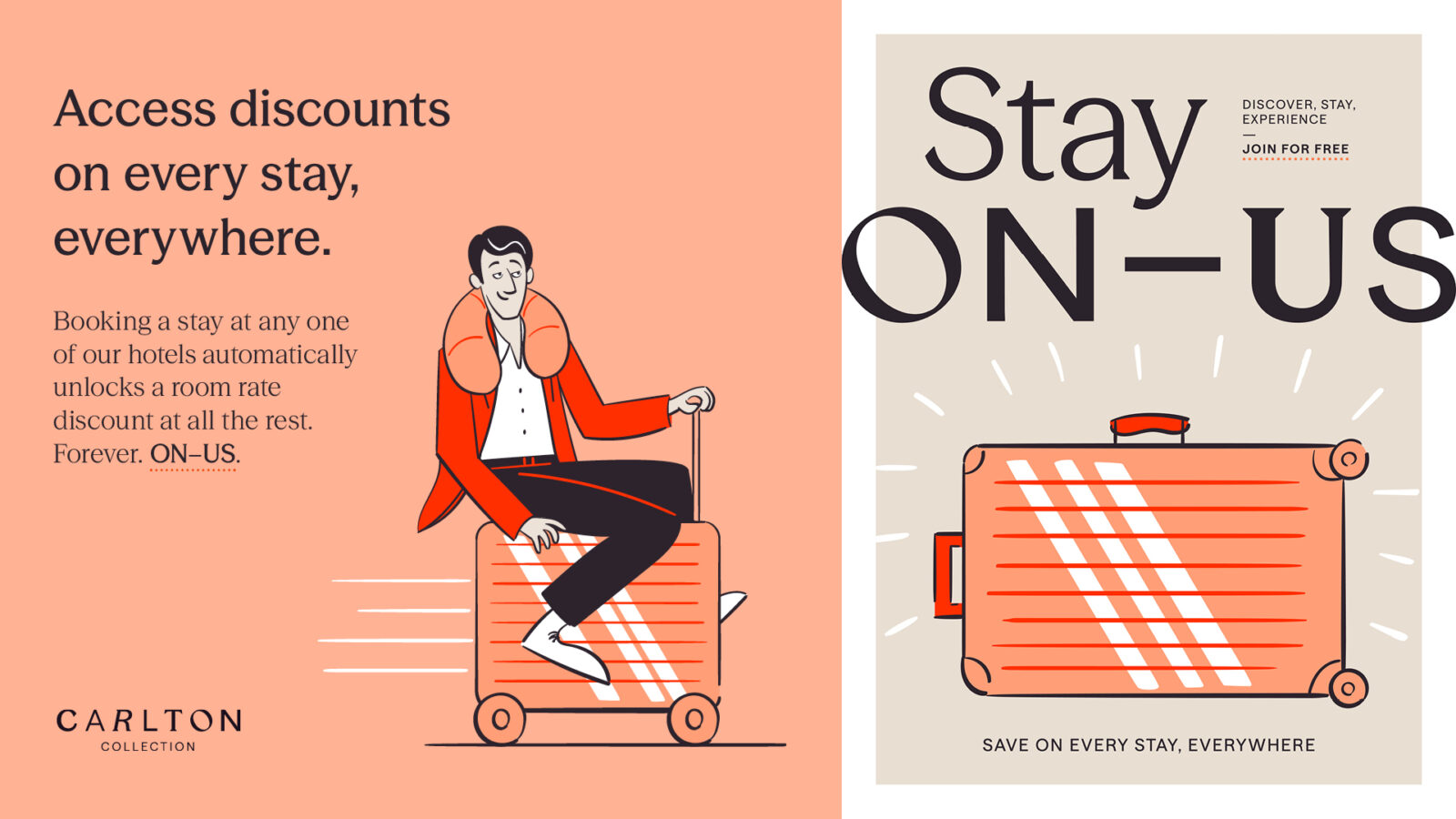
As part of the rebrand, D8 also designed ‘ON-US’, a benefits programme that encourages guests to explore the collection. Unlike traditional loyalty schemes, ON-US isn’t limited to one-time offers, tiers or sliding scale perks, but unlocks flexibility, discounts and special events across every destination.
The new programme is supported by playful, character-driven illustrations that symbolise the different types of stays, occasions and visitors at Carlton Collection and further celebrate the character and diversity of the group.
Christa van Camp, Commercial Director at Carlton Collection says: ” In a world of great diversity, our collection is a celebration of character. We embrace individuality, whether it’s our team members or the hotels and travellers we serve – and are looking forward to bringing this cohesive new vision to our guests through this vibrant rebrand. Working with D8 has helped articulate how we think about the business. The pivotal insight helped align our perspectives and gave us a unifying vision. It allowed us to embrace and amplify our value as a collection, and that shift in thinking has been truly impactful.”
The new Carlton Collection visual identity is rolling out across the collection’s website, with future plans including in-room accents to promote the wider family of destinations.
CREDIT
- Agency/Creative: D8
- Article Title: Carlton Collection Unveils Bold Rebrand by Creative Agency D8, to Inspire Exploration, and Celebrate Individuality and Connection
- Organisation/Entity: Agency
- Project Type: Identity
- Project Status: Published
- Agency/Creative Country: Netherlands
- Agency/Creative City: Amsterdam
- Market Region: Europe
- Project Deliverables: Brand Identity, Brand Naming, Brand Strategy, Brand Tone of Voice, Illustration, Web Design
- Industry: Hospitality
- Keywords: Hotel, Carlton Collection, Visual identity, Rebrand, Wordmark
-
Credits:
Rosie Street: Managing Director


