


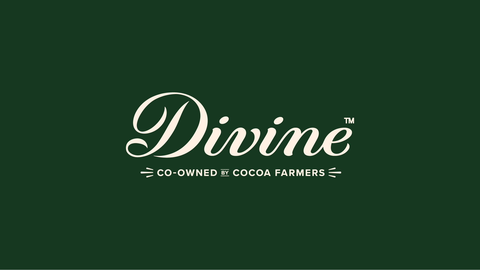
Divine Chocolate has launched a new brand and packaging identity developed by creative agency Wildish & Co., marking the brand’s most significant visual update since its founding in 1998.
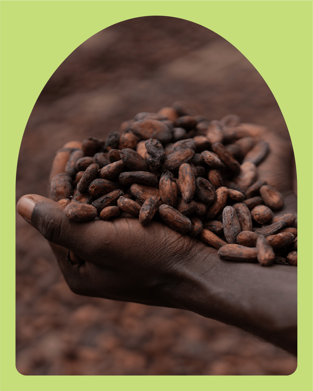
Founded by cocoa farmers from the Kuapa Kokoo cooperative in Ghana, Divine was one of the first Fairtrade chocolate brands in the world.
As the premium chocolate category became increasingly crowded, with newer brands combining ethical credentials with contemporary, taste-led and visually distinctive identities, Divine needed to evolve its visual world while retaining its position as the original farmer co-owned Fairtrade chocolate brands. Market research identified an opportunity for Divine to strengthen its premium cues, distinctiveness and association with taste in the competitive chocolate category.
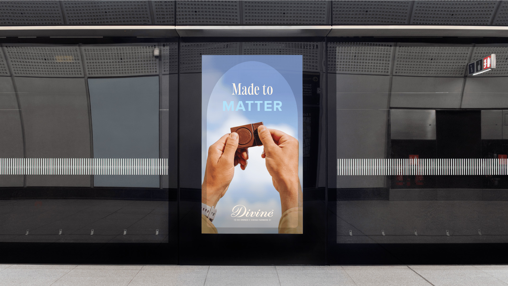
The rebrand was commissioned to modernise Divine’s visual identity, strengthen shelf presence, and reposition the brand as a premium chocolate that happens to be ethical, rather than an ethical brand first. The brief called for a new packaging system, refreshed brand toolkit and updated tone of voice that could deliver stronger taste cues, greater aspiration and more distinctive brand assets, while retaining Divine’s heritage and Ghanaian roots.
Post-launch testing shows the new design delivering significant uplift across key brand metrics, including shelf standout (+317%), taste appeal (+7%) and overall brand attractiveness (+10%).
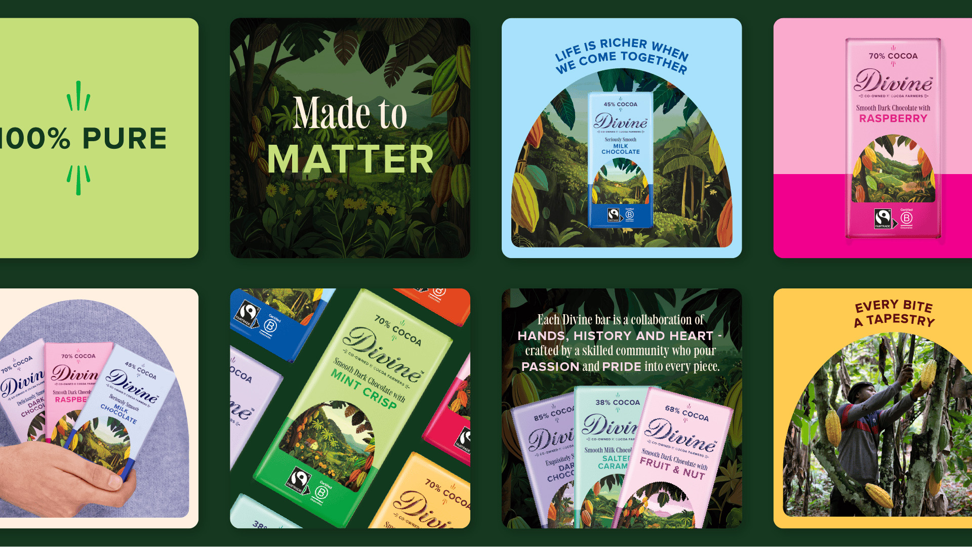
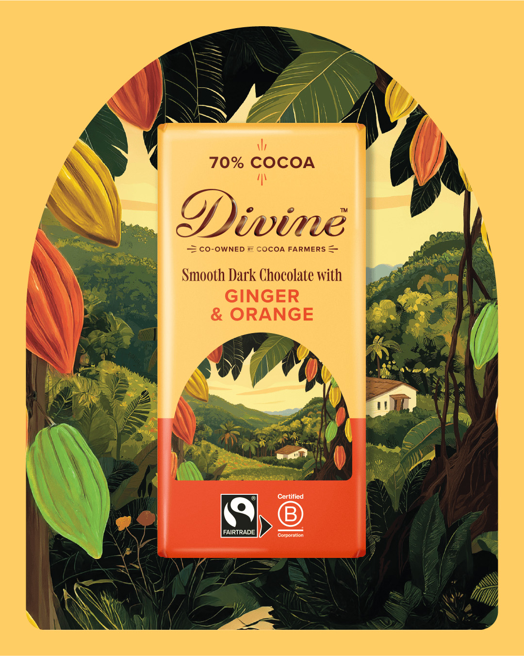
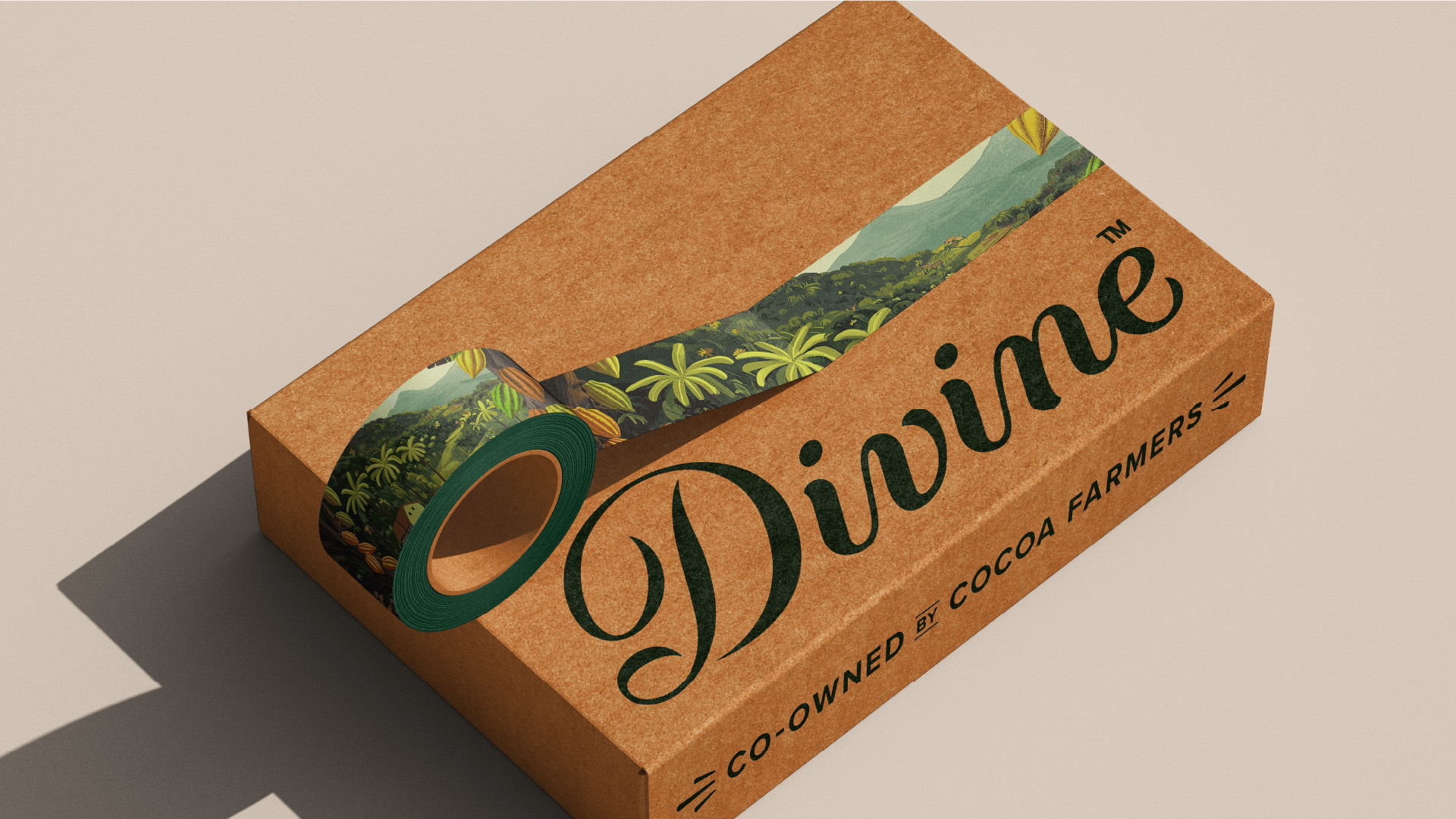
Illustration brings the Ghanaian cocoa story to life
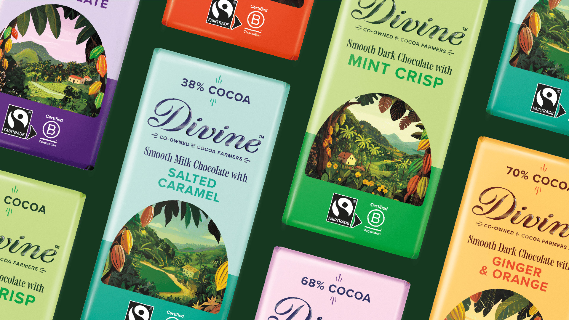
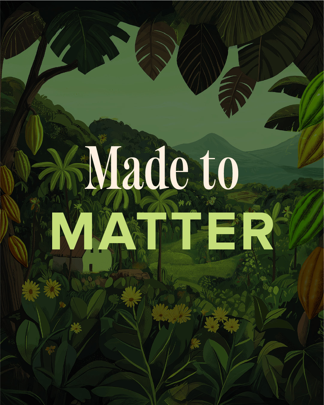
Illustration played a central role in the rebrand from the very first round of concepts. Wildish & Co. explored a range of landscape scenes incorporating people, farmers’ huts and cocoa pods, testing styles from realistic to more graphic, print-inspired approaches.The final hand-drawn style balances realism with elevation, feeling aspirational and warm, while bringing the story of Ghanaian cocoa farms to life.
Divine’s typography has evolved to introduce Holise Medium, an elegant serif used for key headlines and on-pack information. Its warm, human character reflects the people behind the product, while refined detailing signals quality and premium value. Holise is paired with Divine’s existing font, Proxima Nova, which maintains brand recognition and provides clarity and legibility across longer text on-pack and in wider communications.
Colour makes flavour the hero
The identity is rooted in colour theory, using bold, joyful hues that communicate the brand’s positive impact and premium positioning.
Where Divine’s previous packaging relied on dark backgrounds with patterned flavour cues, the new system makes flavour the star.
Dark green and cream form the brand’s core colours, connecting the identity to nature, farming and sustainability, and reinforcing Divine’s Fairtrade roots and farmer co-ownership. A brighter, more vibrant palette is then used across the range to improve shelf standout.
From there, an extended palette of darks, brights and lights represents each flavour, paired with darker shades to ensure legibility and strong on-shelf contrast.
Lydia Stubbins, Group Marketing Director at Divine, noted: “We knew we had a powerful story, but we needed a brand world that could truly match it. This rebrand allows Divine to feel premium, joyful and led by taste, while staying proudly co-owned and rooted in our Ghanaian heritage. Wildish & Co. helped us create a new visual world that brings pride, energy and emotion back to Divine, giving us stronger shelf impact today and the flexibility to grow into new categories while telling our story more powerfully than ever.”
A flexible system built for growth
The new packaging and identity needed to work across Divine’s year-round ranges, seasonal products and future category extensions. In a premium chocolate market dominated by dark palettes and gold cues, Wildish & Co. developed a colour- and illustration-led system that feels distinctively Divine while clearly communicating premium positioning. The result is a cohesive brand world that celebrates flavour, fairness and the power of doing business differently from shelf to every brand touchpoint.
Core elements of the redesign include:
A refreshed packaging structure designed to improve shelf impact across the range
A colour-led identity developed to move away from category-standard premium cues and create stronger ownability
A revised imagery and illustration approach introducing more vibrant Ghanaian energy into the brand world
Sam Fresco, Managing Director, Wildish & Co.: “In the confectionery space, it’s harder than ever for brands to stand out; a brand story alone isn’t enough. We needed to develop a brand with personality and purpose. Through our collaborative brand process, we aimed to give Divine back its visual voice and on-shelf distinction. Divine’s new brand identity represents a brave change for such an established and beloved brand. By replacing category-standard premium cues with bright, bold colours paired with textured illustrations, we created a new brand system that feels instantly recognisable and ownable, and something that stretches far beyond packaging for them.”
CREDIT
- Agency/Creative: Wildish&Co.
- Article Title: Divine Chocolate Gets a Vibrant New Look as Wildish & Co. Reimagine the Farmer Co-owned Brand
- Organisation/Entity: Agency
- Project Type: Illustration
- Project Status: Published
- Agency/Creative Country: United Kingdom
- Agency/Creative City: London
- Market Region: Europe
- Project Deliverables: Brand Design, Brand Identity, Brand Redesign, Brand Rejuvenation, Illustration
- Industry: Food/Beverage
- Keywords: Packaging design Brand identity Rebrand Chocolate packaging FMCG branding Premium brand repositioning Shelf standout
-
Credits:
Creative Studio: Wildish&Co.


