


A shape shifter logotype with infinite possibilities
In the increasingly competitive and culturally conscious world of fashion and brand identity, few projects illustrate the intersection of typographic innovation and cultural expression as vividly as the creation of the Chantelle Pulp® logotype— a custom, variable “shape-shifter” word mark developed in collaboration between the pioneering French lingerie brand Chantelle and type-design leader Monotype. This case study represents a bold exploration of how typography can do more than communicate words: it can embody values, cultural signals, emotional tones, and even a brand’s evolving narrative itself. In this detailed account, we trace the genesis of the project, unpack its conceptual motivations, explore the collaborative process that brought it to life, detail the technological innovations behind it, and consider the broader implications and future potential of a variable identity system rooted in fluidity and inclusivity.
For over a century, Chantelle has been recognized as a linchpin of French lingerie design — celebrated for its craftsmanship, elegance, and unwavering attention to form and fit. Over the past seven years, the company embarked on a conscious effort to realign its creative output with a broader and more nuanced understanding of femininity, one that moves beyond traditional fashion narratives and reflects a multiplicity of body types, identities, and personal expressions. It was within this transformative moment that Chantelle Pulp was conceived: a sub-brand that is simultaneously rooted in the parent company’s legacy and defiantly distinct in its ethos.
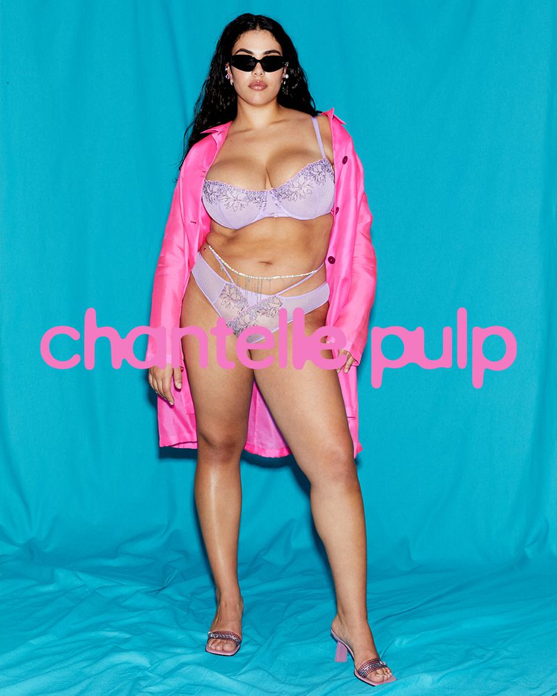
Chantelle Pulp was envisioned as playful, audacious, and inclusive — a brand that celebrates women “no matter their shape or size,” with a product range extending across an extensive size spectrum and embracing vibrant colours and bold patterns. The underlying philosophy was not merely to expand sizing options but to articulate a brand identity that actively challenged and expanded how femininity is portrayed and experienced in the lingerie market. As such, inclusivity was not just a target demographic strategy but a defining cultural value — one that needed to be deeply embedded in every aspect of the Pulp identity.
The creative team at Chantelle quickly realized that this ethos of fluidity and diversity could not be captured effectively by a static, conventional logo. Traditional logotypes — fixed designs with a single form — risked contradicting the very values Pulp was founded on: adaptability, variability, and lived, expressive individuality. The brand needed a logotype that could move, shift, respond — a mark that did not have one fixed state but could be reconfigured, reinterpreted, and re-expressed without losing its core identity.
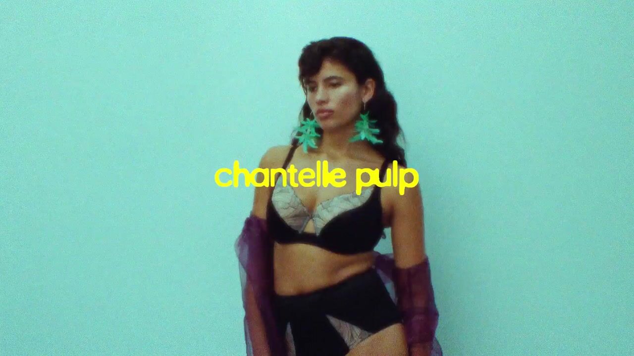
This led to the radical idea of a variable logotype — a type system built on variable font technology that allows letterforms to shift through different weights, widths, and contours. In essence, the logotype would not sit still; it would be alive. This concept — of typography as a living, dynamic expression of brand values — represented a radical departure not just for Chantelle, but for typographic practice in branding more broadly.
While Chantelle had a clear vision of what it wanted the Pulp brand to feel like — inclusive, dynamic, bold — the realization of that vision in typographic form required a specialized partner. Enter Monotype, a company with deep technical expertise in type design and a reputation for pushing the boundaries of what typography can accomplish in brand contexts. Chantelle brought its creative ambition; Monotype brought the tools, experience, and craft to make that ambition tangible.
The collaboration was, in the words of Chantelle’s Head of Design, Natalia Kotkowska, “a truly great branding exercise — always a reflection of strong collaboration.” The team at Monotype — particularly Creative Type Director Damien Collot alongside Chantelle’s internal designers — engaged in a highly iterative process that blended strategic workshops, free-form sketching sessions, and hands-on type exploration. This “creative dance,” as the team described it, was both dynamic and disciplined. Ideas were rapidly prototyped, evaluated, and refined, with multiple rounds of feedback ensuring that the logotype remained authentic to the brand’s voice and aspirations.
A key moment in the process occurred very early: an informal meeting between Collot and Kotkowska over coffee evolved organically into a brainstorming session on how the typography itself could visually reflect the brand’s core narratives. This conversation sparked the variable font concept, moving beyond static letterforms toward a system capable of morphing in response to contextual needs — whether campaign themes, media channels, seasonal motifs, or cultural moments.
The core innovation of the project lies in the application of variable type technology to the logotype itself. Traditionally, variable fonts have been used to allow designers to interpolate weights and styles along axes (e.g., thin to bold). However, in this context, the team exploited the full potential of variability by creating a logotype that can transition across multiple dimensions of form — not just thickness but also fundamentals of shape and character structure.
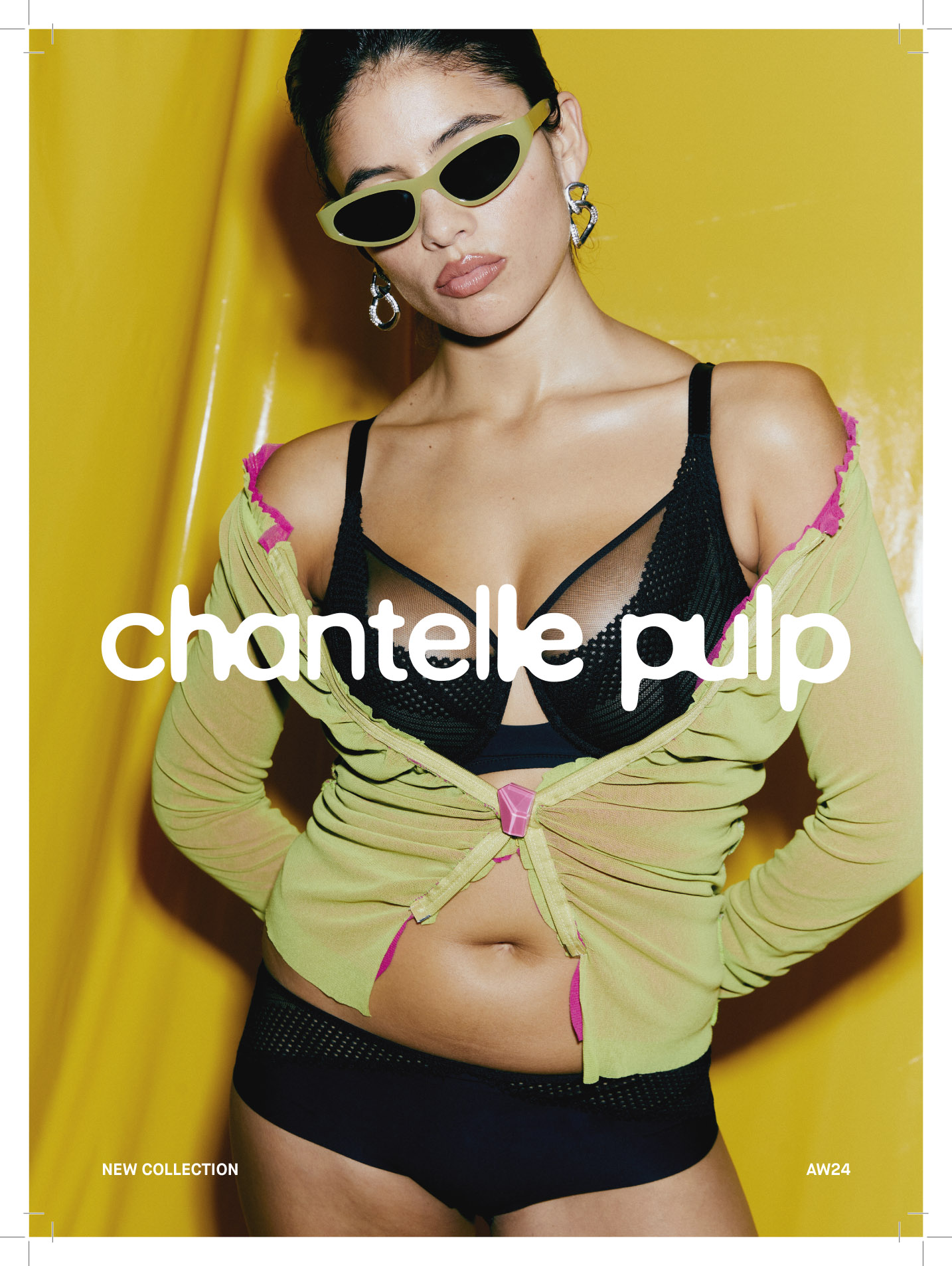
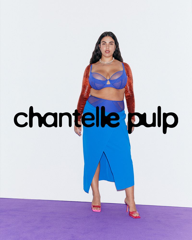
Technically, the logo operates on two axes with three masters per axis, giving designers nuanced control over extreme variations in the design. Instead of a single static lock-up, the wordmark exists as a continuum: each instance of the logo can be customized along predefined parameters that reflect mood, narrative, or visual context. These parameters allow the logotype to stretch, compress, soften, or sharpen — in effect, echoing the fluidity and diversity the brand champions.
Yet, despite its technological sophistication, the logotype’s form still needed to retain coherence and recognizability. To anchor the variable design, the team paired the Pulp logotype with Chantelle’s primary brand typeface — Helvetica Now — a “revisited classic” that provides visual stability and familiarity against the expressive variability of the Pulp mark. This juxtaposition of classic and experimental typography reflects a broader thematic tension in the brand itself: tradition meeting disruption.
While the variable logotype offers theoretically infinite permutations, its initial rollout has been deliberately cautious. To build strong brand recognition and visual familiarity in the marketplace, Chantelle Pulp has primarily deployed the logotype in a static form — selecting one stable variation as the flagship visual anchor. This strategic choice acknowledges a fundamental tension in variable identities: while variation can be expressive, too much variation too sooncan hinder recognition. In essence, the brand is learning how to use its own flexibility while laying a foundation of consistency.
This phased approach reflects a nuanced understanding of brand identity systems. While the technology allows for endless transformations, the brand’s early priority is to establish a baseline identity that audiences can remember and connect with — after which the full expressive potential of the variable system can be unleashed. The Chantelle Pulp team describes future possibilities that go beyond static applications, including “mini visual identities” for distinct seasons, bespoke variations tailored to specific campaigns, and visual customizations for distinct media platforms or cultural contexts.
The creation of the Chantelle Pulp logotype represents more than a typographic experiment; it reflects a deeper cultural shift in how brands conceive of identity and expression. At its heart, the project embodies a shift from fixed logos as monolithic symbols toward dynamic identities as ongoing narratives — marks that evolve in conversation with audiences, campaigns, and cultural moments.
For designers and brand strategists, this project offers a compelling case study in how variable technologies, traditionally relegated to technical weight and style variations, can be elevated to serve as core cultural signifiers. In a marketplace where consumers increasingly value authenticity, diversity, and adaptability, an identity system that visually communicates those values can deepen emotional connection and brand resonance.
Moreover, the project illustrates how technology and craft can co-exist: the logotype is not just an algorithmic artifact but a crafted expression informed by exploratory workshops, iterative feedback cycles, and strategic decision-making. It respects the traditions of typography even as it pushes the field forward, reminding us that innovation in design is most powerful when it is rooted in meaning, not novelty alone.
Though still in its early stages of use, the Chantelle Pulp logotype’s variable framework holds enormous potential for future exploration. The team has only just begun to test the full range of expressions — from subtle shifts to more radical transformations — that could be deployed in different cultural contexts or seasonal narratives. Each variation is not merely a design choice but a storytelling tool; by adjusting letterform shapes, weights, and contours, the brand can subtly shift tone, mood, and emphasis without abandoning its core identity.
This approach anticipates a future where brands are not defined by a single, static visual lock-up but by a living identity system that evolves with audience expectations, cultural trends, and internal strategic priorities. It invites designers to think of typography not as background structure but as active participant in brand communication — a medium as expressive as imagery, narrative, or sound.
In conclusion, the Chantelle Pulp logotype project showcases how thoughtful design and advanced typography can be harnessed to express values that matter deeply in contemporary culture: inclusivity, fluidity, diversity, and playfulness. Through a collaborative process bridging creative ambition and technical mastery, Chantelle and Monotype have crafted a brand identity tool that is not only visually striking but conceptually rich — a shape-shifting logotype that embodies the very ideas it sets out to communicate.
CREDIT
- Agency/Creative: Monotype/Chantelle
- Article Title: Monotype Develops Chantelle Pulp as a Variable Logotype With Infinite Expression
- Organisation/Entity: In-House
- Project Type: Identity
- Project Status: Published
- Agency/Creative Country: France
- Agency/Creative City: Paris
- Market Region: Europe
- Project Deliverables: Art Direction
- Industry: Fashion
- Keywords: inclusivity. typography, variable type
-
Credits:
Creative Partner: Chatelle Pulp


