


Fresco x Cantina Felice: Redefining the Urban Aperitivo
Fresco, an innovative collaboration with Cantina Felice, was born from the desire to rethink wine consumption for the modern era. The project centers on a singular, powerful concept: “Aperitivo with just one click.” By moving away from the traditional bottle and cork, Fresco introduces a canned format designed for spontaneity, convenience, and a seamless transition from the shelf to the social gathering. It is a tribute to informal moments, designed to fit the fast-paced, creative lifestyle of urban dwellers.
A Visual Identity Driven by Minimalist Boldness
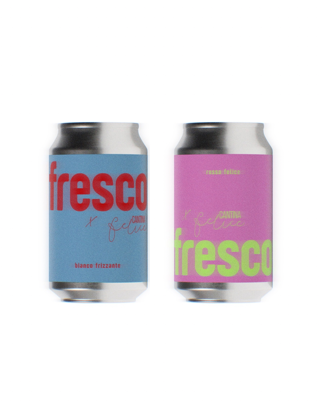
The design language of Fresco is rooted in a minimalist yet high-impact approach. The visual identity avoids the typical “classic” wine tropes—vines, estates, or complex crests—in favor of a clean, typographic-led aesthetic that speaks directly to a design-conscious audience.
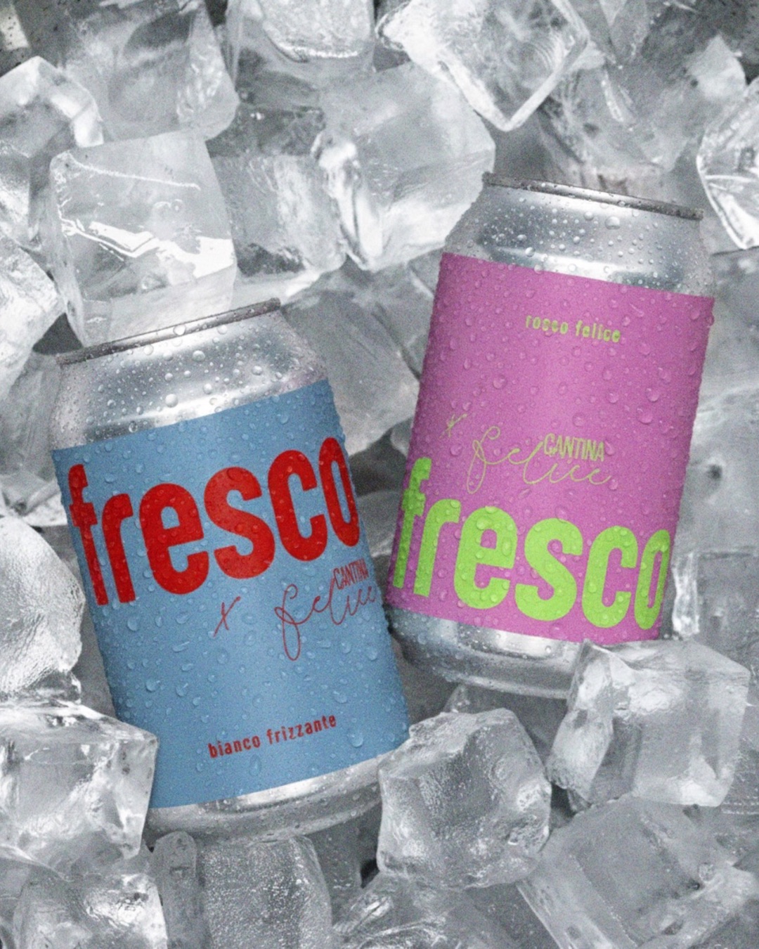
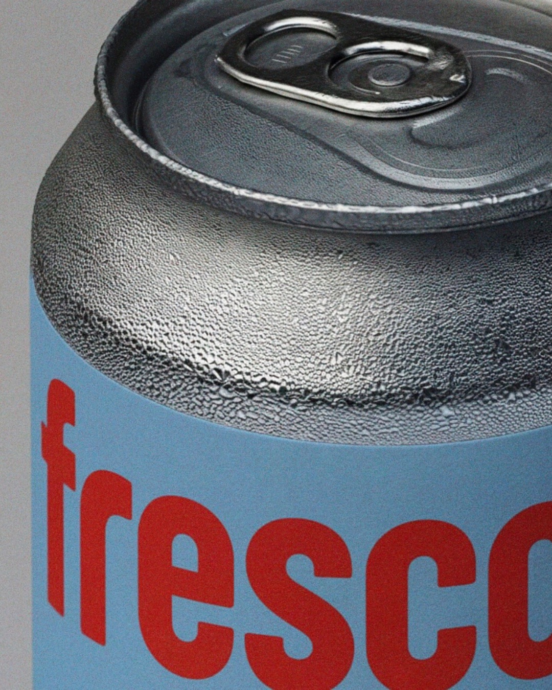
• The Power of Color: Color is the primary storytelling tool. The project utilizes two distinct, vibrant palettes to differentiate the offerings: a striking powder blue combined with a bold red for the “Bianco Frizzante,” and a vivid pink paired with neon lime green for the red wine. These combinations are designed to pop in any environment, whether it’s a sleek record store or a casual outdoor picnic.
• Typography and Contrast: The “fresco” wordmark features a heavy, rounded sans-serif that feels approachable and contemporary. This is layered with the refined, script-like signature of “Cantina Felice,” creating a sophisticated visual dialogue between modern industrial design and artisanal heritage.
• Iconic Packaging: The use of 33 cl and 50 cl cans—traditionally associated with soft drinks or craft beers—serves a dual purpose. It challenges the perceived “preciousness” of wine, making it more democratic, while also providing superior functional benefits like faster cooling and total protection from light.
Spontaneity and Lifestyle Integration
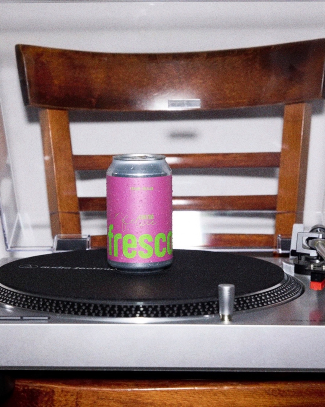
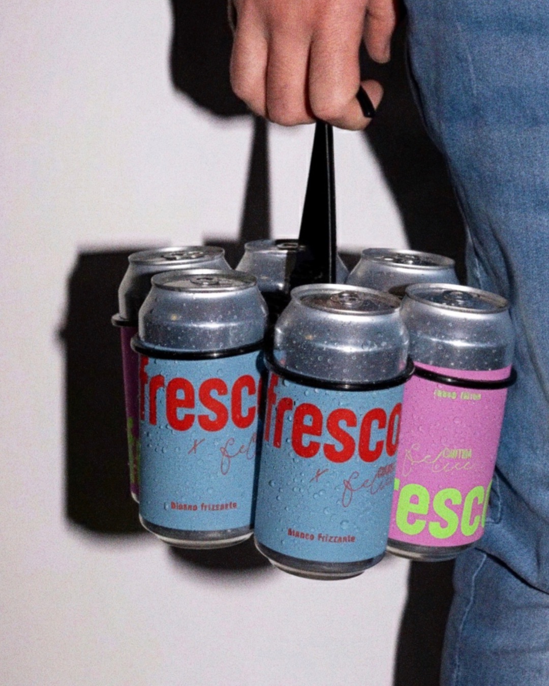
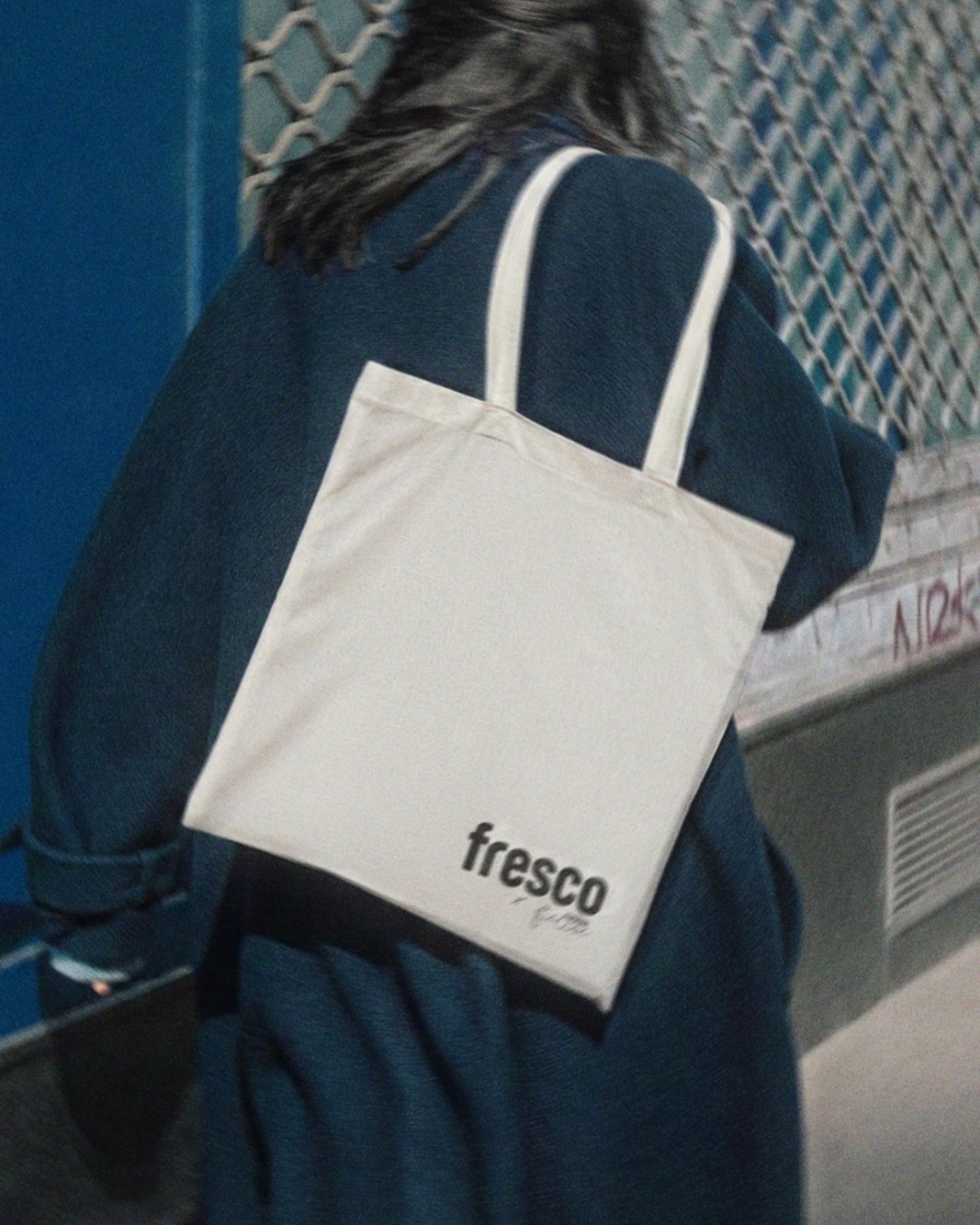
The brand identity extends far beyond the label. Every touchpoint of the Fresco experience is curated to support a “ready-to-go” philosophy. From the minimalist tote bags used for urban exploration to the functional six-can carriers that emphasize portability, Fresco is more than a beverage; it is a lifestyle accessory. The photography, featuring the product on record players or in ice-filled buckets, reinforces this connection to music, art, and effortless conviviality.
Fresco successfully bridges the gap between the storied world of Italian winemaking and the urgent, vibrant energy of contemporary design, proving that great wine can be as simple as a single click.

CREDIT
- Agency/Creative: ad grafica
- Article Title: ad grafica Redefines Urban Aperitivo Culture With Fresco x Cantina Felice
- Organisation/Entity: Freelance
- Project Type: Packaging
- Project Status: Non Published
- Agency/Creative Country: Italy
- Agency/Creative City: Genova
- Market Region: Europe
- Project Deliverables: Art Direction, Brand Design, Graphic Design, Packaging Design, Typography
- Format: Bag, Can
- Industry: Food/Beverage
- Keywords: Wine, cans, graphic design, branding, packaging design
-
Credits:
Graphic Designer: Arianna Ditel


