


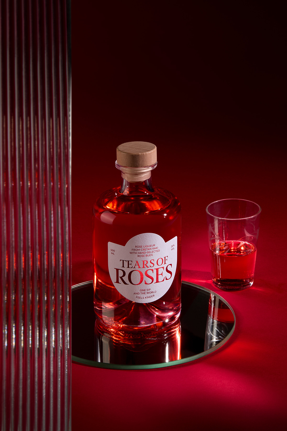
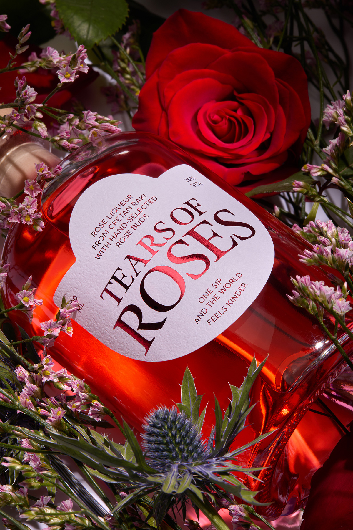
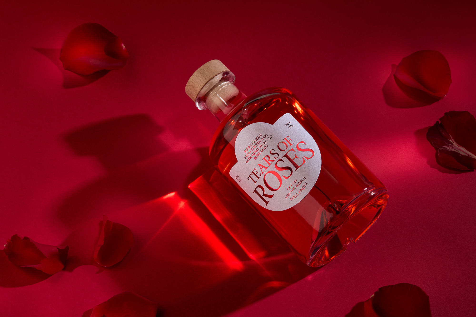
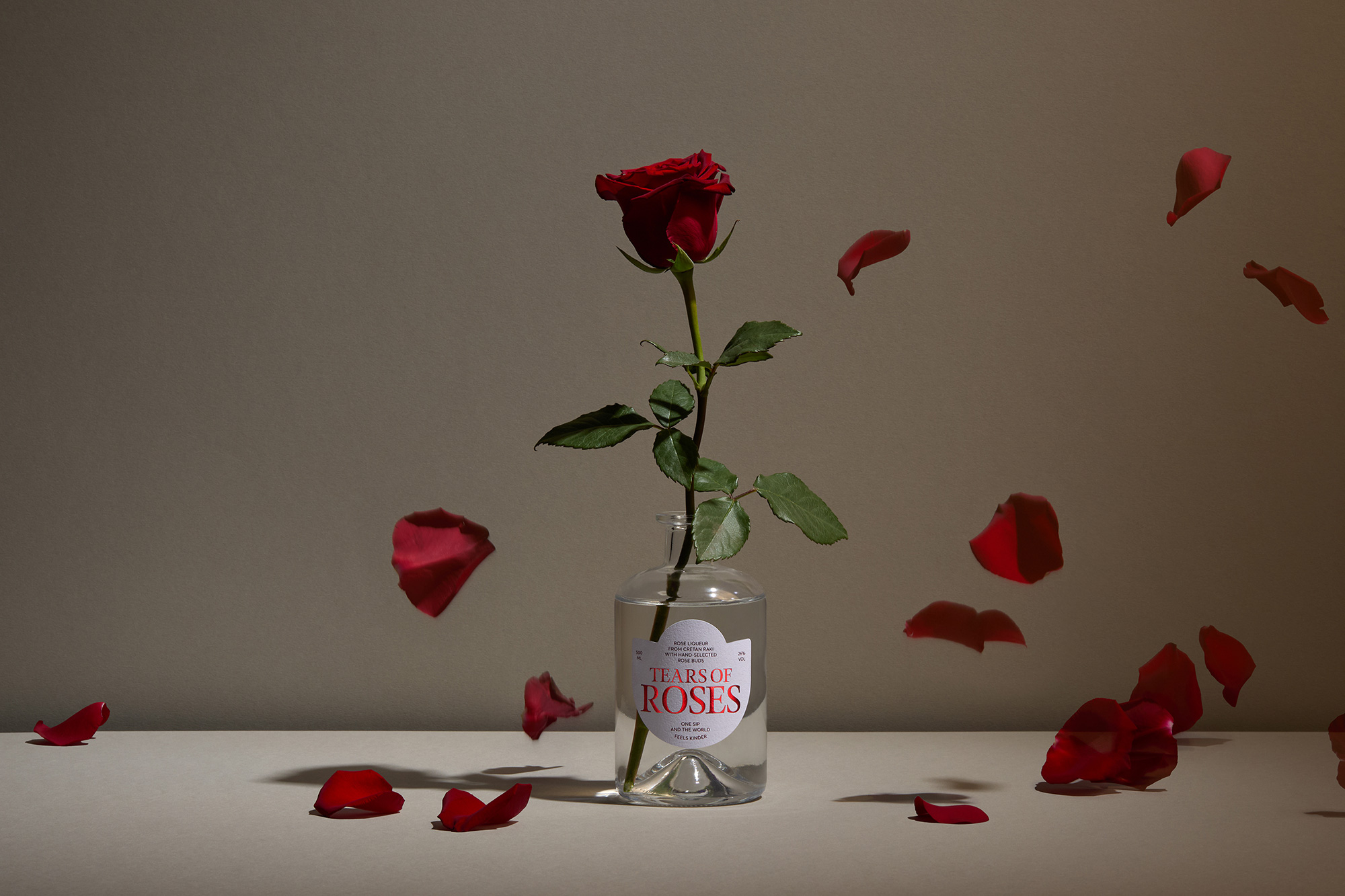
Tears of Roses is designed as a quiet moment of beauty, captured in glass. The deep crimson spirit evokes both passion and tenderness, mirroring the dual nature of the rose itself delicate yet intense. The soft, rose-shaped label frames the name as a keepsake, inviting the drinker into an intimate ritual rather than a casual sip. This design does not shout luxury; it whispers romance. It invites the consumer to slow down, to savor, and to believe that in one sip, the world truly feels kinder.
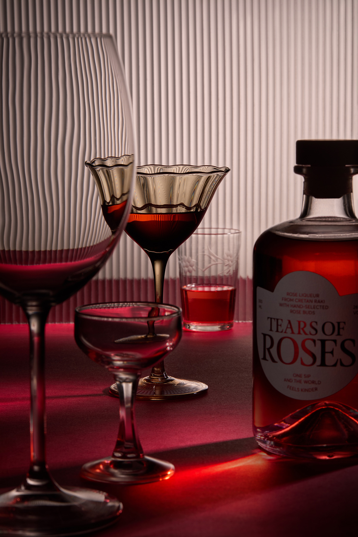
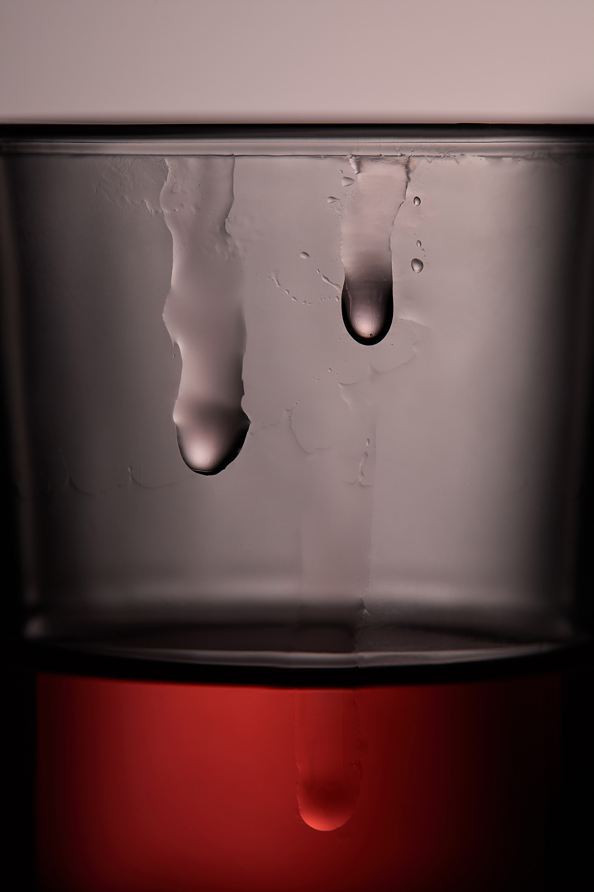
On the palate, the liqueur unfolds gently, opening with a fragrant floral sweetness that recalls freshly cut petals warmed by the sun. Subtle honeyed notes and a soft herbal depth follow, creating a rounded, lingering finish that feels comforting yet refined. Each sip is layered and expressive, never overpowering, allowing emotion and flavor to evolve together. It is a drink meant not only to be tasted, but to be felt.
The bottle becomes an extension of this experience. Its luminous red tone catches the light like liquid velvet, drawing the eye and awakening desire before the first pour. The natural cork signals craftsmanship and authenticity, reinforcing trust and quality at the moment of opening. Reflections, glass curves, and the tender typography work in harmony to create a sense of intimacy on the shelf, transforming the product from a beverage into a gift, a memory, a gesture.
Emotionally, the design builds a bridge between romance and ritual. It positions the spirit as a companion for quiet evenings, celebrations, and meaningful exchanges. Commercially, this storytelling elevates perceived value, encouraging gifting, repeat purchase, and brand loyalty. By offering not only a refined taste but an evocative identity, Tears of Roses becomes more than a liqueur—it becomes an experience worth returning to, a moment consumers are willing to choose again, and share with those they cherish.
CREDIT
- Agency/Creative: AG Design Agency
- Article Title: AG Design Agency Shapes Tears of Roses Into a Poetic Liqueur Experience
- Organisation/Entity: Agency
- Project Type: Packaging
- Project Status: Published
- Agency/Creative Country: Greece
- Agency/Creative City: Athens
- Market Region: Europe
- Project Deliverables: Brand Identity, Food Photography, Packaging Design
- Format: Bottle
- Industry: Food/Beverage
- Keywords: Rose, Liqueur, Spirit, Tradition, Crete, Spora Restaurantr, AG Design Agency
-
Credits:
Creative Direction & Design: Alexandros Gavrilakis
Print: Karydis Label
Photos: Giorgos Vitsaropoulos


