


memode is a color cosmetics brand launched in 2025 for Gen Z women aged 18–30. This audience lives in social media and marketplaces, follows beauty trends and actively searches for affordable products that perform well and last throughout the day. The challenge was to enter an oversaturated market and create a distinctive visual identity that feels genuinely close to its audience, not just visually attractive.
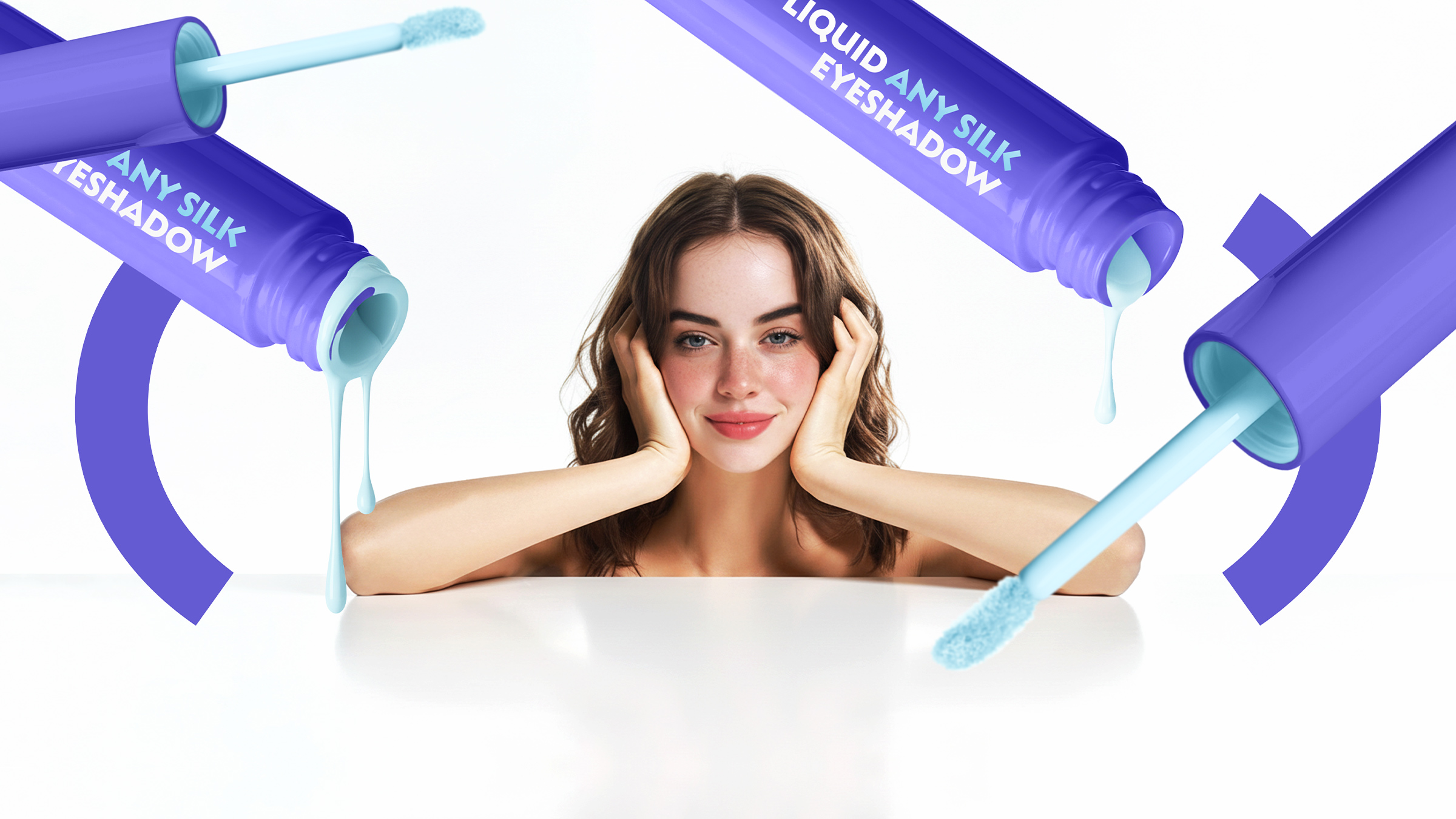
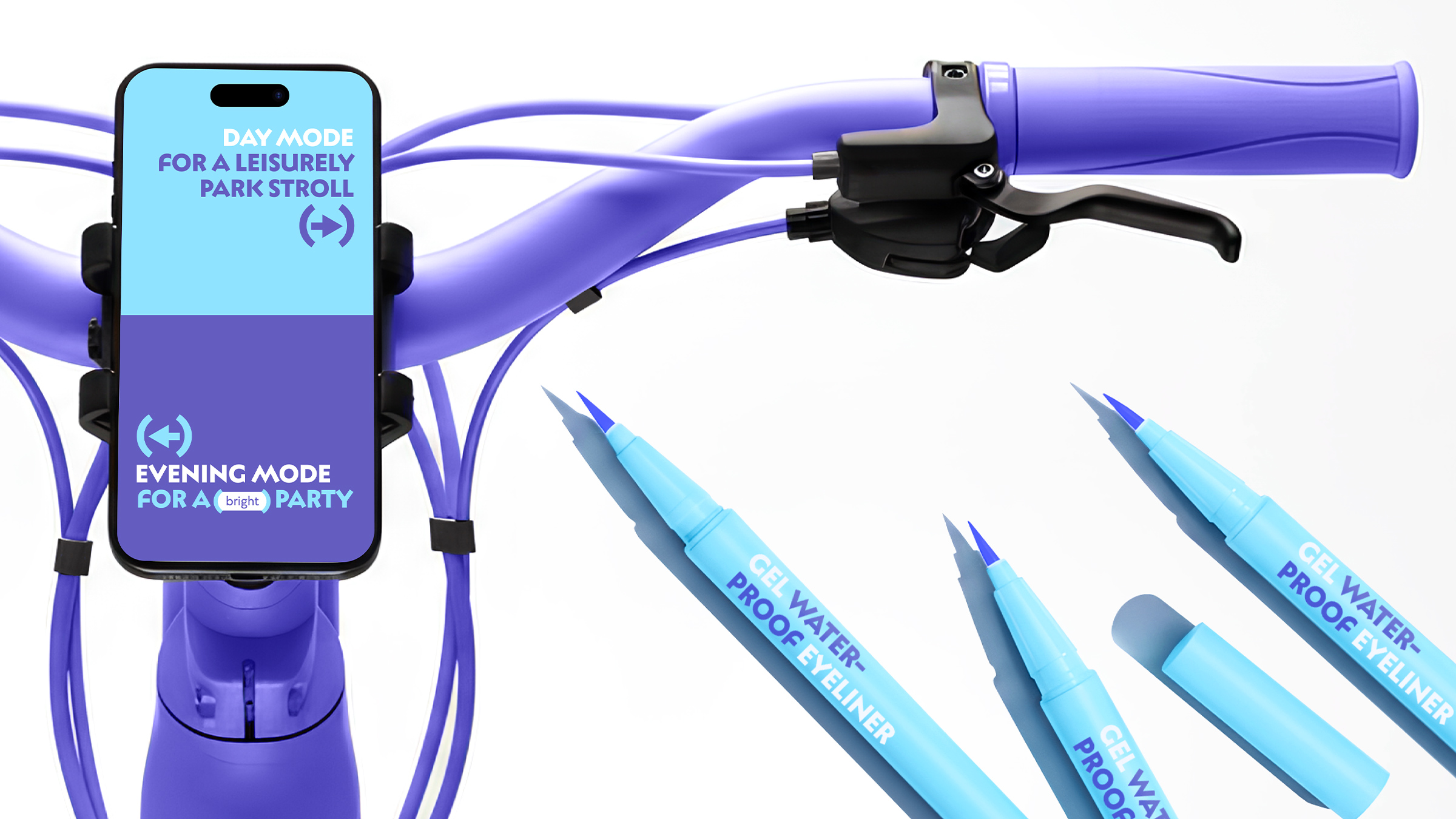
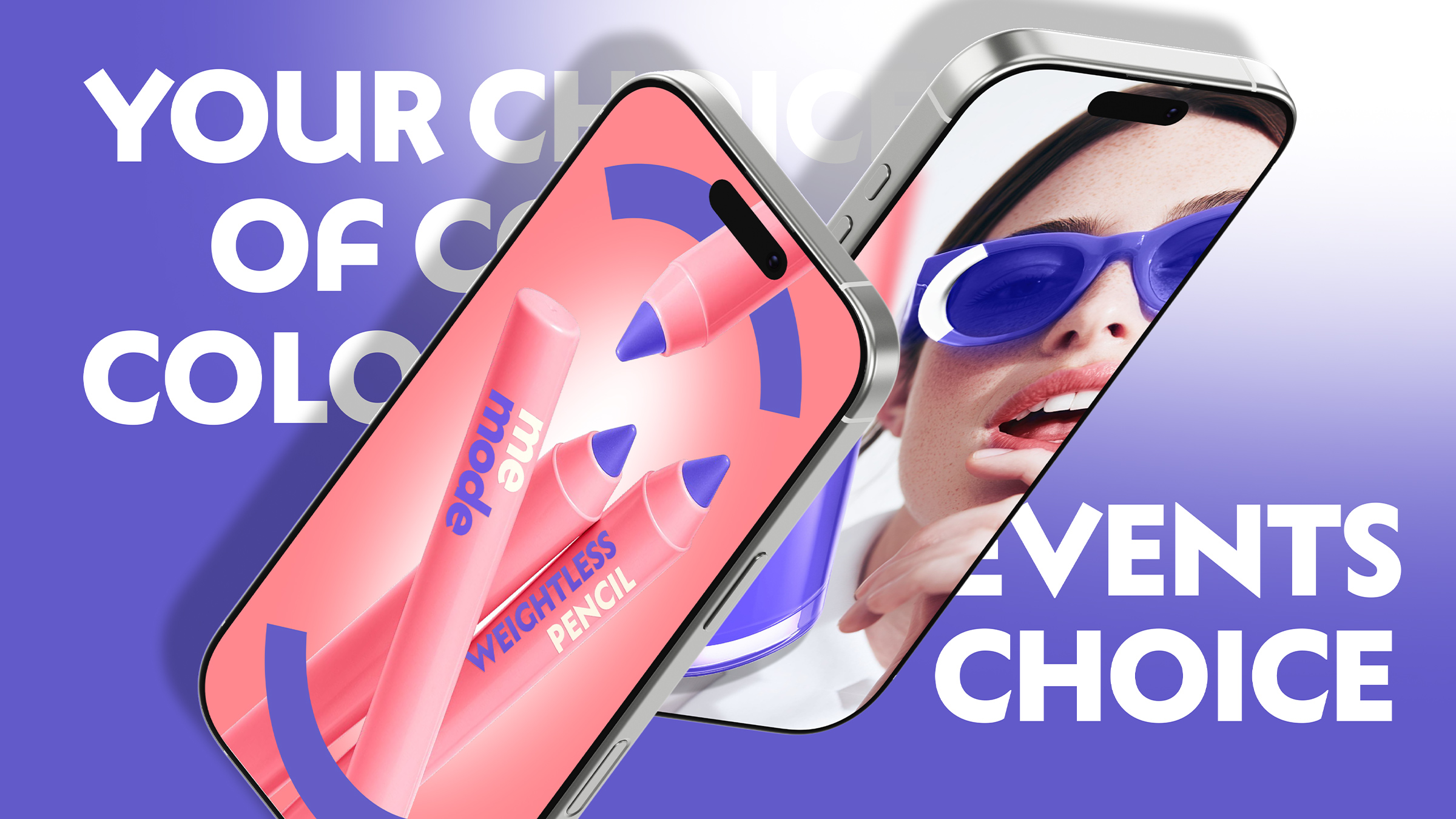
The core idea behind memode is a “beauty friend” that stays with you throughout the day — from morning classes or coffee with friends to evening concerts, movies or dates. The brand concept is built around the metaphor of the “day scroll,” inspired by how people interact with their smartphones. One scroll — and you’re already in a new mode, a new mood, a new context. This everyday gesture became the foundation of memode’s visual language and its key graphic device.
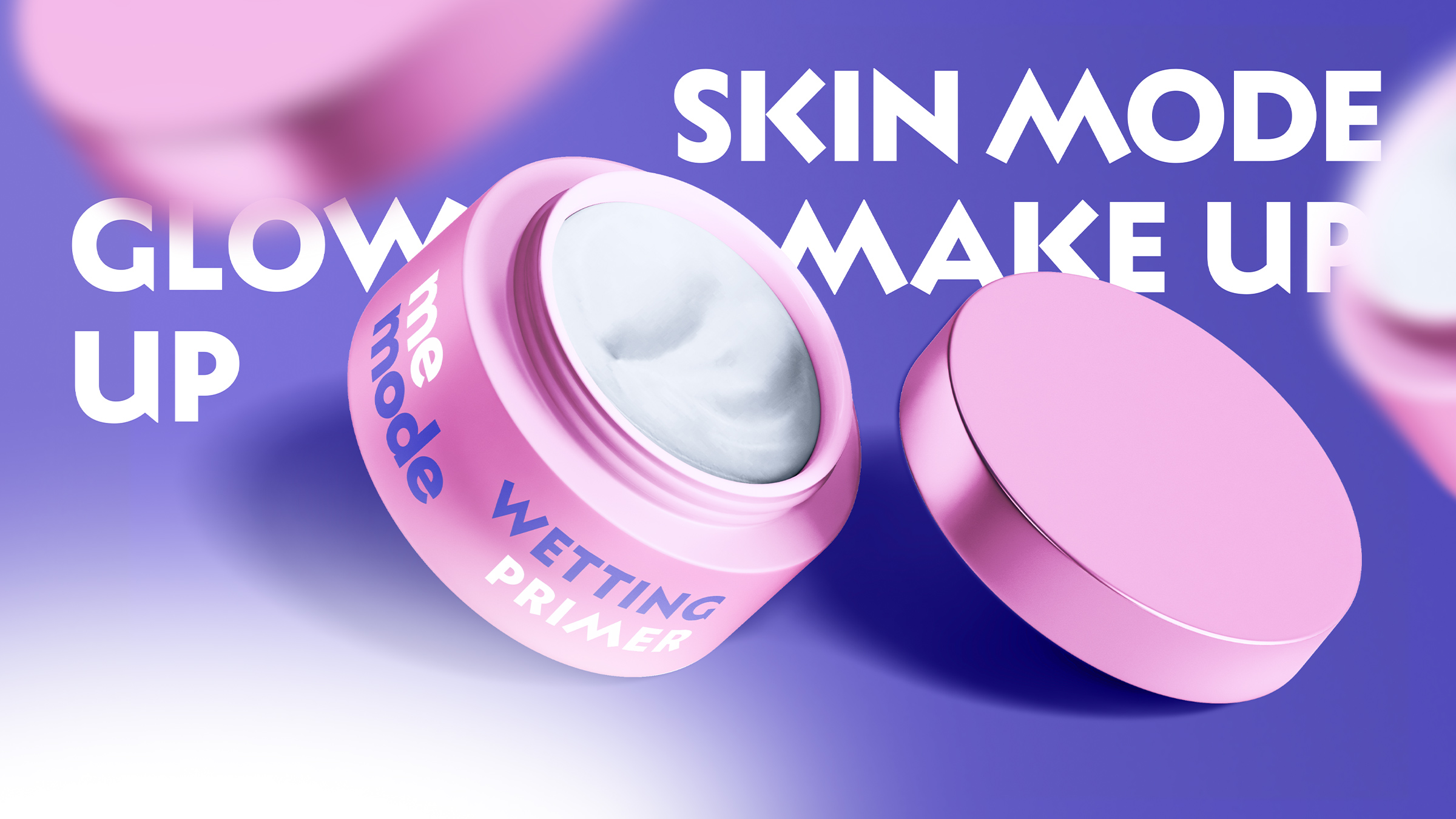
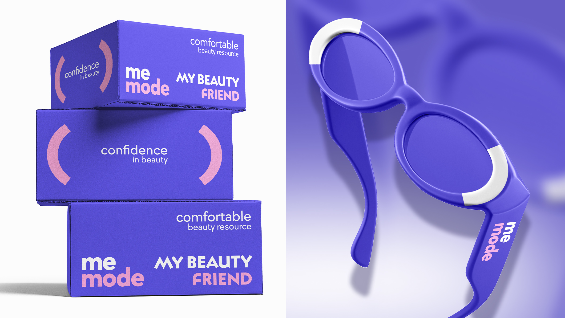
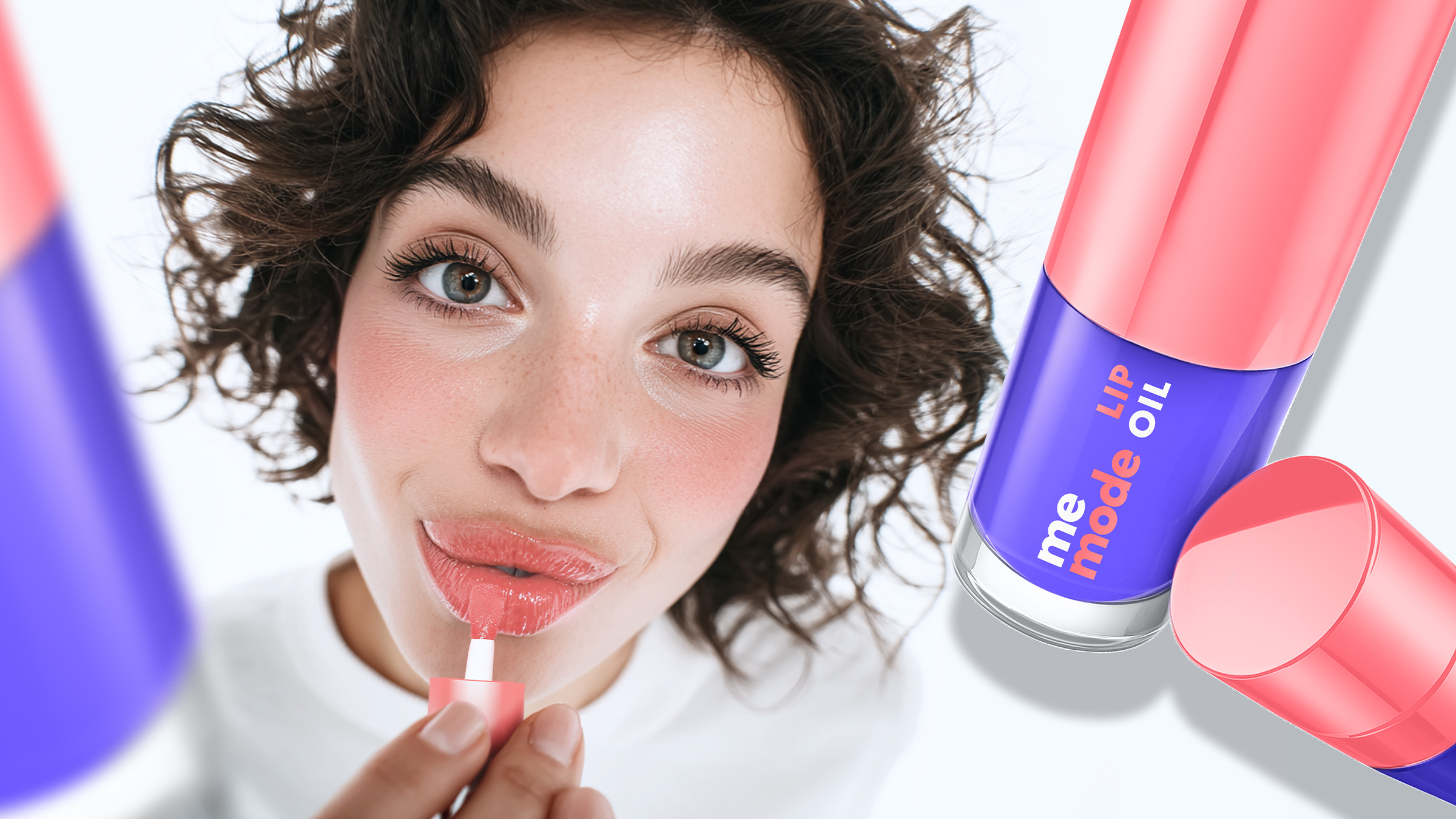
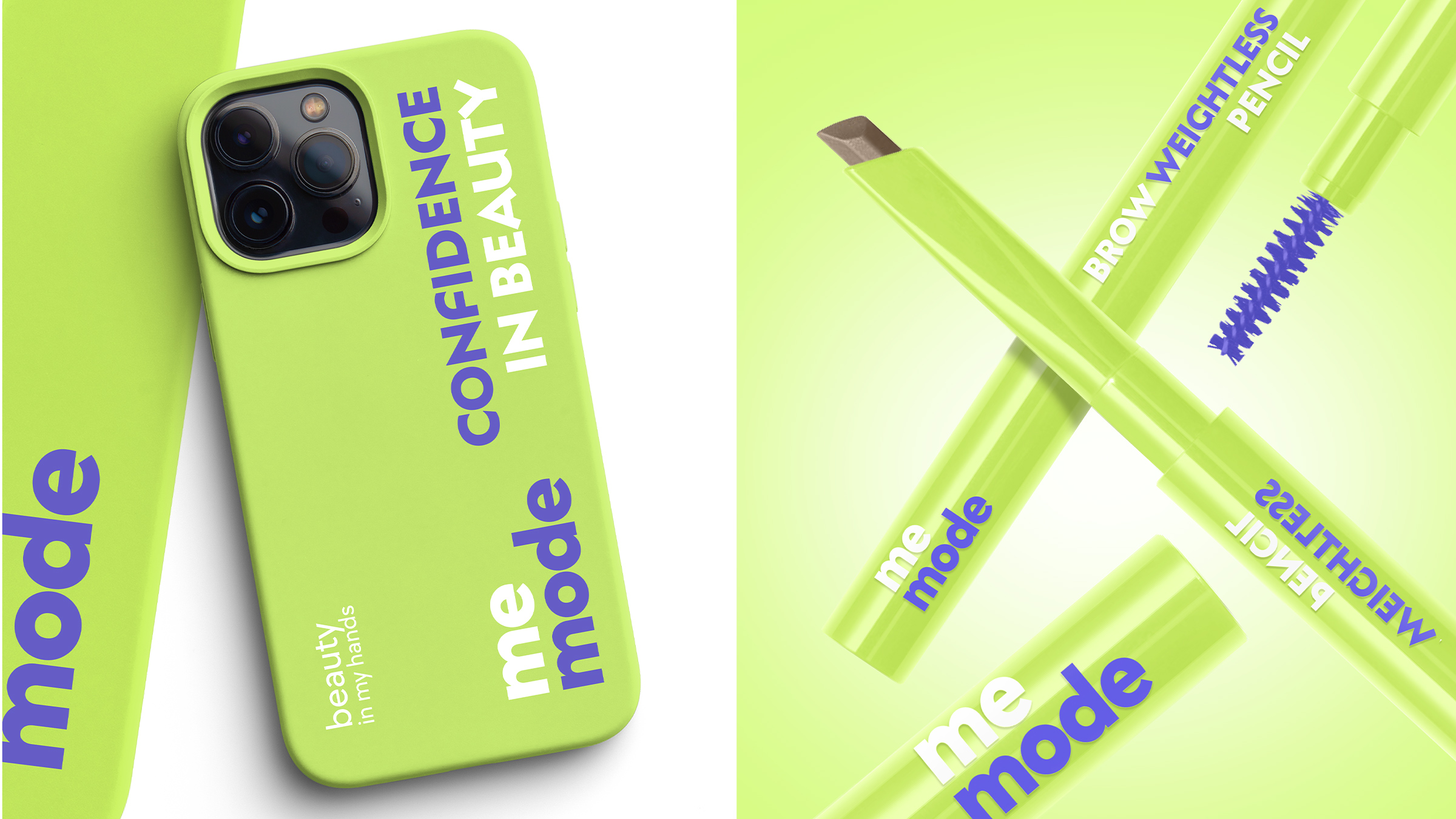
The logo reflects adaptability: a stable “me” combined with a changing “mode,” symbolizing how we switch states and identities during the day. The color system helps users quickly navigate the product range — each accent color represents a specific application area such as face, brows, eyes or lips. This makes choosing products easier both online and in-store.
The main visual device — the “scroll” — works as an attention anchor. It highlights key messages on packaging, strengthens the product’s value proposition and speaks the same visual language as the brand’s digital-native audience.
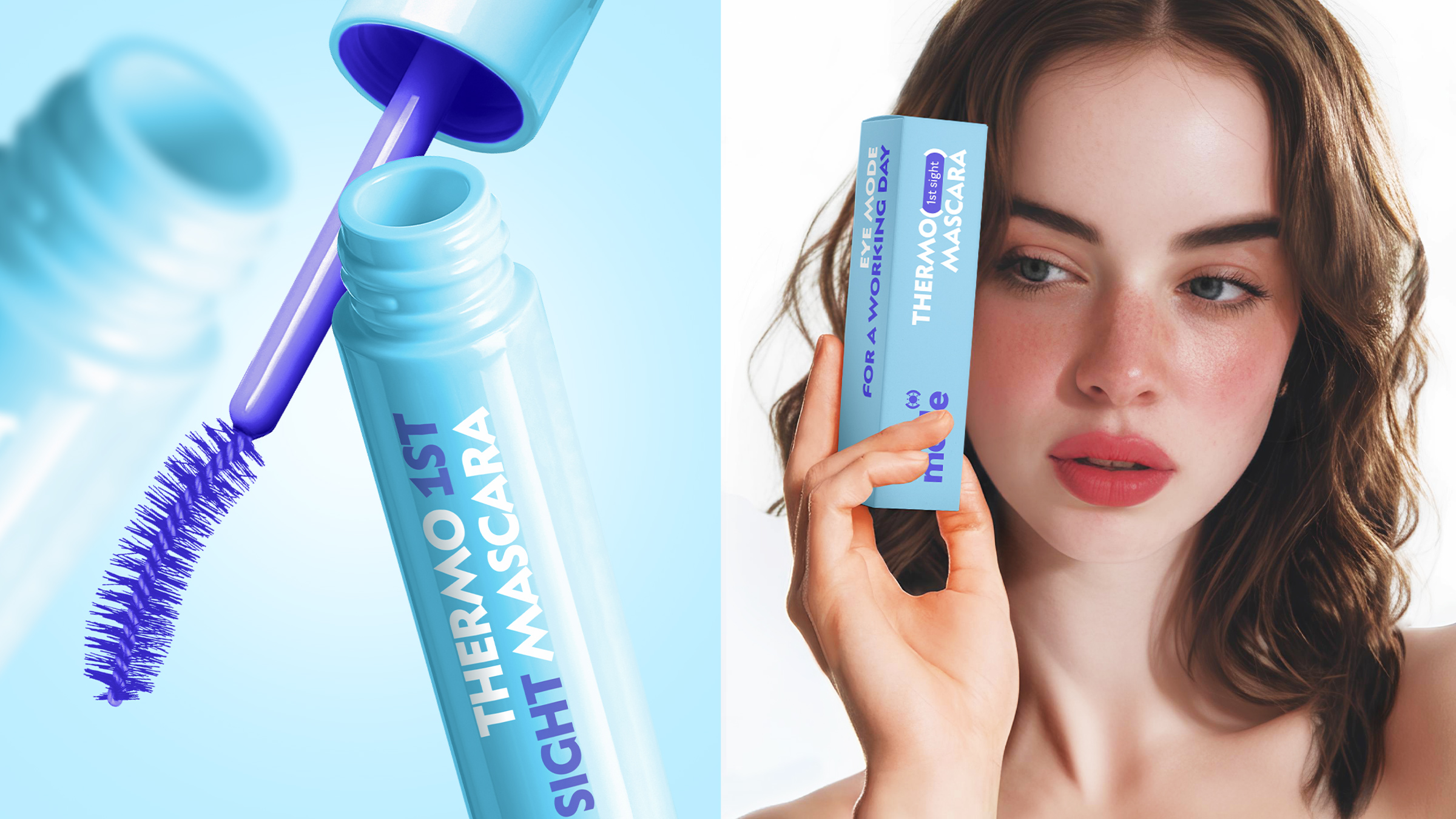
The packaging system is divided into two lines: daytime and evening. This approach is inspired by light and dark interface modes. Day products feature bright backgrounds with nude shades, while evening products use a more contrasting presentation where typography carries the main accent. Secondary packaging adds situational cues, suggesting when to use each product — from sports activities to cultural events. This turns cosmetics into a practical companion rather than just another product.
The project became an extensive exercise in system design. It was necessary to create clear differentiation between lines, synchronize primary and secondary packaging and avoid confusion across a wide assortment. The solution was a detailed brand guideline that structured every design rule.
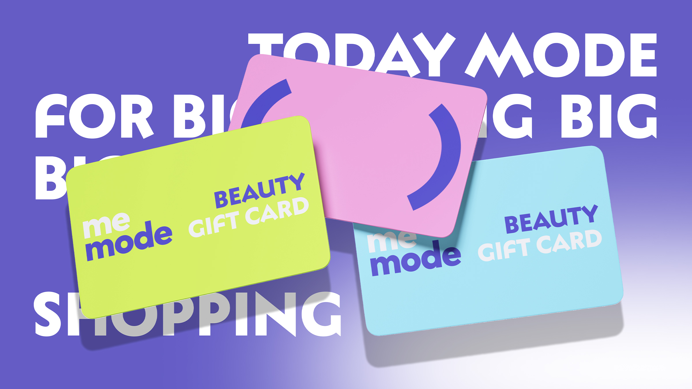
As a result, memode received a flexible, digitally driven identity and packaging system that scales easily, performs well on marketplaces and builds an emotional connection with its audience. The brand feels modern, friendly and alive — it doesn’t impose itself, it accompanies.
CREDIT
- Agency/Creative: Unblvbl
- Article Title: memode Digital Inspired Cosmetics Branding and Packaging by Unblvbl
- Organisation/Entity: Agency
- Project Type: Packaging
- Project Status: Published
- Agency/Creative Country: Russia
- Agency/Creative City: Nizhny Novgorod
- Market Region: Europe
- Project Deliverables: Brand Design, Packaging Design
- Format: Bottle, Box, Tube
- Industry: Beauty/Cosmetics
- Keywords: unblvbl, Cosmetics Branding, Packaging Design, Brand Identity, Beauty Brand, Makeup Packaging, Digital-Inspired Design, Gen Z Branding, Adaptive Design
-
Credits:
art-director: Timur Saberov
designer: Renata Mayanova


