


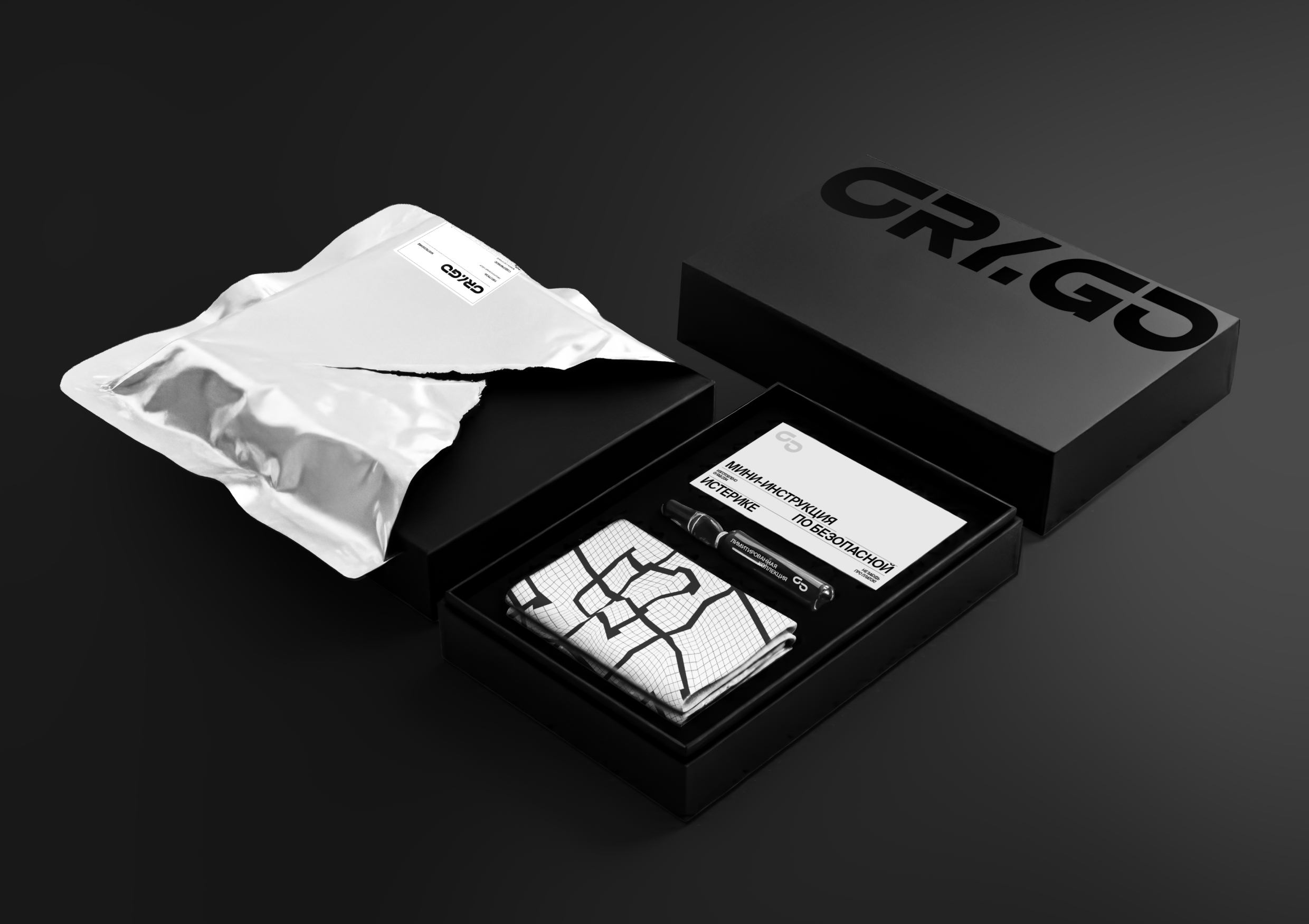
CRY·GO is a speculative delivery service for tears. It treats crying as a normal human function — physical, necessary, and repeatable — rather than a personal weakness or a dramatic event. The service is framed like an on-demand system: you choose what you need, it arrives quickly, and it guides you through a clear release cycle. CRY·GO does not promise transformation or “healing.” It offers structure at the exact moment when a person has no structure left.
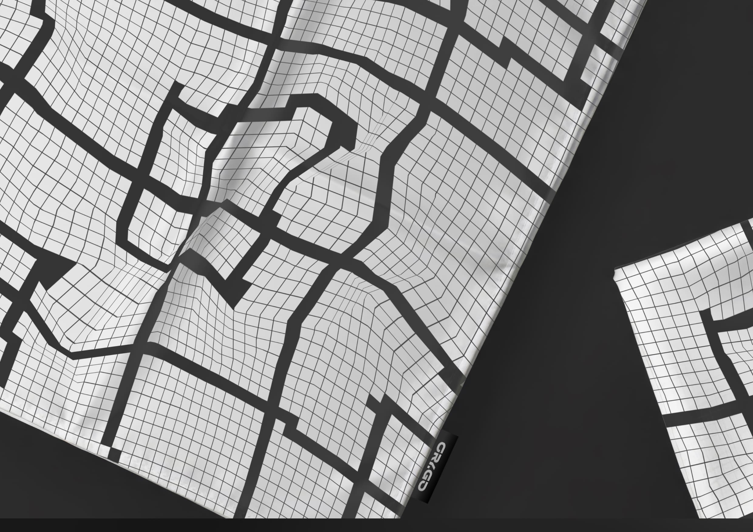
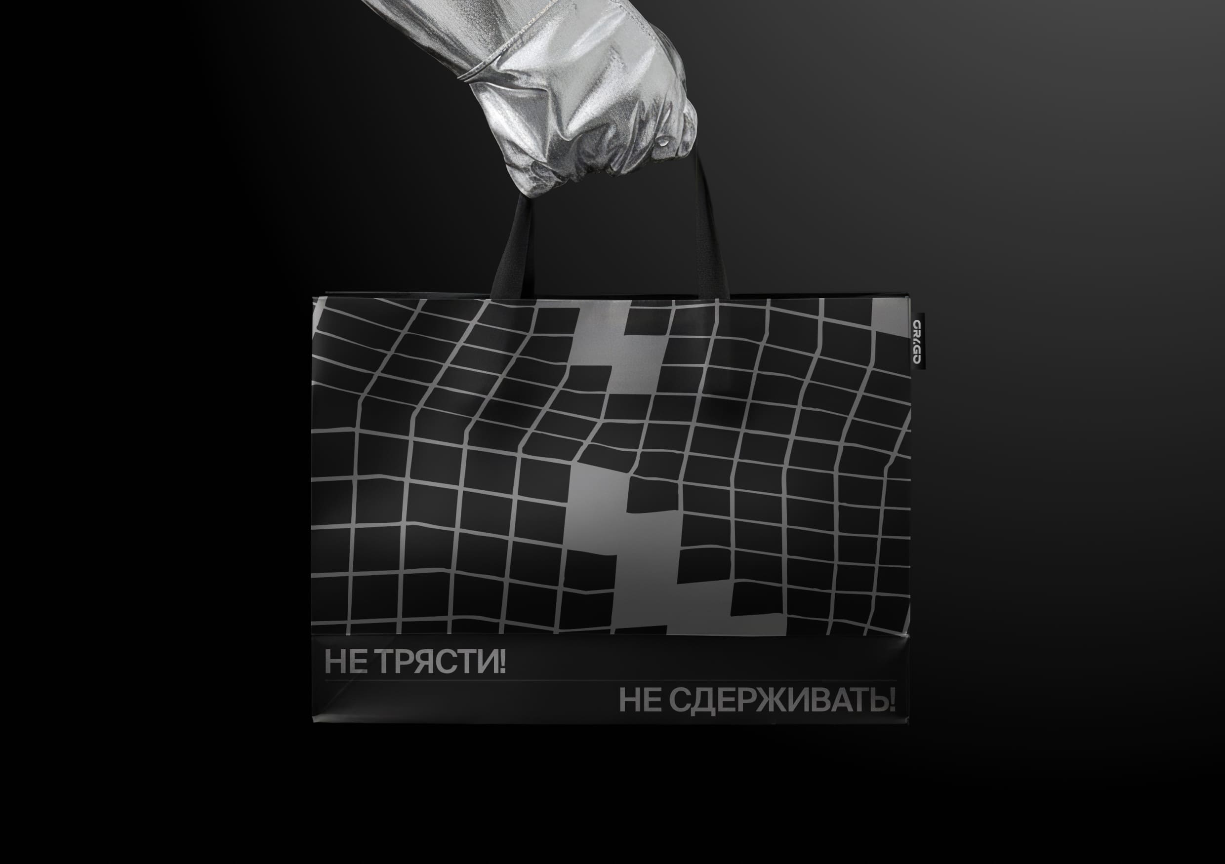
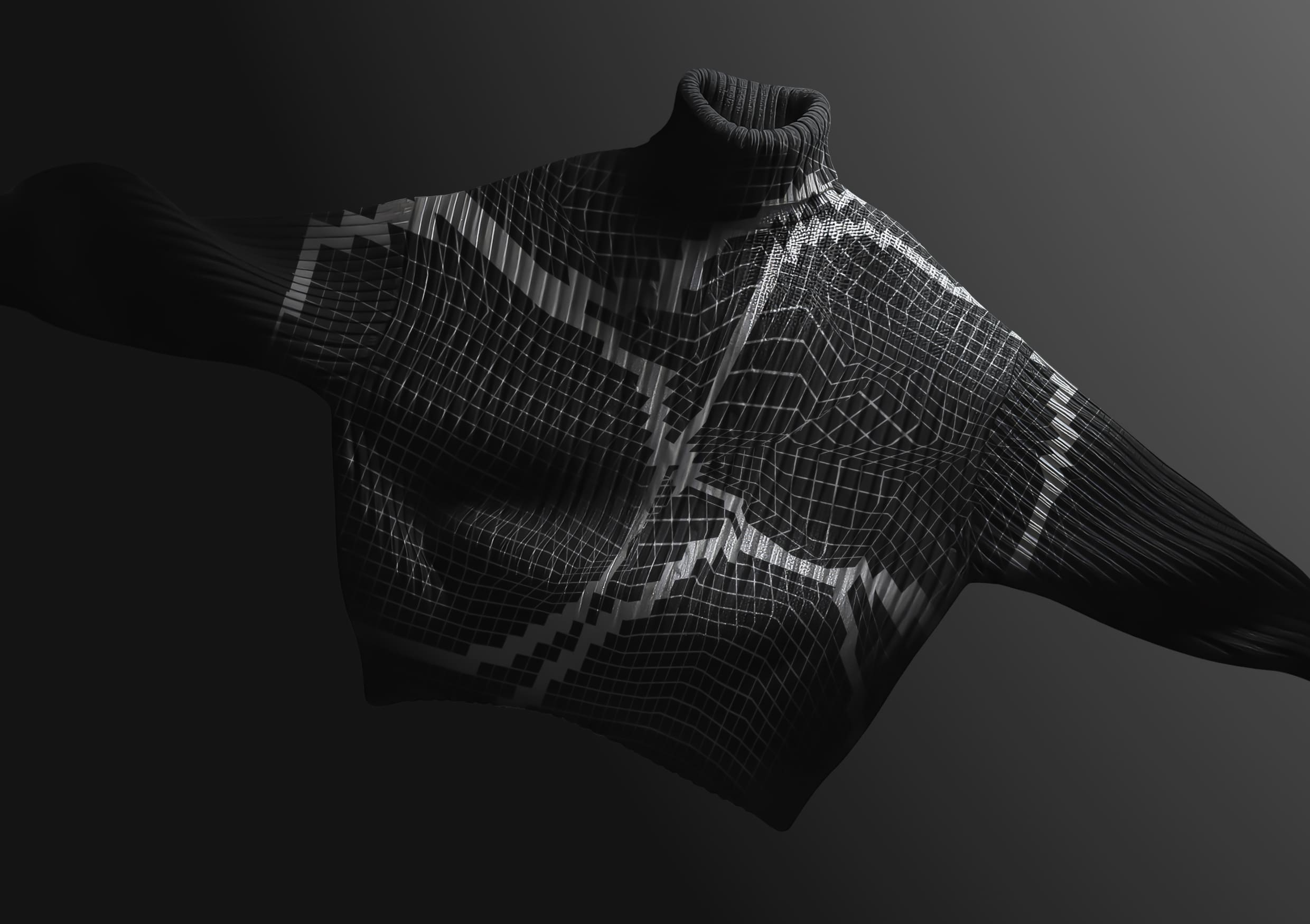
The project is built around the handkerchief as its central symbol — an object historically associated with tears, restraint, and care. Instead of relying on abstract “emotion visuals,” CRY·GO anchors the identity in something concrete and culturally familiar. The classic handkerchief grid becomes the core visual motif. It exists as a strict modular framework, but also transforms into a distorted fabric pattern: the grid bends, compresses, and warps as if the surface has absorbed water, pressure, and movement. This deformation turns the grid into a living trace of emotion without becoming illustrative or sentimental. It functions as a recognisable tag that connects the entire ecosystem, from packaging and posters to digital touchpoints.
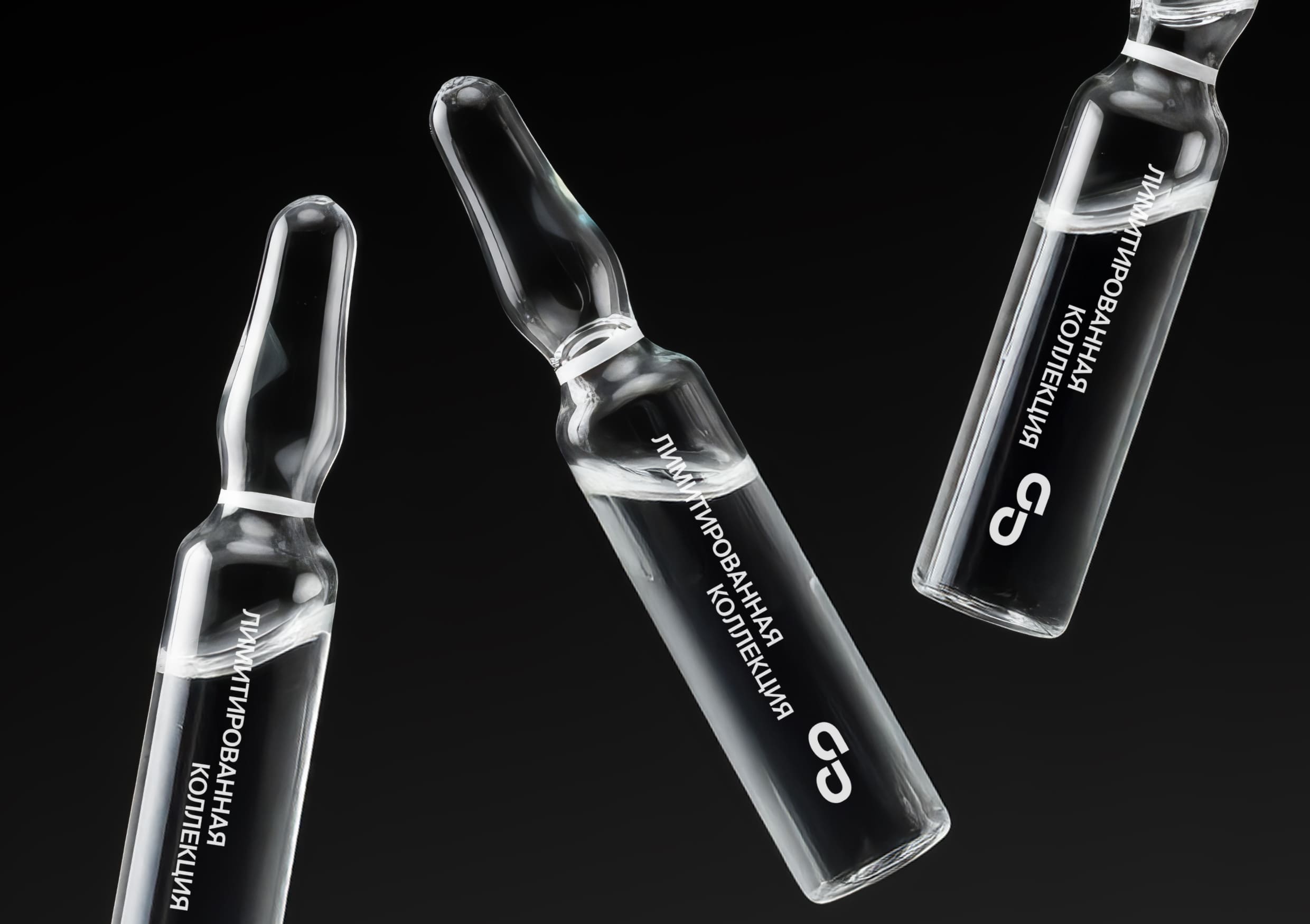
Rendered entirely in black and white, the system increases focus and emotional intensity while removing decorative noise. Monochrome turns the identity into a matter of contrast, hierarchy, and control: typography becomes the voice, and layout becomes behavior. CRY·GO borrows the logic of logistics and service labeling — warnings, care marks, handling rules, and short instructions — to frame vulnerability with the clarity of a shipment. These messages do not “explain feelings.” They direct action: how to start, how to continue, how to stop. The result is a brand language that feels precise and calm, even when the subject is heavy.
CRY·GO is designed as an ecosystem, not a single artifact. The same modular grid governs formats, spacing, and information blocks, making every item feel like part of one system. The deformed handkerchief pattern works both as background and as evidence: sometimes it is subtle, tone-on-tone, like a fabric memory; sometimes it becomes the main field carrying a headline, a warning, or a label. This consistency allows the brand to move across contexts without losing recognition — corporate, almost clinical, or intimate — while staying structurally identical.
The project shows how a service can normalize emotional release through convenience. When tears can be “ordered,” labeled, and handled with care, the conversation shifts from shame to clarity and accessibility. CRY·GO frames vulnerability with the discipline of systems design and the dignity of restraint, making crying less chaotic — and more supported as a real-life action.


CREDIT
- Agency/Creative: Ermolaeva Sofia
- Article Title: CRY.GO Brand Identity by Ermolaeva Sofia
- Organisation/Entity: Student
- Project Type: Identity
- Project Status: Non Published
- Agency/Creative Country: Russia
- Agency/Creative City: Москва
- Market Region: Global
- Project Deliverables: Brand Identity
- Industry: Professional Services
- Keywords: Ermolaeva Sofia, Identity, Brand design, Brand
-
Credits:
Tutor: Tatiana Dunaeva


